在项目中,颜色,图片,等等数据都保存在数组中
动画
使元素从一种样式逐渐变化到另一种样式的
animation: name ;
无顺序要求,但是必须先写 持续时间 ,再写 延迟时间
- 原理
人眼在看到画面的0.34 秒内,画面不会消失
在一幅画面还没消失之前,播放下一张画面
- 关键帧 @keyframes
-
           /* 动画的名称 */
@keyframes animationname {
    keyframes-selector {    /* (关键帧的选择器,动画持续时间的百分比,参照花费的总时间) 或者 (from 代表 0%,to 代表 100%%) */
        /* cssStyles; */
    }
}


/**** 实例 ****/
#box {
     200px;
    height: 200px;
    background-color: olive;

    animation-name: yidong;    /* 1. 动画的名称 */

    animation-duration: 10s;    /* 2. 动画持续时间 */

    animation-delay: 3s;    /* 4. 动画执行前等待的时间 */

    animation-fill-mode: both;    /* 8. 设置动画外的状态 ,① 动画执行前的状态 backwards
                                                        ② 动画执行完以后的 to 状态 forwards
                                                        ③ 元素开始时与 from 状态一致,结束与 to 状态一致 both */

    /* 检测的是关键帧的区间(0%-50%,50%-100%) */
    animation-timing-function: linear;    /* 3. 设置动画的类型
                                                (默认值 ease,
                                                  还有 linear,
                                                      贝塞尔曲线cubic-bezier(0.07, 1.4, 0.86, 1.47),
                                                      1个区间跳2次 steps(2)) */
    animation-iteration-count: 2;    /* 5. 动画执行次数,无限次 infinite 或者 具体次数 */

    animation-direction: alternate;    /* 6. 设置对象动画运动方向,默认值正常 normal,
                                                             相反方向,从结束向开始动画 reverse,
                                                             先正常运动,再反向运动____钟摆动画 alternate 需配合 infinite,
                                                             先反向运动,再正常运动 alternate-reverse 需配合 infinite*/
    animation-play-state: running;    /* 7. 设置对象状态: 运行 running / 暂停 paused */
}

#box {
    animation-play-state: paused;    /* 当鼠标悬浮时,动画暂停 */
}

@keyframes yidong {
    0% { transform: translateX(0px); }    /* 等同于 from {} */

    50% { transform: translateX(20px); }

    100% { transform: translateX(20px); }    /* 等同于 to {} */
}
用来控制动画变化的关键位置(而非所有位置)
- 编写位置
- 帧函数 编写在 控制元素样式的 外面
- animation 的属性 编写在 控制元素样式里面
- animation-name: yidong; /* 1. 动画的名称 */
- animation-duration: 10s; /* 2. 动画持续时间 */
- animation-timing-function: linear; /* 3. 设置动画的类型
-
-
-
- ease 默认值
- linear
- cubic-bezier(0.07, 1.4, 0.86, 1.47) 贝塞尔曲线
- steps(2) 1个区间跳2次
-
-
-
- animation-delay: 3s; /* 4. 动画执行前等待的时间 */
- animation-iteration-count: 2; /* 5. 动画执行次数
-
-
-
- infinite 无限次
- 具体次数 */
-
-
-
- animation-direction: alternate; /* 6. 设置对象动画运动方向
-
-
- normal 默认值正常
- reverse 相反方向,从结束向开始动画
- alternate 先正常运动,再反向运动____钟摆动画 需配合 infinite
- alternate-reverse 先反向运动,再正常运动 需配合 infinite
-
-
- animation-play-state: running; /* 7. 设置对象状态
-
-
- running 运行
- paused 暂停
-
-
- animation-fill-mode: both; /* 8. 设置动画外的状态
-
-
- backwards 动画执行前的状态
- forwards 动画执行完以后的 to 状态
- both 元素开始时与 from 状态一致,结束与 to 状态一致
-
-
- 动画执行完以后,立刻恢复原来状态。
兔斯基动画 (精灵图 steps infinite)
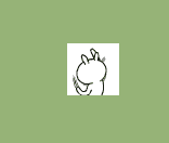
-
<!DOCTYPE html>
<html>
    <head>
        <meta charset="UTF-8" />
        <title>Crazy Rabbit</title>

        <style type="text/css">
            body {
                width: 100%;
                color: #000;
                background: #96b377;
                font: 14px Helvetica, Arial, sans-serif;
                padding-top: 300px;
                padding-left: 300px;
            }

            /**** rabbit ****/
            #running_box {
                width: 48px;
                height: 48px;
                background: url("./img/rabbit.png") no-repeat;
                background-position: 0px 0px;

                animation: crazyRabbit 340ms steps(12) 0s infinite alternate;
            }
            @keyframes crazyRabbit {
                from {
                    background-position-x: 0px;
                }
                to {
                    background-position-x: -576px;
                }
            }
            #running_box:hover {
                animation: paused;
            }
        </style>
    </head>

    <body>

        <div id="running_box">

        </div>

    </body>
</html>
自行车动画
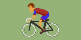
-
<!DOCTYPE html>
<html>
    <head>
        <meta charset="UTF-8" />
        <title>Running Bike</title>

        <style type="text/css">
            body {
                width: 100%;
                color: #000;
                background: #96b377;
                font: 14px Helvetica, Arial, sans-serif;
                padding: 300px 0 0 300px;
            }

            /**** Running Bike  ****/
            #bike_box {
                width: 130px;
                height: 130px;
                background: url("./img/bike.png") no-repeat;

                animation: bike 1s steps(32) infinite;
            }
            @keyframes bike {
                from {background-position: 0px 0px}
                to {background-position: 0px -4160px}
            }
            #bike_box:hover {
                animation: paused;
            }
        </style>
    </head>

    <body>

        <div id="bike_box">

        </div>

    </body>
</html>
开机动画
-
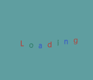
-
<!DOCTYPE html>
<html>
    <head>
        <meta charset="UTF-8"/>
        <title></title>

        <meta http-equiv="X-UA-Compatible" content="ie=edge"/>
        <meta name="viewport"
              content="user-scalable=no,
                       width=device-width,
                       initial-scale=1.0,
                       minimum-scale=1.0,
                       maximum-scale=1.0"/>

        <script type="text/javascript" src="./js/kjfFunctions.js"></script>

        <style rel="stylesheet" type="text/css">
            html, body, div, ul, li {
                margin: 0;
                padding: 0;
            }

            html, body {
                width: 100%;
                height: 100%;    /* 参照屏幕区域的高 */
                min-width: 600px;
                overflow: hidden;
            }

            #wrap {
                width: 100%;
                min-height: 100%;

                background: cadetblue;
            }

            #content {
                width: 100%;

                padding-bottom: 50px;

                font-size: 14px;
                background: darkgrey;
            }

            #footer {
                width: 100%;
                height: 50px;

                margin-top: -50px;

                background: chocolate;
                text-align: center;
                line-height: 50px;
            }

            #loading_animation {
                position: absolute;
                top: 50%;
                left: 50%;
                transform: translate(-50%, -50%);

                list-style: none;
                background-color: #bbb0;
            }

            #loading_animation li {
                float: left;

                margin-right: 10px;
                animation: jumpLetter 1s infinite alternate;
            }
            @keyframes jumpLetter {
                from {
                    transform: translateY(0px);
                }

                to {
                    transform: translateY(-15px);
                }
            }
        </style>
    </head>

    <body>

        <!-- 模拟屏幕区域 -->
        <div id="wrap">

            <!-- 内容区域 -->
            <div id="content">
                <ul id="loading_animation">
                    <li>L</li>
                    <li>o</li>
                    <li>a</li>
                    <li>d</li>
                    <li>i</li>
                    <li>n</li>
                    <li>g</li>
                </ul>
            </div>
        </div>

        <!-- 底部区域 -->
        <div id="footer">

        </div>

        <script type="text/javascript" src="./js/index.js"></script>
        <script type="text/javascript">
            var lis = document.querySelectorAll("#loading_animation li");

            var colorArr = ["red", "green", "blue"];
            var i = 0;
            for(i=0; i<lis.length; i++){
                lis[i].style.color = colorArr[i%3];

                lis[i].style.animationDelay = i*100+"ms";
            }
        </script>
    </body>
</html>