相信很多人都非常喜欢用div+css布局,无论你是前端开发者,还是后台程序员,因为它的好处实在太多,可以用很少的代码来控制布局,然后用CSS表现其形态,表现和样式分离。而且在SEO方面,它还能提供30%的优化,我们何乐而不为呢。
很多人都会碰到如题的布局问题,解决方案很多,可以用背景图来填充,或用js来控制,但终不是最佳方案,最好还是从DIV,CSS本身来考虑:
以下为三行两列的的经典模式,还可以演变成多种布局,有待大家修改:


<!DOCTYPE html PUBLIC "-//W3C//DTD XHTML 1.0 Transitional//EN" "http://www.w3.org/TR/xhtml1/DTD/xhtml1-transitional.dtd"> <html xmlns="http://www.w3.org/1999/xhtml"> <head> <meta http-equiv="Content-Type" content="text/html; charset=gb2312" /> <title>两列高度自适应</title> <style type="text/css"> <!-- *{margin:0;padding:0;} #top{background:#dcdcdc;height:30px;} #main{overflow:hidden;} .sidebar{float:left;width:150px;background:#ff0000;} .content{background:#333333;overflow:hidden;_float:left;/*兼容IE6*/} .row{margin-bottom:-10000px;padding-bottom:10000px;/*内外补丁是关键*/} #footer{clear:both;height:30px;background:#0000ff;} --> </style> </head> <body> <div id="container"> <div id="top"></div> <div id="main"> <div class="sidebar row"> 我在左边<br /> 我在左边<br /> 我在左边<br /> 我在左边<br /> 我在左边<br /> 我在左边<br /> 我在左边<br /> 我在左边<br /> 我在左边<br /> 我在左边<br /> 我在左边<br /> 我在左边<br /> 我在左边<br /> 我在左边<br /> 我在左边<br /> 我在左边<br /> 我在左边<br /> </div> <div class="content row"> 我在正文<br /> 我在正文<br /> 我在正文<br /> 我在正文<br /> 我在正文<br /> 我在正文<br /> 我在正文<br /> 我在正文<br /> 我在正文<br /> 我在正文<br /> 我在正文<br /> 我在正文<br /> 我在正文<br /> 我在正文<br /> 我在正文<br /> 我在正文<br /> 我在正文<br /> 我在正文<br /> 我在正文<br /> 我在正文<br /> 我在正文<br /> 我在正文<br /> 我在正文<br /> 我在正文<br /> <span style="float:right; font-size:0; position:relative; "> </span> <!--为了万恶的ie6--> </div> </div> <div id="footer"></div> </div> </body> </html>
配上效果图:
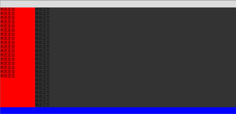
本方案在IE6,IE7,IE8,FF下均测试通过,虽然简单,但是用处广泛,希望对广大web标准爱好者有所帮助
更多: