• Css3 常用布局方式 一行两列&高度自适应&垂直方向居中


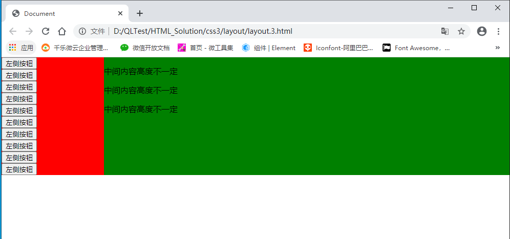
    一、 float+ margin 经典模式,兼容性好

    原理:使用padding+margin扩大内容,使用 hidden隐藏超出部分。

    注:垂直方向无法居中

    <!DOCTYPE html>
    <html lang="en">
    
    <head>
        <meta charset="UTF-8">
        <meta name="viewport" content="width=device-width, initial-scale=1.0">
        <title>Document</title>
        <style>
            html,
            body {
                padding: 0px;
                margin: 0px;
                width: 100%;
                height: 100%;
            }
    
            .wrap {
                /*  100%;
                height: 100%; */
                overflow: hidden;
            }
    
            .row {
                margin-bottom: -10000px;
                padding-bottom: 10000px;
                /*内外补丁是关键*/
            }
    
            .left {
                width: 200px;
                background: red;
                float: left;
            }
    
            .center {
                background: green;
                overflow: hidden;
            }
    
            .clear {
                clear: both;
            }
    
            button {
                display: block;
            }
        </style>
    </head>
    
    <body>
    
        <div class="wrap">
            <div class="left row">
                <button>左侧按钮</button>
                <button>左侧按钮</button>
                <button>左侧按钮</button>
                <button>左侧按钮</button>
                <button>左侧按钮</button>
                <button>左侧按钮</button>
                <button>左侧按钮</button>
                <button>左侧按钮</button>
                <button>左侧按钮</button>
                <button>左侧按钮</button>
            </div>
            <div class="center row">
                <P>中间内容高度不一定</P>
                <P>中间内容高度不一定</P>
                <P>中间内容高度不一定</P>
            </div>
            <div class="clear"></div>
        </div>
    
    </body>
    
    </html>
    View Code


    显示效果:

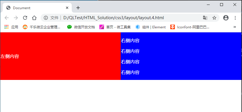
    二、table |  table class 方式

    1.table 布局

    <!DOCTYPE html>
    <html lang="en">
    
    <head>
        <meta charset="UTF-8">
        <meta name="viewport" content="width=device-width, initial-scale=1.0">
        <title>Document</title>
        <style>
            html,
            body {
                padding: 0px;
                margin: 0px;
                width: 100%;
                height: 100%;
            }
    
            .table {
                width: 100%;
                /*  height: 100%; */
                border-collapse: collapse;
                color: white;
            }
    
            .left {
                background: red;
            }
    
            .right {
                background: blue;
            }
        </style>
    </head>
    
    <body>
    
        <table class="table" border="0">
            <tr>
                <td class="left">
                    左侧内容
                </td>
                <td class="right">
                    <p>右侧内容</p>
                    <p>右侧内容</p>
                    <p>右侧内容</p>
                    <p>右侧内容</p>
                </td>
            </tr>
        </table>
    </body>
    
    </html>
    View Code

    2. table class 布局 (推荐)

    <!DOCTYPE html>
    <html lang="en">
    
    <head>
        <meta charset="UTF-8">
        <meta name="viewport" content="width=device-width, initial-scale=1.0">
        <title>Document</title>
        <style>
            html,
            body {
                padding: 0px;
                margin: 0px;
                width: 100%;
                height: 100%;
            }
    
            .table {
                width: 100%;
                 /* height: 100%; */
                border-collapse: collapse;
                color: white;
                display: table;
            }
    
            .table .row {
                display: table-row;
            }
    
            .table .col {
                display: table-cell;
            }
    
            .left {
                background: red;
                vertical-align: middle;
                text-align: center;
            }
    
            .center {
                background: blue;
            }
        </style>
    </head>
    
    <body>
    
        <div class="table">
            <div class="row">
                <div class="col left">
                    左侧内容
                </div>
                <div class="col center">
                    <p>中间内容高度不固定</p>
                    <p>中间内容高度不固定</p>
                    <p>中间内容高度不固定</p>
                </div>
            </div>
        </div>
    </body>
    
    </html>
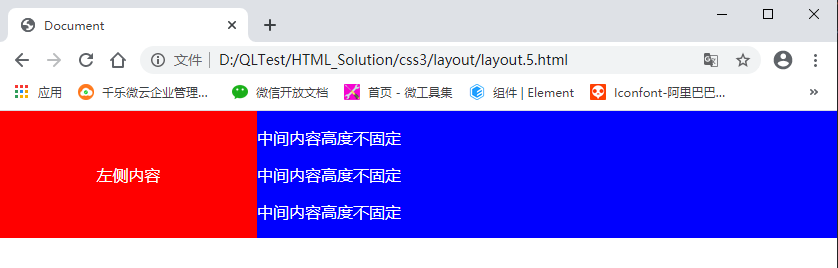
    View Code

    三、flex 布局  (推荐)

     代码量最少,不考虑兼容情况下,推荐使用

    <!DOCTYPE html>
    <html lang="en">
    
    <head>
        <meta charset="UTF-8">
        <meta name="viewport" content="width=device-width, initial-scale=1.0">
        <title>Document</title>
        <style>
            html,
            body {
                padding: 0px;
                margin: 0px;
                width: 100%;
                height: 100%;
            }
    
            .flex {
                display: flex;
                width: 100%;
                /* height: 100%; */
                color: white;
            }
    
            .left {
                background: red;
                width: 200px;
            }
    
            .center {
                background: blue;
                width: 100%;
            }
        </style>
    </head>
    
    <body>
    
        <div class="flex">
            <div class="left">
                左侧内容
            </div>
            <div class="center flex-item">
                <p>中间内容高度不固定</p>
                <p>中间内容高度不固定</p>
                <p>中间内容高度不固定</p>
                <p>中间内容高度不固定</p>
           
            </div>
        </div>
    </body>
    
    </html>
    View Code

    显示效果:

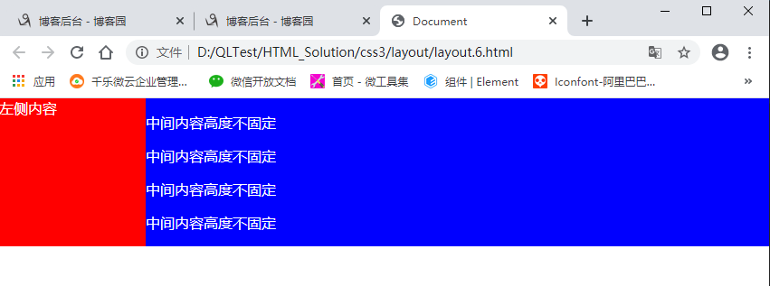
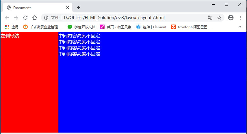
    四、absolute 、fixed + scroll 定位  (推荐)

     此方式主要针对页面整体布局,常用方式

    <!DOCTYPE html>
    <html lang="en">
    
    <head>
        <meta charset="UTF-8">
        <meta name="viewport" content="width=device-width, initial-scale=1.0">
        <title>Document</title>
        <style>
            body,
            html {
                padding: 0px;
                margin: 0px;
                width: 100%;
                height: 100%;
    
            }
    
            .wrap {
                color: white;
                width: 100%;
                height: 100%;
            }
    
            .left {
                width: 200px;
                height: 100%;
                display: fixed;
                background: red;
                left: 0px;
                top: 0px;
                float: left;
            }
    
            .center {
                background: blue;
                margin-left: 200px;
                height: 100%;
            }
        </style>
    </head>
    
    <body>
        <div class="wrap">
            <div class="left">
                左侧导航
            </div>
            <div class="center">
                中间内容高度不固定<br>
                中间内容高度不固定<br>
                中间内容高度不固定<br>
                中间内容高度不固定<br>
            </div>
        </div>
    </body>
    
    </html>
    View Code

    更多:

    两列高度自适应(转)

    三列自适应等高且中列宽度自适

    CSS 盒子模型(转)

  • 相关阅读:
    PyQt5-QComboBox控件使用
    PyQt5-按钮控件使用
    PyQt5-QTextEdit控件使用
    Ubuntu12.04下YouCompleteMe安装教程(部分)
    ubuntu下vim的简单配置
    VirtualBox下vim无法正常使用问题解决
    树莓派下ubuntu-mate中ssh服务的安装与开机后自启动
    水仙花小游戏
    C语言实现判断分数等级
    临时记录(不断更新)
  • 原文地址:https://www.cnblogs.com/tianma3798/p/13906381.html
Copyright © 2020-2023  润新知