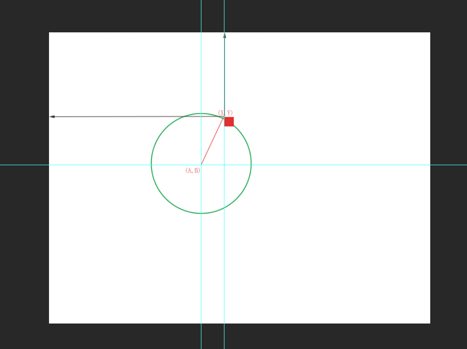
设想下图白色部分为显示器,我们要元素根据不同的角度围绕绿色圆形,做环形运动。
那么我们首先要计算出在不同角度时,元素所在位置的XY坐标。
已知信息圆心A,B,半径R,角度deg
那么我们可以根据以上信息得出两个公式
sin(deg) = (X - A) / R
cos(deg) = (B - Y) / R
根据上述公式我们可以计算出我们需要的X Y位置
X = A + R * sin(deg)
Y = B - R * cos(deg)
我们利用三角函数简单的原理获得X Y,下面简单代码演示
<!DOCTYPE html>
<html lang="en">

<head>
    <meta charset="UTF-8">
    <meta name="viewport" content="width=device-width, initial-scale=1.0">
    <title>Document</title>
    <style>
        div:nth-child(1) {
             30px;
            height: 30px;
            border-radius: 50%;
            background-color: pink;
            position: absolute;
            left: 0;
            top: 0;
        }

        div:nth-child(2) {
             600px;
            height: 600px;
            border: solid 10px blue;
            border-radius: 50%;
            position: absolute;
            top: 200px;
            left: 300px;
        }
    </style>
</head>

<body>
    <div></div>
    <div></div>
    <script>
        // 设定圆心位置
        var A = 600;
        var B = 500;
        // 设定半径长度
        var R = 300;
        // 定义X,Y,deg
        var X, Y, angle = 0;


        setInterval(function() {
            angle++;
            angle = angle % 360;
            gotoDeg(angle);
        }, 20)

        // 根据角度变换位置
        function gotoDeg(deg) {
            X = A + Math.sin(degToRadianChange(deg)) * R;
            Y = B - Math.cos(degToRadianChange(deg)) * R;
            document.querySelectorAll('div')[0].style.left = X + 'px';
            document.querySelectorAll('div')[0].style.top = Y + 'px';
        }

        // 角度转弧度
        function degToRadianChange(deg) {
            return Math.PI / 180 * deg
        }
    </script>
</body>

</html>
下面是面向对象的方式将其封装
<!DOCTYPE html>
<html lang="en">

<head>
    <meta charset="UTF-8">
    <meta name="viewport" content="width=device-width, initial-scale=1.0">
    <title>Document</title>
    <style>
        body {
            position: relative;
        }

        div:nth-child(1) {
             30px;
            height: 30px;
            border-radius: 50%;
            background-color: pink;
            position: absolute;
            left: 0;
            top: 0;
        }

        div:nth-child(2) {
             600px;
            height: 600px;
            border: solid 10px blue;
            border-radius: 50%;
            position: absolute;
            top: 200px;
            left: 300px;
        }
    </style>
</head>

<body>
    <div></div>
    <div></div>
    <script>
        // 旋转元素类
        function rotateDom(dataJson) {
            this.timer = null;
            this.dom = dataJson.dom;
            // 参考元素
            this.referenceDom = dataJson.referenceDom;
            // 方向
            this.direcition = dataJson.direcition || 1;
            // 总时长
            this.time = dataJson.time || 1000;
            // 帧间隔
            this.interval = dataJson.interval || 10;
            // 总帧数
            this.allFrame = this.time / this.interval;
            // 每帧旋转角度
            this.everyAngle = 360 / this.allFrame;
            // 位置数据
            this.A = fetchAllOffsetLeft(this.referenceDom) + this.referenceDom.clientWidth / 2
            this.B = fetchAllOffsetTop(this.referenceDom) + this.referenceDom.clientHeight / 2
            this.R = this.referenceDom.clientHeight / 2

            this.X = this.A + Math.sin(degToRadianChange(0)) * this.R;
            console.log(this.X)
            this.Y = this.B - Math.cos(degToRadianChange(0)) * this.R;
            // 渲染
            this.render();
            this.move();
        }
        rotateDom.prototype.render = function() {
            this.dom.style.top = this.Y + 'px';
            this.dom.style.left = this.X + 'px';
        }
        rotateDom.prototype.move = function() {
            var self = this;
            var angle = 0;
            this.timer = setInterval(function() {
                angle += self.everyAngle * self.direcition;
                angle %= 360;
                self.X = self.A + Math.sin(degToRadianChange(angle)) * self.R;
                self.Y = self.B - Math.cos(degToRadianChange(angle)) * self.R;
                self.render();
            }, this.interval)
        };


        // 角度转弧度
        function degToRadianChange(deg) {
            return Math.PI / 180 * deg
        }
        // 获取净offsetTop,此处忽略border
        function fetchAllOffsetTop(dom) {
            var allTop = dom.offsetTop;
            while (dom = dom.offsetParent) {
                allTop += dom.offsetTop;
            }
            return allTop;
        }

        // 获取净offsetLeft
        function fetchAllOffsetLeft(dom) {
            var allLeft = dom.offsetLeft;
            while (dom = dom.offsetParent) {
                allLeft += dom.offsetLeft;
            }
            return allLeft;
        }
        new rotateDom({
            "dom": document.querySelectorAll('div')[0],
            "referenceDom": document.querySelectorAll('div')[1],
            "time": 2000,
            "interval": 5,
        })
    </script>
</body>

</html>