使用highcharts绘制美观的燃尽图
助教在博客中介绍了两种绘制燃尽图的方法,但是我们组在使用时发现有些任务不适合写进issue,而且网站生成的燃尽图不是很美观,因此我们打算使用其他方法自己绘制燃尽图。经过简单调研,我们采用了highcharts来展现我们的燃尽图。
demo与特点
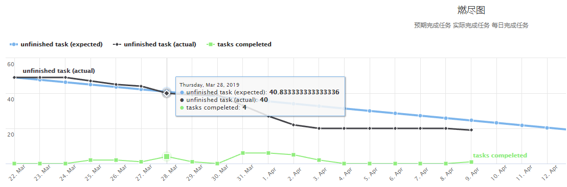
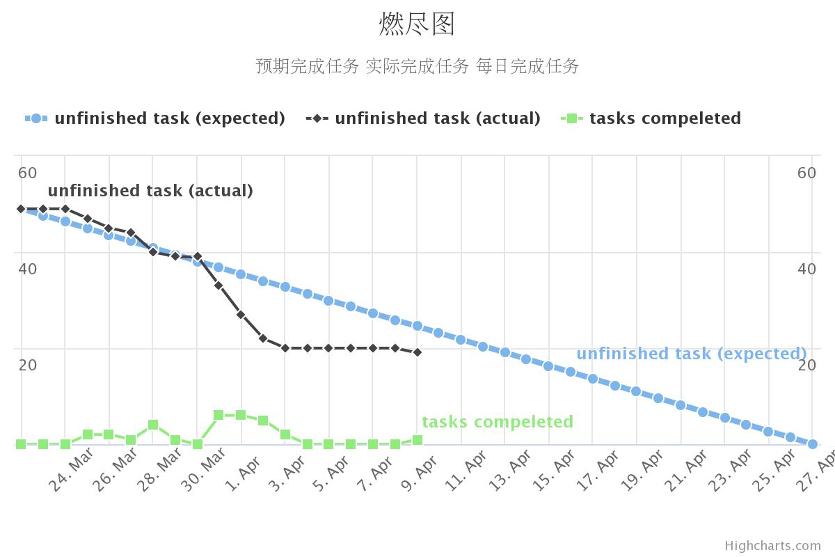
我们的燃尽图demo如下:
demo
我们的燃尽图具有以下特点:
1 交互性图表
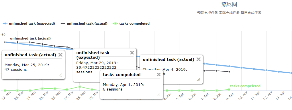
利用highcharts的交互性,访问者可以和图表进行积极交互,获取更多有效信息,如下所示。
-
查询每日工作进度
-
比较任意几天的工作情况
-
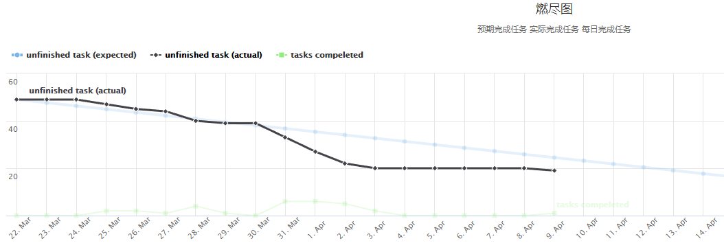
着重显示某条曲线
-
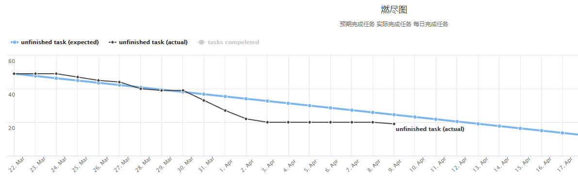
隐藏曲线
2 配色美观,主题丰富,可定制化程度高
相较于利用网站生成的燃尽图,我们的图表配色更加美观。此外highchats还支持大量自定义模板与主题,可以自由更换背景,线型,颜色,图表类型,定制图表样式,带来更好的阅读体验。
3 自动化生成,维护简单
我们通过服务器上一个定时脚本实现了燃尽图的动态更新。该脚本会定时从本项目的石墨文档中提取任务完成情况,加工数据并更新csv文件,而博客中的js脚本则加载这个csv文件进行画图。整个过程自动完成,不需要过多维护。对于使用issues管理的项目也可以自行设计脚本爬取数据更新csv。
4 纯js实现,依赖较少
Based on native browser technologies, no plugins needed
官网介绍
通过加载几个js,我们就可以使用highcharts完整的功能。
highcharts介绍
Highcharts 是一个用纯 JavaScript 编写的一个图表库, 能够很简单便捷的在 Web 网站或是 Web 应用程序添加有交互性的图表,并且免费提供给个人学习、个人网站和非商业用途使用。
Highcharts 支持的图表类型有直线图、曲线图、区域图、柱状图、饼状图、散状点图、仪表图、气泡图、瀑布流图等多达 20 种图表,其中很多图表可以集成在同一个图形中形成混合图。
其主要优势(功能特点)有:
兼容性、非商业使用免费、开源、纯 JavaScript、丰富的图表类型、简单的配置语法、动态交互性、支持多坐标轴、数据提示框、方便加载外部数据等等
燃尽图的具体实现方式
网页js需求
首先我们要开通博客园的js功能,在开通之后,为了使highcharts能正常工作,我们一般需要加载以下几个脚本与样式:
<script src="https://code.jquery.com/jquery-3.1.1.min.js"></script>
<script src="https://code.highcharts.com/highcharts.js"></script>
<script src="https://code.highcharts.com/modules/data.js"></script>
<script src="https://code.highcharts.com/modules/series-label.js"></script>
<script src="https://code.highcharts.com/modules/exporting.js"></script>
<script src="https://code.highcharts.com/modules/export-data.js"></script>

<!-- Additional files for the Highslide popup effect -->
<script src="https://www.highcharts.com/media/com_demo/js/highslide-full.min.js"></script>
<script src="https://www.highcharts.com/media/com_demo/js/highslide.config.js" charset="utf-8"></script>
<link rel="stylesheet" type="text/css" href="https://www.highcharts.com/media/com_demo/css/highslide.css" />
highcharts也支持静态导出图片(如下图),插入这些图片不需要额外的js文件,但是这样的图片就失去了交互性。
highcharts燃尽图具体js脚本
本部分主要介绍我们的燃尽图使用的具体的js脚本与功能,有条件的读者也可以自行阅读官网demo与说明文档,了解更多内容。
全部js脚本与对应功能介绍如下:
<div id="container" style="min- 310px; height: 400px; margin: 0 auto"></div>
<script>
    Highcharts.chart('container', {
        chart: {
            scrollablePlotArea: {
                minWidth: 700
            }
        },
        data: {
            csvURL: 'http://example.com/example.csv',
            beforeParse: function (csv) {
                return csv.replace(/

/g, '
');
            }
        },
        title: {
            text: '燃尽图'
        },
        subtitle: {
            text: '预期完成任务 实际完成任务 每日完成任务'
        },
        xAxis: {
            tickInterval: 1 * 24 * 3600 * 1000,
            tickWidth: 0,
            gridLineWidth: 1,
            labels: {
                align: 'left',
                x: -10,
                y: 35
            }
        },
        yAxis: [{ // left y axis
            title: {
                text: null
            },
            labels: {
                align: 'left',
                x: 3,
                y: 16,
                format: '{value:.,0f}'
            },
            showFirstLabel: false
        }, { // right y axis
            linkedTo: 0,
            gridLineWidth: 0,
            opposite: true,
            title: {
                text: null
            },
            labels: {
                align: 'right',
                x: -3,
                y: 16,
                format: '{value:.,0f}'
            },
            showFirstLabel: false
        }],
        legend: {
            align: 'left',
            verticalAlign: 'top',
            borderWidth: 0
        },
        tooltip: {
            shared: true,
            crosshairs: true
        },
        plotOptions: {
            series: {
                cursor: 'pointer',
                point: {
                    events: {
                        click: function (e) {
                            hs.htmlExpand(null, {
                                pageOrigin: {
                                    x: e.pageX || e.clientX,
                                    y: e.pageY || e.clientY
                                },
                                headingText: this.series.name,
                                maincontentText: Highcharts.dateFormat('%A, %b %e, %Y', this.x) + ':<br/> ' + this.y + ' tasks',
                                 200
                            });
                        }
                    }
                },
                marker: {
                    lineWidth: 1
                }
            }
        },
        series: [{
            name: 'All tasks',
            lineWidth: 4,
            marker: {
                radius: 4
            }
        }, {
            name: 'New users'
        }]
    });
</script>
设置图表位置
<div id="container" style="min- 310px; height: 400px; margin: 0 auto"></div>
<script>
    Highcharts.chart('container', {
        chart: {
            scrollablePlotArea: {
                minWidth: 700
            }
        },
首先,我们要设置图表的目标位置,一般通过一个div实现。在这之后我们就可以用highcharts修改div内容,进行画图了。
加载数据
highcharts同时支持Ajax加载数据和js硬写数据两种方式,具体方法如下:
    data: { // ajax加载数据
        csvURL: 'https://cdn.jsdelivr.net/gh/highcharts/highcharts@v7.0.0/samples/data/analytics.csv',
        beforeParse: function (csv) {
            return csv.replace(/

/g, '
');
        }
    },
//------------------------------------------------------------------------
    series: [{ // 加载硬写进js的数据
        name: 'Installation',
        data: [43934, 52503, 57177, 69658, 97031, 119931, 137133, 154175]
    }, {
        name: 'Manufacturing',
        data: [24916, 24064, 29742, 29851, 32490, 30282, 38121, 40434]
    }, {
        name: 'Sales & Distribution',
        data: [11744, 17722, 16005, 19771, 20185, 24377, 32147, 39387]
    }, {
        name: 'Project Development',
        data: [null, null, 7988, 12169, 15112, 22452, 34400, 34227]
    }, {
        name: 'Other',
        data: [12908, 5948, 8105, 11248, 8989, 11816, 18274, 18111]
    }],
我们使用的是第一种方法,主要原因有:
- 第一种方法代码较短,更加清晰
- 使用csv能更好的配合自动化脚本
修改曲线的颜色也可以在series中进行。
设置标题,次标题,图例
    title: {
        text: '燃尽图'
    },
    subtitle: {
        text: '预期完成任务 实际完成任务 每日完成任务'
    },
    legend: {
        align: 'left',
        verticalAlign: 'top',
        borderWidth: 0
    },
highcharts支持自定义标题,次标题,图例的文字,内容,样式,位置等,具体参数可以参考api文档。一般常用的是通过text修改内容,align,verticalAlign设置位置等。
设置x,y轴坐标与刻度
    xAxis:{
        tickInterval: 1 * 24 * 3600 * 1000,
        tickWidth: 0,
        gridLineWidth: 1,
        labels: {
            align: 'left',
            x: -10,
            y: 35
        }
    },
    yAxis: [{ // left y axis
        title: {
            text: null
        },
        labels: {
            align: 'left',
            x: 3,
            y: 16,
            format: '{value:.,0f}'
        },
        showFirstLabel: false
    }, { // right y axis
        linkedTo: 0,
        gridLineWidth: 0,
        opposite: true,
        title: {
            text: null
        },
        labels: {
            align: 'right',
            x: -3,
            y: 16,
            format: '{value:.,0f}'
        },
        showFirstLabel: false
    }],
highcharts可以分别设置x,y轴坐标与内容,同时支持次坐标轴,并且对于刻度为时间的坐标轴支持较好。
通过title可以设置坐标内容,通过labels可以设置刻度显示的内容,对齐位置与偏移量,tickInterval则支持以时间为单位的坐标。
用户交互设计
    plotOptions: {
        series: {
            cursor: 'pointer',
            point: {
                events: {
                    click: function (e) {
                        hs.htmlExpand(null, {
                            pageOrigin: {
                                x: e.pageX || e.clientX,
                                y: e.pageY || e.clientY
                            },
                            headingText: this.series.name,
                            maincontentText: Highcharts.dateFormat('%A, %b %e, %Y', this.x) + ':<br/> ' + this.y + ' tasks',
                             200
                        });
                    }
                }
            },
            marker: {
                lineWidth: 1
            }
        }
    },
通过这部分代码可以控制用户鼠标焦点在图片中移动时显示的辅助性内容。例如上面的例子可以用来显示鼠标焦点所在的位置的任务数,并进行了格式化输出。
写在后面
以上基本就是我们使用highcharts实现我们的燃尽图的方式了。当然作为一个强大的图表工具,highcharts的功能,支持的图表远不止这些,完全可以用在我们的网站中,带来更好的展示效果。