页眉页脚工具栏的使用、
1.工具栏显示模式
分为两种:固定模式、内联模式(默认)。
固定模式:页眉总是位于屏幕最上方,页脚总是位于屏幕最下方。
内联模式:页眉在页面正文内容上方,正文结束后紧跟页脚工具栏,随着正文内容的长短工具栏的位置也会变化。
<!DOCTYPE html>
<html lang="en">
<head>
<meta charset="UTF-8">
<meta name="viewport" content="width=device-width,initial-scale=1">
<title></title>
<link rel="stylesheet" href="css/jquery.mobile-1.4.5.min.css" type="text/css">
<script src="js/jquery-1.11.3.js"></script>
<script src="js/jquery.mobile-1.4.5.min.js"></script>
</head>
<body>
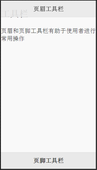
<section id="page1" data-role="page" data-title="工具栏">
<div data-role="header" data-position="fixed" data-fullscreen="true" data-theme="a" >
<h2>页眉工具栏</h2>
</div>
<div>
<h1>工具栏</h1>
页眉和页脚工具栏有助于使用者进行常用操作
</div>
<div data-role="footer" data-position="fixed">
<h2>页脚工具栏</h2>
</div>
</section>
</body>
</html>
代码执行效果如下图所示:
data-position="fixed":设置页眉为固定显示模式。
data-fullscreen="true":设置点击屏幕隐藏页眉页脚。
data-theme="a":设置主题风格为a。
2、工具栏中按钮样式和位置
页眉工具栏中,默认情况下分立在标题两侧,左侧按钮居左显示,右侧按钮居右显示,呈现为内联样式。
<div data-role="header" data-position="fixed" data-fullscreen="true">
    <a href="#" data-role="button" data-icon="arrow-l">左侧</a>
    <h1>页眉工具栏</h1>
    <a href="#" data-role="button" data-icon="arrow-r">右侧</a>
</div>
代码执行效果如下图所示:
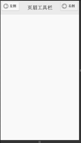
data-role="button":设置a标签为按钮。
data-icon="arrow-l":设置显示图标。
3、导航工具栏
<header data-role="header" data-position="fixed" data-theme="b">
    <h1>导航工具栏</h1>
    <div data-role="navbar">
        <ul>
            <li><a href="#">导航按钮</a></li>
            <li><a href="#">导航按钮</a></li>
            <li><a href="#">导航按钮</a></li>
            <li><a href="#">导航按钮</a></li>
            <li><a href="#">导航按钮</a></li>
            <li><a href="#">导航按钮</a></li>
            <li><a href="#">导航按钮</a></li>
        </ul>
    </div>
</header>
<div data-role="content">
    <p>页眉或页脚导航工具栏都可以集成导航工具栏以实现丰富的导航效果</p>
</div>
<div data-role="footer" data-position="fixed" data-theme="b" data-fullscreen="true">
    <div data-role="navbar">
        <ul>
            <li><a href="#" data-icon="arrow-l">向前</a></li>
            <li><a href="#" data-icon="arrow-r">向后</a></li>
        </ul>
    </div>
</div>
运行效果如图所示:
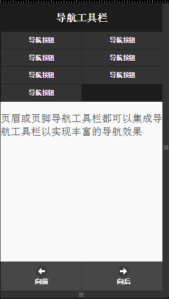
data-role="navbar":设置容器为导航栏,在导航工具栏中每行至多有5个导航按钮,超过则自动换行显示。在自动换行的导航工具栏中每行只有两个导航按钮。