Scipy
- 在numpy基础上增加了众多的数学、科学及工程常用的库函数;
- 线性代数、常微分方程求解、信号处理、图像处理、稀疏矩阵等;
Matplotlib
- 用于创建出版质量图表的绘图工具库;
- 目的是为python构建一个Matlab式的绘图接口;
- import matplotlib.pyplot as plt,pyplot模块包含了常用的matplotlib API函数;
- figure, Matplotlib的图像均位于figure对象中;
- subplot,figure.add_subplot(a,b,c),a、b表示分割成a*b的区域,c表示当前选中要操作的区域(从1开始编号);
# 引入matplotlib包
import matplotlib.pyplot as plt
# 创建figure
fig = plt.figure()

ax1 = fig.add_subplot(2,2,1)
ax2 = fig.add_subplot(2,2,2)
ax3 = fig.add_subplot(2,2,3)
ax4 = fig.add_subplot(2,2,4)

# 在subplot上作图
import numpy as np

random_arr = np.random.randn(100)
#print random_arr

# 默认是在最后一次使用subplot的位置上作图
plt.plot(random_arr)
plt.show()
- 执行结果:
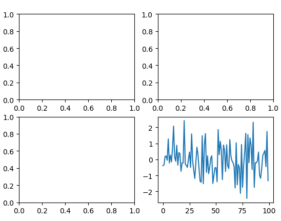
说明:figure.add_subplot(a,b,c)返回的是AxesSubplot对象,plot绘图的区域是最后一次指定subplot的位置。
subplot结合scipy绘制统计图
- 正态分布,scipy.stats.norm.pdf
- 正态直方图,scipy.stats.norm.rvs
import scipy as sp
from scipy import stats
import matplotlib.pyplot as plt
import numpy as np

x = np.linspace(-5, 15, 50)
# print x.shape

# 绘制高斯分布
plt.plot(x, sp.stats.norm.pdf(x=x, loc=5, scale=2))

# 叠加直方图
plt.hist(sp.stats.norm.rvs(loc=5, scale=2, size=200), bins=50, normed=True, color='red', alpha=0.5)
plt.show()
- 执行结果:

subplot直方图hist
# 绘制直方图
import matplotlib.pyplot as plt
import numpy as np
plt.hist(np.random.randn(100), bins=10, color='b', alpha=0.3)
plt.show()
参数:np.random.randn(100) 生成随机100个数据,bins分成10组,color颜色为blue蓝色,alpha为透明度

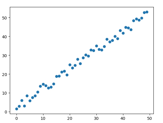
subplot散点图scatter
import matplotlib.pyplot as plt
import numpy as np
# 绘制散点图
x = np.arange(50)
y = x + 5 * np.random.rand(50)
plt.scatter(x, y)
plt.show()
subplot柱状图bar
import matplotlib.pyplot as plt
import numpy as np
# 柱状图
x = np.arange(5)
y1, y2 = np.random.randint(1, 25, size=(2, 5))
width = 0.25
ax = plt.subplot(1,1,1)
ax.bar(x, y1, width, color='r')
ax.bar(x+width, y2, width, color='g')
ax.set_xticks(x+width)
ax.set_xticklabels(['a', 'b', 'c', 'd', 'e'])
plt.show()

subplot矩阵绘图
import matplotlib.pyplot as plt
import numpy as np
m = np.random.rand(10,10)
plt.imshow(m, interpolation='nearest', cmap=plt.cm.ocean)
plt.colorbar()
plt.show()

plt.subplot()
同时返回新创建的figure和subplot对象数组
import matplotlib.pyplot as plt
import numpy as np
fig, subplot_arr = plt.subplots(2,2)
subplot_arr[0,0].hist(np.random.randn(100), bins=10, color='b', alpha=0.3)
plt.show()

学习参考
Matplotlib示例库 http://matplotlib.org/gallery.html