最近一段时间在准备面试——>实习找工作
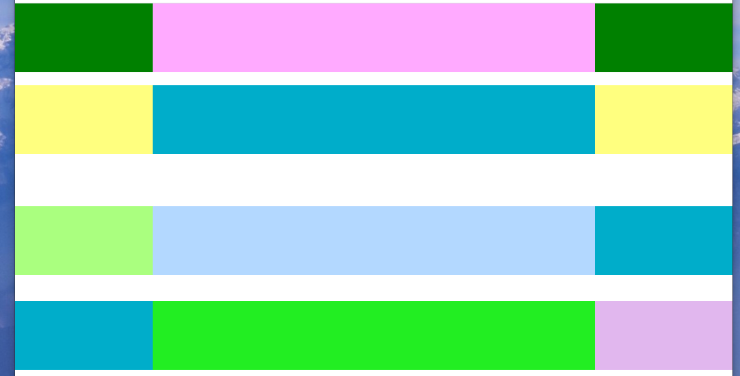
记录一位hr提的一个问题:元素分三栏,左右200px,中间自适应(我这里暂且把高度设为100px)
方式一:使用flex布局实现(这里我用到了css的方法calc()计算宽度)
代码:
html

<div class="outer-wrap">
    <div class="left-area"></div>
    <div class="middle-area"></div>
    <div class="right-area"></div>
</div>

css
html,body{
    100%;
    height:100%;
    padding:0px;
    margin:0px;
}
.outer-wrap{
    display:flex;
    100%;
}
.left-area{
    200px;
    height:100px;
    background-color: #008000;
}
.right-area{
    200px;
    height:100px;
    background-color: #008000;
}
.middle.area{
    calc(100% - 400px);
    height:100px;
    background-color: #ffaaff;
}
方式二:使用float布局
html

<div class="left-area"></div>
<div class="middle-area"></div>
<div class="right-area"></div>

css
html,body{
    100%;
    height:100%;
    padding:0px;
    margin:0px;
}
.left-area{
    float:left;
    width;200px;
    height:100px;
    background:#ffff7f;
}
.right-area{
    float:right;
    width;200px;
    height:100px;
    background:#ffff7f;
}
.middle-area{ /*注意中间的元素样式要写在左右样式的后面*/
       margin-left:200px;
        margin-right:200px;
        height:100px;
       background:#00ADCA;
}
方式三:使用定位(子绝父相)
html

<div class="outer-wrap">
    <div class="left-area"></div>
    <div class="right-area"></div>
    <div class="middle-area"></div><!--注意中间的元素写在最后 -->
</div>

css
html,body{
    100%;
    height:100%;
    padding:0px;
    margin:0px;
}
.outer-wrap{
    100%;
    position:relative;
}
.left-area{
      200px;
      height:100px;
     position:absolute;
     background-color: #aaff7f;
}
.right-area{
    200px;
    height:100px;
    backgroud:#aaff7f;
    right:0px;
    postion:absolute;
}
.middle-area{
    margin-right:200px;
    background:#b3d8ff;
    height:100px;
}
方式四:使用table,table-cell布局
  html
<div class="outer-wrap">
    <div class="left-area"></div>
    <div class="middle-area"></div>
    <div class="right-area"></div>
</div>

css
html,body{
    100%;
    height:100%;
    padding:0px;
    margin:0px;
}
.outer-wrap{
    display:table;
    100%;
}
.left-area{
    display:table-cell;
    200px;
    height:100px;
    background-color:#00ADCA;
}
.middle-area{
    display:table-cell;
    height:100px;
    background-color: #22EE22;
}
.right-area{
    display: table-cell;
    height: 100px;
     200px;
    background-color: #e1b7ee;
}
最终实现效果: