css3 之炫酷的loading效果
- 今天实现了一个炫酷的loading效果,基本全用css来实现,主要练习一下css3的熟练运用
- js需要引入jquery 只用到了一点点js
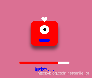
- 先看效果图
html:
<div class="box">
        <div class="master">
            <div class="eyes">
                <div class="eyes-ball"></div>
            </div>
            <div class="mouth"></div>
        </div>
        <div class="master blue">
            <div class="eyes">
                <div class="eyes-ball"></div>
            </div>
            <div class="mouth"></div>
        </div>
    </div>
    <div class="model">
        <div class="master">
            <div class="eyes">
                <div class="eyes-ball"></div>
            </div>
            <div class="mouth"></div>
        </div>
        <div class="loading">
            <div class="loading-bar"></div>
        </div>
        <div class="jz-loading">加载中 . . .</div>
    </div>
css:
html,
body {
    margin: 0;
    padding: 0;
     100%;
    height: 100%;
    background-color: hsla(0, 100%, 80%, 0.5);
    display: flex;
    justify-content: center;
    align-items:center;
}
.box{
    display: flex;
}
.master{
    110px;
    height:100px;
    border-radius: 20px;
    background: red;
    margin:10px;
    display: flex;
    justify-content: center;
    align-items:center;
    flex-direction: column;
    box-shadow: 0 10px 20px rgba(0,0,0,.5);
    position: relative;
    animation: jumping 0.8s infinite;
    transition: all 0.5s;
}
.master .eyes{
    35%;
    height:35%;
    border-radius:50%;
    background-color:#fff;
    display: flex;
    justify-content: center;
    align-items:center;
}
.eyes-ball{
    30%;
    height:30%;
    border-radius: 50%;
    background-color: #000;
    animation: eyesmove 1.6s linear infinite alternate;
}
.master .mouth{
    40%;
    height:10px;
    border-radius:12px;
    background-color:blue;
    margin-top: 20px;
}
.master.blue{
    background-color: blue;
    animation-delay: 0.4s;
}
.master.blue .mouth{
    background: red;
}
.master::before,
.master::after{
    content:'';
    display: block;
     12px;
    height: 20px;
    border-radius: 12px 12px 0 0;
    background: #fff;
    position: absolute;
    top: -15px;
    transform: translateX(-6px) rotate(45deg);
    transform-origin: 100% 100%;
}
.master::after{
    transform:translateX(6px) rotate(-45deg);
    transform-origin: 0 100%;
}

/*****遮罩层*****/
.model{
    position: fixed;
     100%;
    height: 100%;
    background: palevioletred;
    display: flex;
    justify-content: center;
    align-items: center;
    flex-direction: column;
}
.loading{
     200px;
    height: 10px;
    border-radius:12px;
    background-color: #fff;
    margin-top: 50px;
    overflow: hidden;
}
.loading .loading-bar{
     0%;
    height: 10px;
    background: red;
}
.jz-loading{
    color: blue;
    font-weight: bold;
    position: absolute;
    top: 50%;
    transform: translateY(100px);
}
.move{
    transform: scale(0.1) rotate(360deg);
}
/*****动画*****/
@keyframes jumping{
    0%{
        top:0;
        box-shadow: 0 10px 20px rgba(0, 0, 0, .5);
    }
    50%{
        top:-50px;
        box-shadow: 0 100px 20px rgba(0, 0, 0, .3);
    }
    100%{
        top:0;
        box-shadow: 0 10px 20px rgba(0, 0, 0, .5);
    }
}
@keyframes eyesmove{
    0%{
        transform: translateX(-100%);
    }
    10%{
        transform: translateX(-100%);
    }
    90%{
        transform: translateX(100%);
    }
    100%{
        transform: translateX(100%);
    }
}
js:
var timer =null;
var add =0;
timer=setInterval(()=>{
    add++;
    $('.loading-bar').css('width',`${add}%`);
    if(add>=100){
        $('.model .master').addClass('move');
        $('.model').fadeOut();
        clearInterval(timer);
        timer =null;
    }
},30)
参考自:腾讯课堂渡一教育