CSS3
边框:
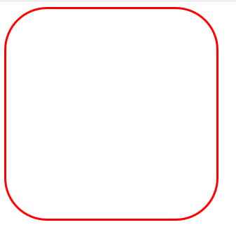
1.盒子圆角:border-radius
#radius{
width: 300px;
height: 300px;
border: 3px solid red;
border-radius:/*5px*/20% ; /*盒子圆角*/
/*border-radius: 5px 10px 15px 20px;*/ /*左上 右上 右下 左下*/
}

<div id="radius"></div>
效果如下:
2.盒子阴影:box-shadow
值有3个时,表示距离左侧、距离上侧、影子颜色
值有4个时,表示距离左侧、距离上侧、虚化的像素、影子颜色
值有5个时,表示距离左侧、距离上侧、虚化的像素、影子颜色、是否显示在内部并且将颜色进行反转
负值时,在相反的方向
#radius{
width: 300px;
height: 300px;
border: 3px solid red;
border-radius:/*5px*/20% ;/*盒子圆角*/
/*border-radius: 5px 10px 15px 20px;*//*左上 右上 右下 左下*/
box-shadow: /*inset;*/ /*内部*/ 5px 5px 5px black
}
效果如下:

背景:
1背景尺寸:backgroud-size:cover;
#back{
                width: 300px;
                height: 300px;
                           background-image:url(five-2.jpg);
                           background-size:cover;
}
效果如下:

2背景位置:
位置定位:background-origin
使用这个属性,必须设置背景为no-repeat
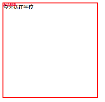
2.1根据文本位置:content-box
#back{
                width: 300px;
                height: 300px;
                border: 3px solid red;
                /*padding: 20px;*/
            background-image: url(english-bg.jpg),url(five-2.jpg);
                background-size:auto;
                background-repeat:no-repeat ;
                background-origin:content-box ;/*适应文本*/
            }
效果如下:

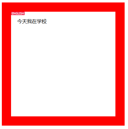
2.2根据边框位置:border-box
#back{
                width: 300px;
                height: 300px;
                border: 3px solid red;
                /*padding: 20px;*/
            background-image: url(english-bg.jpg),url(five-2.jpg);
                background-size:auto;
                background-repeat:no-repeat ;
                /*background-origin:content-box ;*//*适应文本*/
                background-origin:border-box;
            }
效果如下:
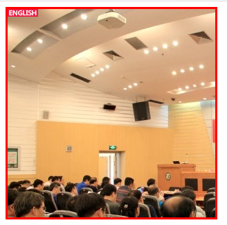
2.3根据内边距位置:padding-box
#back{
                width: 300px;
                height: 300px;
                border: 3px solid red;
                /*padding: 20px;*/
            background-image: url(english-bg.jpg),url(five-2.jpg);
                background-size:auto;
                background-repeat:no-repeat ;
                /*background-origin:content-box ;*//*适应文本*/
                background-origin:padding-box;
            }
效果如下:
3多重背景:逗号分割:background-image:url(images/bg_flower.gif), url(images/border.png); background-repeat:no-repeat;
#back{
                width: 300px;
                height: 300px;
                border: 3px solid red;
                /*padding: 20px;*/
            background-image: url(english-bg.jpg),url(five-2.jpg);
                background-size:auto;
                background-repeat:no-repeat ;

            }
效果如下:
文本
1文本阴影与盒子阴影类似;
2文本溢出属性:
2.1强制不换行:
overflow: hidden; white-space:nowrap;让文本强制不换行
#font{
            width: 300px;
            height: 200px;
            border: 1px solid red;
            overflow: hidden;
            white-space:nowrap;
            /*让文本强制不换行  要先设置这两个属性*/
            }
效果如下:

2.1超出部分显示其他:
text-overflow
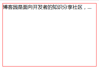
clip:修剪文本。
#font{
            width: 300px;
            height: 200px;
            border: 1px solid red;
            overflow: hidden;
            white-space:nowrap;
            /*让文本强制不换行  要先设置这两个属性*/
            text-overflow:clip;
            }
效果如下:

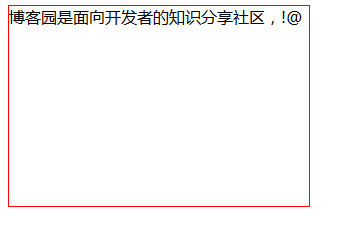
ellipsis:显示省略符号来代表被修剪的文本
自定义(string):自己定义符号,给定的字符串来代表被修剪的文本
#font{
            width: 300px;
            height: 200px;
            border: 1px solid red;
            overflow: hidden;
            white-space:nowrap;
            /*让文本强制不换行  要先设置这两个属性*/
            text-overflow:“!@”;
            }
效果如下:
2.2文本换行
word-break:break-word;
区别就是它会把congratulation整个单词看成一个整体,如果该行末端宽度不够显示整个单词,它会自动把整个单词放到下一行,而不会把单词截断掉的。