水平居中的不同方法实现:
 position: absolute;
 margin:0 auto;
 left:0;
 right:0;
position: absolute;
 left:50%;
 -webkit-transform:translateX(-50%);
垂直居中的几种实现方法:
 position: absolute;
 margin:auto 0;
 top:0;
 bottom:0;
position: absolute;
top:50%;
-webkit-transform:translateY(-50%);
中心居中的几种方法:
position: absolute;
margin:auto;
top:0;
bottom:0;
left:0;
right:0;
  position: absolute;
  top:50%;
  left:50%;
  -webkit-transform:translateX(-50%) translateY(-50%);
透明度的控制(渐显效果)
@-webkit-keyframes opacity_kf {
            0% {
                opacity: 0;
            }
            100% {
                opacity: 1;
            }
         }
延时效果的控制:
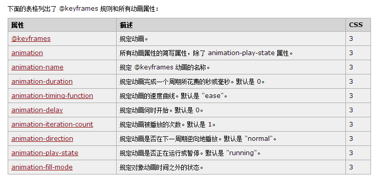
当使用@keyframes创建动画时,一定要把它捆绑到某个选择器,否则不会产生动画。另外必须定义动画的名称和时长,如果忽略时长,那么动画不允许,因为默认值是0。如果是几个动画延时出现构成的整体动画,那么可以为每个小动画设置不同延时,令他们相继出现,当为一个对象设置不同时间的不同状态时最好使用百分比来规定变化发生的时间,或用关键词“from”“to”等同于0%和100%(分别为动画的开始和结束)。
代码示例如下:
div
{
animation: myfirst 5s;
-moz-animation: myfirst 5s;    /* Firefox */
-webkit-animation: myfirst 5s;    /* Safari 和 Chrome */
-o-animation: myfirst 5s;    /* Opera */
}
@keyframes myfirst
{
0%   {background: red;}
25%  {background: yellow;}
50%  {background: blue;}
100% {background: green;}
}

@-moz-keyframes myfirst /* Firefox */
{
0%   {background: red;}
25%  {background: yellow;}
50%  {background: blue;}
100% {background: green;}
}

@-webkit-keyframes myfirst /* Safari 和 Chrome */
{
0%   {background: red;}
25%  {background: yellow;}
50%  {background: blue;}
100% {background: green;}
}

@-o-keyframes myfirst /* Opera */
{
0%   {background: red;}
25%  {background: yellow;}
50%  {background: blue;}
100% {background: green;}
}
@keyframes myfirst
{
0%   {background: red; left:0px; top:0px;}
25%  {background: yellow; left:200px; top:0px;}
50%  {background: blue; left:200px; top:200px;}
75%  {background: green; left:0px; top:200px;}
100% {background: red; left:0px; top:0px;}
}

@-moz-keyframes myfirst /* Firefox */
{
0%   {background: red; left:0px; top:0px;}
25%  {background: yellow; left:200px; top:0px;}
50%  {background: blue; left:200px; top:200px;}
75%  {background: green; left:0px; top:200px;}
100% {background: red; left:0px; top:0px;}
}

@-webkit-keyframes myfirst /* Safari 和 Chrome */
{
0%   {background: red; left:0px; top:0px;}
25%  {background: yellow; left:200px; top:0px;}
50%  {background: blue; left:200px; top:200px;}
75%  {background: green; left:0px; top:200px;}
100% {background: red; left:0px; top:0px;}
}

@-o-keyframes myfirst /* Opera */
{
0%   {background: red; left:0px; top:0px;}
25%  {background: yellow; left:200px; top:0px;}
50%  {background: blue; left:200px; top:200px;}
75%  {background: green; left:0px; top:200px;}
100% {background: red; left:0px; top:0px;}
}