CSS的居中分为水平居中和垂直居中
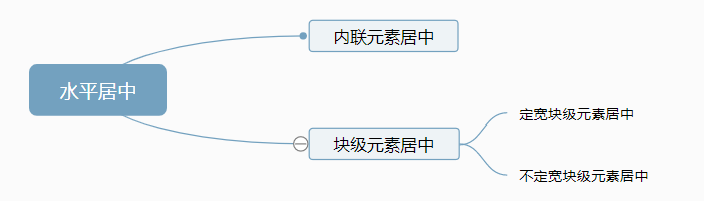
水平居中又分为内联元素居中和块级元素居中,块级元素又分为定宽的块级元素居中和不定宽的块级元素居中
1.内联元素水平居中
利用 text-align: center 可以实现在块级元素内部的内联元素水平居中
.center-text{
    text-align: center;
}
2.固定宽度的块级元素 margin-left 和 margin-right 设置成auto,就可以使块级元素水平居中
.center-block{
    margin: 0 auto;
}
3.多块级元素水平居中
3.1 利用 inline-block
通过设置块级元素显示类型为inline-block,父容器的text-align属性使的多块级元素水平居中
.container{
    text-align: center;
}
.inline-block{
    display: inline-block;
}
3.2 利用 display:flex
利用弹性布局,实现水平居中,其实justify-content用于设置弹性盒子元素在横轴方向上的对齐方式
.flex-center{
    display: flex;
    justify-content: center;
}
3.3 利用 position:relative 和 left:50%
父元素
.container{
    float:left;
    position:relative;
    left:50%;
}
子元素
.child{
    position:relative;
    left:-50%;
}
垂直居中
1.单行文本垂直居中:利用line-height即可实现。
style{
    height: 45px;
    line-height: 45px;
}
2.table方式居中
<div id="wrapper">
    <div id="cell">
        <div class="content">Content goes here</div>
    </div>
</div>
#wrapper {
    display: table;
}

#cell {
    display: table-cell;
    vertical-align: middle;
}
3. position:absoulte, 和水平居中那个有点类似,div需要有高度
<div class="content"> Content goes here</div>
#content {
    position: absolute;
    top: 50%;
    height: 240px;
    margin-top: -120px; /* negative half of the height */
}
4.flex布局
核心代码
    display: flex;
    flex-direction: column;
    justify-content: center;
这种方式,首先给父元素设置display:flex,设置好后改变主轴的方向flex-direction:colum; justify-content:center是对齐方式
flex-direction的参数:

  row(该值为默认值):主轴为水平方向,起点在左端;
  row-reverse:主轴为水平方向,起点在右端;
  column:主轴为垂直方向,起点在上沿;
  column-reverse:主轴为垂直方向,起点在下沿。

justify-content属性定义了项目在主轴上的对齐方式,可能的取值有五个,分别如下(不过具体的对齐方式与主轴的方向有关,以下的值都是假设主轴为从左到右的):

  flex-start(该值是默认值):左对齐;
  flex-end:右对齐;
  center:居中对齐;
  space-between:两端对齐,各个项目之间的间隔均相等;
  space-around:各个项目两侧的间隔相等。
总结:
这两篇布局和对齐的博文我写了两天,参考了很多的网上资料,也看了很多博客,做了一些实验。实话说,学完以后,是清晰了很多,但以我现在的css功力,也还是不能完全理解和搞得清清楚楚。
需要后面在不断的实验中去参透和领悟,也会慢慢的修改和完善这些内容。