给登录按钮加一个loading动画,练习一下css3的动画
咱也不知道咋整动图,所以就不上预览图了,,咱闲言少叙,直接上代码:
html:
<!DOCTYPE html>
<html lang="en">
<head>
  <meta charset="UTF-8">
  <title>login</title>
  <link rel="stylesheet" href="../css/base.css">
  <link rel="stylesheet" href="../css/login.css">
</head>
<body>
  <div class="main" id="app">
    <section class="card">
      <ul>
        <li>
          <h3>login</h3>
        </li>
        <li>
          <span>name:</span>  <input type="text" name="username" placeholder="username">
        </li>
        <li>
          <span>pass: </span> <input type="password" name="password" placeholder="password">
        </li>
        <li>
          <div class="button" :class="{active:type}" @click="type = !type">
            <span v-show="type"></span>
            <span v-show="type"></span>
            <span v-show="type"></span>
            <span v-show="!type">login</span>
          </div>
        </li>
      </ul>
    </section>
  </div>
</body>
<script src="https://cdn.jsdelivr.net/npm/vue/dist/vue.js"></script>
<script>
  new Vue({
    el:'#app',
    data() {
      return {
        type:false
      }
    },
  })
</script>
</html>
里边引入了两个外联样式表,base.css就不说了 就是去一些margin什么的
直接上核心代码,login.css
.main {
  width: 100%;
  height: 100%;
  /* background-color:  hsl(59, 52%, 72%); */
  /* background: -moz-linear-gradient(top, #000000 0%, #ffffff 100%); */
  /* background: -webkit-gradient(linear, left top, left bottom, color-stop(0%,#000000), color-stop(100%,#ffffff)); */
  /* background: -webkit-linear-gradient(top, #000000 0%,#ffffff 100%); */
  /* background: -o-linear-gradient(top, #000000 0%,#ffffff 100%); */
  /* background: -ms-linear-gradient(top, #000000 0%,#ffffff 100%); */
  background: linear-gradient(to bottom, #360909 0%, #ac7a7a 100%);
  display: flex;
  align-items: center;
  justify-content: center;
}
.card {
  width: 300px;
  height: 200px;
  background-color: #fff;
  border: 1px wheat solid;
  border-radius: 10px;
}
.card ul {
  display: flex;
  flex-flow: column nowrap;
  justify-content: end;
  text-transform: uppercase;
}
h3 {
  height: 30px;
  list-style: 30px;
  text-align: center;
  letter-spacing: 6px;
  margin: 10px 0;
}
li > span {
  display: inline-block;
  width: 50px;
  text-align: right;
}

li:nth-child(2),
li:nth-child(3) {
  height: 40px;
  line-height: 40px;
  margin: 0 20px;
  overflow: hidden;
}
input {
  outline: none;
  border: 10x solid #696969;
  height: 26px;
  line-height: 26px;
  width: 178px;
  overflow-x: scroll;
  font-size: 16px;
  padding: 0 5px;
}

.button {
  float: right;
  margin: 20px 30px 0 0;
  width: 60px;
  height: 30px;
  line-height: 30px;
  text-transform: uppercase;
  background-color: black;
  color: #fff;
  border-radius: 6px;
  text-align: center;
  border: none;
  cursor: pointer;
  transition: margin 1s, background-color 1s;
}
div.active {
  margin-right: 50%;
  transform: translate(50%, 0);
  background-color: white;
  border: 1px solid black;
  position: relative;
}
div.active span {
  display: inline-block;
  top: 14px;
  position: absolute;
  width: 4px;
  height: 4px;
  background-color: black;
  border-radius: 2px;
  margin-left: 10px;
  animation: point 1s infinite 1.3s linear;
}
div.active span:nth-child(2) {
  animation: point 1s infinite 1.4s linear;
  left: 20px;
}
div.active span:nth-child(3) {
  animation: point 1s infinite 1.5s linear;
  right: 40px;
}

@keyframes point {
  0% {
    top: 12px;
  }
  25% {
    top: 6px;
  }
  50% {
    top: 12px;
  }
  75% {
    top: 18px;
  }
  100% {
    top: 12px;
  }
}
还是那句话,chrome运行没问题,其他浏览器没有做适配
总结:
1.transition:
语法:
transition: property duration timing-function delay;

property:规定设置过渡效果的 CSS 属性的名称。
duration:规定完成过渡效果需要多少秒或毫秒。
timing-function:规定速度效果的速度曲线。(linear|ease|ease-in|ease-out|ease-in-out|cubic-bezier(n,n,n,n);)

delay:定义过渡效果何时开始。
transition: margin 1s, background-color 1s;
2.animation:
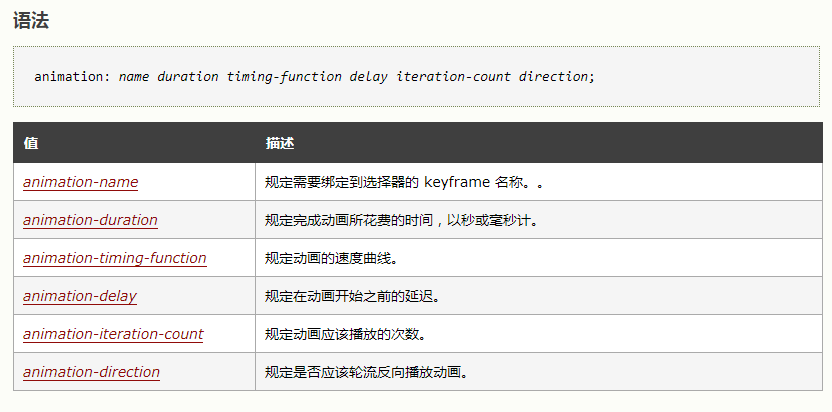
animation: point 1s infinite 1.3s linear;
@keyframes point {
0% {
top: 12px;
}
25% {
top: 6px;
}
50% {
top: 12px;
}
75% {
top: 18px;
}
100% {
top: 12px;
}
}
over!