线性渐变,径向渐变,重复渐变产生的是图像
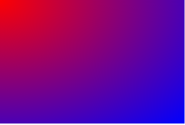
线性渐变:有以下2种方式写法,第二种写的是每个颜色的起始位置,和结束位置
<!DOCTYPE html>
<html lang="en">
<head>
    <meta charset="UTF-8">
    <meta name="viewport" content="width=device-width, initial-scale=1.0">
    <title>Document</title>
    <style>
        div {
            width: 300px;
            height: 300px;
            background: linear-gradient(to right,red,blue);
            background: linear-gradient(to right,red 0%,red 50%,blue 50%,blue 100%);
        }
    </style>
</head>
<body>
    <!-- 线性渐变:不是一个单一的结构,它所产生的是图像,所以使用的是background -->
    <div>

    </div>
</body>

</html>
径向渐变
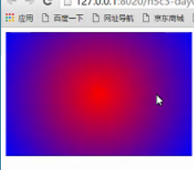
<!DOCTYPE html>
<html lang="en">
<head>
    <meta charset="UTF-8">
    <meta name="viewport" content="width=device-width, initial-scale=1.0">
    <title>Document</title>
    <style>
        div {
            width: 300px;
            height: 200px;
            background: radial-gradient(red,blue);
            /* 语法:radial-gradient(形状 大小 坐标,颜色1,颜色2...);
            形状:shape,circle等等形状,回去适配当前的如果高度不一样默认的效果是ellipse
            坐标:是在正中心可以赋值(参照元素的左上角)
            尺寸:size;
            closeset:最近边
            farthest:最远边
            closeset-corner;最近角
            farthest-corner:最远角
            默认的是最远角

            */
            background: radial-gradient(at left top,red,blue);
            background: radial-gradient(circle farthest-side at 50px 50px, red,blue);
            background: radial-gradient(red,red 50%,blue 50%,blue);

        }
    </style>
</head>
<body>
    <div></div>
</body>
</html>
重复渐变:
<!DOCTYPE html>
<html lang="en">

<head>
    <meta charset="UTF-8">
    <meta name="viewport" content="width=device-width, initial-scale=1.0">
    <title>Document</title>
    <style>
        body {
            background-color: #ccc;
        }

        div:first-of-type {
            width: 300px;
            height: 300px;
            background: repeating-radial-gradient(circle closest-side at center center,
                    #fff 0%, #fff 10%,
                    #000 10%, #000 20%);
        }
        div:last-of-type {
            width: 200px;
            height: 800px;
            background: repeating-linear-gradient(
                45deg,  /*(deg 指的是倾斜多少度)*/
                #fff 0%,#fff 10%,
                #000 10%,#000 20%
            );
        }

    </style>
</head>

<body>
    <div></div>
    <div></div>
</body>

</html>