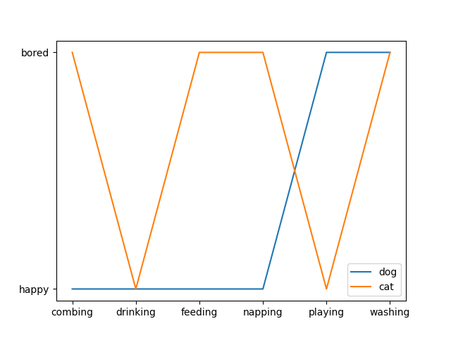
1 折线图
折线图主要用于表现随着时间的推移而产生的某种趋势。
cat = ["bored", "happy", "bored", "bored", "happy", "bored"]
dog = ["happy", "happy", "happy", "happy", "bored", "bored"]
activity = ["combing", "drinking", "feeding", "napping", "playing", "washing"]

fig, ax = plt.subplots()
ax.plot(activity, dog, label="dog")
ax.plot(activity, cat, label="cat")
ax.legend()
plt.show()
2.散点图
散点图经常用来表示数据之间的关系,使用的是 plt 库中的 scatter() 方法,还是先看下 scatter() 的语法,来自官方文档:
matplotlib.pyplot.scatter(x, y, s=None, c=None, marker=None, cmap=None, norm=None, vmin=None, vmax=None, alpha=None, linewidths=None, verts=<deprecated parameter>, edgecolors=None, *, plotnonfinite=False, data=None, **kwargs)
- s : 表示的是每个点的大小,如果只有一个数值的时候,则所有的点都是一样大的,也可以传入一个列表,这时候每个点的大小都不一样,散点图也就成了气泡图。
- c : 表示点的颜色,如果只有一种颜色的时候,则每个点的颜色都会相同,也可以使用列表定义不同的颜色
- linewidths : 表示每个散点的线宽
- edgecolors : 每个散点外轮廓的颜色
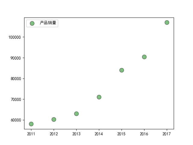
例子一:
import matplotlib.pyplot as plt
import numpy as np

# 处理中文乱码
plt.rcParams['font.sans-serif']=['SimHei']

x_data = np.array([2011,2012,2013,2014,2015,2016,2017])
y_data = np.array([58000,60200,63000,71000,84000,90500,107000])

plt.scatter(x_data, y_data, s = 100, c = 'green', marker='o', edgecolor='black', alpha=0.5, label = '产品销量')

plt.legend()

plt.savefig("scatter_demo.png")
例子二
import matplotlib.pyplot as plt
import numpy as np

# unit area ellipse
rx, ry = 3., 1.
area = rx * ry * np.pi
theta = np.arange(0, 2 * np.pi + 0.01, 0.1)
verts = np.column_stack([rx / area * np.cos(theta), ry / area * np.sin(theta)])

x, y, s, c = np.random.rand(4, 30)
s *= 10**2.

fig, ax = plt.subplots()
ax.scatter(x, y, s, c, marker=verts)

plt.show()

例子三
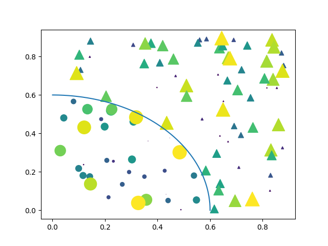
import matplotlib.pyplot as plt
import numpy as np

# Fixing random state for reproducibility
np.random.seed(19680801)


N = 100
r0 = 0.6
x = 0.9 * np.random.rand(N)
y = 0.9 * np.random.rand(N)
area = (20 * np.random.rand(N))**2  # 0 to 10 point radii
c = np.sqrt(area)
r = np.sqrt(x ** 2 + y ** 2)
area1 = np.ma.masked_where(r < r0, area)
area2 = np.ma.masked_where(r >= r0, area)
plt.scatter(x, y, s=area1, marker='^', c=c)
plt.scatter(x, y, s=area2, marker='o', c=c)
# Show the boundary between the regions:
theta = np.arange(0, np.pi / 2, 0.01)
plt.plot(r0 * np.cos(theta), r0 * np.sin(theta))

plt.show()
3.柱状图
柱状图主要用于查看各分组数据的数量分布,以及各个分组数据之间的数量比较。
3.1 普通柱状图
matplotlib.pyplot.bar(left, height, width=0.8, bottom=None, hold=None, data=None, **kwargs)
| 参数 | 接收值 | 说明 | 默认值 |
|---|---|---|---|
| left | array | x 轴; | 无 |
| height | array | 柱形图的高度,也就是y轴的数值; | 无 |
| alpha | 数值 | 柱形图的颜色透明度 ; | 1 |
| width | 数值 | 柱形图的宽度; | 0.8 |
| color(facecolor) | string | 柱形图填充的颜色; | 随机色 |
| edgecolor | string | 图形边缘颜色 | None |
| label | string | 解释每个图像代表的含义 | 无 |
| linewidth(linewidths / lw) | 数值 | 边缘or线的宽度 | 1 |
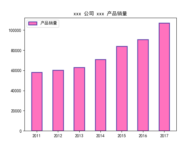
import matplotlib.pyplot as plt
import numpy as np

# 处理中文乱码
plt.rcParams['font.sans-serif']=['SimHei']

x_data = np.array([2011,2012,2013,2014,2015,2016,2017])
y_data = np.array([58000,60200,63000,71000,84000,90500,107000])
y_data_1 = np.array([78000,80200,93000,101000,64000,70500,87000])

plt.title(label='xxx 公司 xxx 产品销量')

plt.bar(x_data, y_data, width=0.5, alpha=0.6, facecolor = 'deeppink', edgecolor = 'darkblue', lw=2, label='产品销量')

plt.legend()

plt.savefig("bar_demo_1.png")
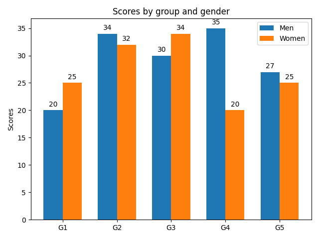
3.2 并排柱状图
接下来是两个柱形图并列显示,这里调用的还是 bar() ,只不过需要调整的是柱子的位置:
import matplotlib
import matplotlib.pyplot as plt
import numpy as np


labels = ['G1', 'G2', 'G3', 'G4', 'G5']
men_means = [20, 34, 30, 35, 27]
women_means = [25, 32, 34, 20, 25]

x = np.arange(len(labels))  # the label locations
width = 0.35  # the width of the bars

fig, ax = plt.subplots()
rects1 = ax.bar(x - width/2, men_means, width, label='Men')
rects2 = ax.bar(x + width/2, women_means, width, label='Women')

# Add some text for labels, title and custom x-axis tick labels, etc.
ax.set_ylabel('Scores')
ax.set_title('Scores by group and gender')
ax.set_xticks(x)
ax.set_xticklabels(labels)
ax.legend()


def autolabel(rects):
    """Attach a text label above each bar in *rects*, displaying its height."""
    for rect in rects:
        height = rect.get_height()
        ax.annotate('{}'.format(height),
                    xy=(rect.get_x() + rect.get_width() / 2, height),
                    xytext=(0, 3),  # 3 points vertical offset
                    textcoords="offset points",
                    ha='center', va='bottom')


autolabel(rects1)
autolabel(rects2)

fig.tight_layout()

plt.show()
3.3 堆积柱状图
Note the parameters yerr used for error bars, and bottom to stack the women's bars on top of the men's bars.
import numpy as np
import matplotlib.pyplot as plt


labels = ['G1', 'G2', 'G3', 'G4', 'G5']
men_means = [20, 35, 30, 35, 27]
women_means = [25, 32, 34, 20, 25]
men_std = [2, 3, 4, 1, 2]
women_std = [3, 5, 2, 3, 3]
width = 0.35       # the width of the bars: can also be len(x) sequence

fig, ax = plt.subplots()

ax.bar(labels, men_means, width, yerr=men_std, label='Men')
ax.bar(labels, women_means, width, yerr=women_std, bottom=men_means,
       label='Women')

ax.set_ylabel('Scores')
ax.set_title('Scores by group and gender')
ax.legend()

plt.show()

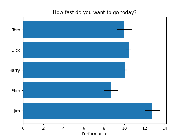
3.4 横向柱状图
import matplotlib.pyplot as plt
import numpy as np

# Fixing random state for reproducibility
np.random.seed(19680801)


plt.rcdefaults()
fig, ax = plt.subplots()

# Example data
people = ('Tom', 'Dick', 'Harry', 'Slim', 'Jim')
y_pos = np.arange(len(people))
performance = 3 + 10 * np.random.rand(len(people))
error = np.random.rand(len(people))

ax.barh(y_pos, performance, xerr=error, align='center')
ax.set_yticks(y_pos)
ax.set_yticklabels(people)
ax.invert_yaxis()  # labels read top-to-bottom
ax.set_xlabel('Performance')
ax.set_title('How fast do you want to go today?')

plt.show()
import matplotlib.pyplot as plt
import numpy as np # 处理中文乱码
plt.rcParams['font.sans-serif']=['SimHei']
x_data = np.array([2011,2012,2013,2014,2015,2016,2017])
y_data = np.array([58000,60200,63000,71000,84000,90500,107000])
y_data_1 = np.array([78000,80200,93000,101000,64000,70500,87000])
plt.title(label='xxx 公司 xxx 产品销量')
plt.bar(x_data, y_data, width=0.5, alpha=0.6, facecolor = 'deeppink', edgecolor = 'darkblue', lw=2, label='产品销量')
plt.legend()
plt.savefig("bar_demo_1.png")
import matplotlib.pyplot as plt import numpy as np # 处理中文乱码 plt.rcParams['font.sans-serif']=['SimHei'] x_data = np.array([2011,2012,2013,2014,2015,2016,2017]) y_data = np.array([58000,60200,63000,71000,84000,90500,107000]) y_data_1 = np.array([78000,80200,93000,101000,64000,70500,87000]) plt.title(label='xxx 公司 xxx 产品销量') plt.bar(x_data, y_data, width=0.5, alpha=0.6, facecolor = 'deeppink', edgecolor = 'darkblue', lw=2, label='产品销量') plt.legend() plt.savefig("bar_demo_1.png")