折叠
基本实例
您可以使用带有href属性的链接,或者使用带有data-target属性的按钮。在这两种情况下,都需要data-toggle="collapse"。
演变过程:
.collapsehides content.collapsingis applied during transitions.collapse.inshows content
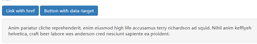
<!--a label-->
<a class="btn btn-primary" role="button" data-toggle="collapse" href="#collapseExample" aria-expanded="false" aria-controls="collapseExample">
  Link with href
</a>
<!--button label-->
<button class="btn btn-primary" type="button" data-toggle="collapse" data-target="#collapseExample" aria-expanded="false" aria-controls="collapseExample">
  Button with data-target
</button>
<!--collapse content-->
<div class="collapse" id="collapseExample">
  <div class="well">
    ...
  </div>
</div>
自动折叠
通过data
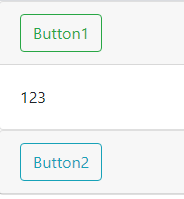
<div id="parent">
    <div class="card">
        <div class="card-header">
            <button class="btn btn-outline-success btn1" data-toggle="collapse" data-target=".collapse1">Button1</button>
        </div>
        <div class="card-body collapse collapse1 show"  data-parent="#parent">
            <div>123</div>
        </div>
    </div>

    <div class="card">
        <div class="card-header">
            <button class="btn btn-outline-info btn2" data-toggle="collapse" data-target=".collapse2">Button2</button>
        </div>
        <div class="card-body collapse collapse2"  data-parent="#parent">
            <div class="collapse collapse2">321</div>
        </div>
    </div>
</div>
通过js
<div id="parent" data-parent="">
<button class="btn btn-outline-success btn1">Button1</button>
<div class="collapse collapse1">123</div>
<button class="btn btn-outline-info btn2">Button2</button>
<div class="collapse collapse2">123</div>
</div>
<script>

    $(".btn1").click(function () {
        $(".collapse1").collapse({parent:$("#parent")}).collapse("toggle")
    });
    $(".btn2").click(function () {
        $(".collapse2").collapse({parent:$("#parent")}).collapse("toggle")
    })

</script>
使用
通过data属性
Just add data-toggle="collapse" and a data-target to the element to automatically assign control of a collapsible element. The data-target attribute accepts a CSS selector to apply the collapse to. Be sure to add the class collapse to the collapsible element. If you'd like it to default open, add the additional class in.
To add accordion-like group management to a collapsible control, add the data attribute data-parent="#selector". Refer to the demo to see this in action.
通过js
Enable manually with:
$('.collapse').collapse()
参数
Options can be passed via data attributes or JavaScript. For data attributes, append the option name to data-, as in data-parent="".
| Name | type | default | description |
|---|---|---|---|
| parent | selector | false | If a selector is provided, then all collapsible elements under the specified parent will be closed when this collapsible item is shown. (similar to traditional accordion behavior - this is dependent on the panel class) |
| toggle | boolean | true |
Toggles the collapsible element on invocation |
方法
.collapse(options)
Activates your content as a collapsible element. Accepts an optional options object.
.collapse('toggle')
Toggles a collapsible element to shown or hidden. Returns to the caller before the collapsible element has actually been shown or hidden (i.e. before the shown.bs.collapse or hidden.bs.collapse event occurs).
.collapse('show')
Shows a collapsible element. Returns to the caller before the collapsible element has actually been shown (i.e. before the shown.bs.collapse event occurs).
.collapse('hide')
Hides a collapsible element. Returns to the caller before the collapsible element has actually been hidden (i.e. before the hidden.bs.collapse event occurs).
.collapse('dispose')
Destroys an element’s collapse.
事件
| Event Type | Description |
|---|---|
| show.bs.collapse | This event fires immediately when the show instance method is called. |
| shown.bs.collapse | This event is fired when a collapse element has been made visible to the user (will wait for CSS transitions to complete). |
| hide.bs.collapse | This event is fired immediately when the hide method has been called. |
| hidden.bs.collapse | This event is fired when a collapse element has been hidden from the user (will wait for CSS transitions to complete). |
$('#myCollapsible').on('hidden.bs.collapse', function () {
  // do something…
})
轮播图
基本实例

<div class="row justify-content-center">
    <div class="carousel col-6 slide" data-ride="carousel">
        <ul class="carousel-inner list-unstyled">
            <li class="carousel-item active"><img class="d-block w-100" src="1.jpg"></li>
            <li class="carousel-item"><img class="d-block w-100" src="2.jpg"></li>
            <li class="carousel-item"><img class="d-block w-100" src="3.jpg"></li>
        </ul>
    </div>
</div>
With controls
Adding in the previous and next controls:

<div class="row justify-content-center">
    <div class="carousel col-6 p-0 slide" id="carousel" data-ride="carousel">
        <!--inner-->
        <ul class="carousel-inner list-unstyled">
            <li class="carousel-item active"><img class="d-block w-100" src="1.jpg"></li>
            <li class="carousel-item"><img class="d-block w-100" src="2.jpg"></li>
            <li class="carousel-item"><img class="d-block w-100" src="3.jpg"></li>
        </ul>
        <!--control-->
        <a class="carousel-control-prev" href="#carousel" role="button" data-slide="prev">
            <span class="carousel-control-prev-icon" aria-hidden="true"></span>
            <span class="sr-only">Previous</span>
        </a>
        <a class="carousel-control-next" href="#carousel" role="button" data-slide="next">
            <span class="carousel-control-next-icon" aria-hidden="true"></span>
            <span class="sr-only">Next</span>
        </a>
    </div>
</div>
With indicators
You can also add the indicators to the carousel, alongside the controls, too.

<div class="row justify-content-center">
    <div class="carousel col-6 p-0 slide" id="carousel" data-ride="carousel">
        <!--indicators 指示器-->
        <ol class="carousel-indicators">
            <li data-target="#carousel" data-slide-to="0" class="active"></li>
            <li data-target="#carousel" data-slide-to="1"></li>
            <li data-target="#carousel" data-slide-to="2"></li>
        </ol>
        <!--inner 内容-->
        <ul class="carousel-inner list-unstyled">
            <li class="carousel-item active"><img class="d-block w-100" src="1.jpg"></li>
            <li class="carousel-item"><img class="d-block w-100" src="2.jpg"></li>
            <li class="carousel-item"><img class="d-block w-100" src="3.jpg"></li>
        </ul>
        <!--control 控制器-->
        <a class="carousel-control-prev" href="#carousel" role="button" data-slide="prev">
            <span class="carousel-control-prev-icon" aria-hidden="true"></span>
            <span class="sr-only">Previous</span>
        </a>
        <a class="carousel-control-next" href="#carousel" role="button" data-slide="next">
            <span class="carousel-control-next-icon" aria-hidden="true"></span>
            <span class="sr-only">Next</span>
        </a>
    </div>
</div>
With captions
Add captions to your slides easily with the .carousel-caption element within any .carousel-item.
<div class="row justify-content-center">
    <div class="carousel col-6 p-0 slide" id="carousel" data-ride="carousel">
        <!--indicators 指示器-->
        <ol class="carousel-indicators">
            <li data-target="#carousel" data-slide-to="0" class="active"></li>
            <li data-target="#carousel" data-slide-to="1"></li>
            <li data-target="#carousel" data-slide-to="2"></li>
        </ol>
        <!--inner 内容-->
        <ul class="carousel-inner list-unstyled">
            <li class="carousel-item active">
                <img class="d-block w-100" src="1.jpg">
                <div class="carousel-caption">
                    <h5>First slide label</h5>
                    <p>Nulla vitae elit libero, a pharetra augue mollis interdum.</p>
                </div>
            </li>
            <li class="carousel-item">
                <img class="d-block w-100" src="2.jpg">
                <div class="carousel-caption">
                    <h5>Second slide label</h5>
                    <p>Lorem ipsum dolor sit amet, consectetur adipiscing elit.</p>
                </div>
            </li>
            <li class="carousel-item">
                <img class="d-block w-100" src="3.jpg">
                <div class="carousel-caption">
                    <h5>Third slide label</h5>
                    <p>Praesent commodo cursus magna, vel scelerisque nisl consectetur.</p>
                </div>
            </li>
        </ul>
        <!--control 控制器-->
        <a class="carousel-control-prev" href="#carousel" role="button" data-slide="prev">
            <span class="carousel-control-prev-icon" aria-hidden="true"></span>
            <span class="sr-only">Previous</span>
        </a>
        <a class="carousel-control-next" href="#carousel" role="button" data-slide="next">
            <span class="carousel-control-next-icon" aria-hidden="true"></span>
            <span class="sr-only">Next</span>
        </a>
    </div>
</div>
Crossfade
Add .carousel-fade to your carousel to animate slides with a fade transition instead of a slide.
<div class="row justify-content-center">
    <div class="carousel col-6 slide carousel-fade" data-ride="carousel">
        <ul class="carousel-inner list-unstyled">
            <li class="carousel-item active"><img class="d-block w-100" src="1.jpg"></li>
            <li class="carousel-item"><img class="d-block w-100" src="2.jpg"></li>
            <li class="carousel-item"><img class="d-block w-100" src="3.jpg"></li>
        </ul>
    </div>
</div>
interval
全部设置
<div class="row justify-content-center">
    <div class="carousel col-6 slide carousel-fade" data-ride="carousel" data-interval="10000">
        <ul class="carousel-inner list-unstyled">
            <li class="carousel-item active"><img class="d-block w-100" src="1.jpg"></li>
            <li class="carousel-item"><img class="d-block w-100" src="2.jpg"></li>
            <li class="carousel-item"><img class="d-block w-100" src="3.jpg"></li>
        </ul>
    </div>
</div>
单独设置
<div class="row justify-content-center">
    <div class="carousel col-6 slide" data-ride="carousel">
        <ul class="carousel-inner list-unstyled">
            <li class="carousel-item active" data-interval="1000">
                <img class="d-block w-100" src="1.jpg">
            </li>
            <li class="carousel-item" data-interval="2000">
                <img class="d-block w-100" src="2.jpg">
            </li>
            <li class="carousel-item" data-interval="3000">
                <img class="d-block w-100" src="3.jpg">
            </li>
        </ul>
    </div>
</div>
使用
使用data
Use data attributes to easily control the position of the carousel. data-slide accepts the keywords prev or next, which alters the slide position relative to its current position. Alternatively, use data-slide-to to pass a raw slide index to the carousel data-slide-to="2", which shifts the slide position to a particular index beginning with 0.
The data-ride="carousel" attribute is used to mark a carousel as animating starting at page load. If you don’t use data-ride="carousel" to initialize your carousel, you have to initialize it yourself. It cannot be used in combination with (redundant and unnecessary) explicit JavaScript initialization of the same carousel.
如:
<div class="carousel slide" id="carousel" data-interval="500" data-pause="false" data-ride="carousel">
使用js
$('.carousel').carousel()
选项
| Name | Type | Default | Description |
|---|---|---|---|
| interval | number | 5000 | The amount of time to delay between automatically cycling an item. If false, carousel will not automatically cycle. |
| keyboard | boolean | true | Whether the carousel should react to keyboard events. |
| pause | string | boolean | "hover" |
If set to On touch-enabled devices, when set to |
| ride | string | false | Autoplays the carousel after the user manually cycles the first item. If "carousel", autoplays the carousel on load. |
| wrap | boolean | true | Whether the carousel should cycle continuously or have hard stops. |
| touch | boolean | true | Whether the carousel should support left/right swipe interactions on touchscreen devices. |
方法
.carousel(options)
Initializes the carousel with an optional options object and starts cycling through items.
.carousel('cycle')
Cycles through the carousel items from left to right.
.carousel('pause')
Stops the carousel from cycling through items.
.carousel(number)
Cycles the carousel to a particular frame (0 based, similar to an array). Returns to the caller before the target item has been shown (i.e. before the slid.bs.carousel event occurs).
.carousel('prev')
Cycles to the previous item. Returns to the caller before the previous item has been shown (i.e. before the slid.bs.carousel event occurs).
.carousel('next')
Cycles to the next item. Returns to the caller before the next item has been shown (i.e. before the slid.bs.carousel event occurs).
.carousel('dispose')
Destroys an element’s carousel.
事件
Bootstrap’s carousel class exposes two events for hooking into carousel functionality. Both events have the following additional properties:
direction: The direction in which the carousel is sliding (either"left"or"right").relatedTarget: The DOM element that is being slid into place as the active item.from: The index of the current itemto: The index of the next item
All carousel events are fired at the carousel itself (i.e. at the <div class="carousel">).
| Event Type | Description |
|---|---|
| slide.bs.carousel | This event fires immediately when the slide instance method is invoked. |
| slid.bs.carousel | This event is fired when the carousel has completed its slide transition. |
列表组
基本实例
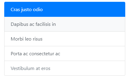
The most basic list group is an unordered list with list items and the proper classes. Build upon it with the options that follow, or with your own CSS as needed.
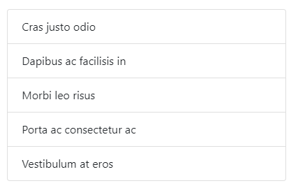
<ul class="list-group">
  <li class="list-group-item">Cras justo odio</li>
  <li class="list-group-item">Dapibus ac facilisis in</li>
  <li class="list-group-item">Morbi leo risus</li>
  <li class="list-group-item">Porta ac consectetur ac</li>
  <li class="list-group-item">Vestibulum at eros</li>
</ul>
添加active
Add .active to a .list-group-item to indicate the current active selection.
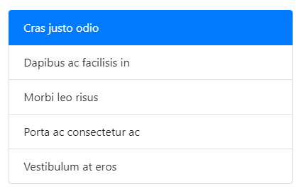
<ul class="list-group">
  <li class="list-group-item active">Cras justo odio</li>
  <li class="list-group-item">Dapibus ac facilisis in</li>
  <li class="list-group-item">Morbi leo risus</li>
  <li class="list-group-item">Porta ac consectetur ac</li>
  <li class="list-group-item">Vestibulum at eros</li>
</ul>
LInk 与 Button
Use <a>s or <button>s to create actionable list group items with hover, disabled, and active states by adding .list-group-item-action.
Be sure to not use the standard .btn classes here.
<div class="list-group">
  <a href="#" class="list-group-item list-group-item-action active">
    Cras justo odio
  </a>
  <a href="#" class="list-group-item list-group-item-action">Dapibus ac facilisis in</a>
  <a href="#" class="list-group-item list-group-item-action">Morbi leo risus</a>
  <a href="#" class="list-group-item list-group-item-action">Porta ac consectetur ac</a>
  <a href="#" class="list-group-item list-group-item-action disabled" tabindex="-1" aria-disabled="true">Vestibulum at eros</a>
</div>
<div class="list-group">
  <button type="button" class="list-group-item list-group-item-action active">
    Cras justo odio
  </button>
  <button type="button" class="list-group-item list-group-item-action">Dapibus ac facilisis in</button>
  <button type="button" class="list-group-item list-group-item-action">Morbi leo risus</button>
  <button type="button" class="list-group-item list-group-item-action">Porta ac consectetur ac</button>
  <button type="button" class="list-group-item list-group-item-action" disabled>Vestibulum at eros</button>
</div>
Flush
Add .list-group-flush to remove some borders and rounded corners to render list group items edge-to-edge in a parent container
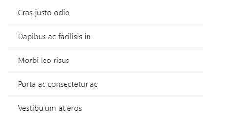
<ul class="list-group list-group-flush">
  <li class="list-group-item">Cras justo odio</li>
  <li class="list-group-item">Dapibus ac facilisis in</li>
  <li class="list-group-item">Morbi leo risus</li>
  <li class="list-group-item">Porta ac consectetur ac</li>
  <li class="list-group-item">Vestibulum at eros</li>
</ul>
Horizontal
Add .list-group-horizontal to change the layout of list group items from vertical to horizontal across all breakpoints. Alternatively, choose a responsive variant .list-group-horizontal-{sm|md|lg|xl} to make a list group horizontal starting at that breakpoint’s min-width. Currently horizontal list groups cannot be combined with flush list groups.
ProTip: Want equal-width list group items when horizontal? Add .flex-fill to each list group item.
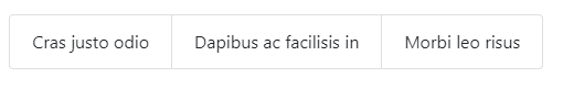
<ul class="list-group list-group-horizontal">
  <li class="list-group-item">Cras justo odio</li>
  <li class="list-group-item">Dapibus ac facilisis in</li>
  <li class="list-group-item">Morbi leo risus</li>
</ul>
上下文颜色
Use contextual classes to style list items with a stateful background and color.
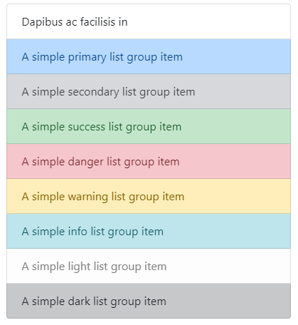
<ul class="list-group">
  <li class="list-group-item">Dapibus ac facilisis in</li>


  <li class="list-group-item list-group-item-primary">A simple primary list group item</li>
  <li class="list-group-item list-group-item-secondary">A simple secondary list group item</li>
  <li class="list-group-item list-group-item-success">A simple success list group item</li>
  <li class="list-group-item list-group-item-danger">A simple danger list group item</li>
  <li class="list-group-item list-group-item-warning">A simple warning list group item</li>
  <li class="list-group-item list-group-item-info">A simple info list group item</li>
  <li class="list-group-item list-group-item-light">A simple light list group item</li>
  <li class="list-group-item list-group-item-dark">A simple dark list group item</li>
</ul>
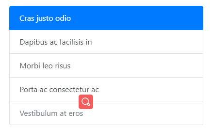
使用徽章
Add badges to any list group item to show unread counts, activity, and more with the help of some utilities.
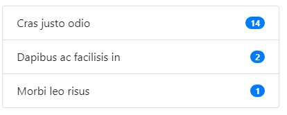
<ul class="list-group">
  <li class="list-group-item d-flex justify-content-between align-items-center">
    Cras justo odio
    <span class="badge badge-primary badge-pill">14</span>
  </li>
  <li class="list-group-item d-flex justify-content-between align-items-center">
    Dapibus ac facilisis in
    <span class="badge badge-primary badge-pill">2</span>
  </li>
  <li class="list-group-item d-flex justify-content-between align-items-center">
    Morbi leo risus
    <span class="badge badge-primary badge-pill">1</span>
  </li>
</ul>
自定制
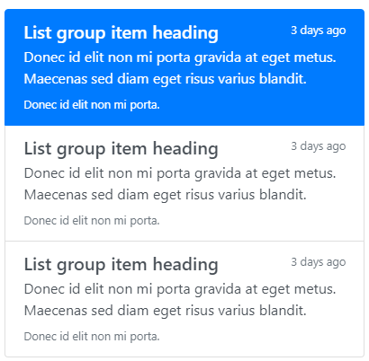
<div class="list-group">
  <a href="#" class="list-group-item list-group-item-action active">
    <div class="d-flex w-100 justify-content-between">
      <h5 class="mb-1">List group item heading</h5>
      <small>3 days ago</small>
    </div>
    <p class="mb-1">Donec id elit non mi porta gravida at eget metus. Maecenas sed diam eget risus varius blandit.</p>
    <small>Donec id elit non mi porta.</small>
  </a>
  <a href="#" class="list-group-item list-group-item-action">
    <div class="d-flex w-100 justify-content-between">
      <h5 class="mb-1">List group item heading</h5>
      <small class="text-muted">3 days ago</small>
    </div>
    <p class="mb-1">Donec id elit non mi porta gravida at eget metus. Maecenas sed diam eget risus varius blandit.</p>
    <small class="text-muted">Donec id elit non mi porta.</small>
  </a>
</div>
选项卡
使用data属性
此动作通过js来完成,要使用需先导入。

<div class="row">
  <div class="col-4">
    <div class="list-group" id="list-tab" role="tablist">
      <a class="list-group-item list-group-item-action active" id="list-home-list" data-toggle="list" href="#list-home" role="tab" aria-controls="home">Home</a>
      <a class="list-group-item list-group-item-action" id="list-profile-list" data-toggle="list" href="#list-profile" role="tab" aria-controls="profile">Profile</a>
      <a class="list-group-item list-group-item-action" id="list-messages-list" data-toggle="list" href="#list-messages" role="tab" aria-controls="messages">Messages</a>
      <a class="list-group-item list-group-item-action" id="list-settings-list" data-toggle="list" href="#list-settings" role="tab" aria-controls="settings">Settings</a>
    </div>
  </div>
  <div class="col-8">
    <div class="tab-content" id="nav-tabContent">
      <div class="tab-pane fade show active" id="list-home" role="tabpanel" aria-labelledby="list-home-list">...</div>
      <div class="tab-pane fade" id="list-profile" role="tabpanel" aria-labelledby="list-profile-list">...</div>
      <div class="tab-pane fade" id="list-messages" role="tabpanel" aria-labelledby="list-messages-list">...</div>
      <div class="tab-pane fade" id="list-settings" role="tabpanel" aria-labelledby="list-settings-list">...</div>
    </div>
  </div>
</div>
<ul class="list-unstyled tab-content col-2">
    <li class="tab-pane fade show active" id="li-1">明天真的不知道</li>
    <li class="tab-pane fade" id="li-2">后天进的不知道</li>
    <li class="tab-pane fade" id="li-3">大后天真的不知道</li>
</ul>
使用js属性
通过JavaScript启用可表列表项(每个列表项需要单独激活):
$('#myList a').on('click', function (e) {
  e.preventDefault()
  $(this).tab('show')
})
你也可以单独的激活个别项目:
$('#myList a[href="#profile"]').tab('show') // Select tab by name
$('#myList a:first-child').tab('show') // Select first tab
$('#myList a:last-child').tab('show') // Select last tab
$('#myList a:nth-child(3)').tab('show') // Select third tab
方法
$().tab("show")
Activates a list item element and content container. Tab should have either a data-target or an href targeting a container node in the DOM.
<div class="list-group" id="myList" role="tablist">
  <a class="list-group-item list-group-item-action active" data-toggle="list" href="#home" role="tab">Home</a>
  <a class="list-group-item list-group-item-action" data-toggle="list" href="#profile" role="tab">Profile</a>
  <a class="list-group-item list-group-item-action" data-toggle="list" href="#messages" role="tab">Messages</a>
  <a class="list-group-item list-group-item-action" data-toggle="list" href="#settings" role="tab">Settings</a>
</div>

<div class="tab-content">
  <div class="tab-pane active" id="home" role="tabpanel">...</div>
  <div class="tab-pane" id="profile" role="tabpanel">...</div>
  <div class="tab-pane" id="messages" role="tabpanel">...</div>
  <div class="tab-pane" id="settings" role="tabpanel">...</div>
</div>

<script>
  $(function () {
    $('#myList a:last-child').tab('show')
  })
</script>
事件
When showing a new tab, the events fire in the following order:
hide.bs.tab(on the current active tab)show.bs.tab(on the to-be-shown tab)hidden.bs.tab(on the previous active tab, the same one as for thehide.bs.tabevent)shown.bs.tab(on the newly-active just-shown tab, the same one as for theshow.bs.tabevent)
If no tab was already active, the hide.bs.tab and hidden.bs.tab events will not be fired.
| Event type | Description |
|---|---|
| show.bs.tab | This event fires on tab show, but before the new tab has been shown. Use event.target and event.relatedTarget to target the active tab and the previous active tab (if available) respectively. |
| shown.bs.tab | This event fires on tab show after a tab has been shown. Use event.target and event.relatedTarget to target the active tab and the previous active tab (if available) respectively. |
| hide.bs.tab | This event fires when a new tab is to be shown (and thus the previous active tab is to be hidden). Use event.target and event.relatedTarget to target the current active tab and the new soon-to-be-active tab, respectively. |
| hidden.bs.tab | This event fires after a new tab is shown (and thus the previous active tab is hidden). Use event.target and event.relatedTarget to target the previous active tab and the new active tab, respectively. |
$('a[data-toggle="list"]').on('shown.bs.tab', function (e) {
  e.target // newly activated tab
  e.relatedTarget // previous active tab
})
滚动监听
使用时需要注意:It must be used on a Bootstrap nav component or list group.
如果你不在body中使用,那么你的滚动内容需要添加滚动条,也就是你需要加滚动条,这根滚动条不是浏览器的。
导航条中
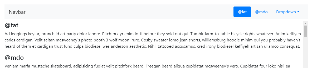
<nav id="navbar-example2" class="navbar navbar-light bg-light">
  <a class="navbar-brand" href="#">Navbar</a>
  <ul class="nav nav-pills">
    <li class="nav-item">
      <a class="nav-link" href="#fat">@fat</a>
    </li>
    <li class="nav-item">
      <a class="nav-link" href="#mdo">@mdo</a>
    </li>
    <li class="nav-item dropdown">
      <a class="nav-link dropdown-toggle" data-toggle="dropdown" href="#" role="button" aria-haspopup="true" aria-expanded="false">Dropdown</a>
      <div class="dropdown-menu">
        <a class="dropdown-item" href="#one">one</a>
        <a class="dropdown-item" href="#two">two</a>
        <div role="separator" class="dropdown-divider"></div>
        <a class="dropdown-item" href="#three">three</a>
      </div>
    </li>
  </ul>
</nav>
<div data-spy="scroll" data-target="#navbar-example2" data-offset="0">
  <h4 id="fat">@fat</h4>
  <p>...</p>
  <h4 id="mdo">@mdo</h4>
  <p>...</p>
  <h4 id="one">one</h4>
  <p>...</p>
  <h4 id="two">two</h4>
  <p>...</p>
  <h4 id="three">three</h4>
  <p>...</p>
</div>
在body中
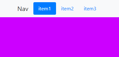
<!DOCTYPE html>
<html lang="en">
<head>
    <meta charset="UTF-8">
    <title>Bootstrap</title>
    <link type="text/css" rel="stylesheet" href="../bootstrap-4.4.1-dist/css/bootstrap.min.css">
    <style>
        #item1{
            height: 600px;
            background: #cc00ff;

        }
         #item2{
            height: 600px;
            background: #ffff00;
        }
         #item3{
            height: 600px;
            background: #00cc00;
        }
    </style>
</head>
<body data-spy="scroll">

<nav class="navbar navbar-light bg-light fixed-top justify-content-center" id="navbar">
    <a class="navbar-brand" href="#">Nav</a>
    <ul class="nav nav-pills">
        <li class="nav-item"><a class="nav-link" href="#item1">item1</a></li>
        <li class="nav-item"><a class="nav-link" href="#item2">item2</a></li>
        <li class="nav-item"><a class="nav-link" href="#item3">item3</a></li>
    </ul>
</nav>

<div data-spy="scroll" data-target="#navbar" data-offset="0">
    <div id="item1"></div>
    <div id="item2"></div>
    <div id="item3"></div>
</div>

</body>
<script type="text/javascript" src="../bootstrap-3.3.7-dist/js/jquery.js"></script>
<script type="text/javascript" src="../bootstrap-4.4.1-dist/js/bootstrap.bundle.min.js"></script>
<script type="text/javascript" src="node_modules/popper.js/dist/umd/popper.min.js"></script>
<script type="text/javascript" src="../bootstrap-4.4.1-dist/js/bootstrap.min.js"></script>

<script>

</script>
</html>
列表组中
Scrollspy also works with .list-groups. Scroll the area next to the list group and watch the active class change.

<div id="list-example" class="list-group">
  <a class="list-group-item list-group-item-action" href="#list-item-1">Item 1</a>
  <a class="list-group-item list-group-item-action" href="#list-item-2">Item 2</a>
  <a class="list-group-item list-group-item-action" href="#list-item-3">Item 3</a>
  <a class="list-group-item list-group-item-action" href="#list-item-4">Item 4</a>
</div>
<div data-spy="scroll" data-target="#list-example" data-offset="0" class="scrollspy-example">
  <h4 id="list-item-1">Item 1</h4>
  <p>...</p>
  <h4 id="list-item-2">Item 2</h4>
  <p>...</p>
  <h4 id="list-item-3">Item 3</h4>
  <p>...</p>
  <h4 id="list-item-4">Item 4</h4>
  <p>...</p>
</div>
在body中

<!DOCTYPE html>
<html lang="en">
<head>
    <meta charset="UTF-8">
    <title>Bootstrap</title>
    <link type="text/css" rel="stylesheet" href="../bootstrap-4.4.1-dist/css/bootstrap.min.css">
    <style>
        #item1{
            height: 600px;
            background: #cc00ff;

        }
         #item2{
            height: 600px;
            background: #ffff00;
        }
         #item3{
            height: 600px;
            background: #00cc00;
        }
    </style>
</head>
<body data-spy="scroll">

<div class="list-group col-2 fixed-top">
    <a class="list-group-item list-group-item-action" href="#item1">item1</a>
    <a class="list-group-item list-group-item-action" href="#item2">item2</a>
    <a class="list-group-item list-group-item-action" href="#item3">item3</a>
</div>

<div>
    <div id="item1"></div>
    <div id="item2"></div>
    <div id="item3"></div>
</div>

</body>
<script type="text/javascript" src="../bootstrap-3.3.7-dist/js/jquery.js"></script>
<script type="text/javascript" src="../bootstrap-4.4.1-dist/js/bootstrap.bundle.min.js"></script>
<script type="text/javascript" src="node_modules/popper.js/dist/umd/popper.min.js"></script>
<script type="text/javascript" src="../bootstrap-4.4.1-dist/js/bootstrap.min.js"></script>

</html>
嵌套的导航
Scrollspy also works with nested .navs. If a nested .nav is .active, its parents will also be .active. Scroll the area next to the navbar and watch the active class change.

<nav id="navbar-example3" class="navbar navbar-light bg-light">
  <a class="navbar-brand" href="#">Navbar</a>
  <nav class="nav nav-pills flex-column">
    <a class="nav-link" href="#item-1">Item 1</a>
    <nav class="nav nav-pills flex-column">
      <a class="nav-link ml-3 my-1" href="#item-1-1">Item 1-1</a>
      <a class="nav-link ml-3 my-1" href="#item-1-2">Item 1-2</a>
    </nav>
    <a class="nav-link" href="#item-2">Item 2</a>
    <a class="nav-link" href="#item-3">Item 3</a>
    <nav class="nav nav-pills flex-column">
      <a class="nav-link ml-3 my-1" href="#item-3-1">Item 3-1</a>
      <a class="nav-link ml-3 my-1" href="#item-3-2">Item 3-2</a>
    </nav>
  </nav>
</nav>

<div data-spy="scroll" data-target="#navbar-example3" data-offset="0">
  <h4 id="item-1">Item 1</h4>
  <p>...</p>
  <h5 id="item-1-1">Item 1-1</h5>
  <p>...</p>
  <h5 id="item-1-2">Item 1-2</h5>
  <p>...</p>
  <h4 id="item-2">Item 2</h4>
  <p>...</p>
  <h4 id="item-3">Item 3</h4>
  <p>...</p>
  <h5 id="item-3-1">Item 3-1</h5>
  <p>...</p>
  <h5 id="item-3-2">Item 3-2</h5>
  <p>...</p>
</div>
使用
使用data属性
To easily add scrollspy behavior to your topbar navigation, add data-spy="scroll" to the element you want to spy on (most typically this would be the <body>).
Then add the data-target attribute with the ID or class of the parent element of any Bootstrap .nav component.
body {
  position: relative;
}
<body data-spy="scroll" data-target="#navbar-example">
  ...
  <div id="navbar-example">
    <ul class="nav nav-tabs" role="tablist">
      ...
    </ul>
  </div>
  ...
</body>
使用js
After adding position: relative; in your CSS, call the scrollspy via JavaScript:
$('body').scrollspy({ target: '#navbar-example' })
选项
Options can be passed via data attributes or JavaScript. For data attributes, append the option name to data-, as in data-offset="".
| Name | Type | Default | Description |
|---|---|---|---|
| offset | number | 10 | Pixels to offset from top when calculating position of scroll. |
| method | string | auto | Finds which section the spied element is in. auto will choose the best method to get scroll coordinates. offset will use jQuery offset method to get scroll coordinates. position will use jQuery position method to get scroll coordinates. |
| target | string | Specifies element to apply Scrollspy plugin. |
方法
.scrollspy('refresh')
When using scrollspy in conjunction with adding or removing of elements from the DOM, you’ll need to call the refresh method like so:
$('[data-spy="scroll"]').each(function () {
  var $spy = $(this).scrollspy('refresh')
})
.scrollspy('dispose')
Destroys an element’s scrollspy.
事件
| Event Type | Description |
|---|---|
| activate.bs.scrollspy | This event fires on the scroll element whenever a new item becomes activated by the scrollspy. |
$('[data-spy="scroll"]').on('activate.bs.scrollspy', function () {
  // do something...
})