I had started a “52 Vis” initiative back in 2016 to encourage folks to get practice making visualizations since that’s the only way to get better at virtually anything. Life got crazy, 52 Vis fell to the wayside and now there are more visible alternatives such as Makeover Mondayand Workout Wednesday. They’re geared towards the “T” crowd (I’m not giving a closed source and locked-in-data product any more marketing than two links) but that doesn’t mean R, Python or other open-tool/open-data communities can’t join in for the ride and learning experience.
This week’s workout is a challenge to reproduce or improve upon a chart by Matt Stiles. You should go to both (give them the clicks and eyeballs they both deserve since they did great work). They both chose a line chart, but the whole point of these exercises is to try out new things to help you learn how to communicate better. I chose to use geom_segment() to make mini-column charts since that:
- eliminates the giant rose-coloured rectangles that end up everywhere
- helps show the differences a bit better (IMO), and
- also helps highlight some of the states that have had more difficulties than others
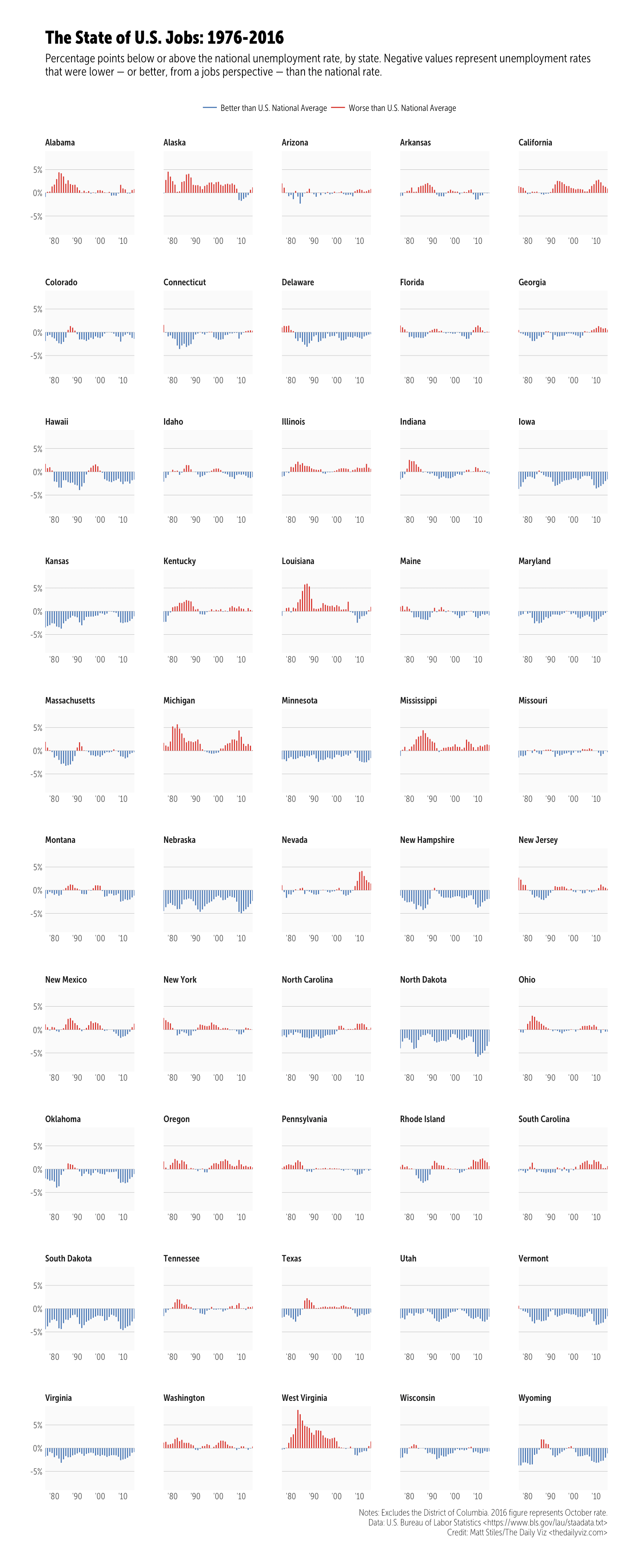
Click/tap to “embiggen”. I kept the same dimensions that Andy did but unlike Matt’s creation this is a plain ol’ PNG as I didn’t want to deal with web fonts (I’m on a Museo Sans Condensed kick at the moment but don’t have it in my TypeKit config yet). I went with official annual unemployment numbers as they may be calculated/adjusted differently (I didn’t check, but I knew that data source existed, so I used it).
One reason I’m doing this is a quote on the Workout Wednesday post:
This will be a very tedious exercise. To provide some context, this took me 2-3 hours to create. Don’t get discouraged and don’t feel like you have to do it all in one sitting. Basically, try to make yours look identical to mine.
This took me 10 minutes to create in R:
#' ---
#' output:
#'  html_document:
#'    keep_md: true
#' ---
#+ message=FALSE
library(ggplot2)
library(hrbrmisc)
library(readxl)
library(tidyverse)

# Use official BLS annual unemployment data vs manually calculating the average
# Source: https://data.bls.gov/timeseries/LNU04000000?years_option=all_years&periods_option=specific_periods&periods=Annual+Data
read_excel("~/Data/annual.xlsx", skip=10) %>%
  mutate(Year=as.character(as.integer(Year)), Annual=Annual/100) -> annual_rate


# The data source Andy Kriebel curated for you/us: https://1drv.ms/x/s!AhZVJtXF2-tD1UVEK7gYn2vN5Hxn #ty Andy!
read_excel("~/Data/staadata.xlsx") %>%
  left_join(annual_rate) %>%
  filter(State != "District of Columbia") %>%
  mutate(
    year = as.Date(sprintf("%s-01-01", Year)),
    pct = (Unemployed / `Civilian Labor Force Population`),
    us_diff = -(Annual-pct),
    col = ifelse(us_diff<0,
               "Better than U.S. National Average",
               "Worse than U.S. National Average")
  ) -> df

credits <- "Notes: Excludes the District of Columbia. 2016 figure represents October rate.
Data: U.S. Bureau of Labor Statistics <https://www.bls.gov/lau/staadata.txt>
Credit: Matt Stiles/The Daily Viz <thedailyviz.com>"

#+ state_of_us, fig.height=21.5, fig.width=8.75, fig.retina=2
ggplot(df, aes(year, us_diff, group=State)) +
  geom_segment(aes(xend=year, yend=0, color=col), size=0.5) +
  scale_x_date(expand=c(0,0), date_labels="'%y") +
  scale_y_continuous(expand=c(0,0), label=scales::percent, limit=c(-0.09, 0.09)) +
  scale_color_manual(name=NULL, expand=c(0,0),
                     values=c(`Better than U.S. National Average`="#4575b4",
                              `Worse than U.S. National Average`="#d73027")) +
  facet_wrap(~State, ncol=5, scales="free_x") +
  labs(x=NULL, y=NULL, title="The State of U.S. Jobs: 1976-2016",
       subtitle="Percentage points below or above the national unemployment rate, by state. Negative values represent unemployment rates
that were lower — or better, from a jobs perspective — than the national rate.",
       caption=credits) +
  theme_hrbrmstr_msc(grid="Y", strip_text_size=9) +
  theme(panel.background=element_rect(color="#00000000", fill="#f0f0f055")) +
  theme(panel.spacing=unit(0.5, "lines")) +
  theme(plot.subtitle=element_text(family="MuseoSansCond-300")) +
  theme(legend.position="top")
Swap out ~/Data for where you stored the files.
The “weird” looking comments enable me to spin the script and is pretty much just the inverse markup for knitr R Markdown documents. As the comments say, you should really thank Andy for curating the BLS data for you/us.
If I really didn’t pine over aesthetics it would have taken me 5 minutes (most of that was waiting for re-rendering). Formatting the blog post took much longer. Plus, I can update the data source and re-run this in the future without clicking anything. This re-emphasizes a caution I tell my students: beware of dragon droppings (“drag-and-drop data science/visualization tools”).
Hopefully you presently follow or will start following Workout Wednesday and Makeover Monday and dedicate some time to hone your skills with those visualization katas.
转自:https://rud.is/b/2017/01/18/workout-wednesday-redux-2017-week-3/