你可能不知道的.5px
移动web设计中,在retina显示屏下网页会由1px会被渲染为2px,那么视觉稿中1px的线条还原成网页需要css定义为.5px。文章开头的漫画中,细心的设计师发现粗线条并吐槽,前端哥的理由是因为css的border-width不支持.5px,所以用了1px来替代,最终渲染为2px的粗线条,这个问题往往会被忽视,从而导致移动网页中普遍存在2px的粗线条。
retina下的网页1px被渲染为2px(甚至是3px,例如iPhone 6 Plus),可参考的文章《高清显示屏原理及设计方案》

错误案例示范:微信-AA收款-详情页按钮,视觉稿给过来的按钮边框是1px,重构上线后按钮边框是2px。

此问题已优化,如何实现请往下看。
border值不支持.5px吗
有部分同学使用boder-.5px后,在PC或者页面页面看不到.5px的边框(ios 8系统已完美支持border-width值0.5px线条),会认为border-width不支持.5px,是不是这样,我们先做个试验。
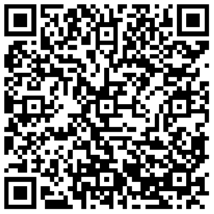
首先打开链接或者扫描二维码,体验demo
http://1.peunzhang.sinaapp.com/demo/d5px/border.html

可以看出.5px的border在chrome浏览器上不显示线条,如下图:

调大chrome分辨率后,.5px的border在PC浏览器上显示出线条,如下图:

.5px的border在iPhone 6 plus下显示出线条,如下图:

.5px的border在三星galaxy s4 android 5.0.1下不显示线条,如下图:

其它设备就不一一截图,有兴趣的请测试,有惊喜,简单整理如下表格:

试验结果参考
- css的border-width值支持.5px,显示状态受屏幕分辨率的影响
- ios 8和winphone 8的设备对高清屏做了特殊处理,支持显示border-.5px
- android 几乎所有的机型不支持显示.5px的边框
另外,本文也对height值做了试验,结果跟border-width是一样的,我们还可以试验font-size、box-shadow等属性。
http://1.peunzhang.sinaapp.com/demo/d5px/height.html

实现.5px的线条
网络上有很多方法,如设置viewport,box-shawdow,border-image,background-image,transform:scale等,这里不做介绍(百度或者谷歌“retina 1px 边框”有答案),本文只介绍一种觉得比较好用的方法,一来兼容性好,二来不依赖图片。
transform:scale(x,y)
通过css支持定义border或者height为.5px大的线条,在android设备中的无法显示出来,这里有个小技巧,果设置线条为1px,然后通过transform:scale(x,y)来缩放线条为原来的一半,可显示0.5px的线条。
<!DOCTYPE html>
<html>
<head>
<meta charset="utf-8">
<meta content="width=device-width,initial-scale=1,maximum-scale=1.0,user-scalable=no" name="viewport">
<meta content="yes" name="apple-mobile-web-app-capable">
<meta content="black" name="apple-mobile-web-app-status-bar-style">
<meta content="telephone=no" name="format-detection">
<meta content="email=no" name="format-detection">
<title>点5测试 - scale</title>
<style type="text/css">
.line {
    height: 50px;
    line-height: 50px;
    background-color: #CCC;
    border-bottom:1px solid red
}

.scale {
    position: relative;
    height: 50px;
    line-height: 50px;
    background-color: #CCC
}
.scale:after {
    position: absolute;
    content: '';
    width: 100%;
    left: 0;
    bottom: 0;
    height: 1px;
    background-color: red;
    -webkit-transform: scale(1,.5);
    transform: scale(1,.5);
    -webkit-transform-origin: center bottom;
    transform-origin: center bottom
}
</style>
</head>

<body>
<div class="line">1px</div>
<br/><br/>
<div class="scale">0.5px</div>
</body>

</html>
http://1.peunzhang.sinaapp.com/demo/d5px/height-scale.html

实现.5px的圆角边框
.5px的边框,看起来看神奇,这里感谢蓝叔提供的方法。
原理:先定义1px的圆角边框,然后拉伸内容的宽度和高度为父级的2倍(边框厚度不变),然后再使用transform:scale(0.5)缩放为原来的0.5倍

<!DOCTYPE html>
<html>
<head>
<meta charset="utf-8">
<meta content="width=device-width,initial-scale=1,maximum-scale=1.0,user-scalable=no" name="viewport">
<meta content="yes" name="apple-mobile-web-app-capable">
<meta content="black" name="apple-mobile-web-app-status-bar-style">
<meta content="telephone=no" name="format-detection">
<meta content="email=no" name="format-detection">
<title>点5测试 - border-radius</title>
<style type="text/css">
body{padding: 50px;-webkit-touch-callout:none;}
[class*="btn"]{margin: 0 auto;}
.btn-1 {
    width: 200px;
    height: 42px;
    -webkit-border-radius: 5px;
    border-radius: 5px;
    text-align: center;
    line-height: 42px;
    background-color: #EDEDED;
    border: 1px solid red;
}
.btn {
    position: relative;
    width: 200px;
    height: 42px;
    -webkit-border-radius: 5px;
    border-radius: 5px;
    text-align: center;
    line-height: 42px;
    background-color: #EDEDED;
}
.btn:before {
    content: '';
    position: absolute;
    top: -50%;
    bottom: -50%;
    left: -50%;
    right: -50%;
    -webkit-transform: scale(0.5);
    transform: scale(0.5);
    border-style: solid;
    border-width: 1px;
    border-color: red;
    -webkit-border-radius: 10px;
    border-radius: 10px;
}
</style>
</script>
</head>

<body>

<div class="btn-1">1px border</div>
<br/><br/>
<div class="btn">.5px border</div>

</body>

</html>
http://1.peunzhang.sinaapp.com/demo/d5px/border-radius.html
如果你在chrome打开,会发现缩放线条会导致边框颜色变浅,但大家可以放心使用,因为在大部分移动设备(相对高端)的颜色还是正常的。
转自:白树 http://peunzhang.cnblogs.com/ 感谢作者分享!