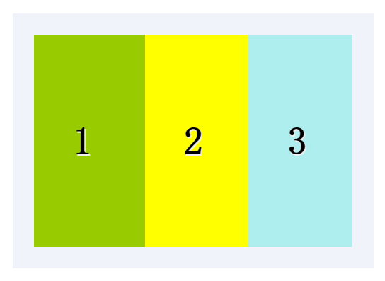
1.box-flex属性规定框的子元素是否可伸缩其尺寸。
父元素必须要声明display:box;子元素才可以用box-flex。
语法:box-flex:value;
示例:
      <style>
        .test_box {display: -moz-box;display: -webkit-box;display:box; 800px;margin: 40px auto;padding: 20px;
            background: #f0f3f9;}
        .list {padding: 0 1em; font: bold 36px/200px monaco;text-shadow: 1px 1px #eee;}
        .list_one { -moz-box-flex: 1;-webkit-box-flex: 1;box-flex: 1;background-color: yellow;}
        .list_two{-moz-box-flex: 2;-webkit-box-flex: 2;box-flex: 2;background-color: #99CC00;}
        .list_three {-moz-box-flex: 1;-webkit-box-flex: 1;box-flex: 1;background-color: paleturquoise;}
      </style>
      <div class="test_box">
        <div class="list list_two">1</div>
        <div class="list list_one">2</div>
        <div class="list list_three">3</div>
      </div>
结果: 图片
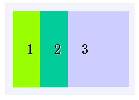
可以指定某个子元素的宽度,剩下的部分平分。
示例:
      <style>
        .test_box {display: -moz-box;display: -webkit-box;display: box; 800px;margin: 40px auto;padding: 20px;
          background: #f0f3f9;}
        .list {padding: 0 1em;font: bold 36px/200px monaco;
          text-shadow: 1px 1px #eee;}
        .list_one {-moz-box-flex: 1;-webkit-box-flex: 1;box-flex: 1;background: #00CC99;}
        .list_two {-moz-box-flex: 2;-webkit-box-flex: 2;box-flex: 2;background: #99FF00;}
        .list_w300 {  300px; background: #CCCCFF}
      </style>
      <div class="test_box">
        <div class="list list_two">1</div>
        <div class="list list_one">2</div>
        <div class="list list_w300">3</div>
      </div>
结果: 图片
2.box-orient
用来确定子元素的方向,是横着还是竖着。
可选值:horizontal | vertical | inline-axis | box-axis | inherit inline-axis是默认的 horizonta inline-axis 是一样的让元素横着 vertical
box-axis 是一样的让元素纵列。
示例:
      <style>
        .test_box { 300px; margin: 0 auto;display: -moz-box;
          display: -webkit-box;display: box;box-orient:horizontal;padding: 20px;background: #f0f3f9;}
        .list{padding: 0 1em;font: bold 36px/120px monaco; text-shadow: 1px 1px #eee;-webkit-box-flex: 1;}
        .one{background: #99FF00;}
        .two{background: #00CC99}
        .three{background:#CCCC00}
      </style>
      <div class="test_box">
        <div class="list one">1</div>
        <div class="list two">2</div>
        <div class="list three">3</div>
      </div>
结果:如图

3.box-direction
用来确定子元素的排列顺序。可选值:
onrmal | revers | inherit onrmal是默认值按着正常顺序排列,从左到右
从前到后,revers表示反转。
示例:
       <style>
         .test_box {display: -moz-box;display: -webkit-box;display: box;-moz-box-direction:reverse;-webkit-box-direction:reverse;
           box-direction:reverse; 300px;margin: 20px auto;padding: 10px;background: #f0f3f9;}
         .list {padding: 0 1em;font: bold 36px/150px monaco;text-shadow: 1px 1px #eee;}
         .list_one {-moz-box-flex: 1;-webkit-box-flex: 1;box-flex: 1;background: yellow;}
           .list_two{-moz-box-flex: 2;-webkit-box-flex: 2;box-flex: 2;background: #99CC00;}
         .three{background: #CCCCFF}
      </style>
      <div class="test_box">
        <div class="list list_two">1</div>
        <div class="list list_one">2</div>
        <div class="list list_one three">3</div>
      </div>
结果: 如图

4.box-align与box-pack
决定盒子内部剩余空间怎么使用,行为效果为对齐方式。
box-align 为垂直方向上的空间利用,box-pack 为水平方向上的空间利用。
box-align 可选参数: start | end | center | baseline | stretch
stretch为默认父标签的高度有多高,子元素就有多高。start表示底边对齐
end 为底部对齐,center居中对齐,baseline 基线对齐。
示例:
      <style>
        .test_box {margin: 0 auto;display: -moz-box;display: -webkit-box;
          display: -o-box;display: box;-moz-box-align:end;
          -webkit-box-align:end; -o-box-align:end; box-align:end;
           300px;height: 200px;padding: 20px;background: #f0f3f9;}
        .list {padding: 0 1em;font: bold 36px/120px monaco;text-shadow: 1px 1px #eee;}
        .one{background: #99FF00;}
        .two{background: #00CC99}
        .three{background:#CCCC00}
      </style>
      <div class="test_box">
        <div class="list one">1</div>
        <div class="list two" style="line-height:200px;">2</div>
        <div class="list three">3</div>
      </div>
结果:如图

box-pack可选值: start | end | center | justify
start为默认值, justify表示两端对齐。
示例:
      <style>
        .test_box {margin: 0 auto;display: -moz-box;display: -webkit-box;
          display: -o-box;display: box;-moz-box-pack:justify;
          -webkit-box-pack:justify; -o-box-pack:justify; box-pack:justify;
           300px;height: 200px;padding: 20px;background: #f0f3f9;}
        .list {padding: 0 1em;font: bold 36px/120px monaco;
          text-shadow: 1px 1px #eee;}
        .one{background: #99FF00;}
        .two{background: #00CC99}
        .three{background:#CCCC00}
      </style>
      <div class="test_box">
        <div class="list one">1</div>
        <div class="list two" style="line-height:200px;">2</div>
        <div class="list three">3</div>
      </div>
结果:如图

5.box-lines
用来决定子元素是否可以换行显示,有两个可以选的值:single | mutiple
single 默认值,不换行。mutiple 换行多行显示。
示例:
      <style>
        .test_box {margin: 0 auto;display: -moz-box;display: -webkit-box;
          display: -o-box;display: box;-moz-box-lines:multiple;
          -webkit-box-lines:multiple;-o-box-lines:multiple;
          box-lines:multiple;  300px;
          height: 200px;padding: 20px;background: #f0f3f9;}
        .list {padding: 0 1em;font: bold 36px/120px monaco;text-shadow: 1px 1px #eee;}
        .one{background: #99FF00;}
        .two{background: #00CC99}
        .three{background:#CCCC00}
      </style>
      <div class="test_box">
        <div class="list one">1</div>
        <div class="list two" style="line-height:200px;">2</div>
        <div class="list three">3</div>
      </div>
结果:如图

6.box-ordinal-group
改变子元素的顺序,值为数字,数字越小越排在前面。
示例:
      <style>
        .test_box {display: -moz-box;display: -webkit-box;display: box;
           300px;margin: 40px auto;padding: 20px;background: #f0f3f9;}
        .list {padding: 0 1em;font: bold 36px/200px monaco;text-shadow: 1px 1px #eee;}
        .list_one {-moz-box-flex: 1;-webkit-box-flex: 1; box-flex: 1;
          -moz-box-ordinal-group: 1;-webkit-box-ordinal-group: 1;box-ordinal-group: 1;background: #99CC00;}
        .list_two{-moz-box-flex: 2;-webkit-box-flex: 2;box-flex: 2;-moz-box-ordinal-group: 2;-webkit-box-ordinal-group: 2;
          box-ordinal-group: 2;background: #CC33CC;}
        .three{ background: #CCCC00}
      </style>
      <div class="test_box">
        <div class="list list_two">1</div>
        <div class="list list_one">2</div>
        <div class="list list_one three">3</div>
      </div>
结果:如图

demo下载https://github.com/ningmengxs/css3.git