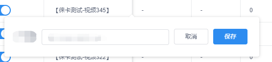
首先接到的任务是这样的:


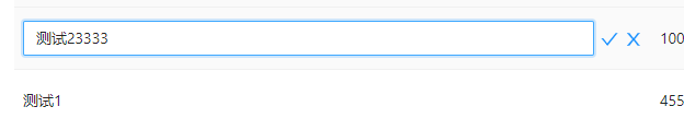
那么打开参考对象看一眼:
总结一下组件的内容和功能点:
1.一个输入框,两个按钮(确定,取消)
2.点击文本,弹出气泡,进行编辑,提交/取消,关闭气泡,更新数据(数据不变则不更新)
而原本的组件,则是直接点击编辑按钮,变为编辑模式:
因此,我选择了antd提供的Popover组件,稍微封装一下功能,做成一个独立的小小组件,代码是这样的:
import React, { useState, useEffect, useRef, useImperativeHandle } from 'react';
import { Input, Button, Popover } from 'antd';
import { CloseCircleOutlined } from '@ant-design/icons';
// 工具函数
import { trimAllBlank } from '@/utils/tools';
// 样式文件
import styles from './style.less';
// 属性定义文件
import { Props } from './index.type';

/**
 * Single line edit bubble component【单行编辑气泡组件】
 * author: wun
 */
const TheEditCellBubble: React.FC<Props> = (props) => {
  const {
    inputType,
    initValue,
    record,
    dataIndex,
    placeholder,
    verify,
    className,
    request,
    update,
    cRef,
  } = props;

  // 输入框ref
  const inputRef = useRef<any>(null);
  // 输入框的值
  const [inputValue, setInputValue] = useState<string>('');
  // 单行展示的值
  const [showValue, setShowValue] = useState<string>('');
  // 错误提示文案
  const [errorText, setErrorText] = useState('');
  // 错误提示文案展示状态控制
  const [errorVisible, setErrorVisible] = useState(false);
  // 确认按钮loading状态控制
  const [submitLoading, setSubmitLoading] = useState(false);
  // 气泡展示状态控制
  const [visible, setVisible] = useState(false);

  // 校验函数
  const verifyInput = (val: any) => {
    if (verify && verify.rules && verify.rules.length > 0) {
      const error = verify.rules.find((el: any) => {
        // 空验证
        if (el.required) {
          return !val;
        }
        // 正则验证
        if (el.pattern) {
          return !el.pattern.test(val);
        }
        // 自定义验证
        if (el.validator) {
          return !el.validator(val);
        }
        return false;
      });
      if (error) {
        setErrorVisible(true);
        setErrorText(error.message);
        return false;
      }
    }
    return true;
  };

  // 监听输入框实时内容
  const handleChange = (e: { target: { value: string } }) => {
    const val = e.target.value;
    setInputValue(trimAllBlank(val));

    // 重置错误提示
    if (errorVisible && verifyInput(val)) {
      setErrorVisible(false);
      setErrorText('');
    }
  };

  // 确定-回调
  const handleOk = async (e: React.MouseEvent | React.KeyboardEvent) => {
    e.stopPropagation();
    // 如输入框内容未修改,直接return
    if (inputValue === showValue) {
      return;
    }
    // 验证输入内容
    if (!verifyInput(inputValue)) return;
    // 创建参数对象
    const params = dataIndex ? { [dataIndex]: inputValue } : {};
    // 如需发送请求
    if (request) {
      try {
        // 确认按钮loading状态开启
        setSubmitLoading(true);
        // 发起请求
        const res: any = await request({ ...record, ...params });
        if (res && res.code === 0 ) {
          setShowValue(inputValue);
          if (update) update(params, res);
          setVisible(false);
        }
        // 默认值不存在时一般是做为新建功能使用此组件, 默认会在成功后清空输入项
        if (!initValue) setInputValue('');
        setSubmitLoading(false);
      } catch (error) {
        setSubmitLoading(false);
      } finally {
        //
      }
    } else if (update) {
      // 无需发送请求,则直接修改数据并返回
      setShowValue(inputValue);
      update(params, {});
      setVisible(false);
      setSubmitLoading(false);
    }
  }

  // 取消-回调
  const handleCancel =(e: React.MouseEvent)=>{
    e.stopPropagation();
    setVisible(false);
  }

  // 点击打开气泡
  const handleVisibleChange = () => {
    setVisible(true)
  };

  // 暴露给父级的方法
  useImperativeHandle(cRef, () => ({
    // 获取当前输入框值
    value: inputValue,
    // 可编辑状态时手动插入值
    insert: (value: string) => {
      // 在当前光标位置插入内容
      if (typeof inputValue === 'string') {
        const { input } = inputRef.current;
        const { selectionStart, selectionEnd } = input;
        // 优先插入当前光标所在位置, 如无法确定当前光标所在位置则插入当前值末尾
        setInputValue(
          inputValue.substring(0, selectionStart) +
            value +
            inputValue.substring(selectionEnd, inputValue.length),
        );
        // 重置光标位置
        input.focus();
      }
      // 重置错误提示
      if (errorVisible && verifyInput(value)) {
        setErrorVisible(false);
        setErrorText('');
      }
    },
  }));

  // 气泡展示时输入框自动聚焦
  useEffect(() => {
    let timer: any = null;

    if (visible) {
      timer = setTimeout(() => {
        inputRef.current.focus();
      }, 0);
    }

    return function cleanUp() {
      if (timer) clearTimeout(timer);
    };
  }, [visible]);

  // 内容初始化赋值
  useEffect(() => {
    if (initValue) {
      setShowValue(initValue);
      setInputValue(initValue);
    }
  }, []);

  return (
    <div className={`${styles['c-edit_cell-bubble']}${className ? ` ${className}` : ''}`}>
      <Popover
        placement="bottom"
        content={
          <div>
            <div className={`${styles['c-edit_cell-bubble-content']}`}>
              <Input
                ref={inputRef}
                value={inputValue}
                placeholder={placeholder}
                maxLength={(verify && verify.maxLength) || 50}
                onChange={handleChange}
                onPressEnter={handleOk}
                type={inputType}
                className={`${errorVisible && styles['c-edit_cell-bubble-input-error']}`}
              />
              <Button type="primary" onClick={handleOk} loading={submitLoading}>确定</Button>
              <Button onClick={handleCancel}>取消</Button>
            </div>
            {errorVisible && <div className={`${styles['c-edit_cell-bubble-error-tips']}`}><CloseCircleOutlined className={`${styles['c-edit_cell-bubble-error-icon']}`}/>{errorText}</div>}
          </div>
        }
        trigger="click"
        visible={visible}
        onVisibleChange={handleVisibleChange}
        getPopupContainer={(triggerNode) => triggerNode} // 改变浮层渲染父节点
      >
        <Button type="text">{showValue}</Button>
      </Popover>
    </div>
  );
};

export default TheEditCellBubble;
属性定义的文件是这样的:
export interface Props {
  inputType?: string; // input类型
  initValue?: string; // 单元格初使值
  record?: any; // 行数据
  dataIndex?: string; // 单元格数据在行数据中对应的路径
  cRef?: any;
  placeholder?: string;
  verify?: {
    rules?: any; // 规则
    maxLength?: number; // 最大程度
  }; // 单元格输入相关规则
  className?: string; // 自定义文本状态 class
  request?: (params?: any) => Promise<any>; // 更新单元格数据接口
  update?: (params?: object, result?: any) => void; // 更新回调, 回传请求参数和后台返回数据
}
css样式是这样的:
.c-edit_cell-bubble {
  .c-edit_cell-bubble-content{
     500px;
    display: flex;
    min-height: 32px;
    align-items: center;
    padding: 4px;
    box-sizing: border-box;
    white-space: nowrap;
    transition: linear 2s;
    input{
       70%;
    }
    button {
      margin-left: 8px;
    }
    .c-edit_cell-bubble-input-error{
      border-color: red;
    }
  }
  .c-edit_cell-bubble-error-tips{
    min-height: 20px;
    line-height: 1.5;
    color: red;
    .c-edit_cell-bubble-error-icon{
      color: red;
      margin: 0 4px;
    }
  }
}
使用方式是这样的:
# Single line edit bubble component【单行编辑气泡组件】

## 引用

import { BasisTheEditCellBubble } from '@/components/index';


## 调用

``
<BasisTheEditCellBubble />
``


## 属性参考

index.type.ts文件


########### 示例参考


[可替换掉项目管理的BasisEditTableCell组件用以体验]

``
<BasisTheEditCellBubble
    initValue={text}
    record={record}
    dataIndex="appName"
    verify={{
        ...rulesData.appName,
        rules: [
            {
                pattern: /S+/,
                message: `请输入${
                    tableHeaderList.filter((el: any) => el.dataIndex === 'appName')[0].title
                }`,
            },
        ],
    }}
    request={modifyProject}
    update={() => initTableList()}
/>
``
我觉得很ok,于是提交了代码,跟大佬表示做完了!
然而大佬看过之后,却表示:代码跟之前那个组件冗余了,要不考虑放到一起吧,减少代码的重复。
我:好的!
于是第二个版本,我的思路是,在原本行内编辑的组件里实现2种模式,在index文件增加一个isBubble(是否气泡模式)的属性,传给这个单行编辑组件进行区分。思路有了,快速进行开发。
开发完成之后,再给大佬看,大佬沉默了。
大佬表示,她想要的不是在最低层去封装,最底层最好不动。
ok!于是第三个版本,我的思路就是在组件的index进行封装,方法都提取出来,底层的组件不再需要进行请求之类的操作,直接在index管理,类似这样:
import React, { useState, useEffect } from 'react';
import { Button } from 'antd';
import { FormOutlined } from '@ant-design/icons';
import { trimAllBlank } from '@/utils/tools';

// 业务组件
import EditableCellForm from './EditableCellForm';
import TheEditCellBubble from './TheEditCellBubble';

// css
import styles from './style.less';

// 类型定义
import { Props } from './index.type';

/**
 * @description 可编辑单元格
 * @param {object} props - 父级数据
 * @returns {component}
 */
const TheEditTableCell: React.FC<Props> = (props) => {
  const {
    initValue,
    record,
    dataIndex,
    placeholder,
    verify,
    ellipsis,
    disabled,
    textClassName,
    inputType,
    request,
    update,
    onEdit,
    onCancel,
    onTextClick,
    isBubble,
  } = props;

  // 文本状态时显示的值
  const [textValue, setTextValue] = useState<string | undefined>(initValue);
  // 可编辑状态
  const [editable, setEditable] = useState(false);
  // 输入框的值
  const [inputValue, setInputValue] = useState<string | undefined>('');
  // 错误提示文案
  const [errorText, setErrorText] = useState('');
  // 错误提示文案展示状态控制
  const [errorVisible, setErrorVisible] = useState(false);
  // 确认按钮loading状态控制
  const [loading, setLoading] = useState(false);
  // 气泡展示状态控制
  const [visible, setVisible] = useState(false);

  const handleOk = async (value?: string) => {
    if (value) {
      // 输入内容校验不通过,直接return
      if (!verifyInput(value)) return;
      // 内容不变,直接return
      if (inputValue === textValue) return;
      // 保存展示内容
      setTextValue(value);
      // 如果是编辑状态,则关闭
      if (editable) {
        setEditable(false);
      }
      // 创建参数对象
      const dataParams = dataIndex ? { [dataIndex]: inputValue } : {};
      // 如需发送请求
      if (request) {
        try {
          // 确认按钮loading状态开启
          setLoading(true);
          // 发起请求
          const res: any = await request({ ...record, ...dataParams });
          if (res && res.code === 0 ) {
            // 保存展示内容
            setTextValue(value);
            setInputValue(value);
            // 如需更新
            if (update) update({ ...record, ...dataParams }, res.result);
            // 关闭编辑框
            if(visible) setVisible(false);
          }
          // 默认值不存在时一般是做为新建功能使用此组件, 默认会在成功后清空输入项
          if (!initValue) setInputValue('');
          setLoading(false);
        } catch (error) {
          setLoading(false);
        } finally {
          //
        }
      } else if (update) {
        // 无需发送请求,则直接修改数据并返回
        setTextValue(inputValue);
        setInputValue(inputValue);
        setVisible(false);
        setLoading(false);
      }
    }
  }
  // 文本点击回调
  const handleTextClick = () => {
    if (onTextClick) onTextClick();
  }
  // 校验函数
  const verifyInput = (val: any) => {
    if (verify && verify.rules && verify.rules.length > 0) {
      const error = verify.rules.find((el: any) => {
        // 空验证
        if (el.required) {
          return !val;
        }
        // 正则验证
        if (el.pattern) {
          return !el.pattern.test(val);
        }
        // 自定义验证
        if (el.validator) {
          return !el.validator(val);
        }
        return false;
      });
      if (error) {
        setErrorVisible(true);
        setErrorText(error.message);
        return false;
      }
    }
    return true;
  };
   // 监听输入框实时内容
   const handleChange = (e: { target: { value: string } }) => {
    const val = e.target.value;
    setInputValue(trimAllBlank(val));
    verifyInput(val);

    // 重置错误提示
    if (errorVisible && verifyInput(val)) {
      setErrorVisible(false);
      setErrorText('');
    }
  };

  // 取消-回调
  const handleCancel =(e: React.MouseEvent)=>{
    e.stopPropagation();
    if(visible) setVisible(false);
    if(editable) setEditable(false);
    setInputValue(textValue);
  }

  // 点击打开气泡
  const handleVisibleChange = () => {
    setVisible(true);
  };

  // 监听初使值的变化
  useEffect(() => {
    if (initValue) {
      setTextValue(initValue);
      setInputValue(initValue);
    }
  }, [initValue]);

  // 监听编辑状态的变化
  useEffect(() => {
    // 激活编辑回调
    if (editable && onEdit) {
      onEdit();
    }
    // 取消编辑回调
    else if (onCancel) {
      onCancel();
    }
  }, [editable]);

  return (
    <>
      {!isBubble && !editable &&
        <div className={`${styles['c-editcell-text']}${textClassName ? ` ${textClassName}` : ''}`}>
          {ellipsis ? (
            <div
              title={textValue}
              className="ads-single-ellipsis"
              style={onTextClick ? { cursor: 'pointer' } : {  '100%' }}
              onClick={handleTextClick}
            >
              {textValue || '-'}
            </div>
          ) : (
            <span style={onTextClick ? { cursor: 'pointer' } : undefined} onClick={handleTextClick}>
              {textValue || '-'}
            </span>
          )}
          {!disabled && (
            <Button type="link" icon={<FormOutlined />} onClick={() => setEditable(true)} />
          )}
        </div>
      }
      {!isBubble && editable && !disabled &&
          <EditableCellForm
            defaultValue={textValue}
            inputValue={inputValue}
            placeholder={placeholder}
            verify={verify}
            errorText={errorText}
            errorVisible={errorVisible}
            loading={loading}
            isFocus={editable}
            inputType={inputType}
            handleOk={handleOk}
            handleCancel={handleCancel}
            handleChange={handleChange}
          />
        }
        { isBubble &&
          <TheEditCellBubble
            inputValue={inputValue}
            showValue={textValue}
            errorText={errorText}
            errorVisible={errorVisible}
            loading={loading}
            visible={visible}
            verify={verify}
            handleChange={handleChange}
            handleVisibleChange={handleVisibleChange}
            handleOk={handleOk}
            handleCancel={handleCancel}
          />
        }
    </>
  );
};

TheEditTableCell.defaultProps = {
  ellipsis: false,
  inputType: 'text',
};

export default TheEditTableCell;
ok实现!
于是再次提交代码,给大佬过目,然而大佬又一次沉默了。
这次沉默的原因是:大可以和index做成并列关系的组件,只是内部的输入框之类,可以直接调用之前已有的,用气泡包裹起来就好了。
我:……
我:好的,我相信这次一定没问题。
这次的思路就是,单独,与index并列,引用已有的底层组件,包一层popover。于是第四个版本诞生了:
import React, { useState, useEffect } from 'react';
import { Popover, Button } from 'antd';
// 业务组件
import EditableCellForm from './EditableCellForm';
// 编辑icon
import { FormOutlined } from '@ant-design/icons';
// 样式文件
import styles from './style.less';
// 类型定义
import { Props } from './index.type';

/**
 * Single line edit bubble component【单行编辑气泡组件】
 * author: wun
 */
const EditCellBubble: React.FC<Props> = (props) => {
    const {
        initValue,
        record,
        dataIndex,
        placeholder,
        verify,
        ellipsis,
        disabled,
        textClassName,
        inputType,
        request,
        update,
        onEdit,
        onCancel,
        cRef,
    } = props;

    // 文本状态时显示的值
    const [textValue, setTextValue] = useState<string | undefined>(initValue);
    // 编辑状态
    const [editable, setEditable] = useState(false);
    // 确定-回调
    const handleOk = async (value?: string, params?: object, result?: any) => {
        if (value) {
          setTextValue(value);

          // 更新父级数据
          if (update) {
            update(params, result);
          }
        }
        if (editable) {
          setEditable(false);
        }
    }
    const handleVisibleChange = () => {
        setEditable(!editable);
      };
    // 监听初使值的变化
    useEffect(() => {
        if (initValue) setTextValue(initValue);
    }, [initValue]);

    // 监听编辑状态的变化
    useEffect(() => {
        // 激活编辑回调
        if (editable && onEdit) { onEdit(); }
        // 取消编辑回调
        else if (onCancel) { onCancel(); }
    }, [editable]);
    return (
        <div className={`${styles['c-edit_cell-bubble']}}`}>
            {!disabled && <Popover
                placement="bottom"
                content={
                    <div className={`${styles['c-edit_cell-bubble-content']}${inputType === 'number' ? ` ${styles['c-edit_cell-bubble-content-number']}` : ''}`}>
                        <EditableCellForm
                            cRef={cRef}
                            defaultValue={textValue}
                            placeholder={placeholder}
                            verify={verify}
                            serverOptions={{ params: record, dataIndex, onRequest: request }}
                            isFocus={editable}
                            inputType={inputType}
                            onOk={handleOk}
                            onCancel={handleVisibleChange}
                        />
                    </div>
                }
                trigger="click"
                visible={editable}
                onVisibleChange={handleVisibleChange}
                >
                <div
                    className={`${styles['c-edit_cell-bubble-value']}${textClassName ? ` ${textClassName}` : ''}${ellipsis ? ` c-edit_cell-bubble-ellipsis` : ''}`}
                    >
                    {textValue || ''}{!disabled && (
                        <Button type="link" icon={<FormOutlined />} onClick={() => setEditable(true)} />
                    )}
                </div>
            </Popover>}
            {disabled && <div className={`${styles['c-edit_cell-bubble-value c-edit_cell-bubble-value-disabled']}${textClassName ? ` ${textClassName}` : ''}${ellipsis ? ` c-edit_cell-bubble-ellipsis` : ''}`}>{textValue || ''}</div>}
        </div>
    );
};
EditCellBubble.defaultProps = {
    ellipsis: false,
    inputType: 'text',
};

export default EditCellBubble;
原来扩展个小破组件,这么难,暴风落泪。