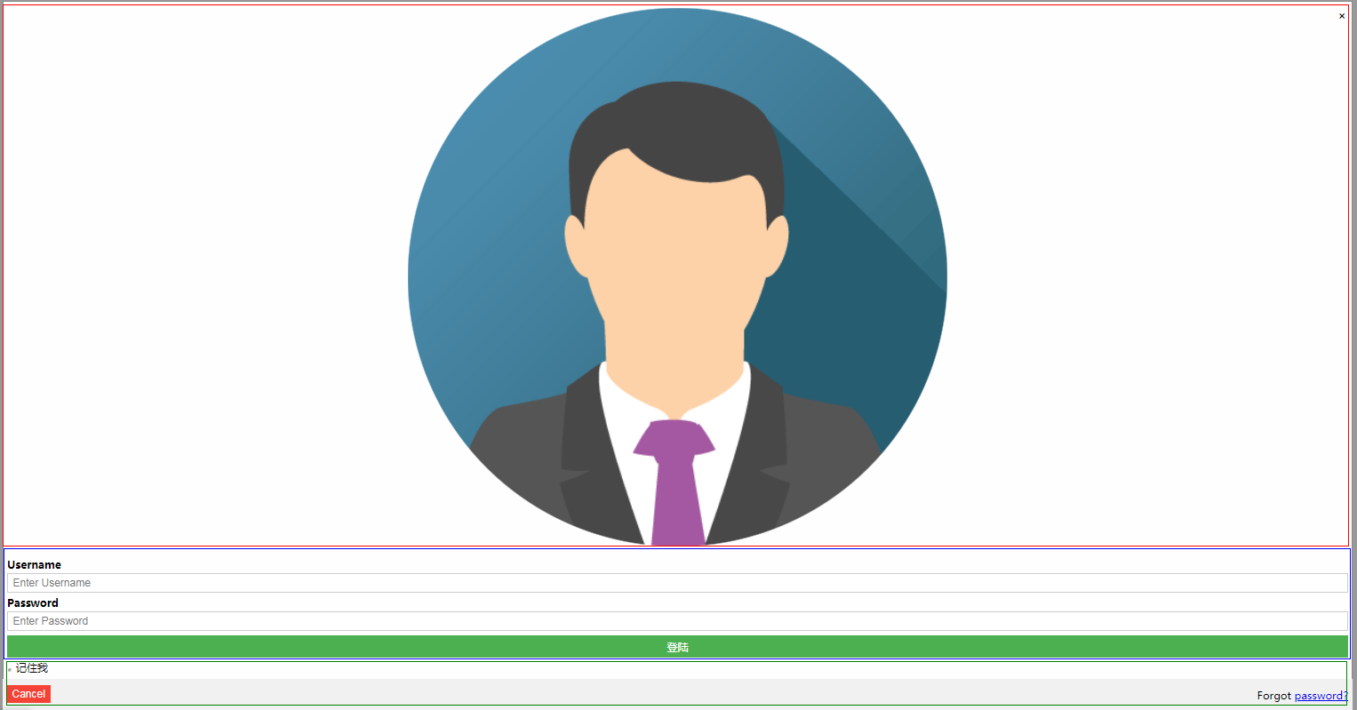
模态框效果,模态框展示登录或注册表单,就不用再跳转到login.html。只需点击一下按钮弹出登录表单即可。3个效果,点击弹出,右上角的×号,和点击左下角的cancel按钮。
登录表单
代码如下
<!DOCTYPE html>
<html>
<head lang="en">
<meta charset="UTF-8">
<title></title>
</head>
<style>
/* Full-width input fields */
input[type=text], input[type=password] {
width: 100%;
padding: 12px 20px;
margin: 8px 0;
display: inline-block;
border: 1px solid #ccc;
box-sizing: border-box;
}
/* Set a style for all buttons */
button {
background-color: #4CAF50;
color: white;
padding: 14px 20px;
margin: 8px 0;
border: none;
cursor: pointer;
width: 100%;
}
button:hover {
opacity: 0.8;
}
/* Extra styles for the cancel button */
.cancelbtn {
width: auto;
padding: 10px 18px;
background-color: #f44336;
}
/* Center the image and position the close button */
.imgcontainer {
text-align: center;
margin: 24px 0 12px 0;
position: relative;
}
img.avatar {
width: 40%;
border-radius: 50%;
}
.container {
padding: 16px;
}
span.psw {
float: right;
padding-top: 16px;
}
/* The Modal (background) */
.modal {
display: none; /* Hidden by default */
position: fixed; /* Stay in place */
z-index: 1; /* Sit on top */
left: 0;
top: 0;
width: 100%; /* Full width */
height: 100%; /* Full height */
overflow: auto; /* Enable scroll if needed */
background-color: rgb(0,0,0); /* Fallback color */
background-color: rgba(0,0,0,0.4); /* Black w/ opacity */
padding-top: 60px;
}
/* Modal Content/Box */
.modal-content {
background-color: #fefefe;
margin: 5% auto 15% auto; /* 5% from the top, 15% from the bottom and centered */
border: 1px solid #888;
80%; /* Could be more or less, depending on screen size */
}
/* The Close Button (x) */
.close {
position: absolute;
right: 25px;
top: 0;
color: #000;
font-size: 35px;
font-weight: bold;
}
.close:hover,
.close:focus {
color: red;
cursor: pointer;
}
/* Add Zoom Animation */
.animate {
-webkit-animation: animatezoom 0.6s;
animation: animatezoom 0.6s
}
@-webkit-keyframes animatezoom {
from {-webkit-transform: scale(0)}
to {-webkit-transform: scale(1)}
}
@keyframes animatezoom {
from {transform: scale(0)}
to {transform: scale(1)}
}
/* Change styles for span and cancel button on extra small screens */
@media screen and (max- 300px) {
span.psw {
display: block;
float: none;
}
.cancelbtn {
width: 100%;
}
}
</style>
<body>
<h2>登录表单</h2>
<button onclick="document.getElementById('id01').style.display='block'" style="auto;">登录</button>
<div id="id01" class="modal">
<form class="modal-content animate" action="/action_page.php">
<div class="imgcontainer">
<!-- 点击×号,隐藏模态框-->
<span onclick="document.getElementById('id01').style.display='none'" class="close" title="Close Modal">×</span>
<img src="https://static.runoob.com/images/mix/img_avatar.png" alt="Avatar" class="avatar">
</div>
<div class="container">
<label><b>Username</b></label>
<input type="text" placeholder="Enter Username" name="uname" required>
<label><b>Password</b></label>
<input type="password" placeholder="Enter Password" name="psw" required>
<button type="submit">登陆</button>
<input type="checkbox" checked="checked"> 记住我
</div>
<div class="container" style="background-color:#f1f1f1">
<!-- 点击cancel按钮,把模态框隐藏-->
<button type="button" onclick="document.getElementById('id01').style.display='none'" class="cancelbtn">Cancel</button>
<span class="psw">Forgot <a href="#">password?</a></span>
</div>
</form>
</div>
</body>
</html>
<script>
    // 获取模型
    var modal = document.getElementById('id01');

    // 鼠标点击模型外区域关闭登录框
    window.onclick = function(event) {
        if (event.target == modal) {
            modal.style.display = "none";
        }
    }
</script>
模态框(model-content)有3个div组成,如图红、蓝‘、绿。