• 使用 WPF 创建预加载控件


    Introduction

    At the time when WPF applications do a very long process like getting response from a web server, download file from a distant server, search files, etc., this control can be used to make the wait time more interactive. This is an alternative method to create preloader by using WPF methods instead of using GIF animation images. GIF animation might require more bitmap processing.

    This demo will explain how to use this control in your projects. The solution used for this demo is created using Visual Studio 2008 (WPF, C#, .NET 3.5).

    Using the Code

    This user control is created with four rectangle blocks animated sequentially with Width property with a defined speed.
    The following XAML is to create the rectangle block: Block.xaml

    Height and width property is set by the PreLoaderControl.xaml control automatically. Developer would not require to change the values of these properties.

    <UserControl x:Class="PreLoader.CustomControls.Block"
        xmlns="http://schemas.microsoft.com/winfx/2006/xaml/presentation"
        xmlns:x="http://schemas.microsoft.com/winfx/2006/xaml"
        Height="Auto" Width="Auto">
        <Grid x:Name="PreLoaderBlock">
            <Rectangle Width="Auto" Height="Auto" Fill="Red" Margin="0">
                <Rectangle.Style>
                    <Style TargetType="{x:Type Rectangle}">
                        <Setter Property="RenderOptions.BitmapScalingMode" Value="NearestNeighbor" />
                        <Setter Property="RenderOptions.EdgeMode" Value="Aliased" />
                    </Style>
                </Rectangle.Style>
            </Rectangle>
        </Grid>
    </UserControl>

    The Fill property can be changed to your desired color or bind with a style theme.

    Fill="{DynamicResource PreLoaderColor}"

    The resource PreLoaderColor can be defined in the App.xaml or in any style theme.

    <ResourceDictionary>
        <SolidColorBrush x:Key="PreLoaderColor" Color="Red" />
    </ResourceDictionary>

    The following xaml is to define the animation: PreLoaderControl.xaml.

    The UserControl.Resources holds the definition for the storyboard animation targeting the Width property for all the four rectangle blocks defined in the Grid as shown below.

    The speed of the animation can be adjusted with the property SpeedRatio.

    Completed event is created in each storyboard to notify when the animation is completed respectively.

    <UserControl x:Class="PreLoader.CustomControls.PreLoaderControl"
        xmlns="http://schemas.microsoft.com/winfx/2006/xaml/presentation"
        xmlns:x="http://schemas.microsoft.com/winfx/2006/xaml" 
        xmlns:local="clr-namespace:PreLoader.CustomControls" 
        Height="{Binding}" Width="{Binding}" Loaded="UserControl_Loaded">
        <UserControl.Resources>
            <Storyboard x:Key="ProgressAnimation1" SpeedRatio="12">
                <DoubleAnimation Storyboard.TargetName="block1" 
                Storyboard.TargetProperty="Width" From="16" To="0"
                                 Completed="ProgressAnimation1_Completed" Duration="0:0:2"/>
            </Storyboard>
            <Storyboard x:Key="ProgressAnimation2" SpeedRatio="12">
                <DoubleAnimation Storyboard.TargetName="block2" 
                Storyboard.TargetProperty="Width" From="16" To="0" 
                                 Completed="ProgressAnimation2_Completed" Duration="0:0:2" />
            </Storyboard>
            <Storyboard x:Key="ProgressAnimation3" SpeedRatio="12">
                <DoubleAnimation Storyboard.TargetName="block3" 
                Storyboard.TargetProperty="Width" From="16" To="0" 
                                 Completed="ProgressAnimation3_Completed" Duration="0:0:2" />
            </Storyboard>
            <Storyboard x:Key="ProgressAnimation4" SpeedRatio="12">
                <DoubleAnimation Storyboard.TargetName="block4" 
                Storyboard.TargetProperty="Width" From="16" To="0"
                                 Completed="ProgressAnimation4_Completed" Duration="0:0:2" />
            </Storyboard>
        </UserControl.Resources>
        <Grid Width="Auto" Height="Auto" >
            <Grid HorizontalAlignment="Left" x:Name="gridBlock1" 
            VerticalAlignment="Top" Margin="0,0,0,0" >
                <local:Block x:Name="block1" RenderTransformOrigin="0.5,4.3689" 
                HorizontalAlignment="Stretch" Height="Auto" 
                Width="Auto" VerticalAlignment="Stretch">
                    <local:Block.RenderTransform>
                        <TransformGroup>
                            <ScaleTransform/>
                            <SkewTransform/>
                            <TranslateTransform/>
                        </TransformGroup>
                    </local:Block.RenderTransform>
                </local:Block>
            </Grid>
            <Grid HorizontalAlignment="Right" x:Name="gridBlock2" 
            VerticalAlignment="Top" Margin="0.5,0,0,0" >
                <local:Block x:Name="block2" RenderTransformOrigin="0.5,4.3689" 
                HorizontalAlignment="Stretch" Height="Auto" 
                Width="Auto" VerticalAlignment="Stretch">
                    <local:Block.RenderTransform>
                        <TransformGroup>
                            <ScaleTransform />
                            <SkewTransform/>
                            <TranslateTransform/>
                        </TransformGroup>
                    </local:Block.RenderTransform>
                </local:Block>
            </Grid>
            <Grid HorizontalAlignment="Right" x:Name="gridBlock3" 
            VerticalAlignment="Bottom" Margin="0.5,0.5,0,0" >
                <local:Block x:Name="block3" RenderTransformOrigin="0.5,4.3689" 
                HorizontalAlignment="Stretch" Height="Auto" 
                Width="Auto" VerticalAlignment="Stretch">
                    <local:Block.RenderTransform>
                        <TransformGroup>
                            <ScaleTransform/>
                            <SkewTransform/>
                            <TranslateTransform/>
                        </TransformGroup>
                    </local:Block.RenderTransform>
                </local:Block>
            </Grid>
            <Grid HorizontalAlignment="Left" x:Name="gridBlock4" 
            VerticalAlignment="Bottom" Margin="0,0.5,0,0" >
                <local:Block x:Name="block4" RenderTransformOrigin="0.5,4.3689" 
                HorizontalAlignment="Stretch" Height="Auto" 
                Width="Auto" VerticalAlignment="Stretch">
                    <local:Block.RenderTransform>
                        <TransformGroup>
                            <ScaleTransform />
                            <SkewTransform/>
                            <TranslateTransform/>
                        </TransformGroup>
                    </local:Block.RenderTransform>
                </local:Block>
            </Grid>
        </Grid>
    </UserControl>

    When the user control is loaded in the parent window, the width and height for all blocks is set automatically.

    <local:PreLoaderControl Height="32" Width="32" />

    Below is the code behind which actually controls the animation.

    namespace PreLoader.CustomControls
    {
        public partial class PreLoaderControl : UserControl
        {
    
            // Flag variables used as a toggle to animate the block in both directions
    
            private bool Animation1RuningForward = true;
            private bool Animation2RuningForward = true;
            private bool Animation3RuningForward = true;
            private bool Animation4RuningForward = true;
            private double blockWidth = 16;
    
            public PreLoaderControl()
            {
                InitializeComponent();
            }
    
            // Calculate the width and height property based on the size defined in the parent
            // window where the control is added and starts the animation #1.
    
            private void UserControl_Loaded(object sender, RoutedEventArgs e)
            {
                Double blockSplitWidth = this.Width / 100;
                if (blockSplitWidth > 0.50)
                    blockSplitWidth = 0.50;
                blockWidth = (this.Width / 2) - (blockSplitWidth * 4);
                double blockHeight = (this.Height / 2) - (blockSplitWidth * 4);
                gridBlock1.Width = blockWidth;
                gridBlock2.Width = blockWidth;
                gridBlock3.Width = blockWidth;
                gridBlock4.Width = blockWidth;
                gridBlock1.Height = blockHeight;
                gridBlock2.Height = blockHeight;
                gridBlock3.Height = blockHeight;
                gridBlock4.Height = blockHeight;
                StartAnimation("ProgressAnimation1", Animation1RuningForward);
            }
    
            // When the animation #1 is completed the following event function 
            // will start the animation #2
            // Animation1RunningForward is toggled to animate the width from and to 0
    
            private void ProgressAnimation1_Completed(object sender, EventArgs e)
            {
                Animation1RuningForward = !Animation1RuningForward;
                StartAnimation("ProgressAnimation2", Animation2RuningForward);
            }
    
            // When the animation #2 is completed the following event function 
            // will start the animation #3 
            // Animation2RunningForward is toggled to animate the width from and to 0
    
            private void ProgressAnimation2_Completed(object sender, EventArgs e)
            {
                Animation2RuningForward = !Animation2RuningForward;
                StartAnimation("ProgressAnimation3", Animation3RuningForward);
            }
    
            // When the animation #3 is completed the following event function 
            // will start the animation #4 
            // Animation3RunningForward is toggled to animate the width from and to 0
    
    
            private void ProgressAnimation3_Completed(object sender, EventArgs e)
            {
                Animation3RuningForward = !Animation3RuningForward;
                StartAnimation("ProgressAnimation4", Animation4RuningForward);
            }
    
            // When the animation #4 is completed the following event function 
            // will start the animation #1 
            // Animation4RunningForward is toggled to animate the width from and to 0
    
            private void ProgressAnimation4_Completed(object sender, EventArgs e)
            {
                Animation4RuningForward = !Animation4RuningForward;
                StartAnimation("ProgressAnimation1", Animation1RuningForward);
            }
    
            // Begins the storyboard animation specified in the storyboardResourceName variable
            // The RunForward flag will toggle the widthFrom, widthTo values from 0 to
            // the calculated block width and vice versa.
    
            private void StartAnimation(String storyboardResourceName, bool RunForward)
            {
                double widthFrom = blockWidth;
                double widthTo = 0;
                if (RunForward)
                {
                    widthFrom = blockWidth;
                    widthTo = 0;
                }
                else
                {
                    widthFrom = 0;
                    widthTo = blockWidth;
                }
                Storyboard storyboard = this.FindResource(storyboardResourceName) as Storyboard;
                DoubleAnimation doubleanimation = storyboard.Children[0] as DoubleAnimation;
                doubleanimation.From = widthFrom;
                doubleanimation.To = widthTo;
                storyboard.Begin();
            }
        }
    }

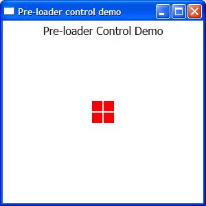
    Below is the sample WPF window loaded with the above defined preloader control.

    Create a new window, include the CustomControls folder containing Block.xaml and PreLoader.xaml.

    Add the PreLoaderControl with the local tag in the grid and specify the Height and Width property values.

    <Window x:Class="PreLoader.Window1"
        xmlns="http://schemas.microsoft.com/winfx/2006/xaml/presentation"
        xmlns:x="http://schemas.microsoft.com/winfx/2006/xaml"
        xmlns:local="clr-namespace:PreLoader.CustomControls"
        Title="Pre-loader control demo" Height="300" Width="300">
        <Grid>
            <Label Content="Pre-loader Control Demo" Height="28" 
            VerticalAlignment="Top" HorizontalContentAlignment="Center" 
            FontSize="16"></Label>
            <local:PreLoaderControl Height="32" Width="32" />
        </Grid>
    </Window>

    You can also add the control programmatically during run-time like the code below:

    using Your_Namespace.CustomControls;

    Your_Namespace will be the namespace defined in your solution and the CustomControls is the folder name where the usercontrol files are present.

    Below is the sample pop-up window which loads the PreLoaderControl programmatically in the gridloaderGrid.

    <Window x:Class="Your_NameSpace.WindowPreloader"
        xmlns="http://schemas.microsoft.com/winfx/2006/xaml/presentation"
        xmlns:x="http://schemas.microsoft.com/winfx/2006/xaml"
        Title="Status" Height="140" Width="250" 
        Background="Transparent" xmlns:my="clr-namespace:Your_Namespace"
        ResizeMode="NoResize" ShowInTaskbar="False" WindowStartupLocation="CenterScreen" 
        WindowStyle="None" Topmost="True" BorderThickness="0" AllowsTransparency="True"
        Closing="Window_Closing" Loaded="Window_Loaded" Icon="images/icon16.png">
        <Grid>
            <GroupBox Header="Processing..." Name="groupBoxHeader">
                <Grid x:Name="loaderGrid">
                    <Label Name="labelStatus" 
                    Content="Please wait..." VerticalContentAlignment="Center" 
                    HorizontalAlignment="Right" Width="106" />
                </Grid>
            </GroupBox>
        </Grid>
    </Window>

    The following code loads the PreLoader control in the Window_Loaded event dynamically. In this example, thePreLoader control is created with the size of 64 includes all required parameters (like alignment, margin, etc.) set and added as children to the grid loaderGrid.

    public partial class WindowPreloader : Window
    {
        PreLoader preloader = null;
    
        public WindowPreloader()
        {
            InitializeComponent();
        }
    
        private void Window_Closing(object sender, System.ComponentModel.CancelEventArgs e)
        {
            preloader = null;
            //...
            // include other finalizing statements if you require
            //...
        }
    
        private void Window_Loaded(object sender, RoutedEventArgs e)
        {
            preloader = CommonFunctions.GetPreloader(64);
            preloader.HorizontalAlignment = HorizontalAlignment.Left;
            preloader.VerticalAlignment = VerticalAlignment.Center;
            preloader.Margin = new Thickness(20, 0, 0, 0);
            loaderGrid.Children.Add(preloader);
        }
    } 

    The following function will return the PreLoader control with the defined width and height specified in thesize parameter.

    public PreLoader GetPreloader(int size)
    {
        PreLoader preloader = new PreLoader();
        try
        {
            preloader.VerticalAlignment = VerticalAlignment.Center;
            preloader.HorizontalAlignment = HorizontalAlignment.Center;
            preloader.Width = size;
            preloader.Height = size;
            preloader.ToolTip = "Processing...";
        }
        catch (Exception ex)
        {
            //throw ex;
        }
        return (preloader);
    }

    As Control Library

    You can also use this control by adding reference as the control library. Both the source and compiled DLL is available for download.

    Create a new WPF project and include the existing (control library) project. Now add the reference ofDMACControls to your project.

    In the below screenshot, the project is created as PreLoaderLibSample and the DMACControls is included in the reference.

    In Window1 design, include the reference to the DMACControls as shown below:

    xmlns:local="clr-namespace:DMACControls;assembly=DMACControls"

    Now add the PreLoaderControl to your grid in Window1 with local tag and set the desired values forWidth and Height properties:

    <Window x:Class="PreloaderLibSample.Window1"
        xmlns="http://schemas.microsoft.com/winfx/2006/xaml/presentation"
        xmlns:x="http://schemas.microsoft.com/winfx/2006/xaml"
        xmlns:local="clr-namespace:DMACControls;assembly=DMACControls"
        Title="Window1" Height="300" Width="300">
        <Grid>
            <Label Content="Pre-loader Control Demo" Height="28" 
            VerticalAlignment="Top" HorizontalContentAlignment="Center" 
            FontSize="16"></Label>
            <local:PreLoaderControl Height="32" Width="32" />
        </Grid>
    </Window>

    Ensure you set a static color or a dynamic resource style of the Block.xaml in the DMACControls project.

    Changing the Color

    Initially in this tip, the Rectangle is filled with static color Red as shown below:

    <Rectangle Width="Auto" Height="Auto" Fill="Red" Margin="0">

    Using the control library, the Fill property can be dynamically set with value set in app resources or in theme styles. From the below example, the Fill value for the Rectangle is set in App.xaml

    <Rectangle Width="Auto" Height="Auto" 
    Fill="{DynamicResource PreLoaderColor}" Margin="0">

    This can be found in Block.xaml in the DMACControls project:

    <UserControl x:Class="DMACControls.Block"
        xmlns="http://schemas.microsoft.com/winfx/2006/xaml/presentation"
        xmlns:x="http://schemas.microsoft.com/winfx/2006/xaml"
        Height="Auto" Width="Auto">
        <Grid x:Name="PreLoaderBlock">
            <Rectangle Width="Auto" Height="Auto" 
            Fill="{DynamicResource PreLoaderColor}" Margin="0">
                <Rectangle.Style>
                    <Style TargetType="{x:Type Rectangle}">
                        <Setter Property="RenderOptions.BitmapScalingMode" Value="NearestNeighbor" />
                        <Setter Property="RenderOptions.EdgeMode" Value="Aliased" />
                    </Style>
                </Rectangle.Style>
            </Rectangle>
        </Grid>
    </UserControl>

    Open App.xaml in your WPF application project and set the color as shown below in key PreLoaderColor. AnyFill style like gradients, solid color, dynamic colors... can be set in the key PreLoaderColor.

    <Application x:Class="PreloaderLibSample.App"
        xmlns="http://schemas.microsoft.com/winfx/2006/xaml/presentation"
        xmlns:x="http://schemas.microsoft.com/winfx/2006/xaml"
        StartupUri="Window1.xaml">
        <Application.Resources>
             <SolidColorBrush x:Key="PreLoaderColor" Color="Orange" />
        </Application.Resources>
    </Application>

    Ensure the key is defined in the App.xaml or in any theme files before you assign the DynamicResource in theFill property.

  • 相关阅读:
    android 学习
    android 学习
    阅读笔记《人月神话》1
    android 学习
    android 学习
    android 学习
    android 学习
    android 学习(家庭记账本的开发 6)
    每日日报
    每日日报
  • 原文地址:https://www.cnblogs.com/mschen/p/4313698.html
Copyright © 2020-2023  润新知