• CSS3、jQuery实现3D翻书动画


    使用CSS3 ,jQuery实现点击翻书动画效果,完整效果可在firefox中查看

    HTML

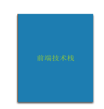
    <div class="desktop">
                <div class="book">
                    <div class="page bg end">
                        <div class="front">谢谢阅读</div>
                    </div>
                    <div class="page">
                        <div class="back">
                            <p>JavaScript很重要</p>
                        </div>
                        <div class="front">JavaScript </div>
                    </div>
                    <div class="page">
                        <div class="back">
                            <p>CSS3非常强大</p>
                        </div>
                        <div class="front">CSS3</div>
                    </div>
                    <div class="page">
                        <div class="back">
                            <p>HTML5新特性不错哦</p>
                        </div>
                        <div class="front">HTML5</div>
                    </div>
                    <div class="page bg">
                        <div class="back">
                            <p>作者:M先生</p>
                            <p>个人博客:</p>
                            <a href="https://home.cnblogs.com/u/mp1994/">https://home.cnblogs.com/u/mp1994/</a>
                        </div>
                        <div class="front">前端技术栈</div>
                    </div>
                </div>
            </div>

    CSS

    /* 简单翻书动画开始 */
                .desktop{
                    background-size: cover;
                    display: flex;
                    justify-content: center;
                    align-items: center;
                    width: 300px;
                    height: 400px;
                    position: absolute;
                    left: 50%;
                    top: 50%;
                    transform: translate(-50%, -50%);
                }
                .book{
                    width: 300px;
                    height: 400px;
                    position: absolute;
                    /* 倾斜30度角 */
                    transform: rotateX(30deg);
                    transform-style: preserve-3d;
                    perspective: 1200;
                    font-size: 30px;
                    color: #9ACD32;
                    box-shadow: 0 6px 10px 0 rgba(0,0,0,.6);
                }
                .page{
                    width: 100%;
                    height: 100%;
                    position: absolute;
                    background-color: #eee;
                        
                    /* 翻转轴left */
                    transform-origin: left;
                    /* backface-visibility: hidden; */
                    border-left: 2px solid saddlebrown;
                    box-sizing: border-box;
                    z-index: ;
                }
                .bg{
                    background-color: #1D7DB1;
                }
                .end{
                    z-index: -999999;
                }
                /* 正面 */
                .front{
                    position: absolute;
                    width: 100%;
                    height: 100%;
                    display: flex;
                    justify-content: center;
                    align-items: center;
                    background-color: inherit;
                }
                /* 背面 */
                .back{
                    position: absolute;
                    width: 100%;
                    height: 100%;
                    display: flex;
                    flex-direction: column;
                    justify-content: center;
                    align-items: center;
                    background-color: inherit;
                    color: red;
                    font-size: 12px;
                    font-weight: bold;
                    transform: rotateY(180deg);
                }
                @keyframes turning {
                    to{
                        transform: rotateY(-160deg);
                    }
                }
                @keyframes resetBook{
                    from{
                        transform: rotateY(-160deg);
                    }
                    to{
                        transform: rotateY(0deg);
                    }
                }
                
    /* 简单翻书动画结束 */

    JavaScript

    <script src="https://cdn.bootcss.com/jquery/3.4.1/jquery.min.js"></script>
        <script>
            $(function () {
                const $page = $('.page')
                let isClick = true
                $page.click(function (e){
                    // 动画执行时禁止再次点击
                    if (isClick) {
                        isClick = false
                        setTimeout( () => {
                            isClick = true
                        }, 2000)
                        
                        // 获取当前点击元素下标
                        const index = $(this).index()
                        const $childFront = $(this).children('.front')
                        const $childBack = $(this).children('.back')
                        
                        // 由于背部封面(下标0)是不动的 因此判断下标大于0才增减class
                        if (index > 0) { 
                            // 判断是否已经翻过 已经翻过则翻回
                            if ( $(this).hasClass('flag') ) {
                                // 设置css执行动画效果
                                $(this).css({
                                    "animation": "resetBook 2s linear 1"
                                })
                                // 转到一半时 设置正反面 z-index
                                setTimeout(() => {
                                    $(this).css({
                                        "z-index": index
                                    })
                                    $childFront.css({'z-index': index})
                                    $childBack.css({'z-index': index - 1})
                                }, 1000)
                                
                                // 去除标记
                                $(this).removeClass('flag')
                                
                            } else {
                                // 设置css执行动画效果
                                $(this).css({
                                    "animation": "turning 2s  linear 1",
                                    "animation-fill-mode": "forwards",
                                })
                                
                                // 动画完成后将设置翻转后的z-index 
                                // 兼容chrome浏览器
                                const isChrome = navigator.userAgent.indexOf('Chrome')
                                if (isChrome > -1) {
                                    setTimeout(() => {
                                        $(this).css({
                                            'z-index': index, 
                                            "box-shadow": "0 6px 10px rgba(0,0,0,.2)"
                                        })    
                                    },2000)
                                } else {
                                    setTimeout(() => {
                                        $(this).css({
                                            'z-index': index * -1, 
                                            "box-shadow": "0 6px 10px rgba(0,0,0,.2)"
                                        })    
                                    },2000)
                                }
                                // 转到一半时 设置正反面 z-index
                                setTimeout(() => {
                                    $childFront.css({'z-index': index})
                                    $childBack.css({'z-index': index + 1})
                                }, 1000)
                                
                                // 添加标记
                                $(this).addClass('flag')
                            }
                        }    
                    }
                })
            })
        </script>

    效果如下:

  • 相关阅读:
    【转贴】龙芯生态产品和解决方案巡展(第四篇)——存储
    【转贴】龙芯生态产品和解决方案巡展(第五篇)——云终端
    【转贴】龙芯生态产品和解决方案巡展(第六篇) ——操作系统
    【转贴】龙芯生态产品和解决方案巡展(一)
    【转贴】龙芯生态产品和解决方案巡展(第二篇)——笔记本电脑
    【转贴】龙芯生态产品和解决方案巡展(第三篇)——服务器
    【转贴】我们的龙芯3号---致龙芯15周年
    【转贴】GS464/GS464E
    【转贴】Windows virtio 驱动
    【转贴】Windows常用命令实例
  • 原文地址:https://www.cnblogs.com/mp1994/p/10827074.html
Copyright © 2020-2023  润新知