关于多子级元素充满父级元素高度的布局方式,听着有些绕口,上个图应该就能很清楚的理解这标题的意思了;
如图:左右分栏的情况下,有顶部和底部导航,且在屏幕高度不定的时候(移动端,多设备适配),如何不适用js来让内容区自适应扩展,填满父级剩下的高度呢?
首先分两种情况:
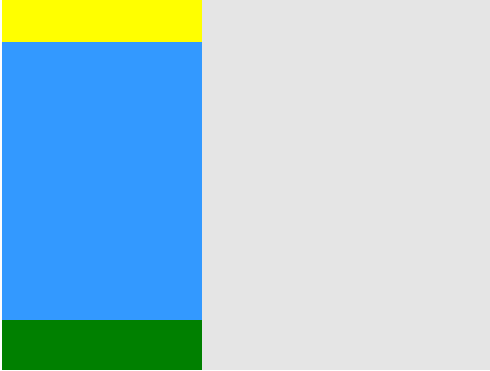
一、顶部和底部导航为固定高度时,这种情况挺常见的,也是相对比较简单的一种情况;
方法1:使用box-sizing: border-box; 配合 height: 100%; 和上下padding来达到全屏侧边的效果;
<!DOCTYPE html>
<html lang="en">
<head>
	<meta charset="UTF-8">
	<title>Document</title>
	<style>
		html, body {height: 100%;}
		.box {
			height: 100%;
		}
		.left {
			position: relative;
			float: left;
			 200px;
			height: 100%;
			padding: 50px 0;
			box-sizing: border-box;
			background: #39f;
		}
		.top {
			height: 50px;
			background: yellow;
		}

		.bottom {
			position: absolute;
			bottom: 0;
			 100%;
			height: 50px;
			background: green;
		}
		.right {
			height: 100%;
			padding-left: 200px;
			background: #e5e5e5;
		}
	</style>
</head>
<body>
	<div class="box">
		<div class="top"></div>
		<div class="left"></div>
		<div class="bottom"></div>
		<div class="right"></div>
	</div>
</body>
</html>
效果预览图:box-sizing方式效果查看;
方法二:使用定位的top、bottom来自适应内容高度
同时设置top值和bottom值时,定位元素会自动充满相对定位元素高度-top-bottom后剩下的内容高度;
<!DOCTYPE html>
<html lang="en">
<head>
	<meta charset="UTF-8">
	<title>Document</title>
	<style>
		html, body {height: 100%;}
		.box {
			height: 100%;
		}
		.left {
			position: relative;
			float: left;
			 200px;
			height: 100%;
		}
		.top {
			height: 50px;
			background: yellow;
		}
		.content {
			position: absolute;
			top: 50px;
			bottom: 50px;
			 100%;
			background: #39f;
		}
		.bottom {
			position: absolute;
			bottom: 0;
			 100%;
			height: 50px;
			background: green;
		}
		.right {
			height: 100%;
			padding-left: 200px;
			background: #e5e5e5;
		}
	</style>
</head>
<body>
	<div class="box">
		<div class="left">
			<div class="top"></div>
			<div class="content"></div>
			<div class="bottom"></div>
		</div>
		<div class="right"></div>
	</div>
</body>
</html>
效果预览: 定位设置top、bottom自适应内容高度效果;
情况一应该还有其他更好的方法,等发现后再来添加,如果各位有什么好方法请在评论中告诉我,谢谢;
情况二:同样布局,但是顶部和底部的导航高度不固定;
例如下图:

顶部使用的广告图片设置width100%,使其高度自己扩展,所以在不同屏幕中,图片高度不同,无法使用情况一的两种方法,
具体的使用方法:
<!DOCTYPE html>
<html lang="en">
<head>
    <meta charset="UTF-8">
    <title>Document</title>
    <!-- <meta name="veiwport" content="width=device-width, initial-scale=1.0, maximum-scale=1.0, user-scalabel=0"> -->
    <meta name="viewport" content="width=device-width, initial-scale=1.0, maximum-scale=1.0, user-scalable=0">

    <style>
        html, body {height: 100%;margin: 0;}
        .box {
            width: 100%;
            height: 100%;
        }
        .content:after {
            content: '200B';
            clear: both;
            display: block;
            height: 0;
        }
        .left {
            overflow: hidden;
            float: left;
            width: 25%;
            padding-bottom: 99999px;
            margin-bottom: -99999px;
            background: #39f;
        }

        .bottom {
            position: fixed;
            bottom: 0;
            width: 100%;
            height: 50px;
            background: green;
        }
        .right {
            padding-left: 25%;
            background: #e5e5e5;
        }
    </style>
</head>
<body>
    <div class="box">
        <img src="57792b4ee20e3.jpg" width="100%" alt="">
        <div class="content">
            <div class="left"></div>
            <div class="right">
                <br>
            </div>
        </div>
        <div style="height: 50px;background: red; clear: both;"></div>
        <div class="bottom"></div>
    </div>
</body>
</html>
</body>
</html>
效果预览: 查看 由于样式按移动端写的,请使用控制台移动端调试页面查看;
中部红色元素是为了防止左右侧内容过长被底部固定定位的footer遮住,请添加right元素内容,就可以看到效果,实际使用的时候,去掉背景色就不会有影响了。
暂时就想到这些,应该还有更好的办法来实现这么布局。
2017.04.24修改:最近看了flexbox的属性,发现可以很完美的解决这种问题,就是兼容性惨不忍睹 IE10+;
具体代码:
<!doctype html>
<html>
<head>
    <meta charset="UTF-8">
    <title>H5course</title>


</head>
<body>
    <style>
        .HolyGrail {
          display: flex;
          min-height: 100vh;
          flex-direction: column; /*最外层垂直排列*/
        }

        header,
        footer {
          height: 50px;
          background: orange;
        }

        .HolyGrail-body { /*内容区默认平行排列*/
          display: flex;
          flex: 1; /*缩写 flex-basis:0%;flex-grow:1;flex-shrink:1;*/
        }

        .HolyGrail-content {
          flex: 1;
          background: skyblue;
        }

        .HolyGrail-nav, .HolyGrail-ads {
          /* 两个边栏的宽度设为12em */
          flex: 0 0 12em;
          background: yellow;
        }

        .HolyGrail-nav {
          /* 导航放到最左边 */
          order: -1;
        }
    </style>
    <div class="HolyGrail">
      <header>...</header>
      <div class="HolyGrail-body">
        <main class="HolyGrail-content">...</main>
        <nav class="HolyGrail-nav">...</nav>
        <aside class="HolyGrail-ads">...</aside>
      </div>
      <footer>...</footer>
    </div>
</body>
</html>
效果预览:flex;
display:flex;确实很强大,就是对于位置和大小的控制有点复杂,还需要多练习。