flex布局中flex-basis|flex-grow|flex-shrink
整个才是正确的算法
flex-basis(基准值)
可以设置flex布局中容器的宽度,如果同时存在width属性,将把它给覆盖!
它也是计算flex-grow和flex-shrink的基准值,默认值是auto;
flex-grow(扩展比例)
当flex-item的总宽度小于容器时,flex-grow设置为0(默认值),那么他将不安比例来均分剩余的空间;
<!DOCTYPE html>
<html xmlns="http://www.w3.org/1999/xhtml">
<head>
<meta http-equiv="Content-Type" content="text/html; charset=utf-8" />
<title>无标题文档</title>
<style type="text/css">
 .flex-container{
     width:400px;
     background:red;
     display:flex;
     /*
      总的空间空间长度400px
      flex-item:100+100=200
      child1分得的空间:=(1/3)*200=66.7
      child1最终的宽度:=flex-basis+66.7=166.666666666(近似值)

      同理可以计算 child2的值:
     */
 }
 .flex-item:nth-child(1){
      flex-basis:100px;/*flex-basis将覆盖width的属性值滴呀*/
      background:black;
      width:200px;
      flex-grow:1;
 }
 .flex-item:nth-child(2){
      flex-basis:100px;
      background:green;
      flex-grow:2;
 }
</style>
</head>

<body>
   <div class="flex-container">
     <div class="flex-item">1</div>
     <div class="flex-item">2</div>
   </div>
</body>
</html>
效果:

flex-shrink(收缩比例)
默认值为1;(ps:收缩比例的算法和扩展算法是不一样的呢!)
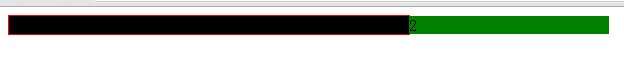
<!DOCTYPE html>
<html xmlns="http://www.w3.org/1999/xhtml">
<head>
<meta http-equiv="Content-Type" content="text/html; charset=utf-8" />
<title>无标题文档</title>
<style type="text/css">
 .flex-container{
     width:400px;
     background:red;
     display:flex;
     border:1px solid red;
     /*
      超出的空间:400-(400+200)=-200;
      child要减去的空间:(1/3)*200=66.66
      最总的空间值:400-66.6=333.4(这种算法是错误滴呀)

      正确的算法:
      超出空间:400-(400+200)=-200;
      加权总和:400*1+200*2=800;
      child1被移除的比例:400*1/800*200=100
      child1的最终宽度:400-100=300

      同理可以求child2

     */
 }
 .flex-item:nth-child(1){
      flex-basis:400px;/*flex-basis将覆盖width的属性值滴呀*/
      background:black;
      flex-shrink:1;
 }
 .flex-item:nth-child(2){
      flex-basis:200px;
      background:green;
      flex-shrink:2;
 }
</style>
</head>

<body>
   <div class="flex-container">
     <div class="flex-item">1</div>
     <div class="flex-item">2</div>
   </div>
</body>
</html>
收缩前后对比:

flex:flex-grow | flex-shrink | flex-basis
默认值:0 1 auto;
无论flex-item被填充的多款,只要我们设置
.flex-item:nth-child(1){flex:1}
.flex-item:nth-child(2){flex:2}
.flex-item:nth-child(1){flex:1}
它是将整个容器分成:1:2:1了,
如果我们这样设置:
.flex-item{flex:1},空间将均分,是整个容器空间,而不是多余的空间;
如果你加上了flex-basis,那么计算就更为复杂!