What is Chart.js?
Chart.js is a well-recognized JavaScript library, and It is used to represent the data using the HTML5 canvas. It allows us to build dynamic as well as static charts, and it comes with full animation support for the various charts. It takes data in the JSON form, so it is merely simple to use it with any programming language.
Table of contents
- Set up Angular Project
- Configure Chart.js and ng2-charts Library in Angular 9
- Line Chart
- Bar Chart
- Doughnut Chart
- Radar Chart
- Pie Chart
- Bubble Chart
Set up Angular Project
Install and setup Angular project by running the following command.ng new angular-charts-app
# Would you like to add Angular routing?
# Select y and Hit Enter.
# Which stylesheet format would you like to use? (Use arrow keys)
# Choose CSS and hit Enter
Next, navigate to the project folder.
cd angular-charts-app
Create components to show charts example in Angular.
ng g c bar-chart

ng g c bubble-chart

ng g c line-chart

ng g c pie-chart

ng g c radar-chart

ng g c doughnut-chart
Install Bootstrap to manage the layout of Angular 8 chart app, however you can skip this step if you don’t want to use Bootstrap.
yarn add -D bootstrap
Import the bootstrap.min.css file into the angular.json file.
"styles": [
      "node_modules/bootstrap/dist/css/bootstrap.min.css",
      "src/styles.css"
]
Configure Chart.js and ng2-charts Library in Angular 9
Install ng2-charts and Chart.js libraries via yarn in Angular 9 project. We'll use ng2-charts along with Chart.js library in our Angular application to show the various charts.
yarn add ng2-charts chart.js
The given command will install both the packages and save the entries inside the package.json file.
Next, import ChartsModule in app.module.ts file.
import { ChartsModule } from 'ng2-charts';

@NgModule({
  declarations: [...],
  imports: [
    ChartsModule
  ],
  providers: [...],
  bootstrap: [...]
})

export class AppModule { }
Line Chart
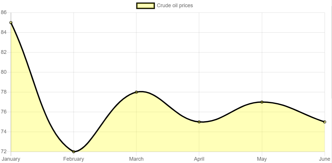
A line chart is a basic chart, and it is also known as the line plot, line curve, and line graph chart. It represents the data in a sequence of information with the small associated points called markers.Let’s represent the crude oil prices for 6 months via line chart in our Angular app using ng2-charts.
Go to line-chart.component.ts file and add the following code in it.
import { Component } from '@angular/core';
import { ChartDataSets, ChartOptions } from 'chart.js';
import { Color, Label } from 'ng2-charts';

@Component({
  selector: 'app-line-chart',
  templateUrl: './line-chart.component.html',
  styleUrls: ['./line-chart.component.css']
})

export class LineChartComponent {

  lineChartData: ChartDataSets[] = [
    { data: [85, 72, 78, 75, 77, 75], label: 'Crude oil prices' },
  ];

  lineChartLabels: Label[] = ['January', 'February', 'March', 'April', 'May', 'June'];

  lineChartOptions = {
    responsive: true,
  };

  lineChartColors: Color[] = [
    {
      borderColor: 'black',
      backgroundColor: 'rgba(255,255,0,0.28)',
    },
  ];

  lineChartLegend = true;
  lineChartPlugins = [];
  lineChartType = 'line';

}
Go to line-chart.component.html file and include the following code in it.
<div class="chart-wrapper">
    <canvas baseChart
        [datasets]="lineChartData"
        [labels]="lineChartLabels"
        [options]="lineChartOptions"
        [colors]="lineChartColors"
        [legend]="lineChartLegend"
        [chartType]="lineChartType"
        [plugins]="lineChartPlugins">
    </canvas>
</div>
Result:
Bar Chart
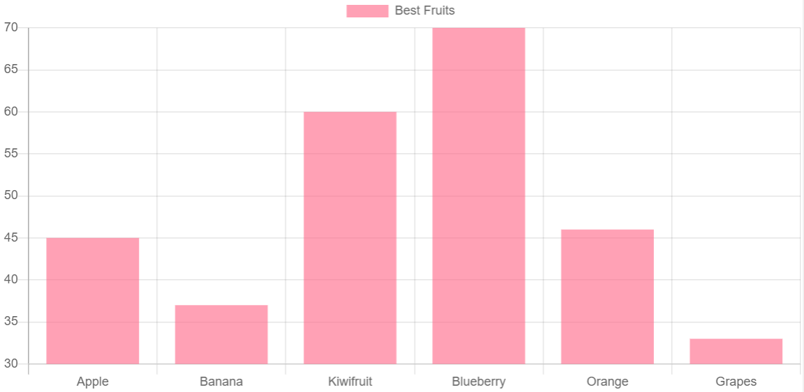
A bar chart is a well-know chart that helps in representing the information categorically with rectangular bars. Data can be shown vertically or horizontally, and the displayed values are proportionate to the heights or length of the values defined. Let us display the best fruit data using vertical bar chart in Angular 8.Go to bar-chart.component.ts file and add the given below code.
import { Component } from '@angular/core';
import { ChartOptions, ChartType, ChartDataSets } from 'chart.js';
import { Label } from 'ng2-charts';

@Component({
  selector: 'app-bar-chart',
  templateUrl: './bar-chart.component.html',
  styleUrls: ['./bar-chart.component.css']
})
export class BarChartComponent {

  barChartOptions: ChartOptions = {
    responsive: true,
  };
  barChartLabels: Label[] = ['Apple', 'Banana', 'Kiwifruit', 'Blueberry', 'Orange', 'Grapes'];
  barChartType: ChartType = 'bar';
  barChartLegend = true;
  barChartPlugins = [];

  barChartData: ChartDataSets[] = [
    { data: [45, 37, 60, 70, 46, 33], label: 'Best Fruits' }
  ];
}
Go to bar-chart.component.html file and add the given below code.
<div class="chart-wrapper">
  <canvas
    baseChart
    [datasets]="barChartData"
    [labels]="barChartLabels"
    [options]="barChartOptions"
    [plugins]="barChartPlugins"
    [legend]="barChartLegend"
    [chartType]="barChartType"
  >
  </canvas>
</div>
Result:
Doughnut Chart
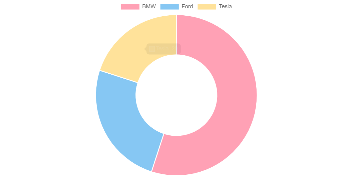
Doughnut charts are used to prove a "part-to-whole" association, and In doughnut charts, all the section together express 100%. Doughnut charts serve the purpose of representing the data for a tiny number of categories (2-5).
Show the car sales data between three companies BMW, Ford and Tesla using Doughnut chart in Angular with ng2-charts module.
Go to doughnut-chart.component.ts file and add the given below code.
import { Component } from '@angular/core';
import { Label, MultiDataSet } from 'ng2-charts';
import { ChartType } from 'chart.js';

@Component({
  selector: 'app-doughnut-chart',
  templateUrl: './doughnut-chart.component.html',
  styleUrls: ['./doughnut-chart.component.css']
})
export class DoughnutChartComponent {

  doughnutChartLabels: Label[] = ['BMW', 'Ford', 'Tesla'];
  doughnutChartData: MultiDataSet = [
    [55, 25, 20]
  ];
  doughnutChartType: ChartType = 'doughnut';

}
Go to doughnut-chart.component.html file and add the following code.
<div class="chart-wrapper">
  <canvas
    baseChart
    [data]="doughnutChartData"
    [labels]="doughnutChartLabels"
    [chartType]="doughnutChartType"
  >
  </canvas>
</div>
Result:
Radar Chart
A radar chart is the best way to graphically displaying the multivariate information in the formation of a two-dimensional graph of three or more quantitative variables represented on axes beginning from the corresponding point
Let us analysis employees' skills using a radar chart in Angular.
Go to radar-chart.component.ts file and add the following code in it.
import { Component } from '@angular/core';
import { RadialChartOptions, ChartDataSets, ChartType } from 'chart.js';
import { Label } from 'ng2-charts';

@Component({
  selector: 'app-radar-chart',
  templateUrl: './radar-chart.component.html',
  styleUrls: ['./radar-chart.component.css']
})
export class RadarChartComponent {

  public radarChartOptions: RadialChartOptions = {
    responsive: true,
  };
  public radarChartLabels: Label[] = ['Punctuality', 'Communication', 'Problem Solving',
    'Team Player', 'Coding', 'Technical Knowledge', 'Meeting Deadlines'];

  public radarChartData: ChartDataSets[] = [
    { data: [0, 1, 2, 3, 4, 5, 6], label: 'Employee Skill Analysis' }
  ];
  public radarChartType: ChartType = 'radar';

}
Go to radar-chart.component.html file and add the given below code.
<div class="chart-wrapper">
  <canvas
    baseChart
    [datasets]="radarChartData"
    [options]="radarChartOptions"
    [labels]="radarChartLabels"
    [chartType]="radarChartType"
  >
  </canvas>
</div>
Result:

Pie Chart
The name of the circle chart also recognizes a pie chart. It is a circular statistical graphic, which is separated into slices to demonstrate mathematical symmetries. In a pie chart, the arc length of per slice is proportionate to the amount it serves.
Now, let's try to represent favorite move data using pie chart in Angular.
Go to pie-chart.component.ts file and add the given below code.
import { Component } from '@angular/core';
import { ChartOptions, ChartType } from 'chart.js';
import { Label, SingleDataSet, monkeyPatchChartJsTooltip, monkeyPatchChartJsLegend } from 'ng2-charts';

@Component({
  selector: 'app-pie-chart',
  templateUrl: './pie-chart.component.html',
  styleUrls: ['./pie-chart.component.css']
})
export class PieChartComponent {

  public pieChartOptions: ChartOptions = {
    responsive: true,
  };
  public pieChartLabels: Label[] = [['SciFi'], ['Drama'], 'Comedy'];
  public pieChartData: SingleDataSet = [30, 50, 20];
  public pieChartType: ChartType = 'pie';
  public pieChartLegend = true;
  public pieChartPlugins = [];

  constructor() {
    monkeyPatchChartJsTooltip();
    monkeyPatchChartJsLegend();
  }

}
Go to pie-chart.component.html file and include the following code.
<div class="chart-wrapper">
  <canvas
    baseChart
    [datasets]="radarChartData"
    [options]="radarChartOptions"
    [labels]="radarChartLabels"
    [chartType]="radarChartType"
  >
  </canvas>
</div>
Result:

Bubble Chart
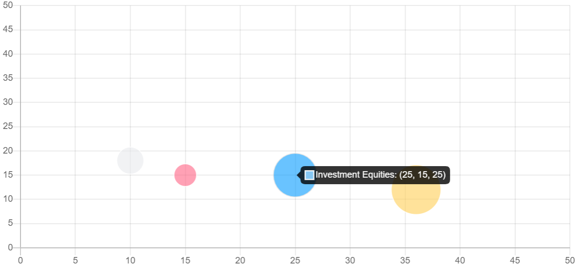
A bubble chart is best suitable to represent the data in 3 dimensions. Per entity with its triplet of correlated data is plotted as a disk that proves two of the vᵢ values through the disk’s xy location and the third through its size.Next, we will show investment equities via Bubble chart in Angular 9.
Go to bubble-chart.component.ts file and include the following code.
import { Component } from '@angular/core';
import { ChartOptions, ChartType, ChartDataSets } from 'chart.js';

@Component({
  selector: 'app-bubble-chart',
  templateUrl: './bubble-chart.component.html',
  styleUrls: ['./bubble-chart.component.css']
})
export class BubbleChartComponent {

  public bubbleChartOptions: ChartOptions = {
    responsive: true,
    scales: {
      xAxes: [{
        ticks: {
          min: 0,
          max: 50,
        }
      }],
      yAxes: [{
        ticks: {
          min: 0,
          max: 50,
        }
      }]
    }
  };

  public bubbleChartType: ChartType = 'bubble';
  public bubbleChartLegend = true;

  public bubbleChartData: ChartDataSets[] = [
    {
      data: [
        { x: 15, y: 15, r: 15 },
        { x: 25, y: 15, r: 25 },
        { x: 36, y: 12, r: 33 },
        { x: 10, y: 18, r: 18 },
      ],
      label: 'Investment Equities',
    },
  ];
}
Go to bubble-chart.component.html file and include the following code.
<div class="chart-wrapper">
  <canvas
    baseChart
    [datasets]="bubbleChartData"
    [options]="bubbleChartOptions"
    [legend]="bubbleChartLegend"
    [chartType]="bubbleChartType"
  >
  </canvas>
</div>
Verify the result in the browser, bubble chart will look like this.