版本: ant-design-vue 1.6.2
效果(按住标题栏拖动,拖动超出窗口会自动出现滚动条):
组件文件结构:
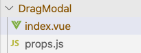
index.vue
(需要注意的是footer和title的处理,其他的props都是一致的)


<template>
  <a-modal
    :class="[modalClass, simpleClass]"
    :visible="visible"
    v-bind="$props"
    :footer="null"
    :bodyStyle="{padding:0}"
    @ok="handleOk"
    @cancel="handleCancel">
    <div class="ant-modal-body" :style="bodyStyle">
      <slot></slot>
    </div>
    <div class="ant-modal-footer relative">
      <slot name="footer"></slot>
    </div>
    <div v-if="!title && title !== ''" slot="title">
      <slot name="title"></slot>
    </div>
  </a-modal>
</template>

<script>
import props from './props.js'
var mouseDownX = 0
var mouseDownY = 0
var deltaX = 0
var deltaY = 0
var sumX = 0
var sumY = 0

var header = null
var contain = null
var modalContent = null

var onmousedown = false
export default {
  name: 'DragModal',
  mixins: [props],
  props: {
    // 容器的类名
    modalClass: {
      type: String,
      default: () => {
        return 'modal-box'
      }
    },
    visible: {
      type: Boolean,
      default: () => {
        return false
      }
    },
    title: {
      type: String,
      default: () => {
        return undefined
      }
    },
     {
      type: String,
      default: () => {
        return '70%'
      }
    },
    footer: {
      type: Boolean,
      default: () => {
        return true
      }
    }
  },
  data () {
    return {
    }
  },
  computed: {
    simpleClass () {
      return Math.random().toString(36).substring(2)
    }
  },
  watch: {
    visible () {
      this.$nextTick(() => {
        this.initialEvent(this.visible)
      })
    }
  },
  mounted () {
    this.$nextTick(() => {
      this.initialEvent(this.visible)
    })
  },
  created () {},
  beforeDestroy () {
    this.removeMove()
    window.removeEventListener('mouseup', this.removeUp, false)
  },
  methods: {
    handleOk (e) {
      this.resetNum()
      this.$emit('ok', e)
    },
    handleCancel (e) {
      this.resetNum()
      this.$emit('cancel', e)
    },
    resetNum () {
      mouseDownX = 0
      mouseDownY = 0
      deltaX = 0
      deltaY = 0
      sumX = 0
      sumY = 0
    },
    handleMove (event) {
      const delta1X = event.pageX - mouseDownX
      const delta1Y = event.pageY - mouseDownY

      deltaX = delta1X
      deltaY = delta1Y
      // console.log('delta1X:' + delta1X, 'sumX:' + sumX, 'delta1Y:' + delta1Y, 'sumY:' + sumY)
      modalContent.style.transform = `translate(${delta1X + sumX}px, ${delta1Y + sumY}px)`
    },
    initialEvent (visible) {
      // console.log('--------- 初始化')
      // console.log('simpleClass===>', this.simpleClass)
      // console.log('document===>', document)
      if (visible) {
        setTimeout(() => {
          window.removeEventListener('mouseup', this.removeUp, false)
          contain = document.getElementsByClassName(this.simpleClass)[0]
          header = contain.getElementsByClassName('ant-modal-header')[0]
          modalContent = contain.getElementsByClassName('ant-modal-content')[0]

          modalContent.style.left = 0
          modalContent.style.transform = 'translate(0px,0px)'

          // console.log('初始化-header:', header)
          // console.log('初始化-contain:', contain)
          // console.log('初始化-modalContent:', modalContent)

          header.style.cursor = 'all-scroll'

          // contain.onmousedown = (e) => {
          header.onmousedown = (e) => {
            onmousedown = true
            mouseDownX = e.pageX
            mouseDownY = e.pageY
            document.body.onselectstart = () => false
            window.addEventListener('mousemove', this.handleMove, false)
          }

          window.addEventListener('mouseup', this.removeUp, false)
        }, 0)
      }
    },
    removeMove () {
      window.removeEventListener('mousemove', this.handleMove, false)
    },
    removeUp (e) {
      // console.log('removeUp')
      document.body.onselectstart = () => true

      if (onmousedown && !(e.pageX === mouseDownX && e.pageY === mouseDownY)) {
        onmousedown = false
        sumX = sumX + deltaX
        sumY = sumY + deltaY
        // console.log('sumX:' + sumX, 'sumY:' + sumY)
      }

      this.removeMove()
      this.checkMove()
    }
  }
}
</script>
props.js
(直接把文档的参数抄过来就行https://www.antdv.com/components/modal-cn/)
export default {
  props: [
    'afterClose', //     Modal 完全关闭后的回调    function    无
    'bodyStyle', //     Modal body 样式    object    {}
    'cancelText', //     取消按钮文字    string| slot    取消
    'centered', //     垂直居中展示 Modal    Boolean    false
    'closable', //     是否显示右上角的关闭按钮    boolean    true
    'closeIcon', //     自定义关闭图标    VNode | slot    -    1.5.0
    'confirmLoading', //     确定按钮 loading    boolean    无
    'destroyOnClose', //     关闭时销毁 Modal 里的子元素    boolean    false
    // 'footer', //     底部内容,当不需要默认底部按钮时,可以设为 :footer="null"    string|slot    确定取消按钮
    'forceRender', //     强制渲染 Modal    boolean    false
    'getContainer', //     指定 Modal 挂载的 HTML 节点    (instance): HTMLElement    () => document.body
    'keyboard', //     是否支持键盘 esc 关闭    boolean    true
    'mask', //     是否展示遮罩    Boolean    true
    'maskClosable', //     点击蒙层是否允许关闭    boolean    true
    'maskStyle', //     遮罩样式    object    {}
    'okText', //     确认按钮文字    string|slot    确定
    'okType', //     确认按钮类型    string    primary
    'okButtonProps', //     ok 按钮 props, 遵循 jsx规范    {props: ButtonProps, on: {}}    -
    'cancelButtonProps', //     cancel 按钮 props, 遵循 jsx规范    {props: ButtonProps, on: {}}    -
    'title', //     标题    string|slot    无
    'visible', // (v-model)    对话框是否可见    boolean    无
    'width', //     宽度    string|number    520
    'wrapClassName', //     对话框外层容器的类名    string    -
    'zIndex', //     设置 Modal 的 z-index    Number    1000
    'dialogStyle', //     可用于设置浮层的样式,调整浮层位置等    object    -    1.6.1
    'dialogClass' //     可用于设置浮层的类名    string
  ]
}
main.js中全局引入:
import DragModal from '@/components/DragModal'
Vue.component('DragModal', DragModal)
调用示范:
<!-- 图片预览弹窗 -->
<drag-modal :visible="visible" @cancel="()=>visible=false">
  内容
</drag-modal>