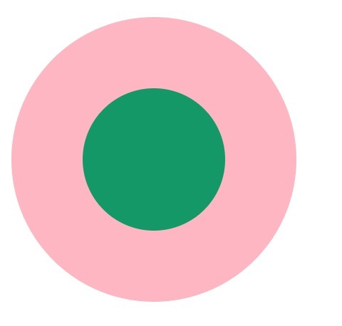
1. 两个标签的嵌套:
<div class="element1">
    <div class="child1"></div>
</div>
.element1{
            width: 200px;
            height: 200px;
            background-color: lightpink;
            border-radius: 50%;
        }

.child1{
            width: 100px;
            height: 100px;
            border-radius: 50%;
            background-color: #009966;
            position: relative;
            top: 50px;
            left: 50px;
       }
2. 使用伪元素,before/after
<div class="element2"></div>
.element2{
            width: 200px;
            height: 200px;
            background-color: lightpink;
            border-radius: 50%;
        }
.element2:after{
            content: "";
            display: block;
            width: 100px;
            height: 100px;
            border-radius: 50%;
            background-color: #009966;
            position: relative;
            top: 50px;
            left: 50px;
        }
3. 使用border
<div class="element3"></div>
 .element3{
            width: 100px;
            height: 100px;
            background-color: #009966;
            border-radius: 50%;
            border: 50px solid lightpink ;
        }
4. 使用border-shadow
<div class="element4"></div>
.element4{
            width: 100px;
            height: 100px;
            background-color: #009966;
            border-radius: 50%;
            box-shadow: 0 0 0 50px lightpink ;
            margin: auto;
        }
<div class="element5">
  .element5{
            width: 200px;
            height: 200px;
            background-color: #009966;
            border-radius: 50%;
            box-shadow: 0 0 0 50px lightpink inset;
            margin: auto;
        }
5. 使用radial-gradient
<div class="element6"></div>
.element6{
            width: 200px;
            height: 200px;
            border-radius: 50%;
            background: -webkit-radial-gradient( circle closest-side,#009966 50%,lightpink 50%);
        }