1、固定定位
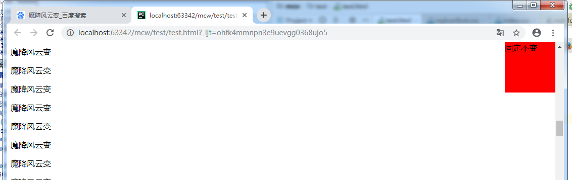
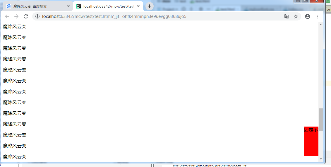
固定定位,页面内容多,页面滚动起来,才能看到固定定位效果。
比如下面这个,随之滚动条滚动它一直在右边。比如固定导航栏,小广告,回到顶部,应用在这些地方。一直固定位置不变的。

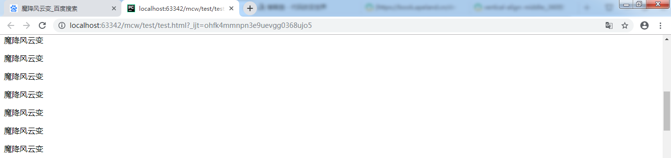
首先让页面能滚动起来
<html lang="en">
<head>
    <meta charset="UTF-8">
</head>
<body>
    <p>魔降风云变</p>
    <p>魔降风云变</p>
    ...............
    <p>魔降风云变</p>
</body>
</html>
固定位置脱标,写在body的什么位置都行。我在最后一个p后面加个div
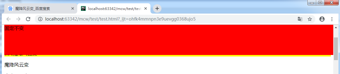
<div class="fix">固定不变</div>
然后给它设置样式
        .fix{
             100px;
            height: 100px;
            background-color: red;
        }
它现在在最下面
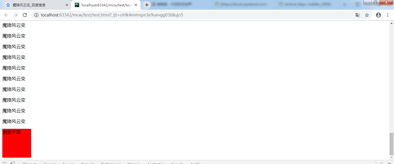
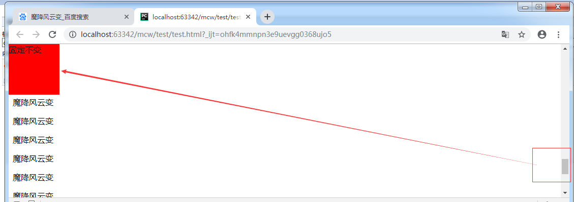
把这个盒子放在很多个p标签的中间,不放到最下边 了,拖动滚动条它的位置根据页面在滚动。
再给它设置位置固定。盒子在浏览器上找不到了。
        .fix{
             100px;
            height: 100px;
            background-color: red;
            position: fixed;
        }
看下面代码:
        .fix{
             100px;
            height: 100px;
            background-color: red;
            position: fixed;
            top:0;
            left: 0;
        }
给它给位置,拖动滚动条它的位置一直不变。并且压盖了下面的元素。现在它是在设备的左上角。
现象:脱标;固定不变,以页面四个角为参考点
            position: fixed;
            top:0;
            right: 0;
            position: fixed;
            bottom:20px;
            right: -50px;
以浏览器显示页面的四个角为原点,指定位置后滚动滚动条它相对于浏览器页面的这个位置显示不变。它的上左下右和浏览器页面对应边距离对应边属性值个位置,值可以为负,为负时是为正时的反方向移动属性值个位置。
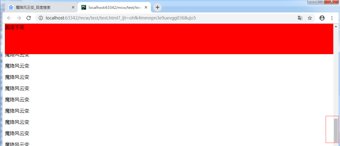
把它放在body的第一个标签,做成导航栏。并且把这个盒子宽度设为100%
        .fix{
             100%;
            height: 100px;
            background-color: red;
            position: fixed;
            top:0px;
        }
发生了压盖现象。
那么内容应该往下挤盒子高度个值。
        body{margin-top:  100px}
        .fix{
             100%;
            height: 100px;
            background-color: red;
            position: fixed;
            top:0px;
        }

 <div class="fix">固定不变</div>
    <p>小马过河</p>
    <p>魔降风云变</p>
红盒子固定不变了。第二个 盒子作为内容会被压盖出不来。给body上部设置margin。这样就能显示了。

下面这个可以用这个做了。
这个也可以做左父元素,右子元素,悬浮父元素的时候空格让子元素display显示出来。默认父元素超出的子元素都是overflow: hidden; 悬浮父则overflow: visible;
如果三角形也想出来,那么就可以用border画三角形的那个方法弄出来。
可以用左父,右两个子。子绝父相的方法显示出来

这时我body里面又有设置子绝父相的元素了。一个父元素设置了相对定位。
        .active{position: relative;
            background-color: yellow;}


    <p>魔降风云变</p>
    <p class="active">abc魔降风云变</p>
    <p>魔降风云变</p>
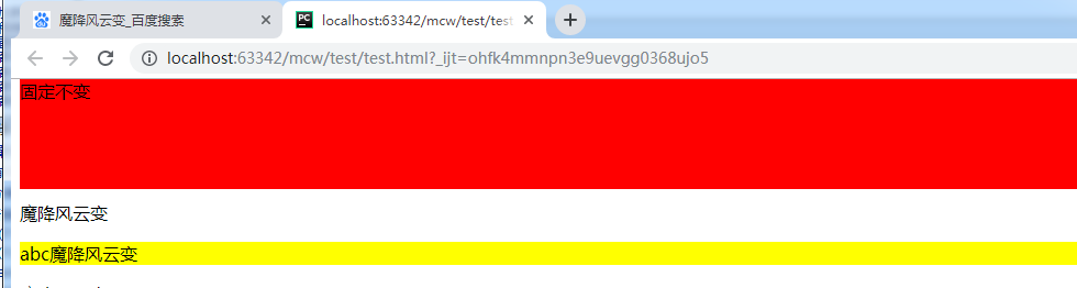
后面设置的使用了子绝父相的父元素压盖了红色导航栏,显然是不行的

这时需要用到z-index。它只适用于定位的元素;默认值是auto,一般属性值取数值,正数。如果它的值越大,则层级越高
       .fix{
             100%;
            height: 100px;
            background-color: red;
            position: fixed;
            top:0px;
        }
        .active{position: relative;
            background-color: yellow;}
那么上面都没设置用的是默认。那为什么黄色的层级大压盖了红色呢?如果都设置了定位,谁写在下面了谁层级越高。现在是要让红色层级高,因为不知道后面会用多少定位元素,那么就给红色盒子设置高点的值。
        .fix{
             100%;
            height: 100px;
            background-color: red;
            position: fixed;
            top:0px;
            z-index: 99999;
        }
这样红色盒子就不被z-index值低的压盖了。
z-index:auto 可以默认为它是0,它们是一样的,那么谁在后谁层级高,能显示出来。
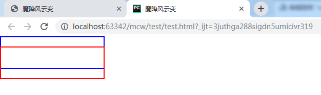
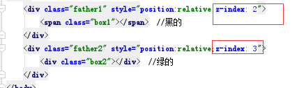
下面的span行内元素设置了绝对定位,这样也是可以给这个行内元素设置宽高的。


<!doctype html>
<html lang="en">
<head>
    <meta charset="UTF-8">
    <title>魔降风云变</title>
    <style>
        .box1{
            position: absolute;
            top: 0;
            left: 0;
             200px;
            height: 60px;
            border: 2px solid blue;
        }
        .box2{
            position: absolute;
            top: 0;
            left: 0;
             200px;
            height: 60px;
            border: 2px solid red;
        }
    </style>
</head>
<body>
    <div class="father1">
        <span class="box1"></span>
    </div>
    <div class="father2">
        <div class="box2"></div>
    </div>
</body>
</html>
看不到效果:蓝框是box1 span标签 ;红色是box2, div标签。两个都是使用了绝对定位

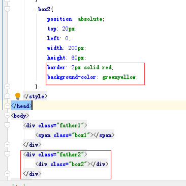
        .box2{
            position: absolute;
            top: 20px;
            left: 0;
             200px;
            height: 60px;
            border: 2px solid red;
        }
现在将红框加20px的top值,红下移
现在给蓝框加个黑色背景色,给红框加个绿色背景色 这样就看出了有压盖现象

因为绿色盒子是在另一个的下面
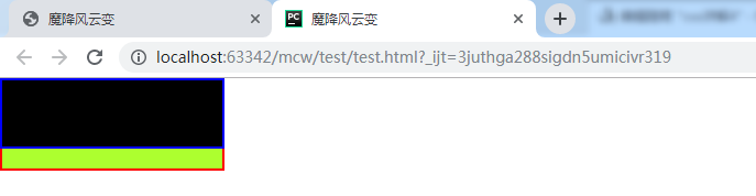
如果我给黑盒子设置z-index:10 给绿色盒子设置z-index:11,还是绿压盖了黑;
如果我给黑盒子设置z-index:10 给绿色盒子设置z-index:6,,小于黑盒子的,那么出现了黑压盖绿
这说明了谁的z-index数越大,谁的层级就越高,就会显示谁
现在给两个盒子的父盒子在行内标签上设置相对定位和z-index。那么现在有种从父现象,谁的父元素z-index大,证明它的层级越高。它不会关心子盒子的z-index。上面看到的是黑压盖绿,黑的z-index大于绿。现在给它俩的父设置了z-index,绿的父大,如果显示绿压盖黑,那么证明了相对定位的父盒子z-index越大,就不再考虑各自子的z-index,父的越大子就越大
结果如下,证明黑的绿的相对定位的父都有z-index,那么谁的父大就显示谁。这里绿的父大显示绿;从父现象

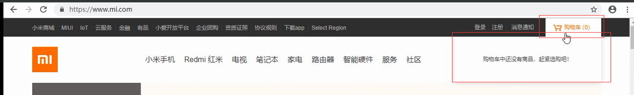
使用场景如下,红框中的购物车z-index比下面的父的z-index要大:下面压盖的搜索框也有子绝父相的布局
正常情况下先写黑色顶部栏再写下面搜索框的,这样相同的情况下按照先后顺序是下面的导航栏的z-index要比黑色顶部栏的大,因此这里需要调整这两个父的z-index值,让购物车的悬浮框压盖下边的
2、圆角设置
参考:https://book.apeland.cn/details/355/#边框属性
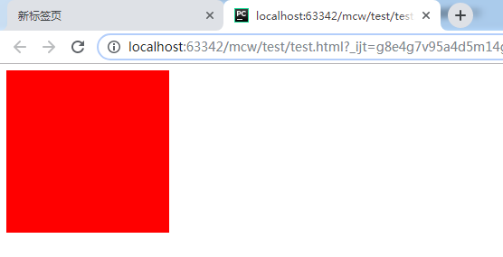
<html lang="en">
<head>
    <meta charset="UTF-8">
    <style>
         #box{
             200px;
            height: 200px;
            background-color: red;
         }
    </style>
</head>
<body>
   <div id="box"></div>
</body>
</html>
先设置一个正方形
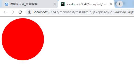
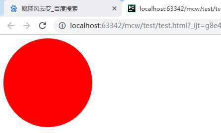
给个边界-半径 正方形边长一般,成了圆
         #box{
             200px;
            height: 200px;
            background-color: red;
            border-radius: 100px;
         }
border-radius是两个方向的值,一个是水平方向,一个垂直方向的半径。比如将第二个设置为50px
         #box{
             200px;
            height: 200px;
            background-color: red;
            border-radius: 100px 50px;
         }
这样水平方向100,垂直方向50:
将边半径设置为200,大小一样。
         #box{
             200px;
            height: 200px;
            background-color: red;
            border-radius: 200px;
         }
半径是正方形的边长和边长的一半效果一样:
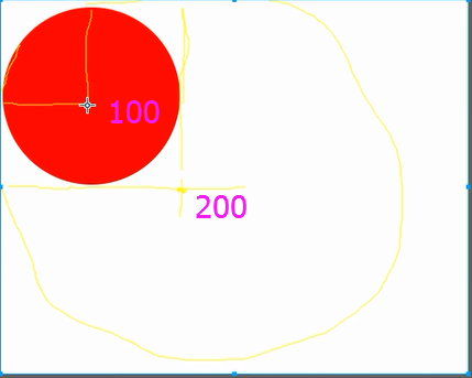
它们画圆的圆心是不同的
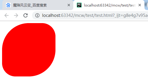
验证了一下,似乎是以画出的正方形的边长到边长一半之内都是同样大小的圆。但是我们经常用边长的一半作为边界半径。
下面看看这个小于一半的:
    <style>
         #box{
             300px;
            height: 300px;
            background-color: red;
            border-radius: 100px;
         }
    </style>
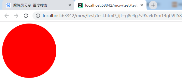
看看半径大于边长的似乎也可以是圆,圆的直径是边长,即使半径超过边长很多
    <style>
         #box{
             200px;
            height: 200px;
            background-color: red;
            border-radius: 600px;
         }
    </style>
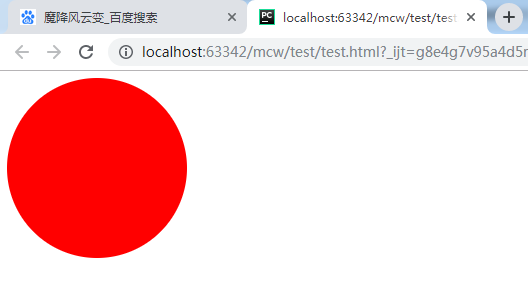
我们经常用的是百分比来画圆:
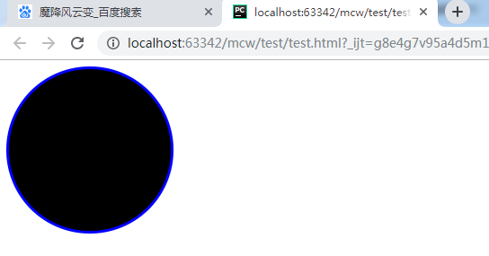
         #box{
             200px;
            height: 200px;
            background-color: red;
            border-radius: 50%;
         }
圆的使用场景之一是下面小圆点:
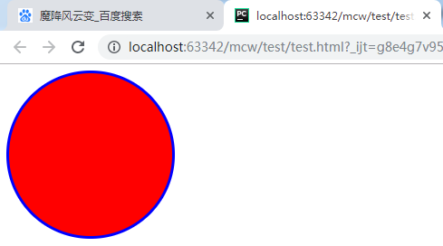
给圆加个边框:
         #box{
             200px;
            height: 200px;
            background-color: red;
            border-radius: 50%;
            border: 3px solid blue;
         }
然后悬浮在圆上的时候加个背景色:
  <style>
         #box{
             200px;
            height: 200px;
            background-color: red;
            border-radius: 50%;
            border: 3px solid blue;
         }
       #box:hover{
          background-color: #000;
       }
    </style>
圆使用场景之二:这样可以用圆来切头像,比如qq头像。方的变圆的。
使用场景之三,可以做圆角
         #box{
             200px;
            height: 200px;
            background-color: red;
            border-radius: 8px;
            border: 3px solid blue;
         }

单个圆角的设置
除了同时设置四个圆角以外,还可以单独对每个角进行设置。对应四个角,CSS3提供四个单独的属性:
- border-top-left-radius
- border-top-right-radius
- border-bottom-right-radius
- border-bottom-left-radius
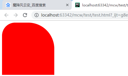
         #box{
             200px;
            height: 200px;
            background-color: red;
            border-top-left-radius: 50px;
         }

         #box{
             200px;
            height: 200px;
            background-color: red;
            border-top-left-radius: 50px;
            border-top-right-radius:100px;
         }
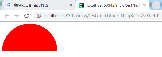
         #box{
             200px;
            height: 100px;
            background-color: red;
            border-top-left-radius: 100px;
            border-top-right-radius:100px;
         }
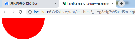
    <style>
         #box{
             200px;
            height: 100px;
            background-color: red;
            border-bottom-left-radius: 100px;
            border-bottom-right-radius:100px;
         }
    </style>
         #box{
             200px;
            height: 100px;
            background-color: red;
            border-top-left-radius: 100px;
            border-bottom-right-radius:100px;
         }
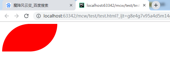
         #box{
             200px;
            height: 100px;
            background-color: red;
            border-top-right-radius: 100px;
            border-bottom-right-radius:100px;
         }
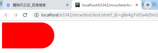
         #box{
             100px;
            height: 200px;
            background-color: red;
            border-top-right-radius: 100px;
            border-bottom-right-radius:100px;
         }

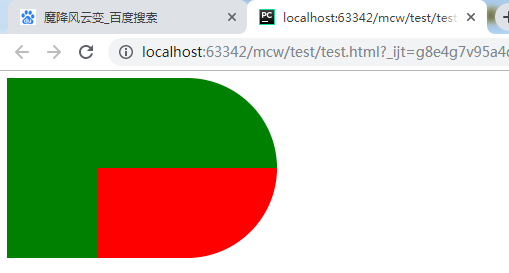
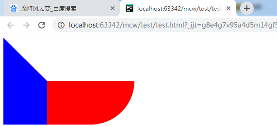
         #box{
             200px;
            height: 100px;
            background-color: red;
            border-left: 100px solid green;
            border-top: 100px solid green;
            border-top-right-radius: 100px;
            border-bottom-right-radius:100px;
         }
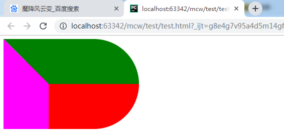
         #box{
             200px;
            height: 100px;
            background-color: red;
            border-left: 100px solid fuchsia;
            border-top: 100px solid green;
            border-top-right-radius: 100px;
            border-bottom-right-radius:100px;
         }
         #box{
             200px;
            height: 100px;
            background-color: red;
            border-left: 100px solid #ffffff;
            border-top: 100px solid green;
            border-top-right-radius: 100px;
            border-bottom-right-radius:100px;
         }

         #box{
             200px;
            height: 100px;
            background-color: red;
            border-left: 100px solid blue;
            border-top: 100px solid #ffffff;
            border-top-right-radius: 100px;
            border-bottom-right-radius:100px;
         }
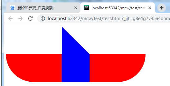
<html lang="en">
<head>
    <meta charset="UTF-8">
    <style>
         #box0{
             200px;
            height: 100px;
            background-color: red;
            border-top: 100px solid #ffffff;
            border-top-left-radius: 100px;
            border-bottom-left-radius:100px;
            float: left;
         }
         #box{
             200px;
            height: 100px;
            background-color: red;
            border-left: 100px solid blue;
            border-top: 100px solid #ffffff;
            border-top-right-radius: 100px;
            border-bottom-right-radius:100px;
            float: left;
         }
    </style>
</head>
<body>
   <div id="box0"></div>
   <div id="box"></div>
</body>
</html>
<html lang="en">
<head>
    <meta charset="UTF-8">
    <style>
         #box0{
             100px;
            height: 100px;
            background-color: red;
            border-radius: 100px;
            position: relative;
            left: 150px;

         }
         #box1{
             400px;
            height: 130px;
            background-color: red;
            border-top-left-radius: 200px;
            border-top-right-radius: 200px;
            /*border-radius: 100px;*/
            line-height: 130px;
            text-align: center;
            font-size: 20px;
         }
         #tui{
            height: 250px;
             400px;
            position: relative;
         }
         #tui .left{
            height: 250px;
             100px;
            position: absolute;
            left: 50px;
            background-color: red;
         }
         .mid{
            height: 100px;
             100px;
            background-color: red;
            position: absolute;
            left: 150px;
            border-bottom-left-radius: 30px ;
            border-bottom-right-radius: 30px ;
         }
         .right{
            height: 250px;
             100px;
            position: absolute;
            left:250px;
            background-color: red;
         }
       #box0 div{
           20px;
          height: 20px;
          background-color: black;
          border :1px solid blue;
          border-radius: 10px;
       }
       #box0 .yan1{
          position: absolute;
          top: 20px;
          left: 20px;
       }
         #box0 .yan2{
          position: absolute;
          top: 20px;
          left: 56px;
       }
       #box0 .zui{
          height: 30px;
           60px;
          background-color: gold;
          border-bottom-left-radius: 30px;
          border-bottom-right-radius: 30px;
          position: absolute;
          top: 51px;
          left: 19px;
       }
       #fa{
          height: 50px;
           400px;
          position: relative;
       }
       #fa .fa1{
           2px;
          height:50px;
          background-color: black;
          position: absolute;
          left: 183px;

       }
         #fa .fa2{
           2px;
          height:50px;
          background-color: black;
            position: absolute;
            left: 213px;
       }
       #foot{
          font-size: 20px;
          text-align: center;
          margin-top: 5px;
          color: blue;
           400px;
       }
    </style>
</head>
<body>
   <div id="fa">
      <div class="fa1"></div>
      <div class="fa2"></div>
   </div>
   <div id="box0">
      <div class="yan1"></div>
      <div class="yan2"></div>
      <div class="zui"> </div>
   </div>
   <div id="box1">please guess who am i ?</div>
   <div id="tui">
      <div class="left"></div>
      <div class="mid"></div>
      <div class="right"></div>
   </div>
   <div id="foot">create by mcw!</div>
</body>
</html>
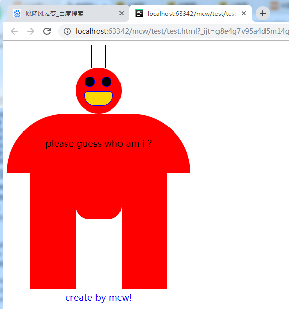
有时间研究一下大风车
<html lang="en">
<head>
    <meta charset="UTF-8">
    <style>
       div{
           200px;
          height: 200px;
          border:50px solid red;
          border-radius: 100px;
       }
    </style>
</head>
<body>
   <div ></div>
</body>
</html>

<html lang="en">
<head>
    <meta charset="UTF-8">
    <style>
       div{
           200px;
          height: 200px;
          border:50px solid red;
          border-radius: 200px;
       }
    </style>
</head>
<body>
   <div ></div>
</body>
</html>

斜线怎么画呢?
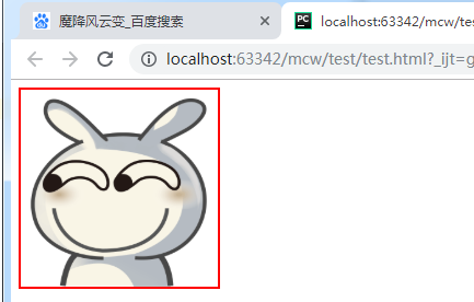
qq头像,微信头像:
<html lang="en">
<head>
    <meta charset="UTF-8">
    <style>
       img{
           200px;
          height: 200px;
          border: 2px solid red;
          border-radius: 200px;
       }
    </style>
</head>
<body>
<img src="timg.gif" alt="">
</body>
</html>

原图: