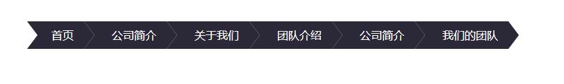
目的: 纯css实现以上这种导航样式
代码:
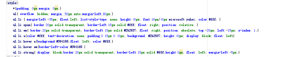
结构: (因为空间问题,删除了一个li)

样式:
分解实现:
知识点: 定位, before和after伪类
<div class="first"></div>
css:
    .first{
            width:30px;
            height:30px;
            background:#3ccd58;
            position:relative;
        }
        .first:after{
            content:"";
            border-top:15px solid transparent;
            border-bottom:15px solid transparent;
            border-left:15px solid #3ccd58;
            position:absolute;
            right:-15px;
            top:0;
        }
注意:如果区分不出来 可以用如下方式解惑
       .first:after{
            content:"";
            border-top:15px solid red;
            border-bottom:15px solid red;
            border-left:15px solid blue;
            position:absolute;
            right:-15px;
            top:0;
        }
同时可以简写成如下方式:
        .first:after{
            content:"";
            border-width:15px 0 15px 15px;
            border-style:solid;
            border-color:transparent transparent  transparent #3ccd58;
            position:absolute;
            right:-15px;
            top:0;
        }
效果:
第二种:css
    .first:before{
            content:"";
            border-top:15px solid #3ccd58;
            border-bottom:15px solid #3ccd58;
            border-left:15px solid transparent;
            position:absolute;
            left:-15px;
            top:0;
        }
        .first:after{
            content:"";
            border-width:15px 0 15px 15px;
            border-style:solid;
            border-color:transparent transparent  transparent #3ccd58;
            position:absolute;
            right:-15px;
            top:0;
        }
效果展示:
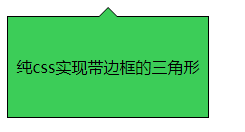
第三种是带箭头的边框:
html:
<div class="triangle">
    <span>
        <em></em>
    </span>
    纯css实现带边框的三角形
</div>
css:
    .triangle{
            width:200px;
            height:100px;
            background:#3ccd58;
            border:1px solid #000000;
            text-align: center;
            line-height:100px;
            position:relative;
        }
        .triangle span{
            display: inline-block;
            width:0;
            height:0;
            border-top:0 solid transparent;
            border-bottom:10px solid #000;
            border-left:10px solid transparent;
            border-right:10px solid transparent;
            position:absolute;
            left:50%;
            margin-left:-10px;
            top:-10px;
        }
        .triangle em{
            display: inline-block;
            width:0;
            height:0;
            border-top:0 solid transparent;
            border-bottom:10px solid #3ccd58;
            border-left:10px solid transparent;
            border-right:10px solid transparent;
            position:absolute;
            left:-10px;
            top:1px;
        }
效果展示: