大家好,这里是「 从零开始学 Web 系列教程 」,并在下列地址同步更新......
- github:https://github.com/Daotin/Web
- 微信公众号:Web前端之巅
- 博客园:http://www.cnblogs.com/lvonve/
- CSDN:https://blog.csdn.net/lvonve/
在这里我会从 Web 前端零基础开始,一步步学习 Web 相关的知识点,期间也会分享一些好玩的项目。现在就让我们一起进入 Web 前端学习的探索之旅吧!

一、CSS3三个案例
1、案例一:携程网首页
需求:页面无横向滚动条,页面随着宽度的改变自动伸缩。
代码:
<!DOCTYPE html>
<html lang="en">
<head>
<meta charset="UTF-8">
<title>Document</title>
<style>
* {
margin: 0;
padding: 0;
}
header {
100%;
display: flex;
}
header > a {
flex: 1;
}
header > a > img {
100%;
}
main {
100%;
padding: 0 10px;
box-sizing: border-box;
}
main > .item {
100%;
height: 100px;
background-color: pink;
border-radius: 10px;
margin-top: 10px;
display: flex;
}
main > .item:nth-of-type(1) {
background-color: rgb(78, 50, 182);
}
main > .item:nth-of-type(2) {
background-color: rgb(31, 153, 209);
}
main > .item:nth-of-type(3) {
background-color: rgb(240, 147, 7);
}
main > .item:nth-of-type(4) {
background-color: rgb(187, 19, 131);
}
.item > .left {
flex: 1;
}
.item > .right {
flex: 2;
flex-wrap: wrap;
display: flex;
}
.item > .right > a {
display: block;
50%;
color: #fff;
text-decoration: none;
line-height: 50px;
text-align: center;
border-left: 1px solid #ccc;
border-bottom: 1px solid #ccc;
box-sizing: border-box;
}
.item > .right > a:nth-last-of-type(-n+2) {
border-bottom: none;
}
.extra {
100%;
display: flex;
}
.extra > a {
flex: 1;
}
.extra > a > img {
100%;
}
footer {
100%;
}
footer > .nav {
100%;
height: 30px;
border-top: 2px solid #ccc;
border-bottom: 2px solid #ccc;
display: flex;
}
footer > .nav > a {
flex: 1;
text-align: center;
line-height: 30px;
text-decoration: none;
color: #666;
}
footer > .link {
text-align: center;
margin-top: 5px;
}
footer > .copyright {
text-align: center;
margin-top: 5px;
}
</style>
</head>
<body>
<div class="container">
<header>
<a href="javascript:;"><img src="./images/banner.jpg"></a>
</header>
<main>
<section class="item">
<div class="left"></div>
<div class="right">
<a href="javascript:;">海外酒店</a>
<a href="javascript:;">团购</a>
<a href="javascript:;">特价机票</a>
<a href="javascript:;">民宿客栈</a>
</div>
</section>
<section class="item">
<div class="left"></div>
<div class="right">
<a href="javascript:;">海外酒店</a>
<a href="javascript:;">团购</a>
<a href="javascript:;">特价机票</a>
<a href="javascript:;">民宿客栈</a>
</div>
</section>
<section class="item">
<div class="left"></div>
<div class="right">
<a href="javascript:;">海外酒店</a>
<a href="javascript:;">团购</a>
<a href="javascript:;">特价机票</a>
<a href="javascript:;">民宿客栈</a>
</div>
</section>
<section class="item">
<div class="left"></div>
<div class="right">
<a href="javascript:;">海外酒店</a>
<a href="javascript:;">团购</a>
<a href="javascript:;">特价机票</a>
<a href="javascript:;">民宿客栈</a>
</div>
</section>
<section class="extra">
<a href="javascript:;"><img src="./images/extra_1.png"></a>
<a href="javascript:;"><img src="./images/extra_2.png"></a>
</section>
</main>
<footer>
<div class="nav">
<a href="javascript:;">电话预定</a>
<a href="javascript:;">下载客户端</a>
<a href="javascript:;">我的</a>
</div>
<p class="link">
<a href="javascript:;">网站地图</a>
<a href="javascript:;">English</a>
<a href="javascript:;">电脑版</a>
</p>
<p class="copyright">© 携程旅行</p>
</footer>
</div>
</body>
</html>
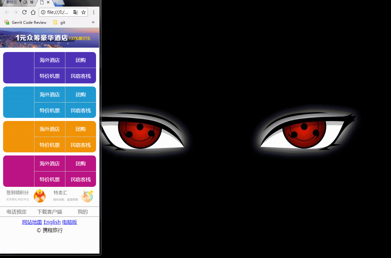
案例截图:
2、案例二:切割轮播图
示例代码:
<!DOCTYPE html>
<html lang="en">
<head>
    <meta charset="UTF-8">
    <title>Document</title>
    <style>
        * {
            margin: 0;
            padding: 0;
        }
        .container {
             560px;
            height: 300px;
            margin: 100px auto;
            position: relative;
        }
        .container > ul {
             100%;
            height: 100%;
            list-style: none;
            /* transform: rotate3d(1,1,0,-45deg); */
            transform-style: preserve-3d;
        }
        ul > li {
             20%;
            height: 100%;
            float: left;
            position: relative;
            transform-style: preserve-3d;
            transition: transform 0.5s;
        }
        ul > li > span {
            position: absolute;
             100%;
            height: 100%;
        }
        ul > li:nth-of-type(2) > span {
            background-position: -100%;
        }
        ul > li:nth-of-type(3) > span {
            background-position: -200%;
        }
        ul > li:nth-of-type(4) > span {
            background-position: -300%;
        }
        ul > li:nth-of-type(5) > span {
            background-position: -400%;
        }
        ul > li > span:nth-of-type(1) {
            background-image: url("./images/q1.jpg");
            transform: translateZ(150px);
        }
        ul > li > span:nth-of-type(2) {
            background-image: url("./images/q2.jpg");
            transform: translateY(-150px) rotateX(90deg);
        }
        ul > li > span:nth-of-type(3) {
            background-image: url("./images/q3.jpg");
            transform: translateZ(-150px) rotateX(180deg);
        }
        ul > li > span:nth-of-type(4) {
            background-image: url("./images/q4.jpg");
            transform: translateY(150px) rotateX(-90deg);
        }
        .left {
             60px;
            height: 60px;
            background-color: rgba(0,0,0,0.5);
            line-height: 60px;
            color: #fff;
            text-align: center;
            font-family: "Consolas";
            font-size: 40px;
            position: absolute;
            left: 0;
            top: 50%;
            transform: translateY(-50%);
            cursor: pointer;
            z-index: 10;
        }
        .right {
             60px;
            height: 60px;
            background-color: rgba(0,0,0,0.5);
            line-height: 60px;
            color: #fff;
            text-align: center;
            font-family: "Consolas";
            font-size: 40px;
            position: absolute;
            right: 0;
            top: 50%;
            transform: translateY(-50%);
            cursor: pointer;
            z-index: 10;
        }
    </style>
</head>
<body>
    <div class="container">
        <ul>
            <li>
                <span></span>
                <span></span>
                <span></span>
                <span></span>
            </li>
            <li>
                <span></span>
                <span></span>
                <span></span>
                <span></span>
            </li>
            <li>
                <span></span>
                <span></span>
                <span></span>
                <span></span>
            </li>
            <li>
                <span></span>
                <span></span>
                <span></span>
                <span></span>
            </li>
            <li>
                <span></span>
                <span></span>
                <span></span>
                <span></span>
            </li>
        </ul>
        <span class="left"><</span>
        <span class="right">></span>
    </div>
</body>
<script>
    var index = 0;
    // 添加节流阀
    var flag = true;
    document.querySelector(".left").onclick = function () {
        if(flag) {
            flag = false;
            index++;
            var liObjs = document.querySelectorAll("li");
            for(var i=0; i<liObjs.length; i++) {
                liObjs[i].style.transform = "rotateX("+90*index+"deg)";
                liObjs[i].style.transitionDelay = i*0.1 + "s";
            }
            setTimeout(function () {
                flag = true;
            }, 1000);
        }
    }
    document.querySelector(".right").onclick = function () {
        if(flag) {
            flag = false;
            index--;
            var liObjs = document.querySelectorAll("li");
            for(var i=0; i<liObjs.length; i++) {
                liObjs[i].style.transform = "rotateX("+90*index+"deg)";
                liObjs[i].style.transitionDelay = i*0.1 + "s";
            }
            setTimeout(function () {
                flag = true;
            }, 1000);
        }
    }
</script>
</html>
示例效果:

3、案例三:360浏览器首页
案例代码:
<!DOCTYPE html>
<html lang="en">

<head>
    <meta charset="UTF-8">
    <title>Document</title>
    <link rel="stylesheet" href="./css/360Page.css">
    <script src="./js/jquery.min.js"></script>
    <script src="./js/jquery.fullPage.min.js"></script>
</head>

<body>
    <div id="360Page">
        <div class="section first">
            <div class="logo"></div>
            <div class="text">
                <img src="./images/text_1.png" alt="">
                <img src="./images/text_2.png" alt="">
                <img src="./images/text_3.png" alt="">
                <img src="./images/text_4.png" alt="">
                <img src="./images/text_5.png" alt="">
                <img src="./images/text_6.png" alt="">
                <img src="./images/text_7.png" alt="">
                <img src="./images/text_8.png" alt="">
            </div>
            <div class="info1"></div>

        </div>
        <div class="section second">
            <div class="shield">
                <img src="./images/shield_1.png" alt="">
                <img src="./images/shield_2.png" alt="">
                <img src="./images/shield_3.png" alt="">
                <img src="./images/shield_4.png" alt="">
                <img src="./images/shield_5.png" alt="">
                <img src="./images/shield_6.png" alt="">
                <img src="./images/shield_7.png" alt="">
                <img src="./images/shield_8.png" alt="">
                <img src="./images/shield_9.png" alt="">
            </div>
            <div class="info2"></div>
        </div>
        <div class="section third">
            <div class="info3"></div>
            <div class="circle">
                <div class="rocket"></div>
            </div>
        </div>
        <div class="section fourth">
            <div class="search">
                <div class="search-bar"></div>
                <div class="search-text"></div>
                <div class="search-content"></div>
            </div>
            <div class="info4"></div>
        </div>
        <div class="section fifth">
            <h3>第五屏</h3>
        </div>
    </div>
</body>

<script>
    $(function(){
        $('#360Page').fullpage({
            sectionsColor: ['#0da5d6', '#2AB561', '#DE8910', '#16BA9D', '#0DA5D6'],
            afterLoad: function (anchorLink, index) {
                $(".section").removeClass("current");
                $(".section:eq("+(index-1)+")").addClass("current");
            }
        });
    });
</script>

</html>
全屏插件的使用:
sectionsColor:设置每一屏的颜色;
afterLoad:回调函数,当每一屏加载完成后需要执行的动作。
CSS 代码:
* {
    margin: 0;
    padding: 0;
}

.section {
    overflow: hidden;
}

/* 第一屏 */
.first {
    padding-top: 100px;
}

.first .logo {
     251px;
    height: 186px;
    background-image: url("../images/logo.png");
    margin: 0 auto;
}
.first .text {
    text-align: center;
    margin: 100px 0 20px 0;
}

.first .text > img {
    margin: 0 20px;
    opacity: 0.1;
    transition: margin 0.8s,opacity 0.8s;
}
.first .info1 {
     772px;
    height: 49px;
    background-image: url("../images/info_1.png");
    margin: 0 auto;
}
/* 第一屏动画 */
.first.current .text > img {
    margin: 0 5px;
    opacity: 1;
}

/* 第二屏 */

.second > div{
    display: flex;
    justify-content: space-around;
    align-items: center;
}
.second .shield {
     440px;
    font-size: 0; /* 消除盾牌之间的间隙*/
}
.second .shield > img {
    opacity: 0.1;
    transition: transform 0.8s, opacity 0.8s;
}

.second .shield > img:nth-of-type(1){
    transform: translate(-100px, 200px) rotate(30deg);
}
.second .shield > img:nth-of-type(2){
    transform: translate(300px, 20px) rotate(60deg);
}
.second .shield > img:nth-of-type(3){
    transform: translate(300px, 10px) rotate(-50deg);
}
.second .shield > img:nth-of-type(4){
    transform: translate(600px, 20px) rotate(-90deg);
}
.second .shield > img:nth-of-type(5){
    transform: translate(30px, 200px) rotate(90deg);
}
.second .shield > img:nth-of-type(6){
    transform: translate(-30px, -30px) rotate(-30deg);
}
.second .shield > img:nth-of-type(7){
    transform: translate(0px, 100px) rotate(-30deg);
}
.second .shield > img:nth-of-type(8){
    transform: translate(320px, 150px) rotate(30deg);
}
.second .shield > img:nth-of-type(9){
    transform: translate(-190px, -280px) rotate(-30deg);
}
.second .info2 {
     635px;
    height: 309px;
    background-image: url("../images/info_2.png");
}
/* 第二屏动画 */
.second.current .shield > img {
    transform: none;
    opacity: 1;
}

/* 第三屏 */
.third {
    position: relative;
}
.third .info3 {
     631px;
    height: 278px;
    background-image: url("../images/info_3.png");
    position: absolute;
    left:50%;
    top: 50%;
    transform: translate(-100%,-50%);
}
.third .circle {
     453px;
    height: 449px;
    background-image: url("../images/circle.png");
    position: absolute;
    left: 57%;
    top: 50%;
    transform: translateY(-50%);
}
.third .circle .rocket {
     203px;
    height: 204px;
    background-image: url("../images/rocket.png");
    position: absolute;
    left: -50%;
    top: 150%;
    transition: left 0.8s, top 0.8s;
}
/* 第三屏动画 */
.third.current .circle .rocket {
    left: 115px;
    top: 115px;
}

/* 第四屏 */
.fourth {
    position: relative;
}
.fourth .search {
     529px;
    height: 438px;
    position: absolute;
    left: 50%;
    top: 50%;
    transform: translate(-115%, -50%);
    overflow: hidden;
}
.fourth .search .search-bar{
     529px;
    height: 66px;
    background-image: url("../images/search.png");
    transform: translateX(-100%);
}
.fourth .search .search-text{
     0;
    height: 22px;
    background-image: url("../images/key.png");
    position: absolute;
    left: 18px;
    top: 23px;
}
.fourth .search .search-content{
     529px;
    height: 0;
    background-image: url("../images/result.png");
    margin-top: -12px;
}
.fourth .info4 {
     612px;
    height: 299px;
    background-image: url("../images/info_4.png");
    position: absolute;
    left: 50%;
    top: 50%;
    transform: translateY(-50%);
}
/* 第四屏动画 */
.fourth.current .search .search-bar{
    transform: none;
    transition: transform 0.8s;
}
.fourth.current .search .search-text{
     99px;
    transition: width 0.8s 0.8s steps(5);
}
.fourth.current .search .search-content{
    height: 372px;
    transition: height 0.8s 1.6s;
}
使用 current 交集选择器实现,当加载完某一全屏后需要执行的动画。
