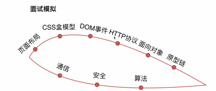
面试
面试技巧(一面/二面)
- 准备要充分
- 知识要系统
- 沟通要简洁
- 内心要诚实
- 态度要谦虚
- 回答要灵活
页面布局
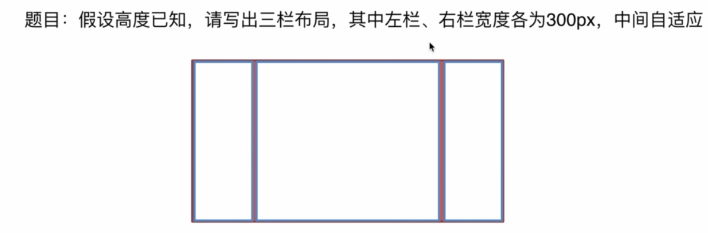
- 浮动
    <style>
        html *{
            padding:0;
            margin:0;
        }
        .layout article div{
            min-height:200px
        }
        .layout.float .left{
             float:left;
              300px;
             background: red;
         }
        .layout.float .right{
            float:right;
             300px;
            background: yellow;
        }
        .layout.float .center{
            background: green
        }
    </style>
</head>
<body>
   <section class="layout float">
       <article class="left-right-center">
           <div class="left"></div>

           <div class="right"></div>
           <div class="center">
               <h1>浮动解决方案</h1>
               1.这是三栏布局的中间部分
           </div>
       </article>
   </section>
</body>
- 定位
    <style>
        html *{
            padding:0;
            margin:0;
        }
        .layout .left-right-center{
            position: relative;
        }
        article div{
            min-height:200px;
        }
        .layout.absolute .left{
            position: absolute;
            left:0;
            300px;
            background: red;
        }
        .layout.absolute .center{
            position: absolute;
            left:300px;
            right:300px;
            background: yellow;
        }
        .layout.absolute .right{
            position: absolute;
            right:0;
            300px;
            background: blue;
        }
    </style>
</head>
<body>
<section class="layout absolute">
    <article class="left-right-center">
        <div class="left"></div>
        <div class="center">
            <h1>浮动解决方案</h1>
            1.这是三栏布局的中间部分
        </div>
        <div class="right"></div>
    </article>
</section>
</body>
- flex
    <style>
        html *{
            padding:0;
            margin:0;
        }
        .layout article div{
            min-height:200px
        }
        .layout .flexbox{
            display: flex;

        }
        .layout .flexbox .left{
            300px;
            background: red;
        }
        .layout .flexbox .center{
            flex:1;
            background:yellow;
        }
        .layout .flexbox .right{
            300px;
            background: blue;
        }

    </style>
</head>
<body>
<section class="layout ">
    <article class="flexbox">
        <div class="left"></div>
        <div class="center">
            <h1>浮动解决方案</h1>
            1.这是三栏布局的中间部分
        </div>
        <div class="right"></div>
    </article>
</section>
</body>
- table
    <style>
        html *{
            padding:0;
            margin:0;
        }
        .layout article div{
            height:200px;
        }
        .layout .left-center-right{
            100%;
            display: table;
        }
        .layout .left-center-right>div{
            display: table-cell;
        }
        .layout.table .left{
            300px;
            background: red;
        }
        .layout.table .center{
            background: yellow;
        }
        .layout.table .right{
            300px;
            background: blue;
        }
    </style>
</head>
<body>
<section class="layout table">
    <article class="left-center-right">
        <div class="left"></div>
        <div class="center">
            <h1>浮动解决方案</h1>
            1.这是三栏布局的中间部分
        </div>
        <div class="right"></div>
    </article>
</section>
</body>
- grid
    <style>
        html *{
            padding:0;
            margin:0;
        }
        .layout article div{
            min-height:200px
        }
        .layout.grid .left-center-right{
            display: grid;
            100%;
            grid-template-rows: 200px;
            grid-template-columns: 300px auto 300px;
        }
        .layout.grid .left{
            background: red;
        }
        .layout.grid .center{
            background: yellow;
        }
        .layout.grid .right{
            background: blue;
        }
    </style>
</head>
<body>
<section class="layout grid">
    <article class="left-center-right">
        <div class="left"></div>
        <div class="center">
            <h1>浮动解决方案</h1>
            1.这是三栏布局的中间部分
        </div>
        <div class="right"></div>
    </article>
</section>
</body>
延伸:
- 这五种方法的优缺点
float布局兼容性比较好,脱离文档流,但是父级需要清浮动,兼容性好
absolute布局简单,兼容性好,脱离文档流
flex布局的优点 布局简单,灵活,移动端友好,缺点是ie8以下的浏览器不兼容
tabe兼容性好,可以兼容ie8,但是是table标签的不正规使用
gird兼容性不太良好,可以使用在非常多的使用场景
- 他们之间的比较
如上
- 假设把高度去掉,那个方案不再适用了?
浮动不能使用,定位不能使用,grid不能使用
table和flex可以使用
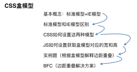
CSS盒模型
题目:谈谈你对CSS盒模型的认识
标准模型
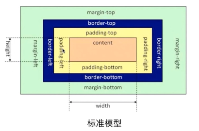
IE盒模型

CSS盒模型:
标准盒子模型:宽度= 内容宽度(content) + padding + boder + margin
IE盒模型:宽度 = 内容宽度(content+padding+ border) +margin
用来控制元素的盒子模型的解析模式,默认为content-box
content-box:w3c的标准盒子模型,设置元素的height/width属性指的是content部分的高/宽
border-box: IE传统盒子模型。设置元素的height/width属性指的是content+padding+border部分的宽和高
css如何设置这两种模型
box-sizing:content-box //标准盒模型
box-sizing:border-box  //IE盒模型
JS如何设置盒模型对应的宽和高
dom.style.width/height  //不会获取外嵌样式宽和高,只能在页面标签上直接添加
dom.currentStyle.width/height //只支持IE
window.getComputedStyle(dom).width/height //支持IE,火狐,chrome
dom.getBoundingCliendRect().width/height //content+padding+border
双边距重叠问题
<!DOCTYPE html>
<html lang="en">
<head>
    <meta charset="UTF-8">
    <title>双边距问题</title>
    <style>
        html *{
            margin:0;
            padding:0;
        }
        #sec{
            background: #f00;
        }
        .child{
            height:100px;
            margin-top:10px;
            background: yellow;
        }

        #bro1{
            height:200px;
            margin-bottom:20px;
            background: blue;
        }
        #bro2{
            height:200px;
            margin-top:10px;
            background: gray;
        }


        .empty{
            margin-top:20px;
            margin-bottom:10px;
        }
    </style>
</head>
<body>
<!--父子双边距  此时父元素sec的高度仍为100px 不会加上子元素的margin-top-->

<section id="sec">
    <article class="child"></article>
</section>

<br>
<br>
<br>
<!--兄弟双边距  此时兄弟节点之间的margin为两者margin的最大值 即20px-->
<section id="bro1"></section>
<section id="bro2"></section>

<br>
<br>
<br>
<!--空元素   此时margin取margin-top和margin-bottom的最大值 即20px-->
<div class="empty"></div>
</body>
</html>
BFC(解决边距重叠方案)
定义:
BFC是块级格式化上下文,是用于布局块级盒子的一块渲染区域,BFC是页面上的一个隔离的独立容器,容器里面的子元素不会影响到外面元素,外面的元素也不会影响到子元素
BFC规则
- 内部的BOX会垂直方向上一个接一个放置
- Box垂直方向的距离由margin决定,属于同一个BFC的两个相邻的Box的margin会发生重叠
- 每个元素的margin box的左边,与包含块border box的左边相接触。即使存在浮动也是如此
- BFC区域不会与float box重叠
- BFC是页面上的一个隔离的独立容器,容器里面的子元素不会影响到外面的元素
- 计算BFC的高度时,浮动元素也会参与计算
如何创建BFC
- float的值不是none
- position的值不是static和relative
- display的值是inline-block, table-cell,flex,table-caption
- overflow的值不是visible
CSS选择器有哪些?哪些属性可以继承?
css选择器:
- id选择器(#myid)
- 类选择器(.myclassName)
- 标签选择器(div, li )
- 子选择器(ul>li)
- 后代选择器(li a)
- 通配符选择器(*)
- 属性选择器(a[rel="external"])
- 为了选择器(a:haver, li:nth-child)
可继承属性:font-size,font-famliy,color
不可继承的样式:boder,padding,margin,width,height
CSS优先级算法如何计算?
元素选择器: 1
class选择器:10
id选择器:100
元素标签:1000
- !important 声明的样式优先级最高,如果冲突在进行计算
- 如果优先级相同,则选择最后出现的样式
- 继承得到的样式的优先级最低
CSS优化,提高性能的方法有哪些?
- 避免过度约束
- 避免后代选择符
- 避免链式选择符
- 使用紧凑的语法
- 避免不必要的命名空间
- 避免不必要的重复
- 最好使用表示语义的名字
- 避免 !important,可以选择其他选择器
- 尽可能的精简规则,你可以合并不同类的重复规则
浏览器是怎样解析CSS选择器的?
CSS选择器的解析是从右到左解析的。若从左向右的匹配,发现不符合规则,则需要进行回溯,会损失很多性能。若从右向左匹配,先找到所有的最右节点,对于每一个节点,向上寻找父节点直到找到根元素或满足条件的匹配规则,则结束这个分支的遍历。两种匹配规则的性能差别很大,是因为从右向左的匹配在第一步就筛选了大量的不符合条件的最右节点,而从左往右的匹配规则的性能都浪费在了失败的查找上面。
而在CSS解析完毕后,需要将解析的结果与DOM tree的内容一起进行分析建立一颗Render Tree,最终用来进行绘画。在建立Render Tree时,浏览器就要为每个DOM tree中的元素根据CSS的解析结果来确定生成怎样的Render Tree
::before 和 :after中双冒号和单冒号有什么区别?解释一下
- 单冒号(:)用于CSS伪类,双冒号(::)用于CSS3伪元素
- ::before就是以一个子元素的存在,定义在元素主体内容之前的一个伪元素。并不存在dom之中,只存在页面之中
说说你对line-height是如何理解的?
行高是指一行文字的高度,具体说是两行文字间的基线的距离。CSS中起高度作用的是height和line-height,没有定义height属性,最终其表现作用一定是line-height
单行文本垂直居中:把line-height值设置为height一样的值可以实现单行文字的垂直居中,其实也可以把height删除。
多行文本垂直居中:需要设置display为inline-block
display;inline-block什么时候会显示间隙
- 有空格时候会有间隙: 解决:移除空格
- margin正值的时候 解决:margin使用负值
- 使用font-size时候,解决:font-size:0 ,letter-spacing,word-spacing
为什么会出现浮动和什么时候需要清浮动?清除浮动的方式?
浮动元素碰到包含它的边框或者浮动元素的边框停留。由于浮动元素不在文档流中,所以文档流的块框表现就像浮动框不存在一样。浮动元素会漂浮在文档流的块框上。
浮动带来的问题
- 父元素的高度无法被撑开,影响与父元素同级的元素
- 与浮动元素同级的非浮动元素(内联元素)会跟随其后
- 若非第一个元素浮动,则该元素之前的元素也需要浮动,否则会影响页面显示的结构。
清浮动的方式:
- 父级div定义height
- 最后一个浮动元素后加空div标签,并添加样式clear:both
- 包含浮动元素的父标签添加样式overflow为hidden或auto
- 父级div定义zoom