wpf combox原生的控件样式 非常的强大,而且支持自动完成、下拉单选、下拉方向、下拉框可定义大小等。
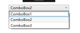
一个原生的combox的样式是这样子的:
在某些时候,根据设计的需要,combox样式需要更改,以下是我根据自己理解所写的combox自定义的样式。这个样式是由ToggleButton和ComboBox组成,先展示一下我改变之后的combox的样式。

我这是为了区分所以设置了不同的颜色,颜色可以根据自己的喜欢改变,话不多说,先展示ToggleButton的代码。
<!--Combox右边button-->
        <Style x:Key="ComboBoxReadonlyToggleButton" TargetType="ToggleButton">
            <Setter Property="IsTabStop" Value="false" />
            <Setter Property="ClickMode" Value="Press" />
            <Setter Property="MinHeight" Value="22"></Setter>
            <Setter Property="MinWidth" Value="80"></Setter>
            <Setter Property="Template">
                <Setter.Value>
                    <ControlTemplate TargetType="ToggleButton">
                        <Grid>
                            <Border x:Name="Background" BorderBrush="#787878"
                                BorderThickness="1"  Background="#198B53">
                                <Path x:Name="Path" Height="Auto" Margin="0,0.082,0,8.859" Width="Auto"
                                    Stretch="Fill" Stroke="{x:Null}" StrokeLineJoin="Round"
                                    StrokeThickness="1"
                                    Data="M0,3 C0,1.3431457 1.3431457,0 3,0 L129,0 C130.65686,0 132,1.3431457 132,3 L132,13.853975 C86.718803,0.055481441 26.160202,27.400364 0,11.585506 z">
                                    <Path.Fill>
                                        <LinearGradientBrush EndPoint="0.5,1" StartPoint="0.5,0">
                                            <!--combox背景色#198B53-->
                                            <GradientStop Color="#198B53" Offset="0.113" />
                                            <GradientStop Color="#198B53" Offset="1" />
                                        </LinearGradientBrush>
                                    </Path.Fill>
                                </Path>
                            </Border>
                            <!--倒三角的颜色#0099ff-->
                            <Path Height="10" x:Name="Path1" HorizontalAlignment="Right"
                                VerticalAlignment="Center" Margin="5,0,7,0" Width="10"
                                Fill="#0099ff" Stretch="Fill" Stroke="#0099ff"
                                Data="M0.5,0.5 L9.5,0.5 L5.0625,9.5 L5.0625,9.5 z" />
                        </Grid>

                        <ControlTemplate.Triggers>
                            <Trigger Property="IsMouseOver" Value="True">
                                <!--移入时按钮颜色 图案颜色 背景颜色 锯齿颜色-->
                                <Setter TargetName="Path1" Property="Fill" Value="#198B53"></Setter>
                                <Setter TargetName="Background" Property="Background" Value="#198B53"></Setter>
                                <Setter TargetName="Background" Property="BorderBrush" Value="#198B53"></Setter>
                            </Trigger>
                        </ControlTemplate.Triggers>
                    </ControlTemplate>
                </Setter.Value>
            </Setter>
        </Style>
然后下面是ComboBox代码:
  <Style x:Key="DefaultComboBoxStyle" TargetType="ComboBox">
            <Setter Property="Foreground" Value="#FFFFFFFF" />
            <Setter Property="Width" Value="100"></Setter>
            <Setter Property="Height" Value="30"></Setter>
            <Setter Property="VerticalAlignment" Value="Center"></Setter>
            <Setter Property="HorizontalContentAlignment" Value="Left"></Setter>
            <Setter Property="BorderBrush" Value="#FFFFFFFF" />
            <Setter Property="BorderThickness" Value="1" />
            <Setter Property="VerticalContentAlignment" Value="Center" />
            <Setter Property="ScrollViewer.HorizontalScrollBarVisibility" Value="Auto" />
            <Setter Property="ScrollViewer.VerticalScrollBarVisibility" Value="Auto" />
            <Setter Property="Padding" Value="4,3" />
            <Setter Property="ItemContainerStyle">
                <Setter.Value>
                    <!--这个是下拉框的属性设置-->
                    <Style TargetType="ComboBoxItem">
                        <Setter Property="Template">
                            <Setter.Value>
                                <ControlTemplate TargetType="ComboBoxItem">
                                    <Border Name="Back"  Background="#525252"  BorderThickness="0,0,0,0" BorderBrush="#525252" >
                                        <ContentPresenter ContentSource="{Binding Source}"  VerticalAlignment="Center" HorizontalAlignment="Left" Margin="10,0,0,0" ></ContentPresenter>
                                    </Border>
                                    <ControlTemplate.Triggers>
                                        <Trigger Property="IsMouseOver" Value="True">
                                            <Setter TargetName="Back" Property="Background" Value="#484848"></Setter>
                                        </Trigger>
                                        <!--下拉框背景色-->
                                        <Trigger Property="IsHighlighted" Value="True">
                                            <Setter TargetName="Back" Property="Background" Value="#3A99FF"></Setter>
                                        </Trigger>
                                    </ControlTemplate.Triggers>
                                </ControlTemplate>
                            </Setter.Value>
                        </Setter>
                    </Style>
                </Setter.Value>
            </Setter>
            <Setter Property="Template">
                <Setter.Value>
                    <ControlTemplate TargetType="ComboBox">
                        <Grid x:Name="MainGrid">
                           <Popup x:Name="PART_Popup" Margin="1" Grid.Row="1"
                                IsOpen="{Binding Path=IsDropDownOpen, RelativeSource={RelativeSource TemplatedParent}}">
                                <Grid x:Name="Shdw" MaxHeight="{TemplateBinding MaxDropDownHeight}"
                                    MinWidth="{Binding Path=ActualWidth, ElementName=MainGrid}" >
                                    <!--下拉框的属性设置-->
                                        <!--Background -->
                                    <Border x:Name="Bordertop"   Width="100" CornerRadius="0" BorderThickness="0"  Background="#525252">
                                        <Border.Effect>
                                            <DropShadowEffect Color="Black"  BlurRadius="2" ShadowDepth="0" Opacity="1"/>
                                        </Border.Effect>
                                        <ScrollViewer Width="150">
                                            <ItemsPresenter />
                                        </ScrollViewer>
                                    </Border>
                                </Grid>
                            </Popup>
                            <ToggleButton Style="{StaticResource ComboBoxReadonlyToggleButton}"
                                BorderThickness="3" BorderBrush="#03ffea"   Background="{TemplateBinding Background}"
                                IsChecked="{Binding Path=IsDropDownOpen, Mode=TwoWay, RelativeSource={RelativeSource TemplatedParent}}" />
                            <!--combox字体的间距-->
                            <TextBlock Margin="10 0 0 0"
                                HorizontalAlignment="{TemplateBinding HorizontalContentAlignment}"
                                VerticalAlignment="{TemplateBinding VerticalContentAlignment}"
                                IsHitTestVisible="false"
                                Text="{TemplateBinding Text}"
                               />
                        </Grid>

                    </ControlTemplate>
                </Setter.Value>
            </Setter>
        </Style>
最后在combox引用样式就大功告成啦:
<StackPanel Margin ="0 20 0 0">
            <ComboBox   Style="{StaticResource DefaultComboBoxStyle}"  VerticalContentAlignment="Center" HorizontalContentAlignment="Left">
                <ComboBoxItem>ComboBox1</ComboBoxItem>
                <ComboBoxItem IsSelected =" True" >ComboBox2</ComboBoxItem>
                <ComboBoxItem>ComboBox3</ComboBoxItem>
            </ComboBox>

        </StackPanel>