两个标签绘制立体感按钮
效果如图
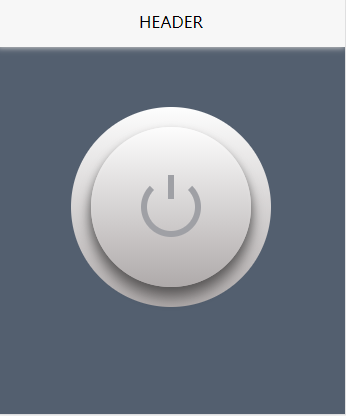 !
!
UI思路:两个圆加开关标志需要四个元素,把伪元素计算在内只要两个标签即可实现。
交互思路:利用内圆阴影或者另一个伪元素绘开关按压效果。
源码如下
<!doctype html>
<html>
	<head>
		<title>naApp</title>
	<style>
* {
	padding: 0;
	margin: 0;
	box-sizing: border-box;
	outline: none;
}
:root {
    --na-transition: all 0.24s ease-out;
}
.na-switch-card {
    position: relative;
     200px;
    height: 200px;
    border-radius: 50%;
    background: linear-gradient(#fdfdfd, #afaaaa);
}
.na-switch-card::after {
    content: '';
    position: absolute;
    top: 20px;
    left: 20px;
     160px;
    height: 160px;
    border-radius: 50%;
    background: linear-gradient(#fdfdfd, #afaaaa);
    box-shadow: inset 0 2px 3px rgba(255,255,255,0.13), 0 5px 8px rgba(0,0,0,0.3), 0 10px 10px 4px rgba(0,0,0,0.3);
    transition: var(--na-transition);
}
.na-switch-card-bg {
    top: 40px;
    left: 40px;
    z-index: 1;
    position: absolute;
     120px;
    height: 120px;
    border-radius: 50%;
}
.na-switch-card-bg::before {
    content: '';
    position: absolute;
     60px;
    height: 60px;
    border-radius: 50%;
    z-index: 2;
    border: 6px solid #9fa0a5;
    border-top: 6px solid transparent;
    top: 30px;
    left: 30px;
    box-sizing: border-box;
    -webkit-transition: var(--na-transition);
    transition: var(--na-transition);
}
.na-switch-card-bg::after {
    content: '';
    position: absolute;
     0;
    border: 0;
    height: 24px;
    z-index: 3;
    border-left: 6px solid #9fa0a5;
    top: 28px;
    left: 57px;
    -webkit-transition: var(--na-transition);
    transition: var(--na-transition);
}
.na-switch-card-on::after {
    box-shadow: inset 0 2px 3px rgba(255,255,255,0.1), 0 5px 8px rgba(0,0,0,0.15), 0 10px 10px -4px rgba(0,0,0,0.2);
}
.na-switch-card-on .na-switch-card-bg::before {
    border-color: #fff;
    border-top: 6px solid transparent;
}
.na-switch-card-on .na-switch-card-bg::after {
    border-color: #fff;
}
	</style>
	</head>
	<body>
		<div class="na-switch-card">
			<div class="na-switch-card-bg"></div>
		</div>
	</body>
<script type="text/javascript">
	document.querySelector('.na-switch-card').addEventListener('click', function() {
		this.classList.toggle('na-switch-card-on');
	})
</script>
</html>