前言:百度Echarts是一个基于Canvas的纯Javascript图表库,提供直观、生动、可交互、可个性化定制的数据可视化图表。官网地址:http://echarts.baidu.com/index.html
一、Echarts基础
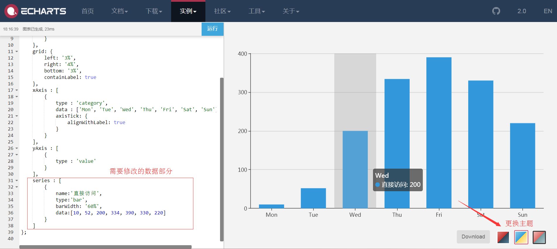
- 实例Demo:http://echarts.baidu.com/examples/

-
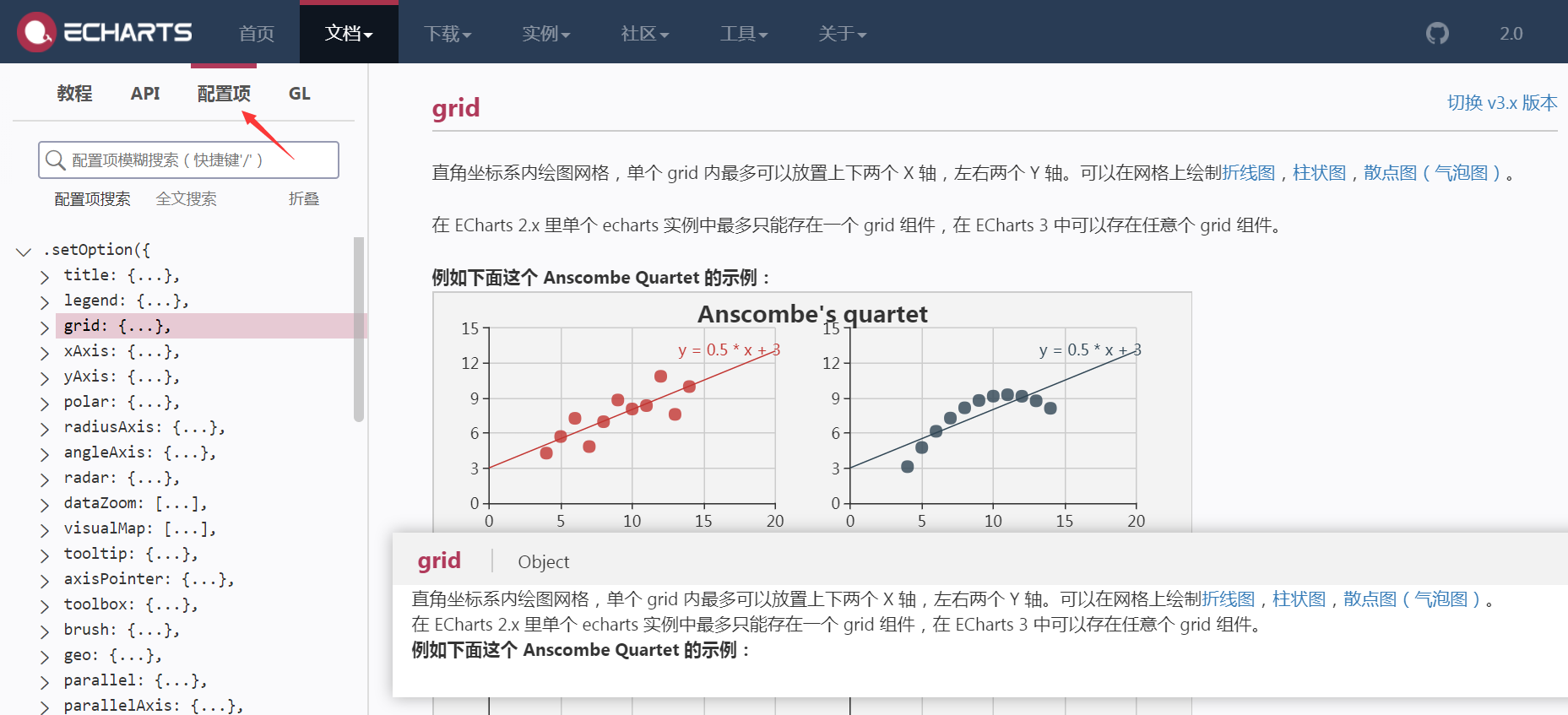
文档教程:http://www.echartsjs.com/option.html#title
-
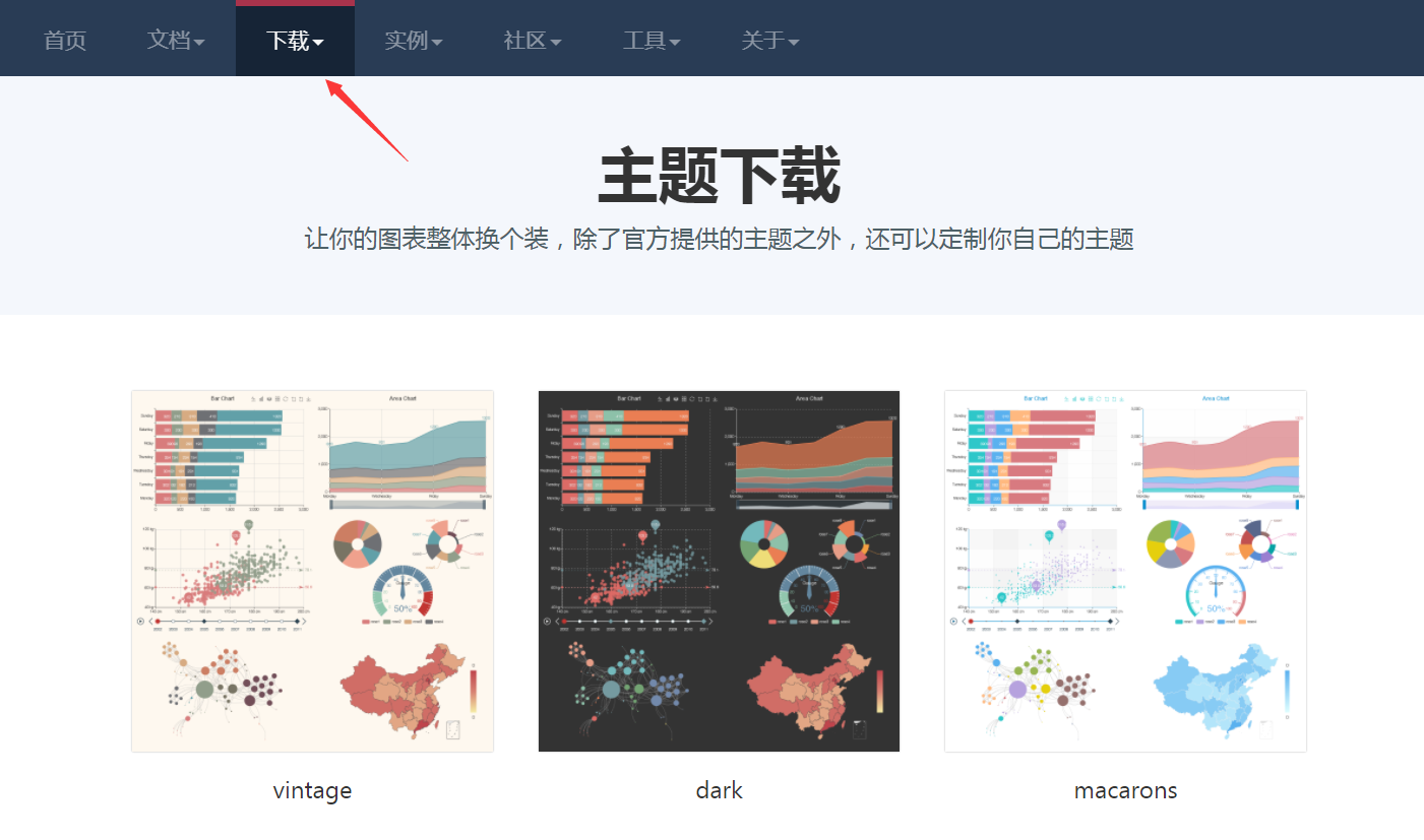
主题下载/定制主题:http://www.echartsjs.com/download-theme.html
-
React组件化theme变量应用主题
-
echarts->echartTheme.js
export default { "color": [ "#f9c700", "#ff5400", "#6699cc", "#9cb3c5", "#e0e6ec", "#666666", "#787464", "#cc7e63", "#724e58", "#4b565b" ], "backgroundColor": "#ffffff", "textStyle": {}, "title": { "textStyle": { "color": "#cccccc" }, "subtextStyle": { "color": "#cccccc" } }, "line": { "itemStyle": { "normal": { "borderWidth": 1 } }, "lineStyle": { "normal": { "width": 2 } }, "symbolSize": "10", "symbol": "emptyCircle", "smooth": false }, "pie": { "itemStyle": { "normal": { "borderWidth": 0, "borderColor": "#ccc" }, "emphasis": { "borderWidth": 0, "borderColor": "#ccc" } } }, "categoryAxis": { "axisLine": { "show": true, "lineStyle": { "color": "#f1f3f5" } }, "axisTick": { "show": true, "lineStyle": { "color": "#f1f3f5" } }, "axisLabel": { "show": true, "textStyle": { "color": "#999999", "fontSize": "14" } }, "splitLine": { "show": true, "lineStyle": { "color": [ "#f1f3f5" ] } }, "splitArea": { "show": false, "areaStyle": { "color": [ "rgba(250,250,250,0.3)", "rgba(200,200,200,0.3)" ] } } }, "valueAxis": { "axisLine": { "show": true, "lineStyle": { "color": "#f1f3f5" } }, "axisTick": { "show": true, "lineStyle": { "color": "#f1f3f5" } }, "axisLabel": { "show": true, "textStyle": { "color": "#999999", "fontSize": "14" } }, "splitLine": { "show": true, "lineStyle": { "color": [ "#f1f3f5" ] } }, "splitArea": { "show": false, "areaStyle": { "color": [ "rgba(250,250,250,0.3)", "rgba(200,200,200,0.3)" ] } } }, "toolbox": { "iconStyle": { "normal": { "borderColor": "#999999" }, "emphasis": { "borderColor": "#666666" } } }, "legend": { "textStyle": { "color": "#333333" } }, "tooltip": { "axisPointer": { "lineStyle": { "color": "#cccccc", "width": 1 }, "crossStyle": { "color": "#cccccc", "width": 1 } } }, "timeline": { "lineStyle": { "color": "#293c55", "width": 1 }, "itemStyle": { "normal": { "color": "#293c55", "borderWidth": 1 }, "emphasis": { "color": "#a9334c" } }, "controlStyle": { "normal": { "color": "#293c55", "borderColor": "#293c55", "borderWidth": 0.5 }, "emphasis": { "color": "#293c55", "borderColor": "#293c55", "borderWidth": 0.5 } }, "checkpointStyle": { "color": "#e43c59", "borderColor": "rgba(194,53,49,0.5)" }, "label": { "normal": { "textStyle": { "color": "#293c55" } }, "emphasis": { "textStyle": { "color": "#293c55" } } } }, "markPoint": { "label": { "normal": { "textStyle": { "color": "#ffffff" } }, "emphasis": { "textStyle": { "color": "#ffffff" } } } } } -
echarts->themeLight.js
var colorPalette = [ '#C1232B', '#27727B', '#FCCE10', '#E87C25', '#B5C334', '#FE8463', '#9BCA63', '#FAD860', '#F3A43B', '#60C0DD', '#D7504B', '#C6E579', '#F4E001', '#F0805A', '#26C0C0' ]; export default { color: colorPalette, title: { textStyle: { fontWeight: 'normal', color: '#27727B' } }, visualMap: { color: ['#C1232B', '#FCCE10'] }, toolbox: { iconStyle: { normal: { borderColor: colorPalette[0] } } }, tooltip: { backgroundColor: 'rgba(50,50,50,0.5)', axisPointer: { type: 'line', lineStyle: { color: '#27727B', type: 'dashed' }, crossStyle: { color: '#27727B' }, shadowStyle: { color: 'rgba(200,200,200,0.3)' } } }, dataZoom: { dataBackgroundColor: 'rgba(181,195,52,0.3)', fillerColor: 'rgba(181,195,52,0.2)', handleColor: '#27727B' }, categoryAxis: { axisLine: { lineStyle: { color: '#27727B' } }, splitLine: { show: false } }, valueAxis: { axisLine: { show: false }, splitArea: { show: false }, splitLine: { lineStyle: { color: ['#ccc'], type: 'dashed' } } }, timeline: { lineStyle: { color: '#27727B' }, controlStyle: { normal: { color: '#27727B', borderColor: '#27727B' } }, symbol: 'emptyCircle', symbolSize: 3 }, line: { itemStyle: { normal: { borderWidth: 2, borderColor: '#fff', lineStyle: { 3 } }, emphasis: { borderWidth: 0 } }, symbol: 'circle', symbolSize: 3.5 }, candlestick: { itemStyle: { normal: { color: '#C1232B', color0: '#B5C334', lineStyle: { 1, color: '#C1232B', color0: '#B5C334' } } } }, graph: { color: colorPalette }, map: { label: { normal: { textStyle: { color: '#C1232B' } }, emphasis: { textStyle: { color: 'rgb(100,0,0)' } } }, itemStyle: { normal: { areaColor: '#ddd', borderColor: '#eee' }, emphasis: { areaColor: '#fe994e' } } }, gauge: { axisLine: { lineStyle: { color: [ [ 0.2, '#B5C334' ], [ 0.8, '#27727B' ], [1, '#C1232B'] ] } }, axisTick: { splitNumber: 2, length: 5, lineStyle: { color: '#fff' } }, axisLabel: { textStyle: { color: '#fff' } }, splitLine: { length: '5%', lineStyle: { color: '#fff' } }, title: { offsetCenter: [0, -20] } } } - 引用主题
//导入主题
import echartTheme from './../echartTheme'
import themeLight from './../themeLight'
- componentWillMount()中注册主题
componentWillMount(){ echarts.registerTheme('Default', echartTheme); echarts.registerTheme('Light', themeLight); } -
ReactEcharts组件中使用主题
<ReactEcharts theme="Default"/>
<ReactEcharts theme="Light"/>
-
React单页面应用中安装echarts、echarts-for-react(常用)
npm install echarts echarts-for-react --save
//或
yarn add echarts echarts-for-react --save
-
引用echarts
-
方法一:加载全部echarts包(少用)
//加载全部echarts
import echarts from 'echarts'
-
方法二:按需加载(常用)
//按需加载
import echarts from 'echarts/lib/echarts'
//必需基础组件
import 'echarts/lib/component/tooltip'
import 'echarts/lib/component/title'
import 'echarts/lib/component/legend'
import 'echarts/lib/component/markPoint'
//导入矩形图
import 'echarts/lib/chart/bar'
-
引用并初始化ReactEcharts:组件化开发,避免通过new对象的形式实现
import ReactEcharts from 'echarts-for-react'

//render echarts options
<ReactEcharts option={this.getOption()} theme="Default"/>
二、柱形图功能实现
- echarts->bar->index.js:对应路由/admin/charts/bar
- 基本柱形图表
-
初始化ReactEcharts
<Card title="基本柱形图表"> <ReactEcharts option={this.getOption()} theme="Default" style={{height: 500}}/> </Card> -
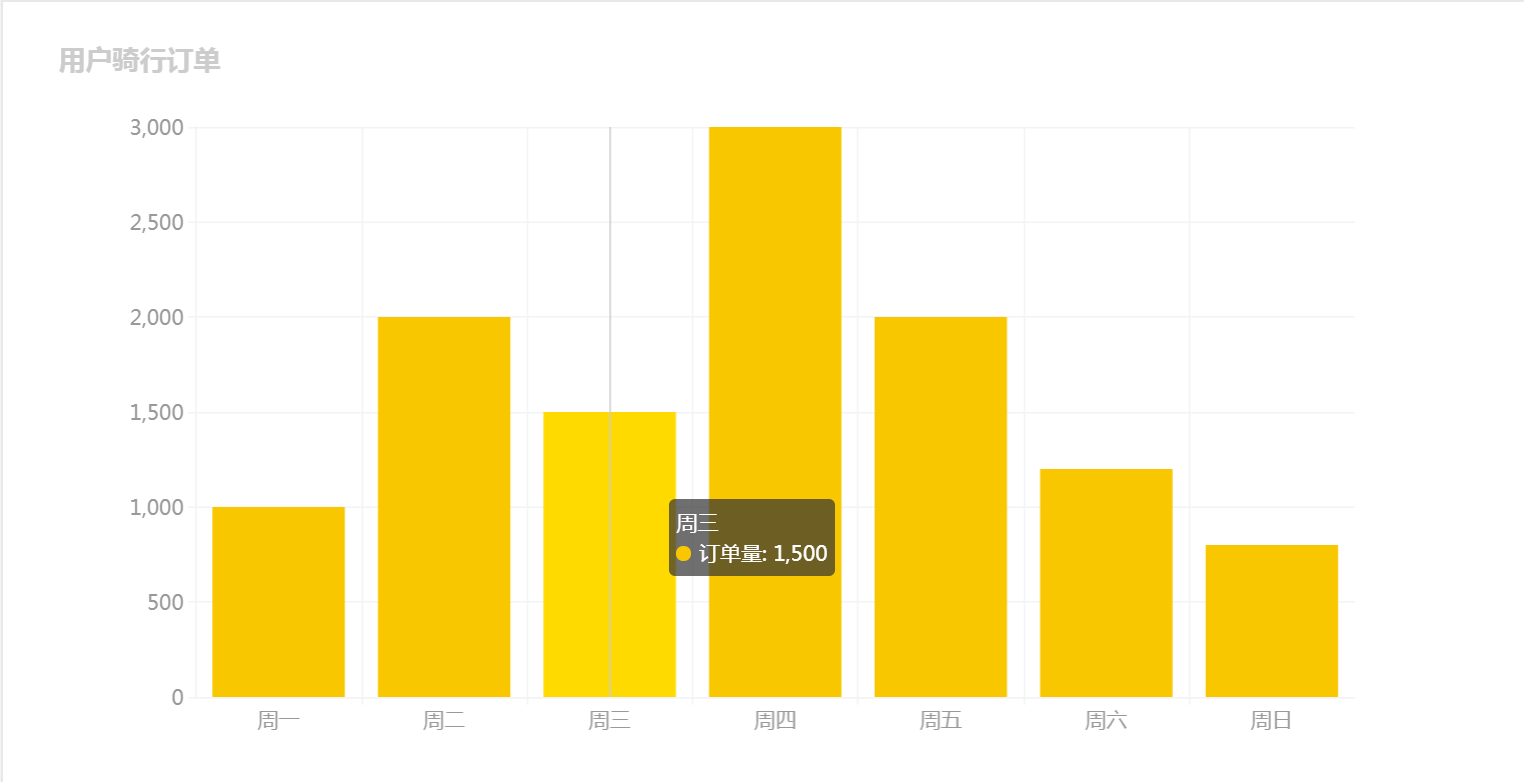
getOption()渲染数据:series为核心整体数据源,type为'bar'
getOption = () => {
        let option = {
            title: {
                text: '用户骑行订单'
            },
            tooltip: {//提示条
                trigger: 'axis'
            },
            xAxis: {  //X轴
                data: ['周一','周二','周三','周四','周五','周六','周日']
            },
            yAxis: {  //Y轴
                type: 'value'
            },
            series: [ //整体数据源
                {
                    name: '订单量',
                    type: 'bar',
                    data: [1000, 2000, 1500, 3000, 2000, 1200, 800]
                }
            ]
        }
        return option;
}
-
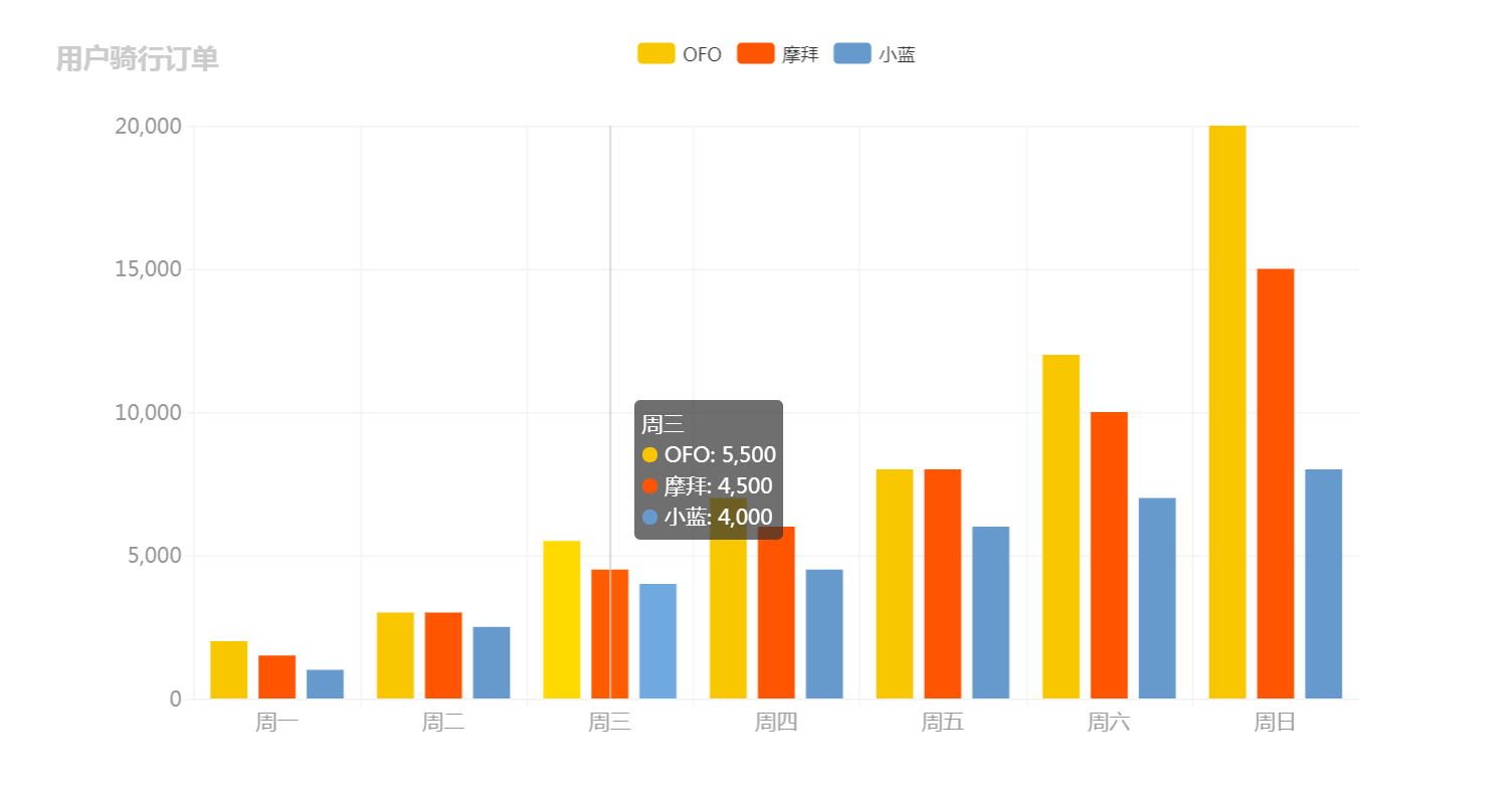
对比柱形图表
-
初始化ReactEcharts
<Card title="对比柱形图表"> <ReactEcharts option={this.getOption2()} theme="Default" style={{height: 500}}/> </Card> -
getOption2()渲染数据
getOption2 = () => {
        let option = {
            title: {
                text: '用户骑行订单'
            },
            legend: { //可过滤父标题
                data: ['OFO','摩拜','小蓝']
            },
            tooltip: {
                trigger: 'axis'
            },
            xAxis: {
                data: ['周一','周二','周三','周四','周五','周六','周日']
            },
            yAxis: {
                type: 'value'
            },
            series: [ //整体数据源
                {
                    name: 'OFO',
                    type: 'bar',
                    data: [2000, 3000, 5500, 7000, 8000, 12000, 20000]
                },
                {
                    name: '摩拜',
                    type: 'bar',
                    data: [1500, 3000, 4500, 6000, 8000, 10000, 15000]
                },
                {
                    name: '小蓝',
                    type: 'bar',
                    data: [1000, 2500, 4000, 4500, 6000, 7000, 8000]
                }
            ]
        }
        return option;
}
三、饼形图功能实现
- echarts->pie->index.js:对应路由/admin/charts/pie
- 按需加载导入饼图
//导入饼图
import 'echarts/lib/chart/pie'
-
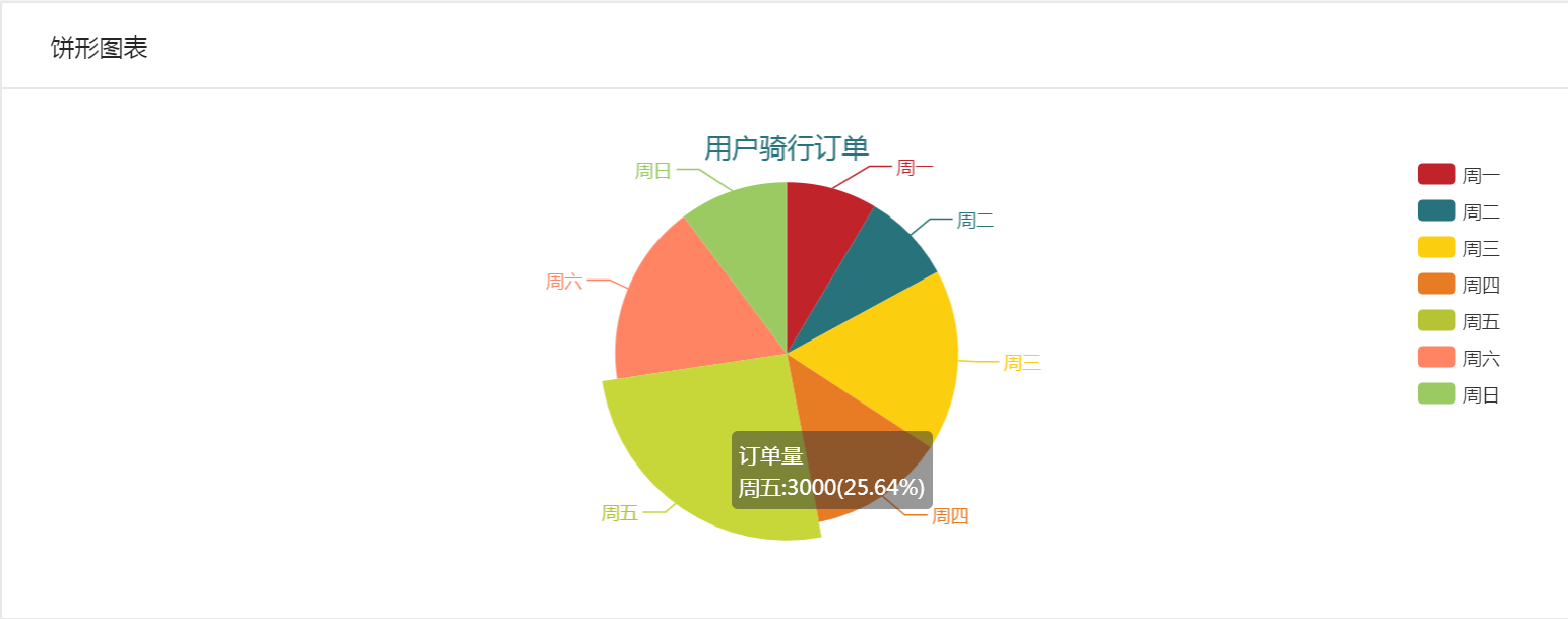
饼形图表
-
初始化ReactEcharts
<Card title="饼形图表"> <ReactEcharts option={this.getOption()} theme="Light"/> </Card> -
getOption():关键在于option不同,type为'pie',data数组元素为对象
getOption = () => {
        let option = {
            title: {
                text: '用户骑行订单',
                x: 'center'  //水平方向居中
            },
            legend: {
                orient: 'vertical', //垂直方向排列
                right: 10,          //绝对定位位置
                top: 20,
                bottom: 20,
                data: ['周一','周二','周三','周四','周五','周六','周日']
            },
            tooltip:{
                trigger: 'item',
                formatter: '{a}<br/>{b}:{c}({d}%)' //格式化提示项
            },
            series: [
                {
                    name: '订单量',
                    type: 'pie',
                    data: [
                        {
                            value: 1000,
                            name: '周一'
                        },
                        {
                            value: 1000,
                            name: '周二'
                        },
                        {
                            value: 2000,
                            name: '周三'
                        },
                        {
                            value: 1500,
                            name: '周四'
                        },
                        {
                            value: 3000,
                            name: '周五'
                        },
                        {
                            value: 2000,
                            name: '周六'
                        },
                        {
                            value: 1200,
                            name: '周日'
                        }
                    ]
                }
            ]
        }
        return option;
}
- 环形图表

-
初始化ReactEcharts
<Card title="环形图表"> <ReactEcharts option={this.getOption2()} theme="Light"/> </Card> -
getOption2():radius属性设置内环外环大小
getOption2 = () => {
        let option = {
            title: {
                text: '用户骑行订单',
                x: 'center'  //水平方向居中
            },
            legend: {
                orient: 'vertical', //垂直方向排列
                right: 10,          //绝对定位位置
                top: 20,
                bottom: 20,
                data: ['周一','周二','周三','周四','周五','周六','周日']
            },
            tooltip:{
                trigger: 'item',
                formatter: '{a}<br/>{b}:{c}({d}%)' //格式化提示项
            },
            series: [
                {
                    name: '订单量',
                    type: 'pie',
                    radius: ['50%','80%'], //内环外环大小
                    // center: ['30%','60%'], //x轴y轴位置
                    data: [
                        {
                            value: 1000,
                            name: '周一'
                        },
                        {
                            value: 1000,
                            name: '周二'
                        },
                        {
                            value: 2000,
                            name: '周三'
                        },
                        {
                            value: 1500,
                            name: '周四'
                        },
                        {
                            value: 3000,
                            name: '周五'
                        },
                        {
                            value: 2000,
                            name: '周六'
                        },
                        {
                            value: 1200,
                            name: '周日'
                        }
                    ]
                }
            ]
        }
        return option;
}
-
南丁格尔图表:表格按数据大小排序、半径或区域随数据递增

-
初始化ReactEcharts
<Card title="南丁格尔图表"> <ReactEcharts option={this.getOption3()} theme="Light"/> </Card> -
getOption3():roseType属性指定半径radius或区域area
getOption3 = () => {
        let option = {
            title: {
                text: '用户骑行订单',
                x: 'center'  //水平方向居中
            },
            legend: {
                orient: 'vertical', //垂直方向排列
                right: 10,          //绝对定位位置
                top: 20,
                bottom: 20,
                data: ['周一','周二','周三','周四','周五','周六','周日']
            },
            tooltip:{
                trigger: 'item',
                formatter: '{a}<br/>{b}:{c}({d}%)' //格式化提示项
            },
            series: [
                {
                    name: '订单量',
                    type: 'pie',
                    data: [
                        {
                            value: 1000,
                            name: '周一'
                        },
                        {
                            value: 1000,
                            name: '周二'
                        },
                        {
                            value: 2000,
                            name: '周三'
                        },
                        {
                            value: 1500,
                            name: '周四'
                        },
                        {
                            value: 3000,
                            name: '周五'
                        },
                        {
                            value: 2000,
                            name: '周六'
                        },
                        {
                            value: 1200,
                            name: '周日'
                        }
                    ].sort((a,b) => {  //数据排序
                        return a.value - b.value;
                    }),
                    roseType:'radius', //数据大、半径大
                }
            ]
        }
        return option;
}
四、折线图功能实现
- echarts->pie->index.js:对应路由/admin/charts/pie
- 按需加载导入折线图
//导入饼图 import 'echarts/lib/chart/line' -
基本折线图表

-
初始化ReactEcharts
<Card title="基本折线图"> <ReactEcharts option={this.getOption()} theme="Default" style={{height: 500}}/> </Card> -
getOption():指定xAxis和yAxis的数据,series中通过data存储趋势点
getOption = () => {
        let option = {
            title: {
                text: '用户骑行订单'
            },
            tooltip: {
                trigger: 'axis'
            },
            xAxis: {
                data: [
                    '周一','周二','周三','周四','周五','周六','周日'
                ]
            },
            yAxis: {
                type: 'value'
            },
            series: [
                {
                    name: '订单量',
                    type: 'line',
                    data: [1000,2000,1500,3000,2000,1200,800] //趋势点
                }
            ]
        }
        return option;
}
-
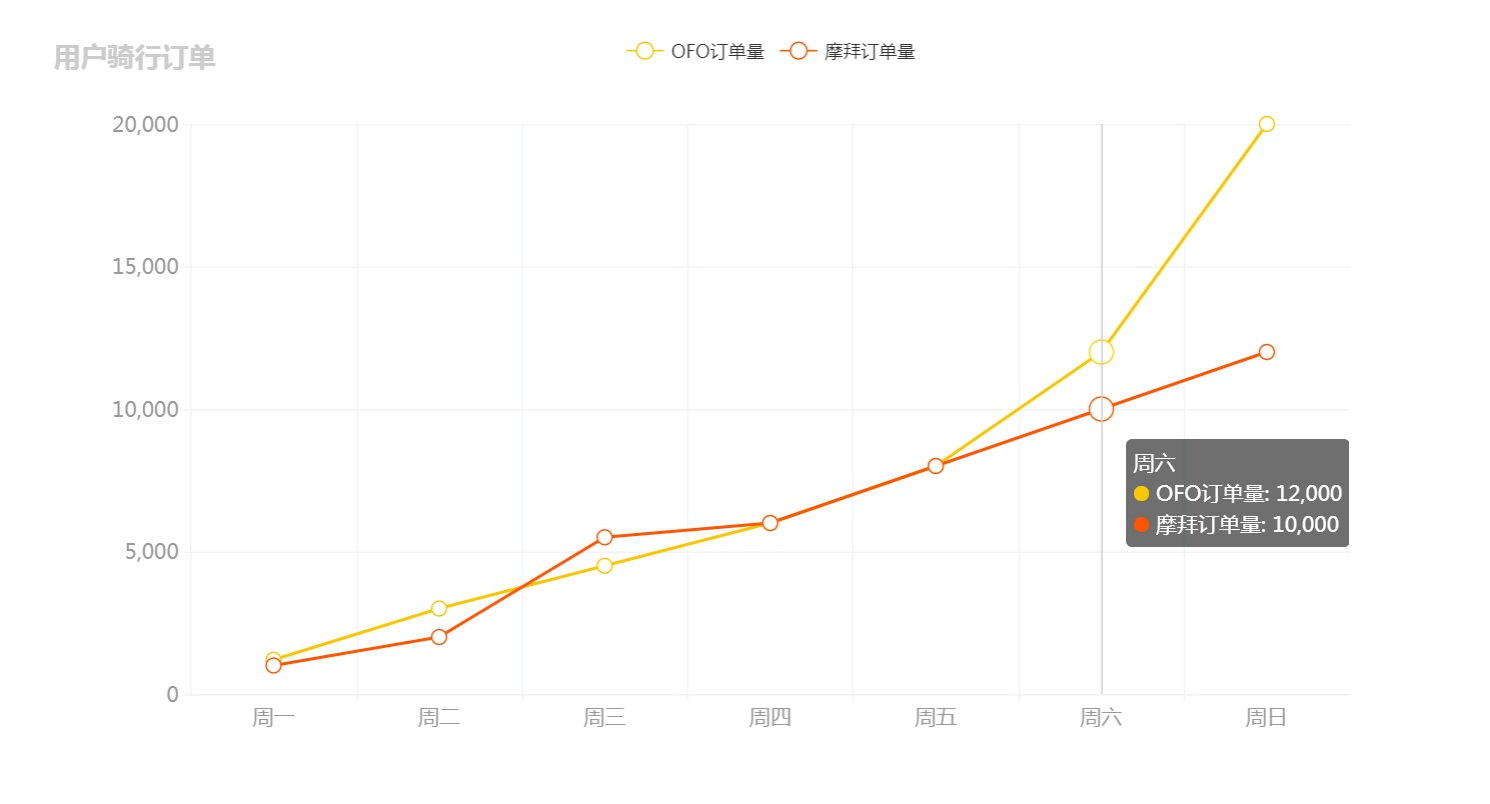
对比折线图表
-
初始化ReactCharts
<Card title="对比折线图"> <ReactEcharts option={this.getOption2()} theme="Default" style={{height: 500}}/> </Card> -
getOptions2():series整体数据源中多个数据对象对比
getOption2 = () => {
        let option = {
            title: {
                text: '用户骑行订单'
            },
            tooltip: {
                trigger: 'axis'
            },
            legend: {
                data: ['OFO订单量','摩拜订单量']
            },
            xAxis: {
                data: [
                    '周一','周二','周三','周四','周五','周六','周日'
                ]
            },
            yAxis: {
                type: 'value'
            },
            series: [
                {
                    name: 'OFO订单量',
                    type: 'line',
                    data: [1200,3000,4500,6000,8000,12000,20000] //趋势点
                },
                {
                    name: '摩拜订单量',
                    type: 'line',
                    data: [1000,2000,5500,6000,8000,10000,12000] //趋势点
                }
            ]
        }
        return option;
}
-
区域折线图表

-
初始化ReactEcharts
<Card title="区域折线图"> <ReactEcharts option={this.getOption3()} theme="Default" style={{height: 500}}/> </Card> -
getOption3():boundaryGap属性指定坐标轴从0开始,areaStyle属性指定区域填充样式
getOption3 = () => {
        let option = {
            title: {
                text: '用户骑行订单'
            },
            tooltip: {
                trigger: 'axis'
            },
            xAxis: {
                boundaryGap: false, //坐标轴从起点开始,true时在中间
                data: ['周一','周二','周三','周四','周五','周六','周日']
            },
            yAxis: {
                type: 'value'
            },
            series: [
                {
                    name: '订单量',
                    type: 'line',
                    data: [1000,2000,1500,3000,2000,1200,800], //趋势点
                    areaStyle: {} //区域填充颜色
                }
            ]
        }
        return option;
}
注:转载请注明出处