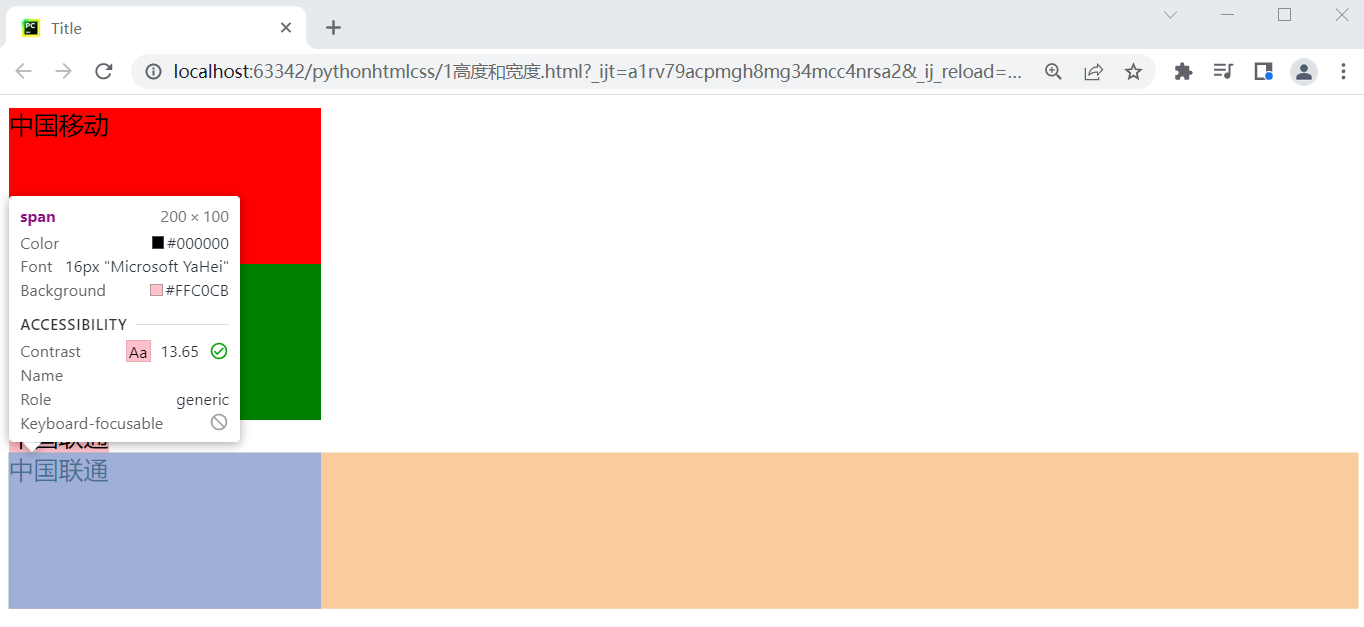
1、高度和宽度
默认情况下,高度和宽度无法应用在行内标签上。
默认情况下,块级标签虽然设置的宽度,右边空白区域也不许被占用
<!DOCTYPE html>
<html lang="en">
<head>
    <meta charset="UTF-8">
    <title>Title</title>
</head>
<body>
<!--块级标签-->
  <div style="height:100px;200px;background-color:red">中国移动</div>
  <div style="height:100px;200px;background-color:green">中国联通</div>
<!--行内标签-->
  <span style="height:100px;200px;background-color:pink">中国联通</span>
<!--行内标签转换成块级标签-->
    <span style="display:block;height:100px;200px;background-color:pink">中国联通</span>
</body>
</html>
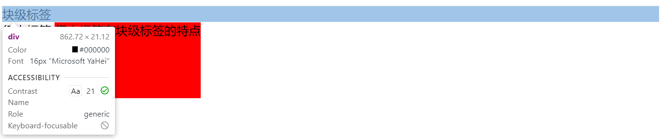
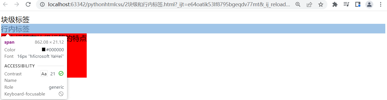
2、行内和块级标签
1)块级标签:
2)行内标签:无法应用高度和宽度
转换前代码
<!DOCTYPE html>
<html lang="en">
<head>
    <meta charset="UTF-8">
    <title>Title</title>
</head>
<body>
<!--块级标签-->
<div>块级标签</div>
<!--行内标签-->
<span>行内标签</span>
<div style="display:inline-block;height: 100px;">行内标签有块级标签的特点</div>
</body>
</html>
转换后代码
<!DOCTYPE html>
<html lang="en">
<head>
    <meta charset="UTF-8">
    <title>Title</title>
</head>
<body>
<!--块级标签转换为行内标签-->
<div style="display:inline;">块级标签</div>
<!--行内标签转换为块级标签-->
<span style="display:block;">行内标签</span>
<div style="display:inline-block;height: 100px;background-color:red;">行内标签有块级标签的特点</div>
</body>
</html>
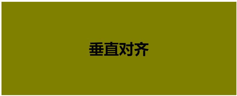
3、文本对齐方式
1)文本水平方向:style=text-align
<!DOCTYPE html>
<html lang="en">
<head>
    <meta charset="UTF-8">
    <title>Title</title>
</head>
<body>
<!--text-align:水平方向对齐方式-->
  <h1 style="text-align: left">左边</h1>
  <h1 style="text-align: right">右边</h1>
  <h1 style="text-align: center">中间</h1>
</body>
</html>
2)文本垂直方向:line-height
<!DOCTYPE html>
<html lang="en">
<head>
    <meta charset="UTF-8">
    <title>Title</title>
</head>
<body>
<!--垂直方向对齐-->
    <h1 style="text-align: center;500px;height:200px;background-color:olive;line-height:200px">垂直对齐</h1>
</body>
</html>
案例:米商城如下图
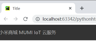
<!DOCTYPE html>
<html lang="en">
<head>
    <meta charset="UTF-8">
    <title>Title</title>
    <style>
        body{
            margin:0;
        }
        .header{
            height: 40px;
            font-size: 12px;
            color: #b0b0b0;
            background: #333;

            line-height:40px;
        }
        .header a{
            display:inline-black;
            text-align:center;
            color: #b0b0b0;
            text-decoration:none;
        }
    </style>
</head>
<body>
    <div class="header">
        <a href="https://www.mi.com/index.html">小米商城</a>
        <a href="https://www.miui.com/" target="_blank">MUMI</a>
        <a href="https://iot.mi.com/" target="_blank">IoT</a>
        <a href="https://i.mi.com/" target="_blank">云服务</a>
    </div>
</body>
</html>
对于颜色的处理:使用RGB颜色对照表:https://www.917118.com/tool/color_3.html
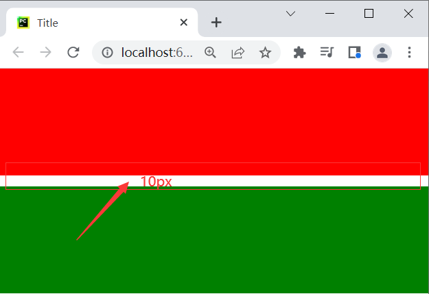
4、外边距(两人离远一点)margin
margin-top:10px; /* 距上边*/
margin-left:10px; /* 距左边*/

margin:10px;   /* 距上下左右边*/

margin:10px 20px;   /* 距上下边10px 左右边20px*/

margin:10px 20px 30px 40px;   /* 距上边10px 右边20px 下边30px 左40px  --> 顺时针方向*/
<!DOCTYPE html>
<html lang="en">
<head>
    <meta charset="UTF-8">
    <title>Title</title>
    <style>
        body{
            margin: 0;
        }
    </style>
</head>
<body>
  <div style="background-color: red;height: 100px"></div>
  <div style="background-color: green;height: 100px;margin-top:10px;"></div>
</body>
</html>
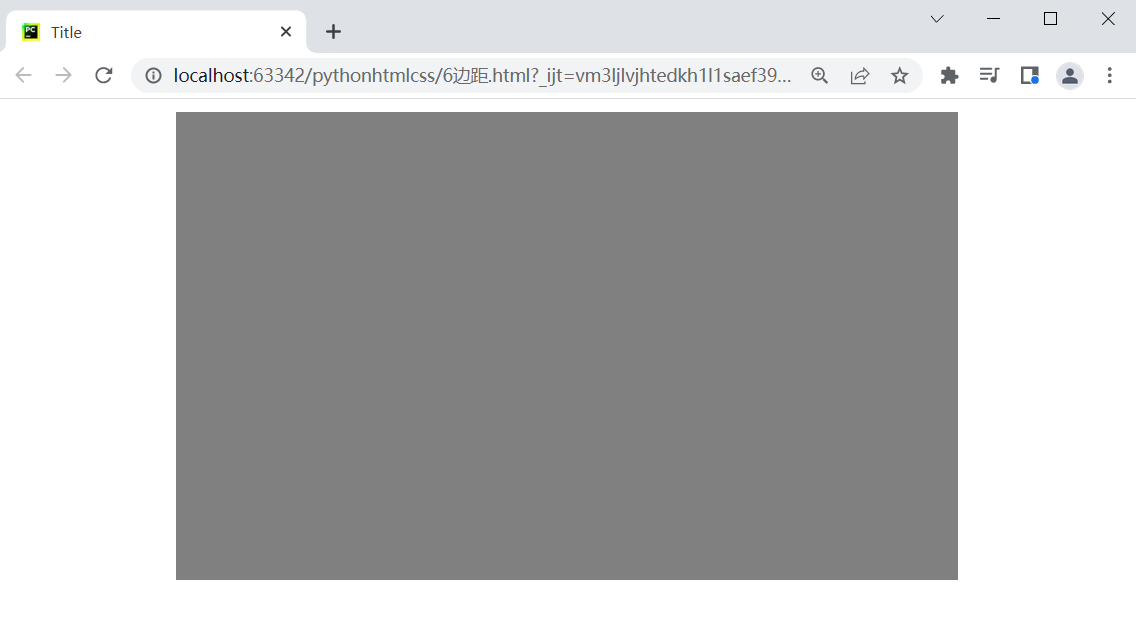
特殊的margin,左右边距自动=>标签居中。
<!DOCTYPE html>
<html lang="en">
<head>
    <meta charset="UTF-8">
    <title>Title</title>
    <style>
        .login-box{
            height: 300px;
            width: 500px;
            background: gray;
            # 左右居中;
            margin-left: auto;
            margin-right: auto;
        }
    </style>
</head>
<body>
    <div class="login-box"></div>
</body>
</html>
常见布局

<!DOCTYPE html>
<html lang="en">
<head>
    <meta charset="UTF-8">
    <title>Title</title>
    <style>
        body{
            margin:0;
        }
        .header{
            height: 40px;
            font-size: 12px;
            color: #b0b0b0;
            background: #333;

            line-height:40px;
        }
        .header a{
            display:inline-black;
            text-align:center;
            color: #b0b0b0;
            text-decoration:none;
        }
        .container{
            width: 1226px;
            margin-right: auto;
            margin-left: auto;
        }
    </style>
</head>
<body>
    <div class="header">
        <div class="container">
            <a href="https://www.mi.com/index.html">小米商城</a>
            <a href="https://www.miui.com/" target="_blank">MUMI</a>
            <a href="https://iot.mi.com/" target="_blank">IoT</a>
            <a href="https://i.mi.com/" target="_blank">云服务</a>
            <a href="https://i.mi.com/" target="_blank" style="float: right">商城</a>
        </div>
    </div>

</body>
</html>
5、内边距(一个人吃胖一点),自己会变大。
padding-left: 10px;  //内边距距离左边10

padding:10px;  //内边距距离上下左右10

padding:10px 20px;  //内边距距离上下10 距离左右20

padding:10px 20px 30px 40px;  //内边距距离上10 距离右20 距离下30 距离左40
<!DOCTYPE html>
<html lang="en">
<head>
    <meta charset="UTF-8">
    <title>Title</title>
    <style>
        body{
            margin:0;
        }
        .header{
            height: 40px;
            font-size: 12px;
            color: #b0b0b0;
            background: #333;

            line-height:40px;
        }
        .header a{
            display:inline-black;
            text-align:center;
            color: #b0b0b0;
            text-decoration:none;
        }
        .container{
            width: 1226px;
            margin-right: auto;
            margin-left: auto;
        }
        .header .menu{
            padding: 0 20px; //设置内边距
        }
    </style>
</head>
<body>
    <div class="header">
        <div class="container">
            <a href="https://www.mi.com/index.html">小米商城</a>
            <a class="menu" href="https://www.miui.com/" target="_blank">MUMI</a>
            <a class="menu" href="https://iot.mi.com/" target="_blank">IoT</a>
            <a class="menu" href="https://i.mi.com/" target="_blank">云服务</a>
            <a class="menu" href="https://i.mi.com/" target="_blank" style="float: right">商城</a>
        </div>
    </div>

</body>
</html>

关于内外边距的提示:
行内标签设置外边距和内边距都是无效的注意使用 display:inline-black;
6、float,页面布局必不可少的一个样式,让标签左右飘。 float可以让标签浮动展示,脱离文档流。
1)标签向左瓢
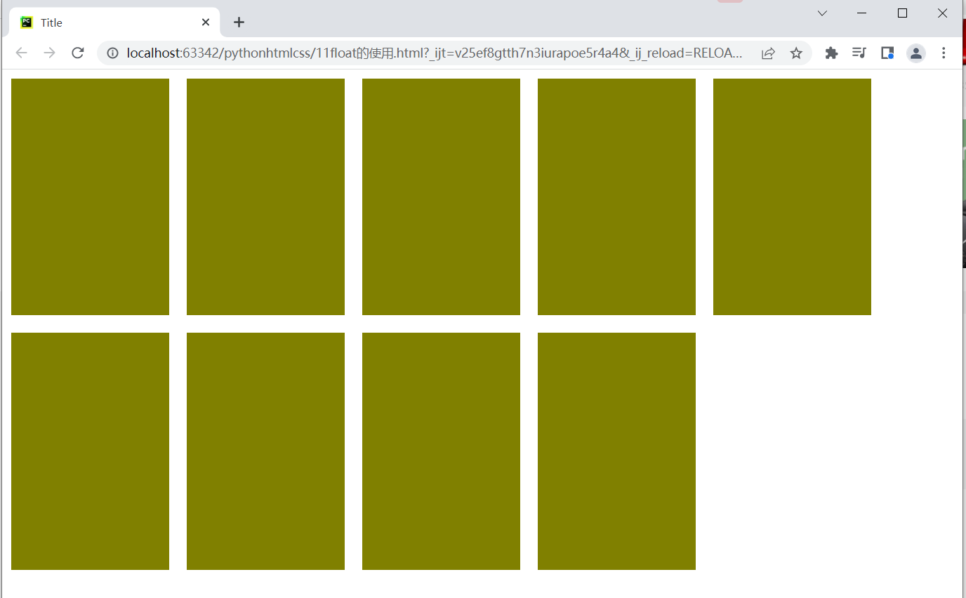
如上的效果代码如下
<!DOCTYPE html>
<html lang="en">
<head>
    <meta charset="UTF-8">
    <title>Title</title>
    <style>
        body{
            margin:0;
        }
        .item{
            height: 270px;
            width: 180px;
            background-color: olive;
            margin: 10px;
            float: left;
        }
    </style>
</head>
<body>
    <div class="course">
        <div class="item"></div>
        <div class="item"></div>
        <div class="item"></div>
        <div class="item"></div>
        <div class="item"></div>
        <div class="item"></div>
        <div class="item"></div>
        <div class="item"></div>
        <div class="item"></div>
    </div>
</body>
</html>
2)标签左右瓢
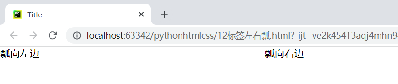
如上的效果代码如下
<!DOCTYPE html>
<html lang="en">
<head>
    <meta charset="UTF-8">
    <title>Title</title>
    <style>
        body{
            margin:0;
        }
    </style>
</head>
<body>
    <div style=" 500px;">
        <div style="float: left">瓢向左边</div>
        <div style="float: right">瓢向右边</div>
    </div>
</body>
</html>
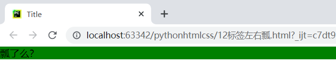
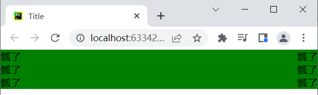
没有瓢:
<!DOCTYPE html>
<html lang="en">
<head>
    <meta charset="UTF-8">
    <title>Title</title>
    <style>
        body{
            margin:0;
        }
    </style>
</head>
<body>
    <div style="background-color: green">
        <div>瓢了么?</div>
    </div>
</body>
</html>
如果瓢:使用笨方法处理(<div style="clear: both"></div>)
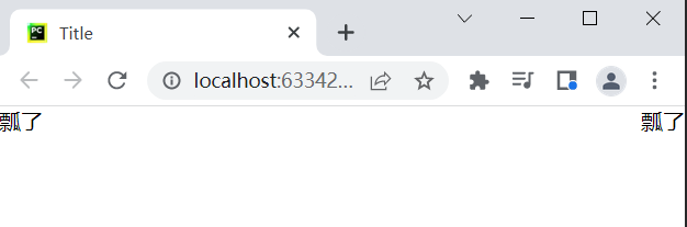
<!DOCTYPE html>
<html lang="en">
<head>
    <meta charset="UTF-8">
    <title>Title</title>
    <style>
        body{
            margin:0;
        }
    </style>
</head>
<body>
    <div style="background-color: green">
        <div style="float: left">瓢了</div>
        <div style="float: right">瓢了</div>

<!--        飘了我再给拉回来-->
        <div style="clear: both"></div>
    </div>
</body>
</html>
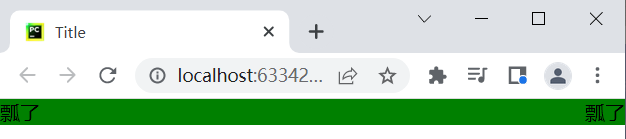
如果瓢:使用聪明的方法处理(after伪类)
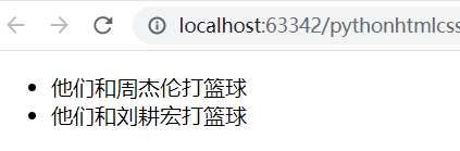
先了解after
<!DOCTYPE html>
<html lang="en">
<head>
    <meta charset="UTF-8">
    <title>Title</title>
    <style>
        li:before{
            content: "他们和";
        }
        li:after{
            content:"打篮球";
        }
    </style>
</head>
<body>
    <ul>
        <li>周杰伦</li>
        <li>刘耕宏</li>
    </ul>
</body>
</html>
使用after处理瓢的问题
<!DOCTYPE html>
<html lang="en">
<head>
    <meta charset="UTF-8">
    <title>Title</title>
    <style>
        body{
            margin:0;
        }
        .bg{
          background-color: green;
        }
        .bg:after{
          display: block;
          content: '';
          clear: both;
        }
    </style>
</head>
<body>
    <div class="bg">
        <div style="float: left">瓢了</div>
        <div style="float: right">瓢了</div>
    </div>
</body>
</html>
上面只是处理一个,要是很多该怎么处理?如下
<!DOCTYPE html>
<html lang="en">
<head>
    <meta charset="UTF-8">
    <title>Title</title>
    <style>
        body{
            margin:0;
        }
        .bg,.xxx,.hhhh{
          background-color: green;
        }
        .clearfix:after{
          display: block;
          content: '';
          clear: both;
        }
    </style>
</head>
<body>
    <div class="bg clearfix">
        <div style="float: left">瓢了</div>
        <div style="float: right">瓢了</div>
    </div>
    <div class="xxx clearfix">
        <div style="float: left">瓢了</div>
        <div style="float: right">瓢了</div>
    </div>
    <div class="hhhh clearfix">
        <div style="float: left">瓢了</div>
        <div style="float: right">瓢了</div>
    </div>
</body>
</html>
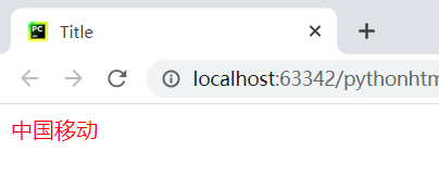
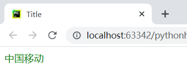
7、hover 鼠标悬停
<!DOCTYPE html>
<html lang="en">
<head>
    <meta charset="UTF-8">
    <title>Title</title>
    <style>
      .c1{
        color: red;
      }
      .c1:hover{
        color:green;
      }
    </style>
</head>
<body>
  <div class="c1">中国移动</div>

</body>
</html>
鼠标悬停后效果
小米案例:
<!DOCTYPE html>
<html lang="en">
<head>
    <meta charset="UTF-8">
    <title>Title</title>
    <style>
        body{
            margin:0;
        }
        .top{
            background: #333;
        }
        .container{
            width: 1226px;
            margin: 0 auto;
        }
        .clearfix:after{
          display: block;
          content: '';
          clear: both;
        }
        .top a{
            display: inline-block;
            line-height: 40px;
            color: #b0b0b0;
            font-size: 12px;

            text-decoration: none;
        }
        .top a:hover{
            color:white;
        }
    </style>
</head>
<body>
    <div class="top">
        <div class="container clearfix">
            <a href="https://www.mi.com/index.html">小米商城</a>
            <a href="https://www.miui.com/">MUMI</a>
            <a href="https://iot.mi.com/" >IoT</a>
            <a href="https://i.mi.com/" >云服务</a>
            <div style="float: right">
                <a>登录</a>
                <a>注册</a>
            </div>
        </div>
    </div>
</body>
</html>
效果如下图:

8、小米logo菜单案例
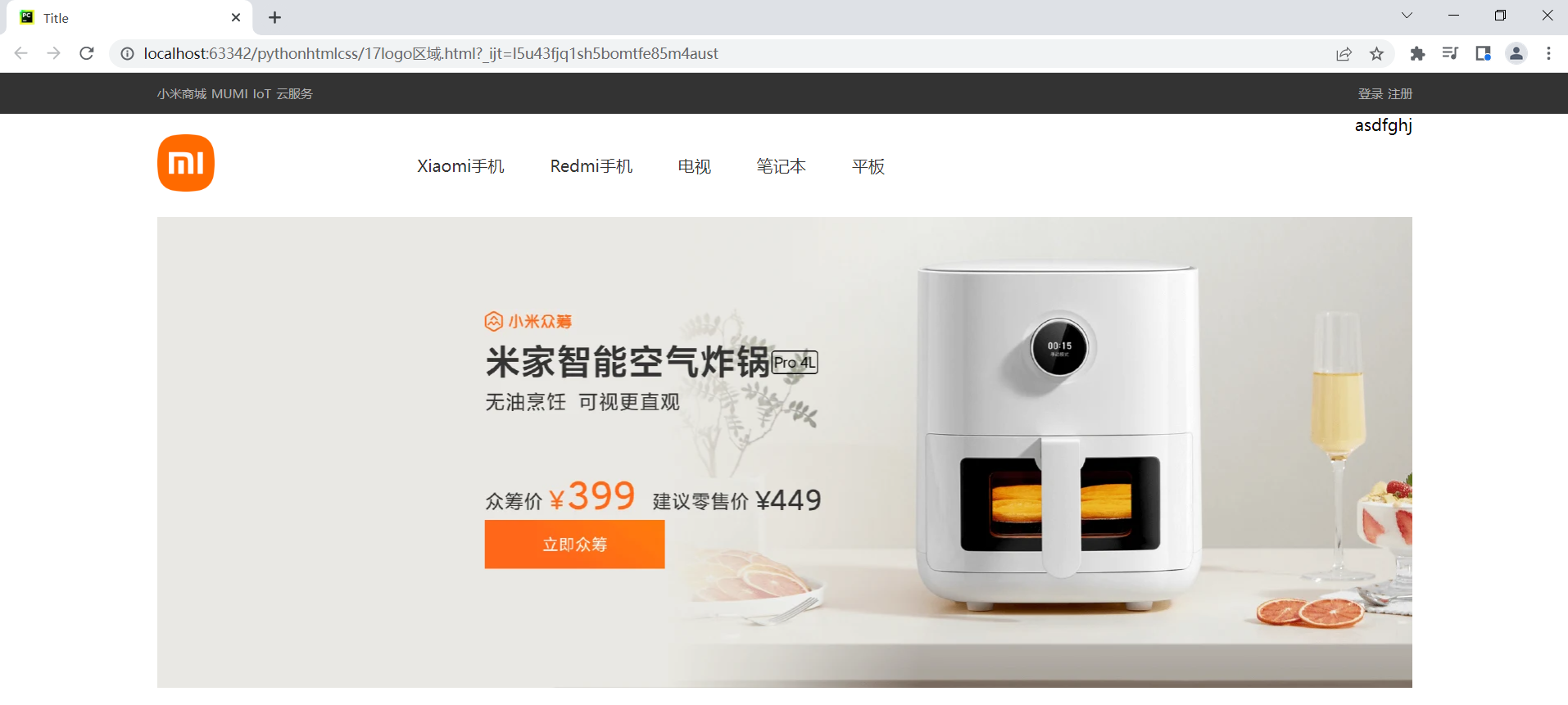
代码:
<!DOCTYPE html>
<html lang="en">
<head>
    <meta charset="UTF-8">
    <title>Title</title>
    <style>
        body {
            margin: 0;
        }

        .top {
            background: #333;
        }

        .container {
            width: 1226px;
            margin: 0 auto;
        }

        .clearfix:after {
            display: block;
            content: '';
            clear: both;
        }

        .top a {
            display: inline-block;
            line-height: 40px;
            color: #b0b0b0;
            font-size: 12px;

            text-decoration: none;
        }
        .top a:hover {
            color: white;
        }

        .hd .logo {
            float: left;
            width: 234px;
        }
        .hd .main-menu{
            float: left;
        }
        .hd .main-menu a{
            display: inline-block;
            padding: 40px 20px;
            color: #333;
            text-decoration: none;
        }
        .hd .main-menu a:hover{
            color: #ff6700;
        }
        .hd .search{
            float: right;
        }
    </style>
</head>
<body>
<div class="top">
    <div class="container clearfix">
        <a href="https://www.mi.com/index.html">小米商城</a>
        <a href="https://www.miui.com/">MUMI</a>
        <a href="https://iot.mi.com/">IoT</a>
        <a href="https://i.mi.com/">云服务</a>
        <div style="float: right">
            <a>登录</a>
            <a>注册</a>
        </div>
    </div>
</div>
<div class="hd">
    <div class="container clearfix">
        <div class="logo">
            <a href="" style="height: 56px; 56px;display: inline-block;margin-top: 20px">
                <img src="imgs/logo-mi2.png" alt="" style=" 100%">
            </a>
        </div>
        <div class="main-menu">
            <a href="https://www.mi.com/index.html">Xiaomi手机</a>
            <a href="https://www.mi.com/index.html">Redmi手机</a>
            <a href="https://www.mi.com/index.html">电视</a>
            <a href="https://www.mi.com/index.html">笔记本</a>
            <a href="https://www.mi.com/index.html">平板</a>
        </div>
        <div class="search">
            asdfghj
        </div>
    </div>
</div>
<div class="banner">
    <div class="container">
        <a href="" style=" 1226px;">
            <img src="imgs/b1.png" alt="" style=" 100%">
        </a>
    </div>
</div>
</body>
</html>
9、边框border实现
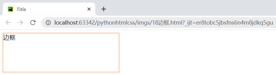
<!DOCTYPE html>
<html lang="en">
<head>
    <meta charset="UTF-8">
    <title>Title</title>
    <style>
        .c1{
            height: 100px;
            width: 300px;
            border: 1px solid #ff6700;
            /*border-right: 1px solid #ff6700;
            border-bottom: 1px solid #ff6700;*/
        }
    </style>
</head>
<body>
    <div class="c1">边框</div>
</body>
</html>
9.1、场景:当鼠标移到到某一字体上出现下滑线
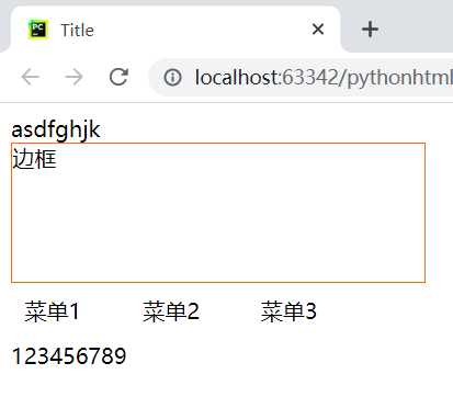
<!DOCTYPE html>
<html lang="en">
<head>
    <meta charset="UTF-8">
    <title>Title</title>
    <style>
        .c1{
            height: 100px;
            width: 300px;
            border: 1px solid #ff6700;
            /*border-right: 1px solid #ff6700;
            border-bottom: 1px solid #ff6700;*/
        }
        .menu{
            display: inline-block;
            padding: 10px;
            margin-right: 20px;

            border-bottom: 2px solid transparent;
        }
        .menu:hover{
            border-bottom: 1px solid #333;
        }
    </style>
</head>
<body>
<div>asdfghjk</div>
<div class="c1">边框</div>
<a class="menu">菜单1</a>
<a class="menu">菜单2</a>
<a class="menu">菜单3</a>
<div>123456789</div>
</body> </html>
9.2、场景:边框的圆角设计
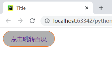
<!DOCTYPE html>
<html lang="en">
<head>
    <meta charset="UTF-8">
    <title>Title</title>
    <style>
        .btn{
            display: inline-block;
            padding: 10px 20px;
            border: 1px solid #ff6700;
            border-radius: 50px;  /* 设计圆角半径*/
            text-decoration: none;
            background-color: #b0b0b0;
        }
    </style>
</head>
<body>
    <a href="http://www.baidu.com" class="btn">点击跳转百度</a>
</body>
</html>
10、position定位的使用
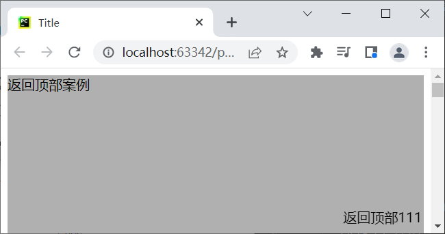
10.1、fiexed固定定位:永远固定在窗口的指定位置
<!DOCTYPE html>
<html lang="en">
<head>
    <meta charset="UTF-8">
    <title>Title</title>
</head>
<body>
    <div style="height: 5000px;background-color: #b0b0b0">返回顶部案例</div>
    <div style="position: fixed;right: 10px;bottom: 10px;">返回顶部111</div>
</body>
</html>
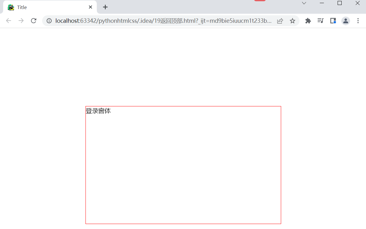
案例:登录窗体所在页面的正中间
<!DOCTYPE html>
<html lang="en">
<head>
    <meta charset="UTF-8">
    <title>Title</title>
    <style>
        .login-box{
            border: 1px solid red;
            height: 300px;
            width: 500px;
            margin: 0 auto;

            position: fixed;
            left: 0;
            right: 0;
            top: 200px;
        }
    </style>
</head>
<body>
    <!--登录窗体所在页面的正中间-->
    <div class="login-box">
        登录窗体
    </div>
</body>
</html>
案例:登录窗体+遮罩层+内容层
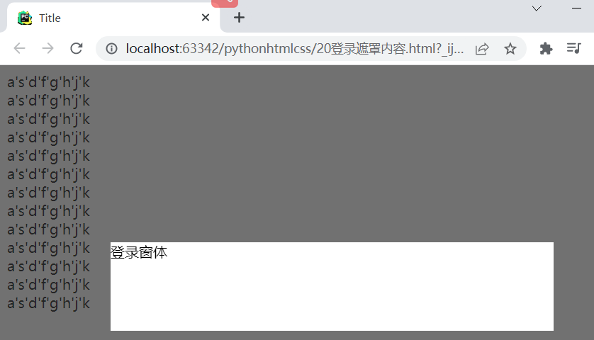
<!DOCTYPE html>
<html lang="en">
<head>
    <meta charset="UTF-8">
    <title>Title</title>
    <style>
        .middle{
            position: fixed;
            background: #333333;
            left: 0px;
            right: 0;
            top: 0px;
            bottom: 0px;
            opacity: 0.7;
            z-index: 100;
        }
        .outer{
            position: fixed;
            background-color: white;
            height: 100px;
            width: 500px;
            left: 0px;
            right: 0px;
            margin: 0 auto;
            top: 200px;
            z-index:101;
        }
    </style>
</head>
<body>
<!--内容层-->
    <div style="height: 5000px;">
        <div>a's'd'f'g'h'j'k</div>
        <div>a's'd'f'g'h'j'k</div>
        <div>a's'd'f'g'h'j'k</div>
        <div>a's'd'f'g'h'j'k</div>
        <div>a's'd'f'g'h'j'k</div>
        <div>a's'd'f'g'h'j'k</div>
        <div>a's'd'f'g'h'j'k</div>
        <div>a's'd'f'g'h'j'k</div>
        <div>a's'd'f'g'h'j'k</div>
        <div>a's'd'f'g'h'j'k</div>
        <div>a's'd'f'g'h'j'k</div>
        <div>a's'd'f'g'h'j'k</div>
        <div>a's'd'f'g'h'j'k</div>
    </div>
<!--最外层z-index:101 值越小表示该部分在最底层-->
<div class="outer">登录窗体</div>
<!--中间层遮罩层-->
<div class="middle"></div>
</body>
</html>
10.2、absolute 绝对定位&relative相对定位
右边弹窗的出现随左边的按钮移动而变化
<!DOCTYPE html>
<html lang="en">
<head>
    <meta charset="UTF-8">
    <title>Title</title>
</head>
<body>
<!--relative相当于是父,absolute相当于子-->
    <div style="height: 500px;  500px;border: 1px solid red;position: relative;">
        <div style="position: absolute;right: 0;top: 0;">xxx</div>
    </div>
</body>
</html>