这两天看了不少文章,对于css布局多了一些理解,现在来总结下。
我们来写一个最普遍的Top、Left、Content、Right、Foot布局。
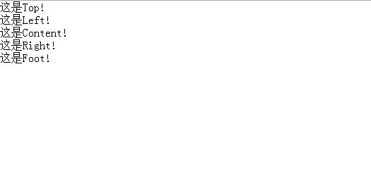
第一步:自然是写一个坯子
 1 <!DOCTYPE HTML PUBLIC "-//W3C//DTD HTML 4.01//EN" "http://www.w3.org/TR/html4/strict.dtd">
 2 <html>
 3     <head>
 4         <meta http-equiv="content-type" content="text/html; charset=utf-8" />
 5         <title>Css布局</title>
 6     </head>
 7     <body>
 8         <div id="parents">
 9            <div id="top">这是Top!</div>
10            <div id="main">
11                   <div id="left">这是Left!</div>
12                <div id="content">这是Content!</div>
13                <div id="right">这是Right!</div>
14              </div>
15            <div id="foot">这是Foot!</div>
16         </div>
17     </body>
18 </html>
效果:
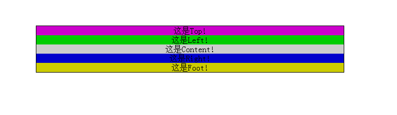
第二步: 我们给这些加上背景色,并将整个parents居中
 1 <style type="text/css">
 2     * {
 3     margin: 0;
 4     padding: 0;
 5     text-Align: center;
 6     }
 7     #parents {
 8          600px;
 9         border: 1px solid;
10         margin: 100px auto 0 auto;
11     }
12     #top {
13         background: #cc00cc;
14      }
15     #left {
16         background: #00cc00;
17     }
18     #content {
19         background: #cccccc;
20     }
21     #right {
22         background: #0000cc;
23     }
24     #foot {
25         background: #cccc00;
26     }
27 </style>
效果:
我们给top和foot设置100的高度,并将left和content向左浮动,right向右浮动。
 1 <style type="text/css">
 2     * {
 3       margin: 0;
 4        padding: 0;
 5        text-Align: center;
 6     }
 7     #parents {
 8         600px;
 9        border: 1px solid;
10        margin: 100px auto 0 auto;
11      }
12     #top {
13        background: #cc00cc;
14        height: 100px;
15     }
16     #left {
17        background: #00cc00;
18        float: left;
19     }
20     #content {
21        background: #cccccc;
22        float: left;
23     }
24     #right {
25        background: #0000cc;
26        float: right;
27     }
28     #foot {
29        background: #cccc00;
30        height: 100px;
31     }
32 </style>
效果:
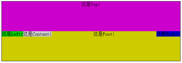
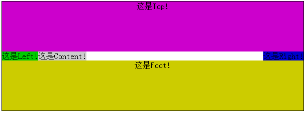
貌似有点不对,没事。把foot给clear一下就可以了!
1 #foot {
2     background: #cccc00;
3     height: 100px;
4     clear: both;
5 }
效果:
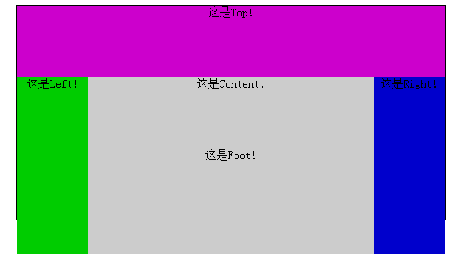
我们给left、content、right分别设置宽度100px、400px、100px。
 1 #left {
 2     background: #00cc00;
 3     float: left;
 4      100px;
 5 }
 6 #content {
 7     background: #cccccc;
 8     float: left;
 9      400px;
10 }
11 #right {
12     background: #0000cc;
13     float: right;
14      100px;
15 }
效果:
看起来貌似大功告成!
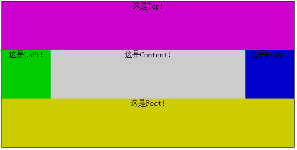
不过这里的设置还有一个大问题,在网页布局中,中间的left、content、right是根据实际需要添删内容的,而各列高度很多时候都不一样。比如我们设置left的高度为100px。
1 #left {
2     background: #00cc00;
3     float: left;
4      100px;
5     height: 100px;
6 }
效果:

我们看到,当其中一个高度发生变化时,其余两者并没有随之改变,这样布局就出现了一个很大的漏洞。
如何使中间层的三者在其中随意一个高度发生变化时,依旧能保持三者高度一致呢?
这里就牵涉到一个负边距的使用技巧了。
这个方法称之为padding补偿法:
首先把列的padding-bottom设为一个足够大的值,再把列的margin-bottom设一个与前面的padding-bottom的正值相抵消的负值,父容器设置超出隐藏,这样子父容器的高度就还是它里面的列没有设定padding-bottom时的高度,当它里面的任一列高度增加了,则父容器的高度被撑到它里面最高那列的高度,其他比这列矮的列则会用它们的padding-bottom来补偿这部分高度差。因为背景是可以用在padding占用的空间里的,而且边框也是跟随padding变化的,这样就成功的使得三者列高最起码看起来是等高的。这样也就满足了我们的需求。
 1 #left {
 2     background: #00cc00;
 3     float: left;
 4      100px;
 5     height: 100px;
 6     margin-bottom: -2000px;
 7     padding-bottom: 2000px;
 8 }
 9 #content {
10     background: #cccccc;
11     float: left;
12      400px;
13     margin-bottom: -2000px;
14     padding-bottom: 2000px;
15 }
16 #right {
17     background: #0000cc;
18     loat: right;
19      100px;
20     margin-bottom: -2000px;
21     padding-bottom: 2000px;
22 }
效果:
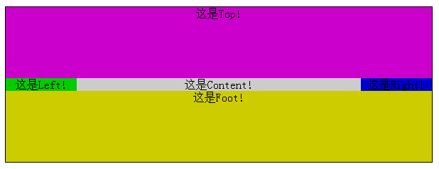
现在产生了一个问题,高度溢出了。
我们可以对其父元素配置一个overflow: hidden来对溢出部分进行修剪。
1 #main {
2     overflow: hidden;
3 }
这样就大功告成了:
此刻,我们给content添加内容改变他的高度。
1 <div id="content">这是Content!<br><br><br>打算打算打<br><br><br>dwdoahdoa<br><br>的味道</div>
效果:
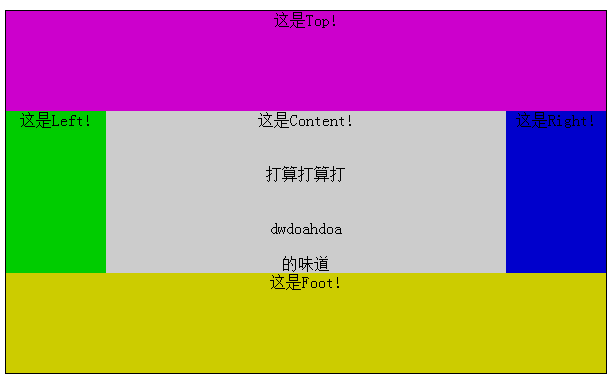
我们看到,当content的高度发生变化时,left和right的高度随之改变,这就是多列等高的奥秘。
最后附上完整代码:
 1 <!DOCTYPE HTML PUBLIC "-//W3C//DTD HTML 4.01//EN" "http://www.w3.org/TR/html4/strict.dtd">
 2 <html>
 3     <head>
 4         <meta http-equiv="content-type" content="text/html; charset=utf-8" />
 5         <title>PE Layout Example 1</title>
 6         <style type="text/css">
 7             * {
 8                 margin: 0;
 9                 padding: 0;
10                 text-Align: center;
11             }
12             #parents {
13                  600px;
14                 border: 1px solid;
15                 margin: 100px auto 0 auto;
16             }
17             #top {
18                 background: #cc00cc;
19                 height: 100px;
20             }
21             #main {
22                 overflow: hidden;
23                  100%;
24             }
25             #left {
26                 background: #00cc00;
27                  float: left;
28                   100px;
29                  margin-bottom: -2000px;
30                  padding-bottom: 2000px;
31             }
32             #content {
33                 background: #cccccc;
34                 float: left;
35                  400px;
36                 margin-bottom: -2000px;
37                  padding-bottom: 2000px;
38             }
39             #right {
40                 background: #0000cc;
41                 float: right;
42                  100px;
43                 margin-bottom: -2000px;
44                  padding-bottom: 2000px;
45             }
46             #foot {
47                 background: #cccc00;
48                 height: 100px;
49                 clear: both;
50             }
51         </style>
52     </head>
53     <body>
54         <div id="parents">
55            <div id="top">这是Top!</div>
56            <div id="main">
57                   <div id="left">这是Left!</div>
58                <div id="content">这是Content!<br><br><br>打算打算打<br><br><br>dwdoahdoa<br><br>的味道</div>
59                <div id="right">这是Right!</div>
60              </div>
61            <div id="foot">这是Foot!</div>
62         </div>
63     </body>
64 </html>