css按钮的样式
效果展示 + 代码
html代码:
<!DOCTYPE html>
<head>
    <meta http-equiv =“Content-Type”content =“text / html; charset = utf-8”/>
    <title>css3按钮悬停</title>
    <link rel="stylesheet" type="text/css" href="./01.css">
</head>
<body>
    <button class="btn-1">按钮1</button>
    <button class="btn-2">按钮2</button>
    <button class="btn-3">按钮3</button>
    <button class="btn-4">按钮4</button>
    <button class="btn-5">按钮5</button>
    <button class="btn-6">按钮6</button>
</body>
css代码
总体
body {
    --primary: 25,91,255;
    --color: 44, 62, 80;
    display: flex;
    align-items: center;
    justify-content: center;
    height: 100vh;
    background: #f4f7f8;
    height: calc(var(--vh, 1vh) * 100);
    overflow: hidden;
    color: rgb(var(--color));
     100%;
    height: 100vh;
}
* {
    list-style: none;
    outline: none;
    padding: 0;
    margin: 0;
    font-family: 'Poppins', sans-serif;
    box-sizing: border-box;
}
button {
    padding: 20px 50px;
    font-size: 1.5rem;
    cursor: pointer;
    border: 0px;
    background: transparent;
    position: relative;
    margin: 20px;
    transition: all .25s ease;
}
btn1
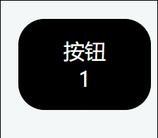
.btn-1 {
    background: #000;
    color: #fff;
    border-radius: 30px;
    transition: all .25s ease;
}
.btn-1::after,.btn-1::before {
    content: '';
    position: absolute;
    opacity: .3;
    background: #000;
    border-radius: inherit;
     100%;
    height: 100%;
    left: 0px;
    bottom: 0px;
    z-index: -1;
    transition: all .25s ease;
}
.btn-1:hover {
    transform: translate(-12px, -12px);
}
.btn-1:hover:after {
    transform: translate(6px, 6px);
}
.btn-1:hover:before {
    transform: translate(12px, 12px);
}
btn2
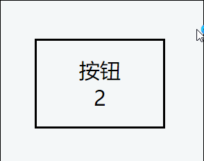
.btn-2:hover::after {
    transform: translate(-5px, -5px);
}
.btn-2:hover::before {
    transform: translate(5px, 5px);
}
.btn-2::after,.btn-2::before {
    border: 3px solid #000;
    content: '';
    position: absolute;
    border-radius: inherit;
     calc(100% - 6px);
    height: calc(100% - 6px);
    left: 0px;
    bottom: 0px;
    z-index: -1;
    transition: all .25s ease;
}
btn3
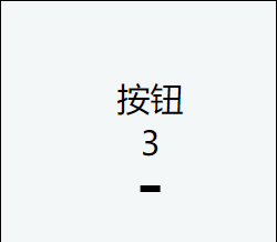
.btn-3:hover::after {
     100%;
}

.btn-3::after {
    content: '';
    position: absolute;
    border-radius: inherit;
     10%;
    height: 5px;
    background: #000;
    left: 0px;
    bottom: 0px;
    z-index: -1;
    transition: all .25s ease;
    left: 50%;
    transform: translate(-50%);
}
btn4

.btn-4 {
    overflow: hidden;
    color: #fff;
    border-radius: 30px;
    box-shadow: 0px -0px 0px 0px rgba(143, 64, 248, .5), 0px 0px 0px 0px rgba(39, 200, 255, .5);
}
.btn-4:hover {
    transform: translate(0,-6px);
    box-shadow: 10px -10px 25px 0px rgba(143, 64, 248, .25), -10px 10px 25px 0px rgba(39, 200, 255, .25);
}
.btn-4:hover::after {
    transform: rotate(150deg);
}
.btn-4::after {
    content: '';
     400px;
    height: 400px;
    position: absolute;
    top: -50px;
    left: -100px;
    background-color: #FF3CAC;
    background-image: linear-gradient(225deg, #27d86c 0%, #26caf8 50%, #c625d0 100%);
    z-index: -1;
    transition: all .5s ease;
}
btn5
.btn-5:hover {
    color: #fff;
}
.btn-5:hover::after {
    transform: scale(1);
    opacity: 1;
}
.btn-5::after {
    content: '';
     100%;
    height: 100%;
    border-radius: 30px;
    position: absolute;
    top: 0px;
    left: 0px;
    transform: scale(.1);
    background: #000;
    z-index: -1;
    opacity: 0;
    transition: all .25s ease;
}