本章我们要学习的控件有:
- ButtonGroup: 按钮组,可以设置RadioButton、CheckBox等成员是否互斥. 即在一个按钮组中只能选中一个.
- RadioButton: 单选按钮,一组RadioButton只有一个选中, 并且单个RadioButton在选中后,通过点击无法变为未选中,一般ui用圆形表示
- CheckBox: 复选框,一组CheckBox可以有多个选中,一般ui用矩形表示
本章我们以RadioButton和CheckBox为例,当然在qml中,除了该两个按钮组件外,还有其它的,比如Switch(开关按钮):
如果要想了解更多不同的button,也可以在帮助手册中通过Button Controls查看所有button控件:

1.ButtonGroup
ButtonGroup控件是import QtQuick.Controls 2.0版本以上才出现的,它比低版本更加简便好用,我们只需要使用ButtonGroup,就可以完全替代ExclusiveGroup来实现互斥效果,当然也可以设置exclusive属性为false,则可以实现非互斥.
ButtonGroup的属性和方法如下所示:
- buttons : list<AbstractButton>,存放的按钮成员
- exclusive : bool ,是否互斥,默认值为true,表示按钮成员们都是互斥的,始终只能选中一个按钮
- checkState : enumeration,获取/设置当前按钮组的选中状态,它的值如下所示:
- Qt.Unchecked : 没有按钮被选中,如果在exclusive属性为false情况下,设置checkState为Qt.Unchecked时,那么所以按钮都将会取消选中.它的
- Qt.PartiallyChecked : 部分按钮被选中
- Qt.Checked : 所有按钮被选中,如果在exclusive属性为false情况下,设置checkState为Qt.Checked,那么所以按钮都将会选中.
- checkedButton : AbstractButton,获取当前互斥状态下选中的按钮成员,如果没有则返回null,前提必须exclusive属性为true才行
Signals:
- clicked(button) : 按钮点击信号,就算在互斥下,选中状态下再次点击不会变为未选中的情况下,也会触发该信号.
Methods:
- void addButton(button) : 添加一个button到ButtonGroup中
- void removeButton(button) : 移除一个button(移除并不会导致button消失,只是取消了被控制)
ButtonGroup示例1
使用ButtonGroup最粗暴的方法就是,将一组button list分配给ButtonGroup的buttons属性即可实现互斥.示例如下所示:
import QtQuick 2.2
import QtQuick.Window 2.0
import QtQuick.Controls 2.0
Window {
visible: true;

    ButtonGroup {
        buttons: column.children
    }

    Column {
        id: column

        RadioButton {
            checked: true
            text: qsTr("DAB")
        }

        RadioButton {
            text: qsTr("FM")
        }

        RadioButton {
            text: qsTr("AM")
        }
    }

}
但是这种方法只适用于父类布局下的所有按钮都要互斥的情况下.
ButtonGroup示例2
假如Column布局中还存在非互斥按钮,那么我们可以使用"ButtonGroup.group"附加属性来指定ButtonGroup.
或者使用addButton()和removeButton()方法来动态添加和移除。
示例如下所示:
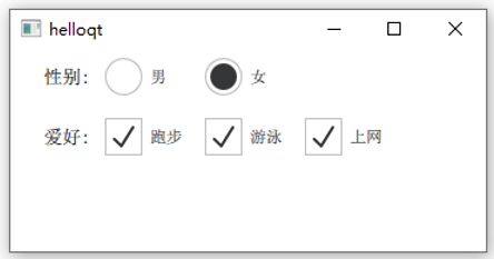
import QtQuick 2.2
import QtQuick.Window 2.0
import QtQuick.Controls 2.0
import QtQuick.Layouts 1.2
Window {
    visible: true;

    ButtonGroup {
        id: radiuGroup
    }

    GridLayout {
        columns: 5

        Text {
            Layout.preferredWidth: 60
            font.pixelSize: 14
            horizontalAlignment: Text.AlignRight
            text: "性别:"
        }
        RadioButton {
            text: "男"
            ButtonGroup.group:radiuGroup // 使用"ButtonGroup.group"附加属性添加到指定的ButtonGroup中
        }
        RadioButton {
            text: "女"
            Component.onCompleted: {
                radiuGroup.addButton(this) // 使用方法添加
            }
        }

        Text {
            Layout.preferredWidth: 60
            font.pixelSize: 14
            horizontalAlignment: Text.AlignRight
            Layout.row: 1
            Layout.column: 0
            text: "爱好:"
        }

        CheckBox {
            Layout.row: 1
            Layout.column: 1
            text: "跑步"
        }
        CheckBox {
            Layout.row: 1
            Layout.column: 2
            text: "游泳"
        }
        CheckBox {
            Layout.row: 1
            Layout.column: 3
            text: "上网"
        }

    }
}
效果如下所示:
2.RadioButton
刚刚我们学习ButtonGroup的时候,就已经简单使用RadioButton了.由于RadioButton继承于AbstractButton,所以使用的很多属性都是父类继承下来的.
比如checkable属性,默认为true,表示当前RadioButton支持选中,如果我们设置为false,那么RadioButton就会类似于Button一样,释放鼠标的时候,就会弹起来.无法被选中.
而checked属性,默认为false,表示当前RadioButton是未选中的状态,如果为true,则表示选中状态.
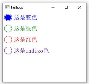
接下来我们便来自定义RadioButton样式:
import QtQuick 2.14
import QtQuick.Window 2.0
import QtQuick.Controls 2.14
Window {
    visible: true;

    ButtonGroup {
        id: radioGroup
    }

    Column {
        id: column

        Loader {
            sourceComponent: dynamicRadio
            onLoaded: {
                item.text = "这是蓝色"
                item.radioColor = "blue"
                radioGroup.addButton(item)
            }
        }

        Loader {
            sourceComponent: dynamicRadio
            onLoaded: {
                item.text = "这是绿色"
                item.radioColor = "green"
                radioGroup.addButton(item)
            }
        }

        Loader {
            sourceComponent: dynamicRadio
            onLoaded: {
                item.text = "这是红色"
                item.radioColor = "red"
                radioGroup.addButton(item)
            }
        }

        Loader {
            sourceComponent: dynamicRadio
            onLoaded: {
                item.text = "这是indigo色"
                item.radioColor = "indigo"
                radioGroup.addButton(item)
            }
        }
    }

    Component {
        id: dynamicRadio

        RadioButton {
          id: radioBtn
          property var radioColor: "blue"
          text: "RadioButton"
          checked: true
          font.pixelSize: 20

          indicator: Rectangle {    // 绘制圆圈
              id : icon
              implicitWidth: 26
              implicitHeight: 26
              x: parent.leftPadding
              y: parent.height / 2 - height / 2
              radius: height / 2
              border.color: radioColor
              border. 1

              Rectangle {           // 绘制内圆圈
                   parent.width * 0.8
                  height: parent.height * 0.8
                  x: parent.width * 0.1
                  y: parent.height * 0.1
                  radius: height / 2
                  color: parent.border.color
                  visible: radioBtn.checked
              }
          }

          contentItem: Text {
              text: parent.text
              font: parent.font
              opacity: enabled ? 1.0 : 0.3
              color: icon.border.color
              verticalAlignment: Text.AlignVCenter
              leftPadding: parent.indicator.width + parent.spacing
          }
          onDownChanged: {
              icon.border.color = down ? Qt.lighter(radioColor, 0.7) : radioColor  // 设置按下的背景颜色

          }
          onHoveredChanged: {
              icon.border.color = hovered ? Qt.lighter(radioColor, 1.2) : radioColor // 设置徘徊的背景颜色
          }
        }
    }
}
效果如下所示:
3.CheckBox
CheckBox和RadioButton类似,但是CheckBox的状态有三种状态:选中、未选中、部分选中(当在树视图中选择多个子节点时,此状态才会有用)
并且比RadioButton还多出了3个属性:
- tristate : bool ,默认值为false,表示复选框只有2种状态.如果为true,则用户操作将会变成三个状态之间切换
- checkState : enumeration,设置/获取显示的状态,checkState属性的取值如下所示:
- Qt.Unchecked : 未选中,
- Qt.PartiallyChecked : 部分被选中
- Qt.Checked : 选中
- nextCheckState : function,设置checkState的回调函数,我们可以在该回调函数中判断条件,如果不满足,则返回要切换的checkState状态即可.
自定义样式,等我们后面学了Canvas后来补充