一个盒子里文字过长,如果容器宽度固定,那么文字就会下溢,这样也就不美观。
所以在最末位超出宽度时用省略号显示会美观一点。
点击看效果demo
demo源码。
<!DOCTYPE html>
<html lang="en">
<head>
    <meta charset="UTF-8">
    <meta name="viewport" content="width=device-width, initial-scale=1.0">
    <meta http-equiv="X-UA-Compatible" content="ie=edge">
    <title>Document</title>
    <link href="./demo.css" rel="stylesheet">
    <style>
    .text_overflow_1{
        27em;
        white-space:nowrap;
        text-overflow:ellipsis;
        -o-text-overflow:ellipsis;
        overflow:hidden;
        text-align: center;
        margin: 0 auto;
        margin-bottom: 20px;
    }
    .text_overflow_2{
        27em;
        white-space:nowrap;
        text-overflow:ellipsis;
        -o-text-overflow:ellipsis;
        -moz-binding:url('ellipsis.xml#ellipsis');
        overflow:hidden;
        margin: 0 auto;
        margin-bottom: 20px;
    }
    .zxx_text_overflow3{
        24em;
        height:1.3em;
        overflow:hidden;
        zoom:1;
        margin: 0 auto;
        margin-bottom: 20px;
    }
    .zxx_text_overflow3 .text_con{
        float:left;
        height:1.3em;
        margin-right:3em;
        overflow:hidden;
    }
    .zxx_text_overflow3 .text_dotted{
        3em;
        height:1.31em;
        float:right;
        margin-top:-1.3em;
    }
    .zxx_text_overflow4{
        margin: 0 auto;
        margin-bottom: 20px;
        text-align: center;
    }
    .zxx_text_overflow5{
        margin: 0 auto;
        margin-bottom: 20px;
        text-align: center;
        400px;
    }
    .zxx_text_overflow6{
         400px;
        display: -webkit-box;
        -webkit-line-clamp: 3;
        -webkit-box-orient: vertical;
        overflow: hidden;
        margin: 0 auto;
        margin-bottom: 20px;
        text-align: center;
    }
    </style>
</head>
<body>
    <div class="demo-container">
        <div class="method-title">方法1</div>
        <div title="look at here!" class="text_overflow_1">
            这种方法除了火狐下表现不尽人意,其他IE, 谷歌下表现可以。很多文字,这里有很多文字
        </div>
        <div class="method-title">方法2</div>
        <div title="look at here!" class="text_overflow_2">
            这种方法主要解决火狐下的差异,这里有很多文字,这里有很多文字,这里有很多文字
        </div>
        <div class="method-title">方法3</div>
        <div class="zxx_text_overflow3" >
            <div class="text_con" >这是一段比较长的文字,用来测试是否文字溢出时会用省略号显示。</div>
            <div class="text_dotted" >…</div>
        </div>
        <div class="zxx_text_overflow3" >
            <div class="text_con" >这是一段很短的文字拿来对比。</div>
            <div class="text_dotted" >…</div>
        </div>
        <div class="method-title">方法4</div>
        <div class="zxx_text_overflow4">
            这种方法用的是jquery的方法替换掉最大字符长度以外的字符,这里要写长一点
        </div>
        <div class="method-title">方法5</div>
        <div class="zxx_text_overflow5">
            这种方法用的是jquery的方法替换掉最大字符长度以外的字符,这里要写长一点
        </div>
        <div class="method-title">方法6</div>
        <div class="zxx_text_overflow6">
            这种方法用的是多行文字句末显示省略号,这里要写长一点这里要写长一点这里要写长一点这里要写长一点这里要写长一点这里要写长一点这里要写长一点这里要写长一点这里要写长一点
        </div>
    </div>
    <script src="https://cdn.bootcss.com/jquery/3.2.1/jquery.min.js"></script>
    <script>
        $(function() {

            //限制字符个数
            // $(".zxx_text_overflow").each(function(){
                var maxwidth=43;

                if($('.zxx_text_overflow4').text().length>maxwidth){
                    $('.zxx_text_overflow4').attr('title', $('.zxx_text_overflow4').text());
                    $('.zxx_text_overflow4').text($('.zxx_text_overflow4').text().substring(0, maxwidth));
                    $('.zxx_text_overflow4').html($('.zxx_text_overflow4').html()+'...');
                }
            // });

            var wordLimit=function(){
                $('.zxx_text_overflow5').each(function(){
                    var copyThis = $(this.cloneNode(true)).hide().css({
                        'position': 'absolute',
                        'width': 'auto',
                        'overflow': 'visible'
                    });
                    $(this).after(copyThis);

                    if(copyThis.width() > $(this).width()) {
                        $(this).text($(this).text().substring(0,$(this).html().length-4));
                        $(this).html($(this).html()+'…');
                        copyThis.remove();
                        wordLimit();
                    }else{
                        copyThis.remove(); //清除复制
                        return;
                    }
                });
            }
            wordLimit();
        })
    </script>
</body>
</html>
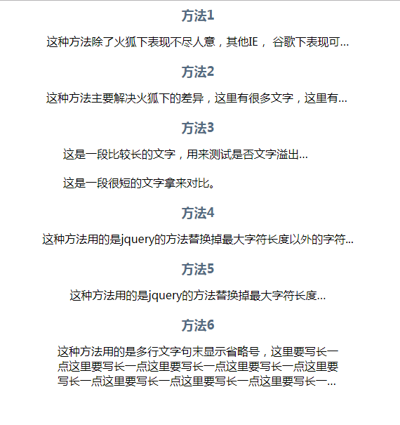
效果图
个人总结:
如今几乎所有浏览器都支持了text-overflow:ellipsis;
所以实现方法可以给定盒子宽度和text-overflow:ellipsis;便可以轻松达到效果
相比以上方法,个人认为方法四是较为出色的。
技术参考:http://www.zhangxinxu.com