1.基本概念
所谓的盒子模型:就是把HTML页面中的布局元素看作是一个矩形的盒子,也就是装内容的容器。
盒子模型的组成 : 边框,外边距,内边距,内容。
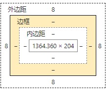
2.边框(border)
(1)边框的组成
宽度,样式,颜色
border-with: 粗细  /* 一般用px作为单位*/

border-style:样式( solid实线 dashed 虚线边框 dotted 点线边框 )

border-color:颜色
demo
div {
     300px;
    height: 200px;
    border- 5px;
    border-style: solid;
    border-color: pink;
}
(2)三个属性复合写法
border: width style color (没有顺序)
(3)四个方向边框分开写
border-top: 1px solid blue;
border-bottom: 1px solid red;
border-left: 1px solid red;
border-right: 1px solid red;
demo——设置上边框为蓝色,其他为红色
写法一
div {
     200px;
    height: 200px;
    border-top: 1px solid blue;
    border-bottom: 1px solid red;
    border-left: 1px solid red;
    border-right: 1px solid red;
   }
写法二,利用层叠性
 div {
     200px;
    height: 200px;
    border: 1px solid red;
    border-top: 1px solid blue;
   }
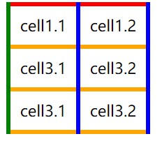
(4)表格边框是否合并
相邻的两个表格的边框,粗细会叠加,影响美观,可以合并
border-collapse: collapse  —— 相邻的单元格共用同一条边框

border-collapse: separate —— 默认值。每个单元格拥有独立的边框
demo
<!DOCTYPE html>
<html lang="en">
<head>
    <meta charset="UTF-8">
    <meta name="viewport" content="width=device-width, initial-scale=1.0">
    <title>Document</title>
    <style>
        td ,
        tr {
            padding: 10px;

            border-left: solid 5px  green;
            border-right:solid 5px blue;
            border-bottom: solid 5px orange;
            border-top: solid 5px red;
                    }
    </style>
</head>
<body>
    <form action="">
        <table>
            <tr>
                <td>cell1.1</td>
                <td>cell1.2</td>
            </tr>
            <tr>
                <td>cell3.1</td>
                <td>cell3.2</td>
            </tr>
            <tr>
                <td>cell3.1</td>
                <td>cell3.2</td>
            </tr>
        </table>
    </form>
</body>
</html

添加
 table {
        border-collapse: collapse;
     }
2.内边距(padding)
内边距是边框和内容的边距。
(1)分开写法
 div {
     200px;
    height: 200px;
    padding-top: 1px ;
    padding-bottom: 1px ;
    padding-left: 1px ;
    padding-right: 1px ;
    }
(2)复合写法
padding: 5px;     代表上下左右的都有内边距

padding: 5px 10px;       代表上下内边距是5px  左右是10px

padding: 5px 10px 20px;    代表上边距5px ,左右10px 下边距20px

padding :5px 10px 20px 30px;    代表上边距5px,右边距10px,下边距20px,左边距为30px(顺时针)
/*比如要设置一个200px*200px的盒子,而padding等于20*/
div {
     160px;
    height: 160px;
    padding: 20px;
 }
 /*最后盒子的实际大小为(160+40)px *(160+40)px*/
3.盒子的外边距(margin)
margin属性用于控制盒子和盒子之间的距离。
(1)分开写法
margin-left       左外边距

margin-right     右外边距

margin-top      上外边距

margin-bottom     下边距
注:
margin复合写法和padding一样
(2)外边距的运用
外边距可以让块级盒子水平居中,要满足的条件:
1.盒子必须指定了宽度width
2.盒子左右边距都设置为auto
demo
.div {
    200;
   margin: 0 auto;
}
注:
如果是行内元素或行内块元素水平居中可以给父级元素添加 text-align: center。
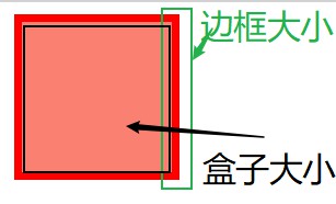
4.盒子模型的坑
(1)border撑大盒子问题
在计算盒子大小的时候,实际盒子大小 = 边框大小 + 盒子大小
(2)padding撑大盒子问题
设置了盒子的大小,又添加了padding,会使盒子撑大。
 div {
          height: 200px;
           200px;
          border: solid 2px green;
          padding: 10px
      }
/*盒子的实际大小等于 = 盒子原本的宽高 + padding*/
/*
盒子大小 :
宽 = 200 + 10 10 = 220px
高 = 200 + 10 10 = 220px
*/
注
盒子撑大的前提是,盒子本身都设置了宽高。
<!DOCTYPE html>
<html lang="en">
<head>
    <meta charset="UTF-8">
    <meta name="viewport" content="width=device-width, initial-scale=1.0">
    <title>Document</title>
    <style>

      div {
          height: 200px;
           200px;
          border: solid 2px green;
      }
      p {
          /* 不设置宽度,默认和父级一样宽 ,但是本身没有设置宽度,所以不会撑大盒子*/
          height: 20px;
          background-color:pink;
      }
    </style>
</head>
<body>
    <div>
        <p>键盘敲烂,工资过万</p>
    </div>
</body>
</html>

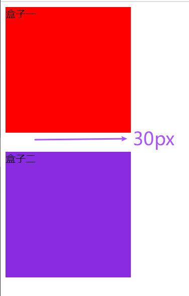
(3)margin的覆盖
同时使用margin定义块级的垂直外边距时,可能会出现外边距的覆盖。(数值大的覆盖掉小的,最终只显示数值大的margin)

<style>
     .div1 {
       200px;
      height: 200px;
      background-color: red;
      margin-bottom: 10px;
      }
      .div2 {
          200px;
         height: 200px;
         background-color: blueviolet;
         margin-top:30px;
       }
</style>
<body>
   <div class="div1">盒子一</div>
   <div class="div2">盒子二</div>
</body>
注释
合并后的margin大小并不是(10 + 30)px,而是30px(数值大的覆盖了数值小的margin)
(4)margin塌陷问题
产生的条件
1.两个嵌套关系(父子关系)的块元素,在子元素上设置了margin-top,这个margin-top会作用到父级盒子上。(造成父级盒子塌陷)
2.两个嵌套关系(父子关系)的块元素,在子元素上和父元素同时设置了margin-top,两个margin-top都会作用到父级盒子上(造成父级盒子更大的塌陷)
塌陷之前
两个盒子都没有设置margin-top
 <style>
    .father {
           200px;
           height: 200px;
           background-color: red;
        }
    .sun {
           100px;
          height: 100px;
          background-color: blueviolet;
        }
 </style>
<body>
   <div class="father">
       <div class="sun"></div>
   </div>
</body>
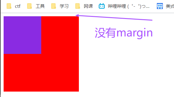
效果
塌陷之后
其中一个盒子设置了margin-top
<style>
   .father {
        400px;
       height: 400px;
       background-color: red;
        margin-top: 50px;
        }
    .sun {
        200px;
       height: 200px;
       background-color: blueviolet;
       margin-top: 60px;
      }
</style>
<body>
   <div class="father">
      <div class="sun">盒子二</div>
   </div>
</body>
效果

处理方法
方法一: 定义父级元素上边框
border: 1px solid transparent
方法二: 为父级元素定义内边距
padding: 1px
方法三:可以为父级元素添加
overflow: hidden
(5)默认内外边距问题
网页元素很多带有内外边距,而且不同浏览器默认的也不一样,因此在布局之间,首先要清除网页元素的内外边距。
* {
padding: 0;
margin: 0;
}
注:
行内元素为了兼容性,尽量只设置左右边距,如果要设置上下边距可以转换成为块元素或者行内块元素。