专门开一篇用来记录实际面试过程中遇到的各种题目及经验总结,不定期更新。
(更新时间:2020/05/27)
准备面试:
1.题目准备
第一大类:基础知识(html+css)
① 请简述一下em,rem,px的区别
参考网站(https://www.jianshu.com/p/f5248dda87c2)
答:
(px)是固定长度单位,不随其他元素的变化而变化。
(em)是相对长度单位,相对父级元素的变化而变化。浏览器默认比例是1em=16px,此单位一旦父元素单位变化,就需要不停的修改子元素的值, 不推荐使用。
(rem)也是相对长度单位,相对根节点(html节点)变化而变化。浏览器默认比例是1rem=16px,解决了em元素的使用弊端。一般使用方法如下:
html,body{
font-size:62.5%; //比例调整成1:10
}
 扩展:参考网站(https://www.jianshu.com/p/a0bdd3e9133d)

 移动端适配法则:

 以下代码px与rem的尺寸比例是1:100,例如设计稿width:100px; font-size:20px,换算成rem为1rem;font-size:0.2rem
(function (doc, win) {
    'use strict';
    var docEl = doc.documentElement,    //根元素html
        resizeEvt = 'orientationchange' in window ? 'orientationchange' : 'resize',//判断窗口有没有orientationchange这个方法,有就赋值给一个变量,没有就返回resize方法。
        recalc = function () {
            var clientWidth = docEl.clientWidth;
            if (!clientWidth) {
                return;
            }
            if (clientWidth >= 560) {
                clientWidth = 560;  //把document的fontSize大小设置成跟窗口成一定比例的大小,从而实现响应式效果。
            }
            docEl.style.fontSize = 100 * (clientWidth / 750) + 'px'; //这里的尺寸(750)可以根据设计稿尺寸调整,例如(640)等
        };
    if (!doc.addEventListener) {
        return;
    }
    recalc();
    win.addEventListener(resizeEvt, recalc, false);   //addEventListener事件方法接受三个参数:第一个是事件名称比如点击事件onclick,第二个是要执行的函数,第三个是布尔
    doc.addEventListener('DOMContentLoaded', recalc, false);    //绑定浏览器缩放与加载时间
})(document, window);
② 请问css的哪些属性可以继承,哪些不可以继承
参考网站:(https://www.jianshu.com/p/896caadce2e7)
答:
一、能继承的属性
1. 字体系列属性:font、font-family、font-weight、font-size、font-style;
2. 文本系列属性:
(1)内联元素:color、line-height、word-spacing、letter-spacing、text-transform;
(2)块级元素:text-indent、text-align;
3. 元素可见性:visibility
4. 表格布局属性:caption-side、border-collapse、border-spacing、empty-cells、table-layout;
5. 列表布局属性:list-style
6. 生成内容属性:quotes
7. 光标属性:cursor
8. 页面样式属性:page、page-break-inside、windows、orphans;
9. 声音样式属性:speak、speech-rate、volume、voice-family、pitch、stress、elevation;
二、不能继承的属性
1. display:规定元素应该生成的框的类型;
2. 文本属性:vertical-align、text-decoration;
3. 盒子模型的属性:width、height、margin 、border、padding;
4. 背景属性:background、background-color、background-image;
5. 定位属性:float、clear、position、top、right、bottom、left、min-width、min-height、max-width、max-height、overflow、clip;
6. 生成内容属性:content、counter-reset、counter-increment;
7. 轮廓样式属性:outline-style、outline-width、outline-color、outline;
8. 页面样式属性:size、page-break-before、page-break-after;
9. 声音样式属性:pause、cue、play-during;
③ 请简述一下盒子模型。
参考网站(https://www.jianshu.com/p/afb119b66e7b)
答:盒模型分两种:标准盒模型(w3c盒模型)和怪异盒模型(ie盒模型)
W3C标准盒子模式包括内容(content)、填充(padding)、边框(border)、边界(margin)
IE盒子模型的范围也包括内容(content)、填充(padding)、边框(border)、边界(margin),但是content包含了border和padding
切换标准模式和怪异模式
box-sizing:border-box(ie盒模型)
box-sizing:content-box(默认:标准盒模型)
(更新时间:2020/05/29)
④ 清除浮动的方法
答:以下列举4种办法清楚浮动。
第一种:写一个空标签;
    <style>
        .son{ 200px;height: 50px;float:left;}
        .clear{clear:both;}
    </style>
    <div class="dad">
        <div class="son"></div>
        <div class="son"></div>
        <div class="clear"></div>
    </div>
缺点:多余添加标签,语义化不友好,不推荐使用。
第二种:父元素设置overflow属性触发BFC;
   <style>
        .dad{overflow: hidden;}
        .son{ 200px;height: 50px;float:left;}
        .clear{clear:both;}
    </style>
    <div class="dad">
        <div class="son"></div>
        <div class="son"></div>
    </div>
缺点:超出隐藏,简单粗暴,但是会隐藏点子元素超出部分,并且文字内容无法换行等问题,不推荐使用。
第三种:添加伪类;
  <style>
        .dad:after{content:'';display: block;clear: both;height: 0;line-height: 0;visibility: hidden;}
        /* IE6 */
        .dad{*zoom: 1;}
        .son{ 200px;height: 50px;float:left;}
        .clear{clear:both;}
    </style>
    <div class="dad">
        <div class="son"></div>
        <div class="son"></div>
    </div>
缺点:ie6-7不支持伪元素after,需要使用zoom来触发hasLayout,但是结构简单,符合闭合浮动思想,推荐使用。
第四种:添加双伪类;
    <style>
        .dad:before,.dad:after{content:'';display: table;}
        .dad:after{clear: both;}
        /* IE6 */
        .dad{*zoom: 1;}
        .son{ 200px;height: 50px;float:left;}
        .clear{clear:both;}
    </style>
    <div class="dad">
        <div class="son"></div>
        <div class="son"></div>
    </div>
缺点:与上述一样,效果更完善,推荐使用。
(更新时间:2020/06/01)
⑤ css中transition和animation的区别
参考网站:https://www.cnblogs.com/mufc/p/11468742.html
答:1.两个都是css3属性,transition可以看做hover的延伸,animation可以看做flash的延伸;
2.transition: property(规定设置效果的属性如width或height) duration(规定过渡需要完成的时间) timing-function(规定速度效果的速度曲线) delay(定义何时开始过渡);
3.animation: name(规定要绑定到选择器的 keyframe名称) duration(规定动画时间) timing-function(规定动画曲线) delay(规定动画开始前延迟) iteration-count(规定播放次数) direction(是否轮流反向播放);
4.transition 是过渡,是样式值的变化的过程,只有开始和结束;animation 其实也叫关键帧,通过和 keyframe 结合可以设置中间帧的一个状态;
5.animation 配合 @keyframe 可以不触发时间就触发这个过程,而 transition 需要通过 hover 或者 js 事件来配合触发;
6.在性能方面:浏览器有一个主线程和排版线程;主线程一般是对 js 运行的、页面布局、生成位图等等,然后把生成好的位图传递给排版线程,而排版线程会通过 GPU 将位图绘制到页面上,也会向主线程请求位图等等;我们在用使用 aniamtion 的时候这样就可以改变很多属性,像我们改变了 width、height、postion 等等这些改变文档流的属性的时候就会引起,页面的回流和重绘,对性能影响就比较大,但是我们用 transition 的时候一般会结合 tansfrom 来进行旋转和缩放等不会生成新的位图,当然也就不会引起页面的重排了,所以,如果可以使用transition属性完成效果就可以尽量少的使用animation。
(更新时间:2020/06/02)
⑥ 实现一个两边大小固定中间随宽度自适应的布局
实现效果如下:
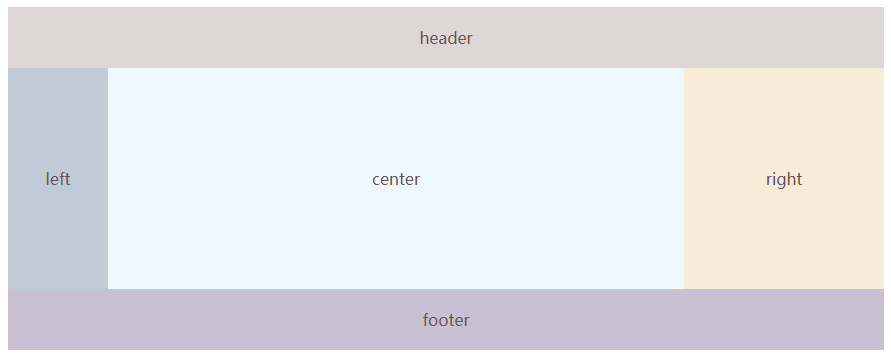
答:三种写法:
1.圣杯布局
<!DOCTYPE html>
<html lang="en">

<head>
    <meta charset="UTF-8">
    <meta name="viewport" content="width=device-width, initial-scale=1.0">
    <meta http-equiv="X-UA-Compatible" content="ie=edge">
    <title>圣杯布局</title>
</head>
<style>
    /* 圣杯布局 */
    body {
        min- 500px;
        text-align: center;
        color: #6b5152;
    }

    header {
        background: #dfd7d7;
        padding: 20px 0;
    }

    .main {
        padding-left: 100px;
        padding-right: 200px;
        clear: both;
    }

    .fl {
        float: left;
    }

    .left {
         100px;
        background: #c1cbd7;
        margin-left: -100%;
        position: relative;
        right: 100px;
        padding: 100px 0;
    }

    .right {
         200px;
        background: #f8ebd8;
        margin-right: -200px;
        padding: 100px 0;
    }

    .center {
         100%;
        background: aliceblue;
        padding: 100px 0;
    }

    footer {
        clear: both;
        background: #c9c0d3;
        padding: 20px 0;
    }


</style>

<body>
    <header>header</header>
    <div class="main">
        <div class="fl center">
            center
        </div>
        <div class="fl left">
            left
        </div>
        <div class="fl right">
            right
        </div>
    </div>
    <footer>footer</footer>
</body>

</html>
2.双飞翼布局
<!DOCTYPE html>
<html lang="en">

<head>
    <meta charset="UTF-8">
    <meta name="viewport" content="width=device-width, initial-scale=1.0">
    <meta http-equiv="X-UA-Compatible" content="ie=edge">
    <title>双飞翼布局</title>
</head>
<style>
    /* 双飞翼布局 */
    body{
        min- 500px;
       text-align: center;
    }
    header {
        background: #dfd7d7;
        padding: 20px 0;
    }
    .main {
         100%;
    }

    .fl {
        float: left;
    }

    .center {
        background: aliceblue;
        margin-left: 100px;
        margin-right: 200px;
        padding: 100px 0;

    }

    .left {
         100px;
        background: #c1cbd7;
        margin-left: -100%;
        padding: 100px 0;
    }

    .right {
         200px;
        background: #f8ebd8;
        margin-left: -200px;
        padding: 100px 0;
    }

    footer {
        clear: both;
        background: #c9c0d3;
        padding: 20px 0;
    }
</style>

<body>
    <header>header</header>
    <div class="main fl">
        <div class="center">
            center
        </div>
    </div>
    <div class="fl left">
        left
    </div>
    <div class="fl right">
        right
    </div>
    <footer>footer</footer>
</body>

</html>
3.flex布局
<!DOCTYPE html>
<html lang="en">

<head>
    <meta charset="UTF-8">
    <meta name="viewport" content="width=device-width, initial-scale=1.0">
    <meta http-equiv="X-UA-Compatible" content="ie=edge">
    <title>flex布局</title>
</head>
<style>
    /* flex布局 */
    body {
        min- 500px;
        text-align: center;
    }

    header {
        background: #dfd7d7;
        padding: 20px 0;
    }

    .main {
        display: flex;
    }

    .center {
        flex: 1;
        background: aliceblue;
        padding: 100px 0;
    }

    .left {
         100px;
        background: #c1cbd7;
        flex: 0 0 100px;
        padding: 100px 0;
        order: -1;
    }

    .right {
         200px;
        background: #f8ebd8;
        flex: 0 0 200px;
        padding: 100px 0;
    }

    footer {
        clear: both;
        background: #c9c0d3;
        padding: 20px 0;
    }
</style>

<body>
    <header>header</header>
    <div class="main">
        <div class="center">
            center
        </div>
        <div class="left">
            left
        </div>
        <div class="right">
            right
        </div>
    </div>
    <footer>footer</footer>
</body>

</html>
⑦ 列出几种实现水平垂直居中的方法
1.块级元素的水平垂直居中
<!DOCTYPE html>
<html lang="en">

<head>
    <meta charset="UTF-8">
    <meta name="viewport" content="width=device-width, initial-scale=1.0">
    <meta http-equiv="X-UA-Compatible" content="ie=edge">
    <title>块级元素水平垂直居中</title>
    <style>
        /* 第一种*/
        .content {
             300px;
            height: 300px;
            background: #faead3;
            margin: auto;
            position: absolute;
            left: 0;
            right: 0;
            top: 0;
            bottom: 0;
        }

        /* 第二种*/
        .content {
             300px;
            height: 300px;
            background: #faead3;
            position: absolute;
            left: 50%;
            top: 50%;
            margin-top: -150px;
            margin-left: -150px;
        }

        /* 第三种*/
        .content {
             300px;
            height: 300px;
            background: #faead3;
            position: absolute;
            left: 50%;
            top: 50%;
            transform: translate(-50%, -50%);
        }
    </style>
</head>

<body>
  <div class="content"></div>
</body>

</html>
2.行内元素的水平垂直居中
<!DOCTYPE html>
<html lang="en">

<head>
    <meta charset="UTF-8">
    <meta name="viewport" content="width=device-width, initial-scale=1.0">
    <meta http-equiv="X-UA-Compatible" content="ie=edge">
    <title>行内元素水平垂直居中</title>
    <style>
        /* 单行文本水平垂直居中 */
        /* 第一种 */
        .wrapper {
             300px;
            height: 300px;
            background: #faead3;
            text-align: center;
            word-break: break-all;
        }

        .content {
            line-height: 300px;
        }

        /* 多行文本水平垂直居中 */
        /* 第一种 */
        .wrapper {
             300px;
            height: 300px;
            background: #faead3;
            text-align: center;
            word-break: break-all;
            display: table-cell;
            vertical-align: middle;
        }

        .content {
            display: inline-block;
            /* IE7 */
            /* display: inline;
            zoom:1; */
        }

        /* 第二种 */
        .wrapper {
             300px;
            height: 300px;
            background: #faead3;
            text-align: center;
            word-break: break-all;
            display: table-cell;
            vertical-align: middle;
        }

        .content {
            display: table;
            margin: 0 auto;
        }

        /* 图片元素水平垂直居中 */
        /* 第一种 */
        .wrapper {
             300px;
            height: 300px;
            background: #faead3;
            text-align: center;
            line-height: 300px;
            font-size: 0;
        }

        img {
             80%;
            height: auto;
            vertical-align: middle;
        }
    </style>
</head>

<body>
    <div class="wrapper">
        <div class="content">88888888888888888888</div>
    </div>
</body>

</html>
3.通用水平垂直居中
<!DOCTYPE html>
<html lang="en">

<head>
    <meta charset="UTF-8">
    <meta name="viewport" content="width=device-width, initial-scale=1.0">
    <meta http-equiv="X-UA-Compatible" content="ie=edge">
    <title>通用水平垂直居中</title>
    <style>
        /* 通用规则 */
        /* 第一种 */
        .wrapper {
            display: flex;
            justify-content: center;
            align-items: center;
        }

        .content {
             300px;
            height: 300px;
            background: #faead3;
        }

        /* 第二种 */
        .wrapper {
             300px;
            height: 300px;
            background: #faead3;
            text-align: center;
            word-break: break-all;
            display: flex;
        }

        .content {
            margin: auto;
        }

        /* 第三种 */
        .wrapper {
             300px;
            height: 300px;
            background: #faead3;
            text-align: center;
            word-break: break-all;
            display: grid;
        }

        .content {
            align-self: center;
            justify-self: center;
        }
    </style>
</head>

<body>
    <div class="wrapper">
        <div class="content">88888888888888888888</div>
    </div>
</body>

</html>
⑧ css预处理用的什么以及预处理的时候写过什么方法
⑨ flex布局的方法以及写法
⑩ ES5中, 除了函数,什么能够产生作用域
⑪ 简述一下你了解到的选择器
⑫ 什么是无样式内容闪烁,应该如何避免
⑬ 浏览器的内核问题
⑭ 浏览器兼容问题
⑮ CSS3的新特性(粘性定位 斜切)
⑯ 说出使用过的ui框架
第二大类:JS
⑰ 简述js的数据类型
⑱ 简述一下闭包
⑲ 简述一下 for in,for of,for each,map 的用法以及区别
⑳ 实现模糊查询的时候怎么让他发送的请求减少(事件节流)