前言
Angular Material 只有 Form field, 但 Material Design 有份 Text field 和 Form field, Form field 是给 checkbox 和 radio 用的, Text field 则是给 input, select 用的.
它就是一个框, 里头包含了 label 和 accessor (e.g. input, select, textarea 等)
封装了 floating label, error color, helper text 等等功能.
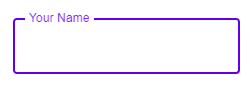
Input Text
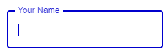
先来一个最简单的 input text 的 field
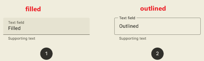
Filled and Outlined
Material 3 中, 有 2 种 text field 设计, 一个是 filled 一个是 outlined, 下面以 outlined 作为例子.
HTML
<label class="mdc-text-field mdc-text-field--outlined">
  <span class="mdc-notched-outline">
    <span class="mdc-notched-outline__leading"></span>
    <span class="mdc-notched-outline__notch">
      <span class="mdc-floating-label">Your Name</span>
    </span>
    <span class="mdc-notched-outline__trailing"></span>
  </span>
  <input type="text" name="firstName" class="mdc-text-field__input"/>
</label>
它包含了 3 给组件.
1. text-field
2. notched-outline (notch 是 缺口, 槽口, 凹槽的意思)
3. floating-label
Yarn add
有 3 个组件所以需要安装 3 给 module. MDC 把组件分的非常细.
yarn add @material/textfield
yarn add @material/notched-outline
yarn add @material/floating-label
Scss
@use '@material/floating-label/mdc-floating-label';
@use '@material/notched-outline/mdc-notched-outline';
@use '@material/textfield';
@include textfield.core-styles;
也是三剑客一起上
TypeScript
import { MDCTextField } from '@material/textfield';

document.querySelectorAll('.mdc-text-field').forEach(element => {
  new MDCTextField(element);
});
记得, 绝大部分 MDC 的组件用法都是 HTML, Scss, TypeScript 三边都需要的 (除非没有交互才不需要 TypeScript)
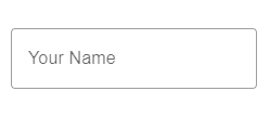
效果
Error Design
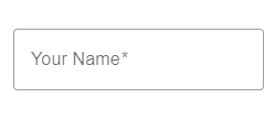
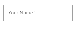
Material Design 的体验是 inline error, 就是说尽可能快的让用户知道它 invalid 了.
比如上面这个 input 是 required 的, 当用户 blur 以后马上就会变红色.
required
MDC 对游览器原生的 validation 都有做处理. 比如 required
<input type="text" class="mdc-text-field__input" required />
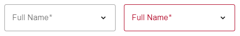
当 input 有 required 属性时, label 会自动加上星号 *, 当用户没有填写内容 unblur 后框框会变红色.
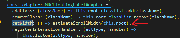
以下是相关源码, 来自 MDCTextFieldFoundation class
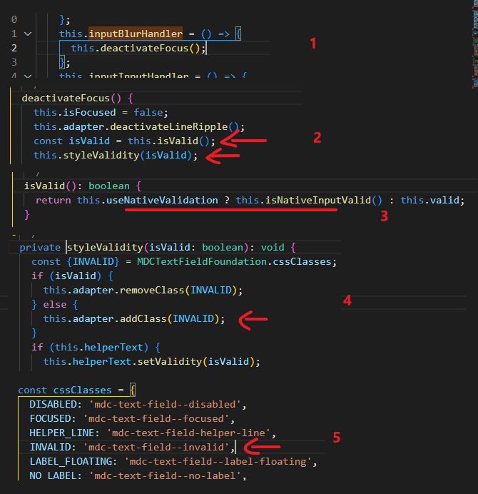

从第三段可以看出, MDC 是通过游览器 native validation 实现验证的. MDC 本身并没有任何验证逻辑.
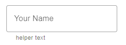
Helper Text
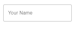
Helper text 就是框框下面的一行提示. 可以用来提示用户如何填写资料 (比如格式, 例子等等).
它是 text field 下的另一个 module 负责
HTML
<label class="mdc-text-field mdc-text-field--outlined">
  <span class="mdc-notched-outline">
    <span class="mdc-notched-outline__leading"></span>
    <span class="mdc-notched-outline__notch">
      <span class="mdc-floating-label">Your Name</span>
    </span>
    <span class="mdc-notched-outline__trailing"></span>
  </span>
  <input type="text" class="mdc-text-field__input" />
</label>
<div class="mdc-text-field-helper-line">
  <div class="mdc-text-field-helper-text">helper text</div>
</div>
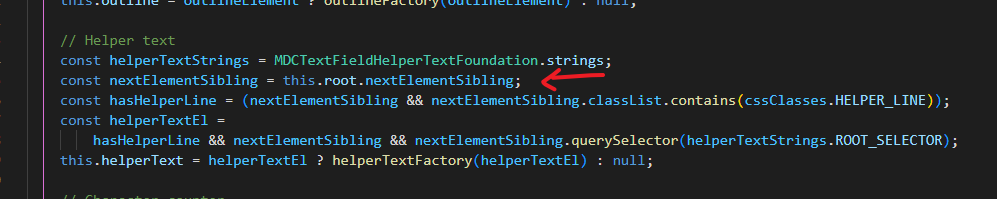
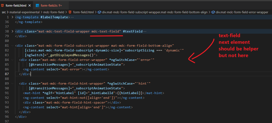
helper-line element 需要放到 text field 的 next sibling, 位置很重要哦
text field 是通过 nextElementSibling 去找到它对应的 helper text 的
提醒: helper text 是 sibling, 很容易就会破坏 Flex / Grid 布局, 最好是把它们 wrap 起来, wrap 起来后 lable 是 inline, input 有 default width (also depend on on font-size), 所以要把 label set 成 block element 或者 width 100% 哦
Scss
@use '@material/textfield/helper-text';
@include helper-text.helper-text-core-styles;
TypeScript
import { MDCTextFieldHelperText } from '@material/textfield/helper-text';

document.querySelectorAll('.mdc-text-field-helper-text').forEach(element => {
  new MDCTextFieldHelperText(element);
});
persistent
细看你会发现它默认的体验是: 当 focused, helper text 会出现, 当 blur 以后 helper text 会消失.
如果希望它一直出现, 可以加上 class "mdc-text-field-helper-text--persistent"
<div class="mdc-text-field-helper-text mdc-text-field-helper-text--persistent">helper text</div>
或用 TypeScript set
document.querySelectorAll('.mdc-text-field-helper-text').forEach(element => {
  const helperText = new MDCTextFieldHelperText(element);
  helperText.foundationForTextField.setPersistent(true);
});
效果
as error message
在 Material Design 手册中有说到, error message 和 helper text 是 share 同一个位置的.
也就是说当 error message 出现的时候 helper text 就必须被替换掉. MDC 没有直接提供这样的体验支持, 但是可以用 TS 动态 setup.
先看看没有 helper text 但是有 error message 的情况怎么写
<div class="mdc-text-field-helper-text mdc-text-field-helper-text--validation-msg">
  Name is required
</div>
加上 class "mdc-text-field-helper-text--validation-msg"
或者 TypeScript set
helperText.foundationForTextField.setValidation(true);
效果
如果想同时处理 error message 和 helper text 需要直接操作 helperText 对象
document.querySelectorAll('.mdc-text-field-helper-text').forEach(element => {
  const helperText = new MDCTextFieldHelperText(element);
  helperText.foundationForTextField.setContent('helper text');
  helperText.foundationForTextField.setPersistent(true);
  // 监听 form-field attr 出现 invalid 的 class 就切换到 error message
  helperText.foundationForTextField.setContent('Name is required');
  helperText.foundationForTextField.setValidation(true);
});
关键就是监听到 invalid 时切换成 error message. 流程大概是
1. 找到对应的 form field (它们是 sibling 关系, 所以找的到)
2. 用 mutation 监听 class 的变化, invalid 时 text field 会有 class "mdc-text-field--invalid" (依赖这个比较稳定)
3. 操作 helperText 对象, 却换成 error message 或者切换回来.
如果有 2 个验证, 比如 required + email 想针对不同 validation 时输出正确的 error message 他也没有 build-in 的. 需要用 TS 去换 error message.
另外我也发现了, Angular Material 虽然用了 MDC 的 text field 但它没有用 helper text. 反而是自己实现了一套.
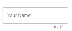
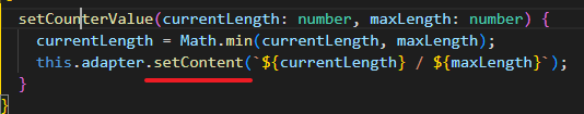
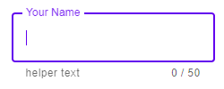
character counter & max length
helper text 还有一个常用的场景就是 max length 提示
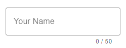
它是搭配 input maxlength 一起使用的
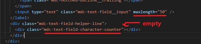
helper text 不需要写任何内容, MDC 会自动填上.
另外, character counter 和 helper text 是不冲突的哦, 因为一个在左边一个在右边
<div class="mdc-text-field-helper-line">
  <div class="mdc-text-field-helper-text">helper text</div>
  <div class="mdc-text-field-character-counter"></div>
</div>
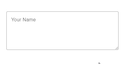
Textarea
text field 里面也可以放 textarea


<label class="mdc-text-field mdc-text-field--outlined mdc-text-field--textarea">
  <span class="mdc-notched-outline">
    <span class="mdc-notched-outline__leading"></span>
    <span class="mdc-notched-outline__notch">
      <span class="mdc-floating-label">Your Name</span>
    </span>
    <span class="mdc-notched-outline__trailing"></span>
  </span>
  <span class="mdc-text-field__resizer">
    <textarea class="mdc-text-field__input" rows="4" cols="40"></textarea>
  </span>
</label>
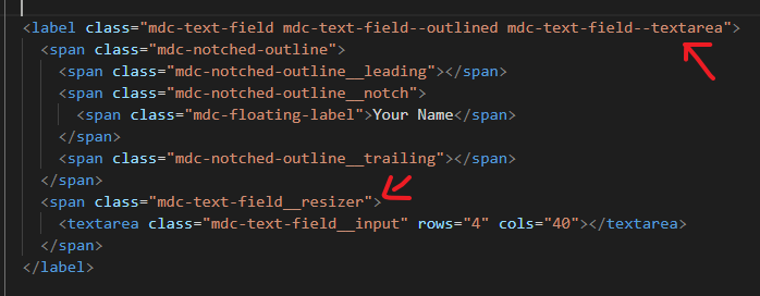
和 input 的结构一样, 只是 text field 需要添加 class "mdc-text-field--textarea" 和里面使用一个 span wrap 着 textarea
这个 span wrapper 是为了让它支持 resize, 如果不需要 resize 可以省略掉这个 span
效果
有一个点需要注意, 它的 resize 是 apply 在 span 上, 而不是 textarea 哦
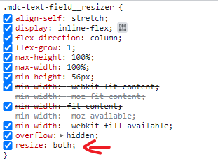
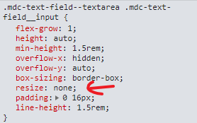
而且是双边 resize: both, 没有接口可以设置单边 resize, 只能通过 override 它的 style="resize: vertical"
Input Date
MDC 没有 datepicker, MWC 也没有 datepicker, 因为 Material Design 团队一直画不出他们满意的 datepicker 所以干脆就不画了.
一直等到 Material Design 3 才终于画出来了, 但是从稿到开发成型, 以 Material Design 团队的实力, 最少也需要 1 – 2 年的时间. 所以短期是肯定用不了的.
目前最好的方案是用原生的 input date 替代.
但是它也有许多问题哦. 我们来看看吧.
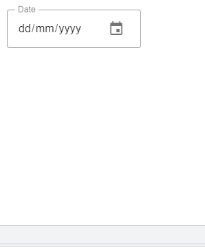
label missing
直接把 type 改成 date 就可以了
<input type="date" class="mdc-text-field__input" />
效果

第一个是正常的表现, 第二个的 label 不见了, 之所以会这样是因为

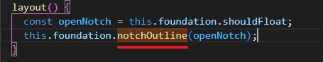
width = 0px 了, 相关代码如下
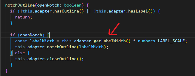
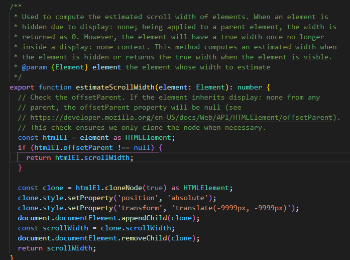
有点复杂, 我觉得大概率就是一个 bug 而已 (因为 Firefox 没有这个问题), 所以不用去理会它.
它应该是太早尝试获取 width 值了, 可能游览器还没有 render 好, 做一个 delay 是可以解决了
document.querySelectorAll('.mdc-text-field').forEach(element => {
  const textField = new MDCTextField(element);
  requestAnimationFrame(() => {
    textField.layout();
  });
});
icon mission
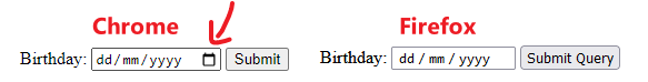
上面是原生 input date 的样子, Chrome 是有一个 icon 的. 因为它和 Firefox 的体验不同.
Chrome 只有点击 icon 才能召唤出 picker (在 laptop), Firefox 点击任何一个地方都会召唤出 picker.
也就是说使用 Chrome, 没有 icon = 没有 picker.
那为什么 MDC 没有 icon 呢?
因为这个 icon 会破坏 Material Design, 而且不容易用 CSS 去调整它, 加上它不属于 W3C 规范, 所以 MDC 果断把它给关了. stackoverflow – Hide the calendar icon in Google Chrome
所以, laptop 没有 picker 用, 体验就掉了. 怎么办呢?
stackoverflow – Method to show native datepicker in Chrome
可以通过原生 API, input.showPicker() 召唤出 picker. 但需要很新的 browser 才支持 Can I use – showPicker
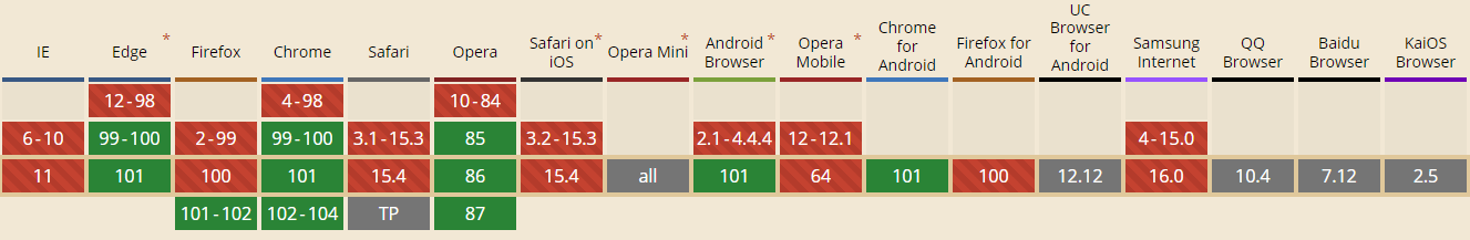
Chrome 99 (2022 年 3 月发布的)
trailing icons
参考: Text field icon
有了这个 API, 那么解决思路就是搞一个 calendar trailing icons, 点击以后调用 show.picker()
HTML
<input type="date" class="mdc-text-field__input" />
<i
  class="material-icons mdc-text-field__icon mdc-text-field__icon--leading"
  tabindex="0"
  role="button"
  >event</i
>
放到 input 的后面, 注意: tabindex="0" 一定要放哦, 不然是无法点击的.
Scss
@use "@material/textfield/icon";

@include icon.icon-core-styles;
TypeScript
const textFieldIcon = new MDCTextFieldIcon(document.querySelector('.mdc-text-field__icon')!);
textFieldIcon.listen('click', () => {
  (
    textFieldIcon.root.previousElementSibling! as unknown as { showPicker: () => void }
  ).showPicker();
});
效果
当发现游览器不支持
if ('showPicker' in HTMLInputElement.prototype) {
  // showPicker() is supported.
}
可以直接把 icon hide 起来或者 pointer-event: none. 不然点击率没有反应很尴尬.
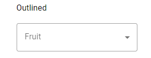
Select
安装 module
yarn add @material/list
yarn add @material/menu-surface
yarn add @material/menu
yarn add @material/select
HTML
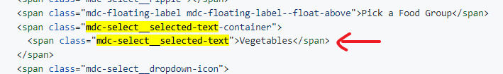
<div class="mdc-select mdc-select--outlined demo-width-class my-demo-select">
  <div class="mdc-select__anchor" aria-labelledby="outlined-select-label">
    <span class="mdc-notched-outline">
      <span class="mdc-notched-outline__leading"></span>
      <span class="mdc-notched-outline__notch">
        <span id="outlined-select-label" class="mdc-floating-label">Pick a Food Group</span>
      </span>
      <span class="mdc-notched-outline__trailing"></span>
    </span>
    <span class="mdc-select__selected-text-container">
      <span id="demo-selected-text" class="mdc-select__selected-text"></span>
    </span>
    <span class="mdc-select__dropdown-icon">
      <svg class="mdc-select__dropdown-icon-graphic" viewBox="7 10 10 5" focusable="false">
        <polygon
          class="mdc-select__dropdown-icon-inactive"
          stroke="none"
          fill-rule="evenodd"
          points="7 10 12 15 17 10"
        ></polygon>
        <polygon
          class="mdc-select__dropdown-icon-active"
          stroke="none"
          fill-rule="evenodd"
          points="7 15 12 10 17 15"
        ></polygon>
      </svg>
    </span>
  </div>

  <div class="mdc-select__menu mdc-menu mdc-menu-surface mdc-menu-surface--fullwidth">
    <ul class="mdc-deprecated-list" role="listbox" aria-label="Food picker listbox">
      <li
        class="mdc-deprecated-list-item mdc-deprecated-list-item--selected"
        aria-selected="true"
        data-value=""
        role="option"
      >
        <span class="mdc-deprecated-list-item__ripple"></span>
      </li>
      <li
        class="mdc-deprecated-list-item"
        aria-selected="false"
        data-value="grains"
        role="option"
      >
        <span class="mdc-deprecated-list-item__ripple"></span>
        <span class="mdc-deprecated-list-item__text"> Bread, Cereal, Rice, and Pasta </span>
      </li>
      <li
        class="mdc-deprecated-list-item mdc-deprecated-list-item--disabled"
        aria-selected="false"
        data-value="vegetables"
        aria-disabled="true"
        role="option"
      >
        <span class="mdc-deprecated-list-item__ripple"></span>
        <span class="mdc-deprecated-list-item__text"> Vegetables </span>
      </li>
      <li
        class="mdc-deprecated-list-item"
        aria-selected="false"
        data-value="fruit"
        role="option"
      >
        <span class="mdc-deprecated-list-item__ripple"></span>
        <span class="mdc-deprecated-list-item__text"> Fruit </span>
      </li>
    </ul>
  </div>
</div>
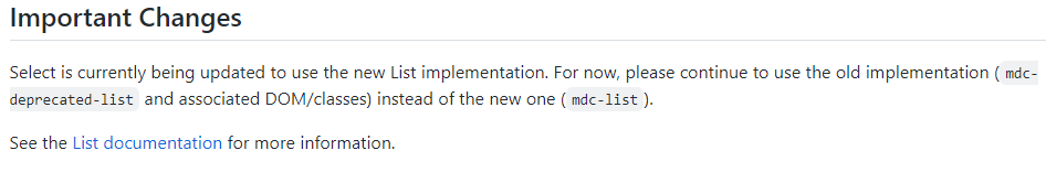
注意: 用 mdc-deprecated-list 是因为当前 MDC 正在升级中...
Scss
@use '@material/list/mdc-list';
@use '@material/menu-surface/mdc-menu-surface';
@use '@material/menu/mdc-menu';
@use '@material/select/styles';
@use '@material/select';

.demo-width-class {
  width: 400px;
}
.my-demo-select {
  @include select.outlined-density(-2); /* 注: 我用的是 outlined */
}
docs 有说, 需要 set width

TypeScript
import {MDCSelect} from '@material/select';

const select = new MDCSelect(document.querySelector('.mdc-select'));

select.listen('MDCSelect:change', () => {
  alert(`Selected option at index ${select.selectedIndex} with value "${select.value}"`);
});
效果

icon 没有旋转 animation
下面这个是官网 demo 的样子
右边的 icon 会有一个 180° 旋转, 但是我们做出来的却没有.
我看了一下它的 HTML 发现它俩实现根本就不一样. 我们的 icon 有 2 个, 一个上, 一个下. 切换.
demo 的只有一个 icon, 不是切换是旋转. 也不知道哪个是正确的.
Use in Form
要在 form 使用 select 的话, 需要加上一个 input hidden 作为 submit value, MDC 会同步它
<div class="mdc-select mdc-select--filled demo-width-class">
  <input type="hidden" name="demo-input">
  <div class="mdc-select__anchor">
    <!-- Rest of component omitted for brevity -->
  </div>
</div>
Default Value
在 list 加上 selected
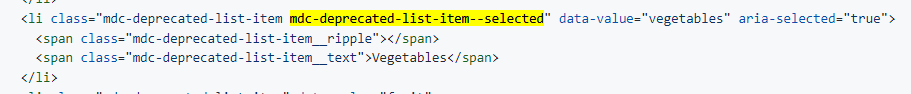
同时在 display value 加上相同的值
The Validation Problem
虽然 select 支持 required validation
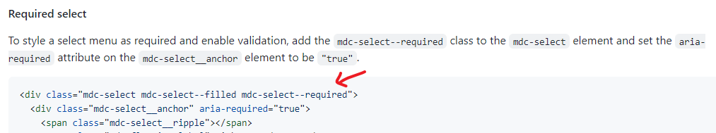
但毕竟不是原生 validation, 所以无法真的搭配 form 来使用, 比如 submit 的时候, by right 有 invalid 是不能成功的, 但是 select 的 invalid 是无法通知 form 的, 所以 form 能 submit 成功.
native form 没有类似 Angular Form 那样支持扩展 accessor, 所以要实现的话非常麻烦.
思路:
拦截 form submit
检查 select 是否 valid
invalid 就 prevent default
focus to select anchor element (这个是 tabindex 0)
set invalid (为了让它变红色和出 error message)
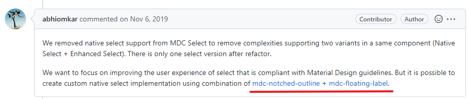
太麻烦了, 所以建议用 native select 来实现.
Native Select
no support native select
以前 MDC 是支持 native select 的, 但后来由于 maintain 不来, 所以 remove 掉了.
参考: Github Issue – Remove support for native select from MDC Select
虽然没有 build-in 的, 但是自己做也不会太难
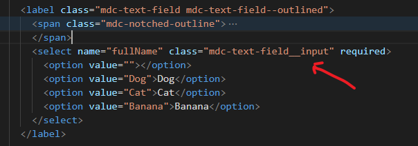
HTML
<label class="mdc-text-field mdc-text-field--outlined">
  <span class="mdc-notched-outline">
    <span class="mdc-notched-outline__leading"></span>
    <span class="mdc-notched-outline__notch">
      <span class="mdc-floating-label">Full Name</span>
    </span>
    <span class="mdc-notched-outline__trailing"></span>
  </span>
  <select name="fullName" class="mdc-text-field__input" required>
    <option value=""></option>
    <option value="Dog">Dog</option>
    <option value="Cat">Cat</option>
    <option value="Banana">Banana</option>
  </select>
</label>
用 text field 把 input 换成 select 就可以了 (注意: 虽然是 select, 但 class 依然要放 mdc-text-field__input 哦)
Scss 和 TypeScript
和 input 一样, 我就不写了
箭头的问题
MDC 把箭头 hide 起来了
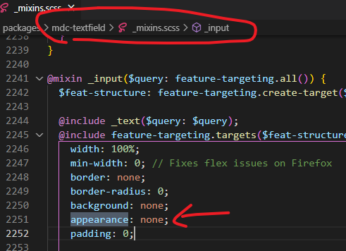
可以通过 override 的方式叫它出来
select {
  appearance: revert !important;
}
但它有缺陷, 颜色不美
不管什么情况下都是黑色, 如果体验要求不高的话, 可以算了.
我试过用 trailing icons 做 (类似上面做 datepicker 那样), 但 select 没有 showPicker 这个功能, 所以这个方向是错的.
正确的做法是 appearance: none, 然后用 background image 做箭头.
参考: stackoverflow – Select arrow style change
Theme
参考: Theming Guide
text field 框的颜色是依据 them 的 primary color
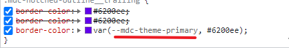
而 Material Design 默认的颜色是紫色
想换颜色最好是把 primary 换了.
@use '@material/theme' with (
  $primary: MediumBlue
);
效果