1、创建数据报表分支report并push到远程
创建分支:
git checkout -b report
推送到远程:(以前码云中没有该分支,所以要加-u,如果码云中有该分支,则不需要加-u)
git push -u origin report
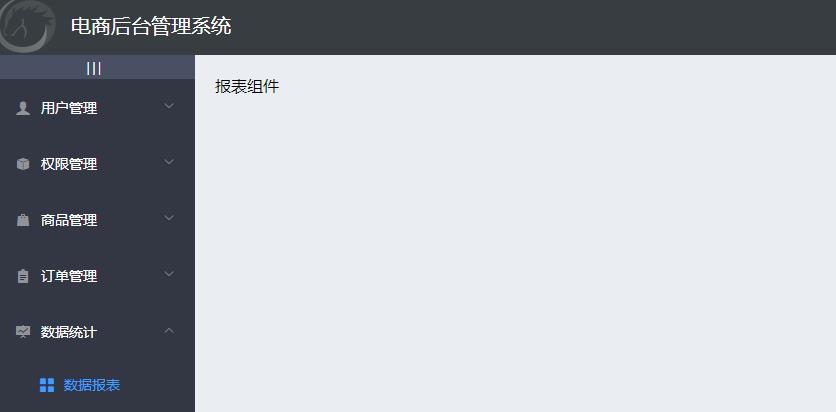
2、通过路由加载数据报表组件
新建report文件夹和Report.vue文件:
<template>
<div>报表组件</div>
</template>

<script>
export default {

}
</script>

<style lang="less" scoped>

</style>
添加路由:
import Report from '../components/report/Report.vue'

const routes = [
  { path: '/', redirect: '/login' }, // 重定向
  { path: '/login', component: Login },
  {
    path: '/home',
    component: Home,
    redirect: '/welcome', // 重定向
    children: [ // 子路由
      { path: '/welcome', component: Welcome },
      { path: '/users', component: Users }, // 用户列表
      { path: '/rights', component: Rights }, // 权限列表
      { path: '/roles', component: Roles }, // 角色列表
      { path: '/categories', component: Cate }, // 商品分类
      { path: '/params', component: Params }, // 分类参数
      { path: '/goods', component: List }, // 商品列表
      { path: '/goods/add', component: Add }, // 添加商品
      { path: '/orders', component: Order }, // 订单列表
      { path: '/reports', component: Report } // 数据报表
    ]
  }
]
点击左侧菜单的商品分类的效果如图:
3、绘制数据报表组件的基本布局
还是面包屑和card视图:
<template>
<div>
  <!--面包屑导航区域-->
  <el-breadcrumb separator-class="el-icon-arrow-right">
      <el-breadcrumb-item :to="{ path: '/home' }">首页</el-breadcrumb-item>
      <el-breadcrumb-item>数据统计</el-breadcrumb-item>
      <el-breadcrumb-item>数据报表</el-breadcrumb-item>
  </el-breadcrumb>
  <!--卡片视图区域-->
  <el-card>
    11
  </el-card>
</div>
</template>
4、安装Echarts并渲染Demo图表
打开可视化工具,点击项目依赖--添加依赖--运行依赖 中搜索:echarts,然后进行安装。
回到Report.vue文件,导入echarts:
import echarts from 'echarts'
然后添加 echarts 区域:
<!--卡片视图区域-->
<el-card>
    <!-- 2.为ECharts准备一个具备大小(宽高)的Dom -->
    <div id="main" style=" 600px;height:400px;"></div>
</el-card>

<script>
// 1.导入 echarts
import echarts from 'echarts'
export default {
  // 此时页面上的元素,已经被渲染完毕
  mounted() {
    // 3.基于准备好的dom,初始化echarts实例
    var myChart = echarts.init(document.getElementById('main'))

    // 4.指定图表的配置项和数据
    var option = {
      title: {
        text: 'ECharts 入门示例'
      },
      tooltip: {},
      legend: {
        data: ['销量']
      },
      xAxis: {
        data: ['衬衫', '羊毛衫', '雪纺衫', '裤子', '高跟鞋', '袜子']
      },
      yAxis: {},
      series: [{
        name: '销量',
        type: 'bar',
        data: [5, 20, 36, 10, 10, 20]
      }]
    }

    // 5.使用刚指定的配置项和数据显示图表。
    myChart.setOption(option)
  }
}
</script>
此时刷新页面:

5、获取折线图数据并渲染图表
发起请求,调用api的基于时间统计的折线图接口,请求路径:reports/type/1,请求方法:get,不需要传递参数。
// 此时页面上的元素,已经被渲染完毕
  async mounted() {
    // 3.基于准备好的dom,初始化echarts实例
    var myChart = echarts.init(document.getElementById('main'))

    const { data: res } = await this.$http.get('reports/type/1')
    if (res.meta.status !== 200) {
      return this.$message.error('获取折线图数据失败')
    }
    console.log(res)

    // 4.指定图表的配置项和数据
    // var option = {
    //   title: {
    //     text: 'ECharts 入门示例'
    //   },
    //   tooltip: {},
    //   legend: {
    //     data: ['销量']
    //   },
    //   xAxis: {
    //     data: ['衬衫', '羊毛衫', '雪纺衫', '裤子', '高跟鞋', '袜子']
    //   },
    //   yAxis: {},
    //   series: [{
    //     name: '销量',
    //     type: 'bar',
    //     data: [5, 20, 36, 10, 10, 20]
    //   }]
    // }

    // 5.使用刚指定的配置项和数据显示图表。
    myChart.setOption(res.data)
  }
此时刷新可以看到效果图:
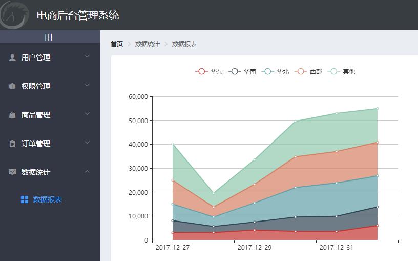
但是缺少了鼠标跟随的效果,下面进行添加。
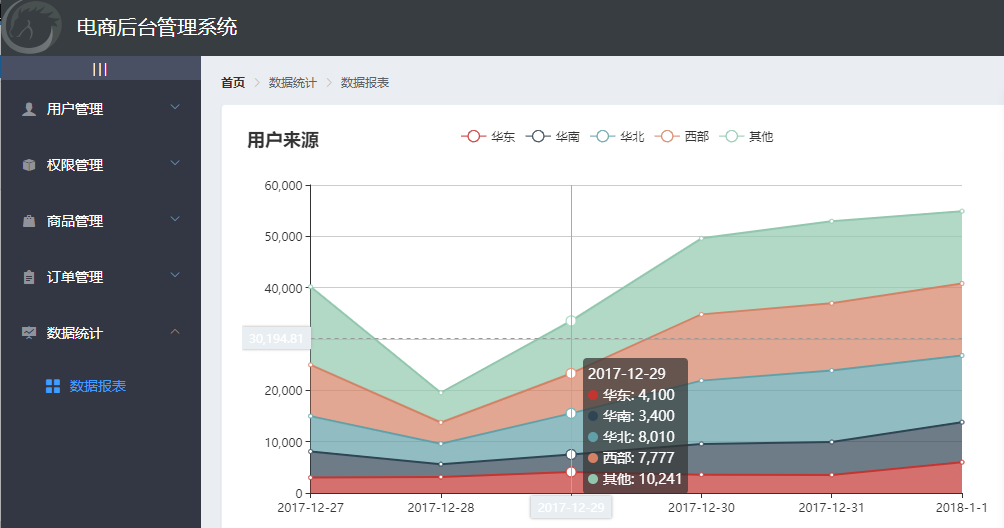
需要将返回的数据和 option 进行合并,然后把合并后的结果给图表
import _ from 'lodash'
export default {
  data () {
    return {
      // 需要合并的数据
      options: {
        title: {
          text: '用户来源'
        },
        tooltip: {
          trigger: 'axis',
          axisPointer: {
            type: 'cross',
            label: {
              backgroundColor: '#E9EEF3'
            }
          }
        },
        grid: {
          left: '3%',
          right: '4%',
          bottom: '3%',
          containLabel: true
        },
        xAxis: [
          {
            boundaryGap: false
          }
        ],
        yAxis: [
          {
            type: 'value'
          }
        ]
      }
    }
  },
  // 此时页面上的元素,已经被渲染完毕
  async mounted() {
    、、、
    // 4.指定图表的配置项和数据
    // merge 函数,可以合并两个对象
    const result = _.merge(res.data, this.options)

    // 5.使用刚指定的配置项和数据显示图表。
    myChart.setOption(result)
  }
}
</script>
如果觉得图表比较小,可以调整宽和高:
<!-- 2.为ECharts准备一个具备大小(宽高)的Dom -->
<div id="main" style=" 750px;height:400px;"></div>
此时效果图:
可以提交代码了:
git add .
git commit -m "完成了报表功能的开发"
git push

git checkout master
git merge report
git push