1.边框:border
-
border-radius
-
-
border-image
/*css圆角*/ border-radius:25px; border-radius: 15px 50px 30px 5px; border-radius: 15px 50px; border-radius: 15px 50px 30px; /*css阴影:注意着三个参数*/ box-shadow: 10px 10px 5px #888888; /*css边界图片:只需要掌握两个循环和单个就行*/ 1.border-image: url(border.png) 30 stretch;/*一堆图片,图像平铺(重复),以填补该地区*/ 2.border-image: url(border.png) 30 round;/*四个图片,图像被拉伸以填补该地区*/
2.背景设置:background
-
background-image
-
background-size
-
background-origin
-
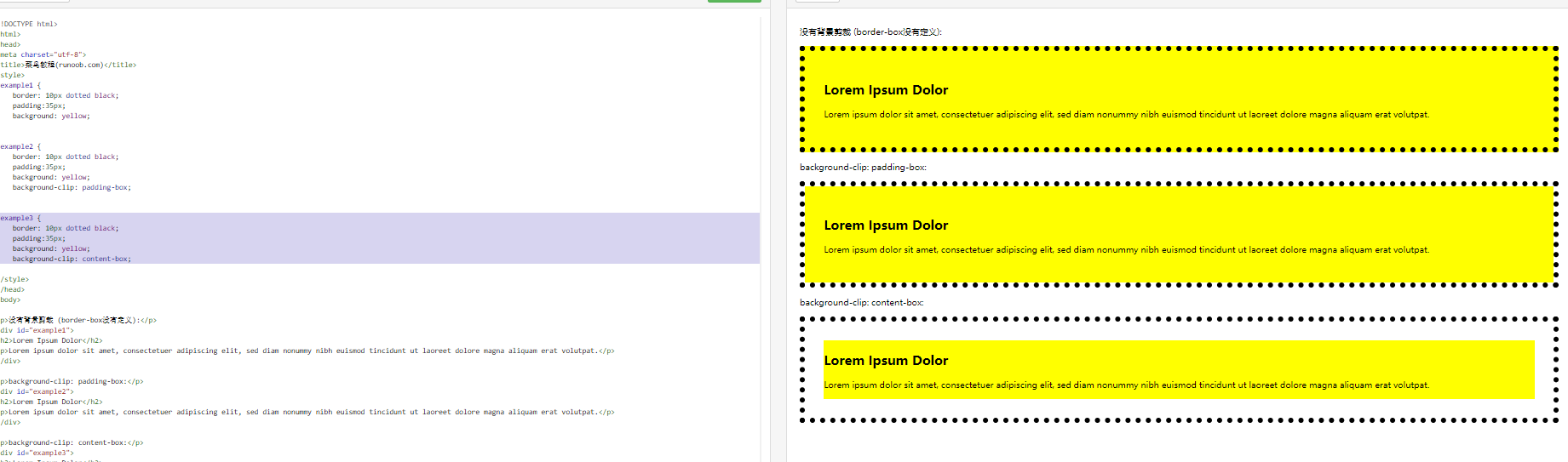
background-clip
/*添加图片:background-image/position/repeat*/
    background-image: url(img_flwr.gif), url(paper.gif);
    background-position: right bottom, left top;
    background-repeat: no-repeat, repeat;
/*背景大小:background-size*/
    background:url(img_flwr.gif);
    background-size:80px 60px;
    background-repeat:no-repeat;
/*选择填充范围:background-origin*/
    background:url(img_flwr.gif);
    background-repeat:no-repeat;
    background-size:100% 100%;
    background-origin:content-box;
/*背景绘制:background-clip(重点:显示背景在那出现,从那个点开始绘制)*/
#example3 {
    border: 10px dotted black;
    padding:35px;
    background: yellow;
    background-clip: content-box;
}
3.渐变效果:
/*1.线性渐变 - 从上到下(默认情况下)*/
background-image: linear-gradient(#e66465, #9198e5);
/*2.线性渐变 - 从左到右*/
background-image: linear-gradient(to right, red , yellow);
/*3.线性渐变 - 对角*/
background-image: linear-gradient(to bottom right, red, yellow);
/*4.线性渐变 - 使用多个颜色节点*/
background-image: linear-gradient(to right, red,orange,yellow,green,blue,indigo,violet);
/*5.使用透明度:transparent
    rgba() 函数中的最后一个参数可以是从 0 到 1 的值,它定义了颜色的透明度:0 表示完全透明,1 表示完全不透明。
*/
background-image: linear-gradient(to right, rgba(255,0,0,0), rgba(255,0,0,1));
4.文本效果:box/text属性:
/*文本阴影*/ text-shadow: 5px 5px 5px #FF0000; /*盒子阴影:也就是只有右边和下边*/ box-shadow: 10px 10px 5px #888888; /*给阴影添加颜色*/ box-shadow: 10px 10px red; /*给before/after中添加阴影效果*/ /*重点:添加卡片阴影效果*/ div.card { width: 250px; box-shadow: 0 4px 8px 0 rgba(0, 0, 0, 0.2), 0 6px 20px 0 rgba(0, 0, 0, 0.19); text-align: center; } /*显示溢出效果:overflow*/ overflow: hidden; text-overflow: clip; overflow: hidden; text-overflow: ellipsis;
| 属性 | 描述 | CSS |
|---|---|---|
| hanging-punctuation | 规定标点字符是否位于线框之外。 | 3 |
| punctuation-trim | 规定是否对标点字符进行修剪。 | 3 |
| text-align-last | 设置如何对齐最后一行或紧挨着强制换行符之前的行。 | 3 |
| text-emphasis | 向元素的文本应用重点标记以及重点标记的前景色。 | 3 |
| text-justify | 规定当 text-align 设置为 "justify" 时所使用的对齐方法。 | 3 |
| text-outline | 规定文本的轮廓。 | 3 |
| text-overflow | 规定当文本溢出包含元素时发生的事情。 | 3 |
| text-shadow | 向文本添加阴影。 | 3 |
| text-wrap | 规定文本的换行规则。 | 3 |
| word-break | 规定非中日韩文本的换行规则。 | 3 |
| word-wrap | 允许对长的不可分割的单词进行分割并换行到下一行。 |
5.css2D转换:transform
/*translate(平移):根据左(X轴)和顶部(Y轴)位置给定的参数,从当前元素位置移动*/ transform: translate(50px,100px); /*rotate(旋转):在一个给定度数顺时针旋转的元素。*/ transform: rotate(30deg); /*scale(缩放):缩放为x、y轴的任意倍数*/ transform: scale(2,3); /* 标准语法:x方法为2倍,y放大为3倍 */ /*skew(倾斜角度):表示X轴和Y轴倾斜的角度,如果第二个参数为空,则默认为0*/ skewX(<angle>);表示只在X轴(水平方向)倾斜。 skewY(<angle>);表示只在Y轴(垂直方向)倾斜。 transform: skew(30deg,20deg); /*综合上述所有能力的一个特性:matrix*/ matrix 方法有六个参数,包含旋转,缩放,移动(平移)和倾斜功能 transform:matrix(0.866,0.5,-0.5,0.866,0,0); /*transform两个效果合成,可以不用上面那个matrix*/ transform: rotate(90deg) scale(2);
6.重点:(过渡)
CSS3 过渡是元素从一种样式逐渐改变为另一种的效果。要实现这一点,必须规定两项内容:
-
指定要添加效果的CSS属性
-
指定效果的持续时间。
/*指定添加效果的css属性*/ div{ transition: width 2s; -webkit-transition: width 2s; /* Safari */ } div:hover{ 300px; } /*多项改变:和前面的2D转换联系起来*/ transition: width 2s, height 2s, transform 2s; <meta charset="utf-8"> <title>菜鸟教程(runoob.com)</title> <style> div { width: 100px; height: 100px; background: red; -webkit-transition: width 2s, height 2s, -webkit-transform 2s; /* For Safari 3.1 to 6.0 */ transition: width 2s, height 2s, transform 2s; } div:hover { width: 200px; height: 200px; -webkit-transform: rotate(180deg); /* Chrome, Safari, Opera */ transform: rotate(180deg); } </style> </head> <body> <p><b>注意:</b>该实例无法在 Internet Explorer 9 及更早 IE 版本上工作。</p> <div>鼠标移动到 div 元素上,查看过渡效果。</div> </body> </html>
| 属性 | 描述 | CSS |
|---|---|---|
| transition | 简写属性,用于在一个属性中设置四个过渡属性。 | 3 |
| transition-property | 规定应用过渡的 CSS 属性的名称。 | 3 |
| transition-duration | 定义过渡效果花费的时间。默认是 0。 | 3 |
| transition-timing-function | 规定过渡效果的时间曲线。默认是 "ease"。 | 3 |
| transition-delay | 规定过渡效果何时开始。默认是 0。 |
7.动画实现(重点)
第一步:添加动画空间animation
/*1.给按钮或者图片添加动画控件名字,持续时间,效果方式*/
animation-name: drive;/*定义效果控件的名字*/
animation-delay: 2s;/*设置动画效果延迟时间*/
animation-duration: 1s;/*设置效果持续时间*/
animation-fill-mode: forwards;/*设置效果结束位置:forwards,backwards,both*/
/*设置动画循环播放的次数*/
animation-iteration-count: 3;/*循环3次,无数次:infinite*/
animation-direction: alternate;/*动画方向:normal:正向,reverse:反向,alternate:正向+反向,reverse alternate:反向+正向*/
/*动画时速控件:
1.ease:默认方法,初速度较慢,然后加速再减速
2.ease-in:初速度最慢,然后一直加速
3.ease-out:初速度最快,然后一直减速
4.ease-in-out:初速度较慢,然后加速再减速,与ease的区别在于加速减速过程是对称的
5.linear:恒速运动
*/
animation-timing-function: linear;
第二步:使用@Keyframes添加关键帧然后使用transform实现过渡效果:
/*1.注意:使用的区域是动画控件的名字*/
        @keyframes drive {
            from{
                transform: translate(0);
            }
            to{
                transform: translate(700px);
            }
        }
eg:
<style> html, body { height: 100%; width: 100%; overflow: hidden; margin: 0; } .grass, .sky, .road { position: relative; } .sky { height: 40%; background: skyblue; } .grass { height: 30%; background: seagreen; } .road { height: 30%; background: dimgrey; box-sizing: border-box; border-top: 10px solid grey; border-bottom: 10px solid grey; width: 100%; } .lines { box-sizing: border-box; border: 5px dashed #fff; height: 0px; width: 100%; position: absolute; top: 45%; } .animated { animation-name: drive; animation-duration: 5s; animation-fill-mode: both; animation-iteration-count: infinite; animation-timing-function: linear; } .mario { position: absolute; top: -40px; left: 0px; z-index: 2; animation: drive 3s both infinite linear, jump 0.5s 1.2s ease-in-out infinite; } .luigi { position: absolute; top: -150px; left: 0; z-index: 1; } .cloud { position: absolute; } .cloud:nth-child(1) { width: 200px; top: 120px; opacity: 0.5; animation: wind 80s linear infinite reverse; } .cloud:nth-child(2) { width: 300px; top: 0; animation: wind 50s linear infinite reverse; } @keyframes drive { from { transform: translateX(-200px) } to { transform: translateX(1400px) } } @keyframes wind { from { left: -300px; } to { left: 100%; } } @keyframes jump { 0% { top: -40px; } 50% { top: -120px; } 100% { top: -40px; } } </style> <body> <div class="sky"> <img src="http://lc-jOYHMCEn.cn-n1.lcfile.com/8ba2d4cc06e96162cbba.png" class="cloud"> <img src="http://lc-jOYHMCEn.cn-n1.lcfile.com/8ba2d4cc06e96162cbba.png" class="cloud"> </div> <div class="grass"></div> <div class="road"> <div class="lines"> <img src="http://lc-jOYHMCEn.cn-n1.lcfile.com/a3f630c957a4b32d0221.png" class="mario animated"> <img src="http://lc-jOYHMCEn.cn-n1.lcfile.com/a1aa3ebfc1d96b954025.png" class="luigi animated"> </div> </div> </body>
8.分页导航:
1.鼠标悬停效果:
ul.pagination li a {
    transition: background-color .3s;
}
2.面包屑导航:display:inline(横向排列元素)
ul.breadcrumb { padding: 8px 16px; list-style: none; background-color: #eee; } ul.breadcrumb li {display: inline;} ul.breadcrumb li+li:before { padding: 8px; color: black; content: "/�0a0"; }
9.框大小:box-sizing
10.Css3弹性盒子:(适用于div元素布局上)
| 属性 | 描述 |
|---|---|
| flex-direction | 指定弹性容器中子元素排列方式 |
| flex-wrap | 设置弹性盒子的子元素超出父容器时是否换行 |
| flex-flow | flex-direction 和 flex-wrap 的简写 |
| align-items | 设置弹性盒子元素在侧轴(纵轴)方向上的对齐方式 |
| align-content | 修改 flex-wrap 属性的行为,类似 align-items, 但不是设置子元素对齐,而是设置行对齐 |
| justify-content | 设置弹性盒子元素在主轴(横轴)方向上的对齐方式 |
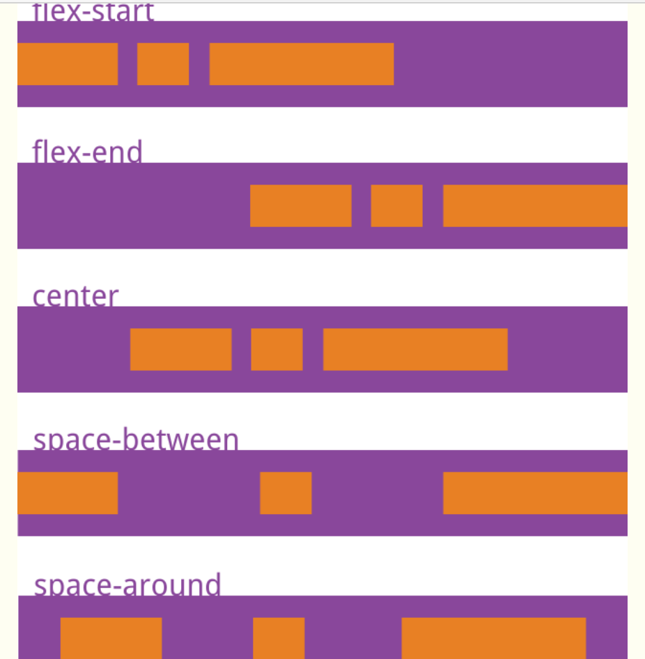
/*flex-direction:决定项目的方向。*/ .flex-container { flex-direction: row(水平) | row-reverse(水平反) | column(竖直) | column-reverse;(竖直反) } /*flex-warp:换行,规定flex容器是单行或者多行,同时横轴的方向决定了新行堆叠的方向*/ .flex-container { flex-wrap: nowrap(不拆行或列) | wrap(必要时拆) | wrap-reverse;(相反拆) } /*align-items:定义子项目对齐在那条基准线上:stretch:拉伸/center:基准线在中心/flex-start容器上边线/flex-end容器下边线*/ /*justify-content:设置子元素在主轴线上的对齐方式:flex-start/flex-end/center/space-between/space-around*/
align-items:
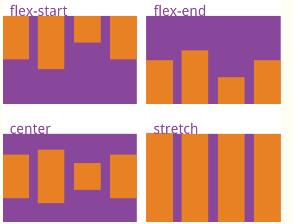
justify-content:
11.弹性盒子子元素属性:
| order | 设置弹性盒子的子元素排列顺序。 |
|---|---|
| flex-grow | 设置或检索弹性盒子元素的扩展比率。 |
| flex-shrink | 指定了 flex 元素的收缩规则。flex 元素仅在默认宽度之和大于容器的时候才会发生收缩,其收缩的大小是依据 flex-shrink 的值。 |
| flex-basis | 用于设置或检索弹性盒伸缩基准值。 |
| flex | 设置弹性盒子的子元素如何分配空间。 |
| align-self | 在弹性子元素上使用。覆盖容器的 align-items 属性。 |
1. flex属性
flex 属性用于设置或检索弹性盒模型对象的子元素如何分配空间。
flex 属性是 flex-grow、flex-shrink 和 flex-basis 属性的简写属性。
.flex-container .flex-item { flex: flex-grow flex-shrink flex-basis | auto | initial | inherit; }
| 值 | 描述 |
|---|---|
| flex-grow | 一个数字,规定项目将相对于其他元素进行扩展的量。 |
| flex-shrink | 一个数字,规定项目将相对于其他元素进行收缩的量。 |
| flex-basis | 项目的长度。合法值:"auto"、"inherit" 或一个后跟 "%"、"px"、"em" 或任何其他长度单位的数字。 |
| auto | 与 1 1 auto 相同。 |
| none | 与 0 0 auto 相同。 |
| initial | 设置该属性为它的默认值,即为 0 1 auto。 |
| inherit | 从父元素继承该属性。 |
6. align-self属性
.flex-container .flex-item {
    align-self: auto | stretch | center | flex-start | flex-end | baseline | initial | inherit;
}
| 值 | 描述 |
|---|---|
| auto | 默认值。元素继承了它的父容器的 align-items 属性。如果没有父容器则为 "stretch"。 |
| stretch | 元素被拉伸以适应容器。 |
| center | 元素位于容器的中心。 |
| flex-start | 元素位于容器的开头。 |
| flex-end | 元素位于容器的结尾。 |
| baseline | 元素位于容器的基线上。 |
| initial | 设置该属性为它的默认值。 |
| inherit | 从父元素继承该属性。 |
12.多媒体查询(直接在css中返回页面的一些信息)
-
viewport(视窗) 的宽度与高度
-
设备的宽度与高度
-
朝向 (智能手机横屏,竖屏) 。
-
分辨率
| 值 | 描述 |
|---|---|
| all | 用于所有多媒体类型设备 |
| 用于打印机 | |
| screen | 用于电脑屏幕,平板,智能手机等。 |
| speech | 用于屏幕阅读器 |
/*通过屏幕尺寸变化实现多媒体查询功能*/ @media screen and (max- 480px) {/*在屏幕可视窗口尺寸小于 480 像素的设备上修改背景颜色:*/ body { background-color: lightgreen; } } @media screen and (min- 480px) {/*以下实例在屏幕可视窗口尺寸大于 480 像素时将菜单浮动到页面左侧:*/ #leftsidebar {width: 200px; float: left;} #main {margin-left:216px;} } @media screen and (max- 600px) {/*在屏幕可视窗口尺寸小于 600 像素时将 div 元素隐藏:*/ div.example { display: none; } }