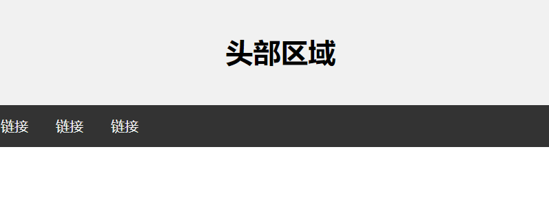
一:头部区域:
<!--1.消除body与页面之间的间隙:body{padding:0px;margin:0px;}-->
<!--2.消除body与div之间的间隙:div{position:absolute;padding:0px}-->
二:导航区域:
<!DOCTYPE html> <html> <head> <meta charset="utf-8"> <title>CSS 网页布局</title> <meta name="viewport" content="width=device-width, initial-scale=1"> <style> * { box-sizing: border-box; } body { margin: 0; } /* 头部样式 */ .header { background-color: #f1f1f1; padding: 20px; text-align: center; } /* 导航条 */ .topnav { overflow: hidden; background-color: #333; } /* 导航链接 */ .topnav a { float: left; display: block; color: #f2f2f2; text-align: center; padding: 14px 16px; text-decoration: none; } /* 链接 - 修改颜色 */ .topnav a:hover { background-color: #ddd; color: black; } </style> </head> <body> <div class="header"> <h1>头部区域</h1> </div> <div class="topnav"> <a href="#">链接</a> <a href="#">链接</a> <a href="#">链接</a> </div> </body> </html>
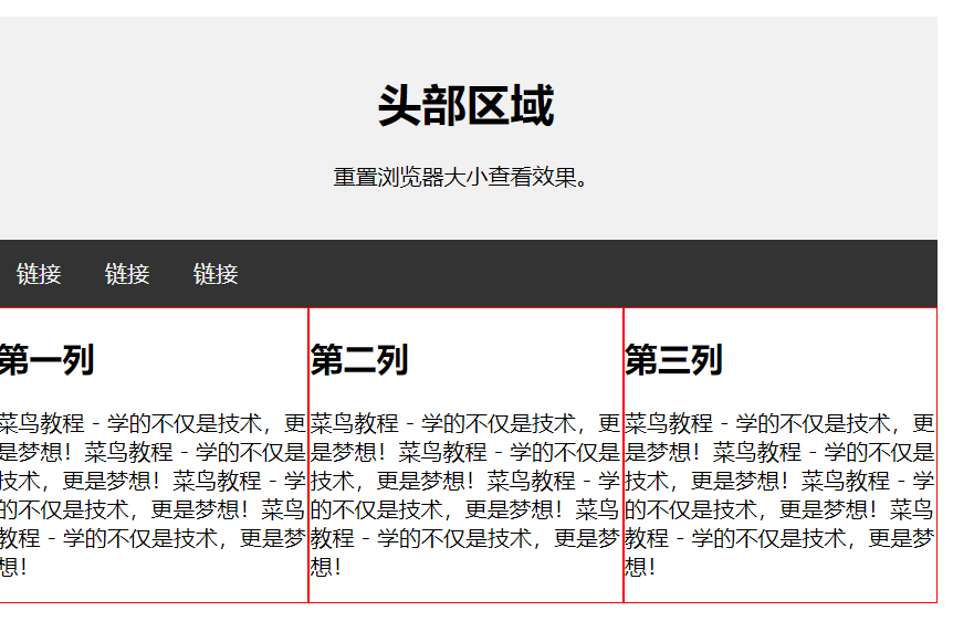
三:内容区域:
-
1 列:一般用于移动端
-
2 列:一般用于平板设备
-
3 列:一般用于 PC 桌面设备
<!DOCTYPE html> <html> <head> <meta charset="utf-8"> <title>CSS 网页布局</title> <meta name="viewport" content="width=device-width, initial-scale=1"> <style> * { box-sizing: border-box; } body { margin: 0; } /* 头部样式 */ .header { background-color: #f1f1f1; padding: 20px; text-align: center; } /* 导航条 */ .topnav { overflow: hidden; background-color: #333; } /* 导航链接 */ .topnav a { float: left; display: block; color: #f2f2f2; text-align: center; padding: 14px 16px; text-decoration: none; } /* 链接 - 修改颜色 */ .topnav a:hover { background-color: #ddd; color: black; } /* 创建三个相等的列 */ .column { float: left; width: 33.33%; border:1px solid red; overflow:auto; } /* 列后清除浮动 */ .row:after { content: ""; display: table; clear: both; } /* 响应式布局 - 小于 600 px 时改为上下布局 */ @media screen and (max- 600px) { .column { width: 100%; } } </style> </head> <body> <div class="header"> <h1>头部区域</h1> <p>重置浏览器大小查看效果。</p> </div> <div class="topnav"> <a href="#">链接</a> <a href="#">链接</a> <a href="#">链接</a> </div> <div class="row"> <div class="column"> <h2>第一列</h2> <p>xxxxxxxxxxxxxxxxxxx</p> </div> <div class="column"> <h2>第二列</h2> <p>xxxxxxxxxxxxxxxxxxx</p> </div> <div class="column"> <h2>第三列</h2> <p>xxxxxxxxxxxxxxxxxxx</p> </div> </div> </body> </html>
四:底部区域:
<!DOCTYPE html> <html> <head> <meta charset="utf-8"> <title>CSS 网页布局</title> <meta name="viewport" content="width=device-width, initial-scale=1"> <style> * { box-sizing: border-box; } body { margin: 0; } /* 头部样式 */ .header { background-color: #f1f1f1; padding: 20px; text-align: center; } /* 导航条 */ .topnav { overflow: hidden; background-color: #333; } /* 导航链接 */ .topnav a { float: left; display: block; color: #f2f2f2; text-align: center; padding: 14px 16px; text-decoration: none; } /* 链接 - 修改颜色 */ .topnav a:hover { background-color: #ddd; color: black; } /* 创建三个相等的列 */ .column { float: left; padding: 10px; } /* 左右两侧宽度 */ .column.side { width: 25%; } /* 中间区域宽度 */ .column.middle { width: 50%; } /* 列后面清除浮动 */ .row:after { content: ""; display: table; clear: both; } /* 响应式布局 - 宽度小于600px时设置上下布局 */ @media screen and (max- 600px) { .column.side, .column.middle { width: 100%; } } /* 底部样式 */ .footer { background-color: #f1f1f1; padding: 10px; text-align: center; } </style> </head> <body> <div class="header"> <h1>头部区域</h1> <p>重置浏览器大小查看效果。</p> </div> <div class="topnav"> <a href="#">链接</a> <a href="#">链接</a> <a href="#">链接</a> </div> <div class="row"> <div class="column side"> <h2>左侧栏</h2> <p>xxxxxxxxxxxxxxx</p> </div> <div class="column middle"> <h2>主区域内容</h2> <p>xxxxxxxxxxxxxxxx</p> <p>xxxxxxxxxxxxxxxxxx</p> </div> <div class="column side"> <h2>右侧栏</h2> <p>xxxxxxxxxxxxxxxxxx!</p> </div> </div> <div class="footer"> <p>底部区域</p> </div> </body> </html>
五:整体布局:
<!DOCTYPE html> <html> <head> <meta charset="utf-8"> <title>ass</title> <style> * { box-sizing: border-box; } body { font-family: Arial; padding: 10px; background: #f1f1f1; } /* 头部标题 */ .header { padding: 30px; text-align: center; background: white; } .header h1 { font-size: 50px; } /* 导航条 */ .topnav { overflow: hidden; background-color: #333; } /* 导航条链接 */ .topnav a { float: left; display: block; color: #f2f2f2; text-align: center; padding: 14px 16px; text-decoration: none; } /* 链接颜色修改 */ .topnav a:hover { background-color: #ddd; color: black; } /* 创建两列 */ /* Left column */ .leftcolumn { float: left; width: 75%; } /* 右侧栏 */ .rightcolumn { float: left; width: 25%; background-color: #f1f1f1; padding-left: 20px; } /* 图像部分 */ .fakeimg { background-color: #aaa; width: 100%; padding: 20px; } /* 文章卡片效果 */ .card { background-color: white; padding: 20px; margin-top: 20px; } /* 列后面清除浮动 */ .row:after { content: ""; display: table; clear: both; } /* 底部 */ .footer { padding: 20px; text-align: center; background: #ddd; margin-top: 20px; } /* 响应式布局 - 屏幕尺寸小于 800px 时,两列布局改为上下布局 */ @media screen and (max- 800px) { .leftcolumn, .rightcolumn { width: 100%; padding: 0; } } /* 响应式布局 -屏幕尺寸小于 400px 时,导航等布局改为上下布局 */ @media screen and (max- 400px) { .topnav a { float: none; width: 100%; } } </style> </head> <body> <div class="header"> <h1>我的网页</h1> <p>重置浏览器大小查看效果。</p> </div> <div class="topnav"> <a href="#">链接</a> <a href="#">链接</a> <a href="#">链接</a> <a href="#" style="float:right">链接</a> </div> <div class="row"> <div class="leftcolumn"> <div class="card"> <h2>文章标题</h2> <h5>2019 年 4 月 17日</h5> <div class="fakeimg" style="height:200px;">图片</div> <p>一些文本...</p> <p>xxxxxxxxxxxxxxxxxxx</p> </div> <div class="card"> <h2>文章标题</h2> <h5>2019 年 4 月 17日</h5> <div class="fakeimg" style="height:200px;">图片</div> <p>一些文本...</p> <p>xxxxxxxxxxxxxxxxxxx</p> </div> </div> <div class="rightcolumn"> <div class="card"> <h2>关于我</h2> <div class="fakeimg" style="height:100px;">图片</div> <p>关于我的一些信息..</p> </div> <div class="card"> <h3>热门文章</h3> <div class="fakeimg"><p>图片</p></div> <div class="fakeimg"><p>图片</p></div> <div class="fakeimg"><p>图片</p></div> </div> <div class="card"> <h3>关注我</h3> <p>一些文本...</p> </div> </div> </div> <div class="footer"> <h2>底部区域</h2> </div> </body> </html>