最近看了两个javascript练手小项目,用了两种布局方式,记录一下。
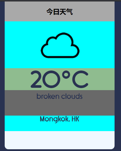
第一种就是用div做成盒子套盒子,
项目地址:https://github.com/CodeExplainedRepo/Weather-App-JavaScript
HTML:
<!DOCTYPE html>
<html lang="en">
<head>
    <meta charset="UTF-8">
    <title>Weather App - JavaScript</title>
    <link rel="stylesheet" href="font/Rimouski.css">
    <link rel="stylesheet" href="style.css">
</head>
<body>

    <div class="container">
        <div class="app-title">
            <p>Weather</p>
        </div>
        <div class="notification"> </div>
        <div class="weather-container">
            <div class="weather-icon">
                <img src="icons/unknown.png" alt="">
            </div>
            <div class="temperature-value">
                <p>- °<span>C</span></p>
            </div>
            <div class="temperature-description">
                <p> - </p>
            </div>
            <div class="location">
                <p>-</p>
            </div>
        </div>
    </div>

    <script src="app.js"></script>
</body>
</html>
CSS:
*{
    font-family: "Rimouski";
}

body{
    background-color: #293251;
}

.container{
    width: 300px;
    background-color: #FFF;

    display: block;
    margin: 0 auto;

    border-radius: 10px;
    padding-bottom : 50px;
}

.app-title{
    width: 300px;
    height: 50px;
    border-radius: 10px 10px 0 0;
}

.app-title p{
    text-align: center;
    padding: 15px;
    margin: 0 auto;
    font-size: 1.2em;
    color: #293251;
}

.notification{
    background-color: #f8d7da;
    display: none;
}

.notification p{
    color: #721c24;
    font-size: 1.2em;
    margin: 0;
    text-align: center;
    padding: 10px 0;
}

.weather-container{
    width: 300px;
    height: 260px;
    background-color: #F4F9FF;
}

.weather-icon{
    width: 300px;
    height: 128px;
}

.weather-icon img{
    display: block;
    margin: 0 auto;
}

.temperature-value{
    width: 300px;
    height:60px;
}

.temperature-value p{
    padding: 0;
    margin: 0;
    color: #293251;
    font-size: 4em;
    text-align: center;
    cursor: pointer;
}

.temperature-value p:hover{

}

.temperature-value span{
    color: #293251;
    font-size: 0.5em;
}

.temperature-description{

}

.temperature-description p{
    padding: 8px;
    margin: 0;
    color: #293251;
    text-align: center;
    font-size: 1.2em;
}

.location{

}

.location p{
    margin: 0;
    padding: 0;
    color: #293251;
    text-align: center;
    font-size: 0.8em;
}
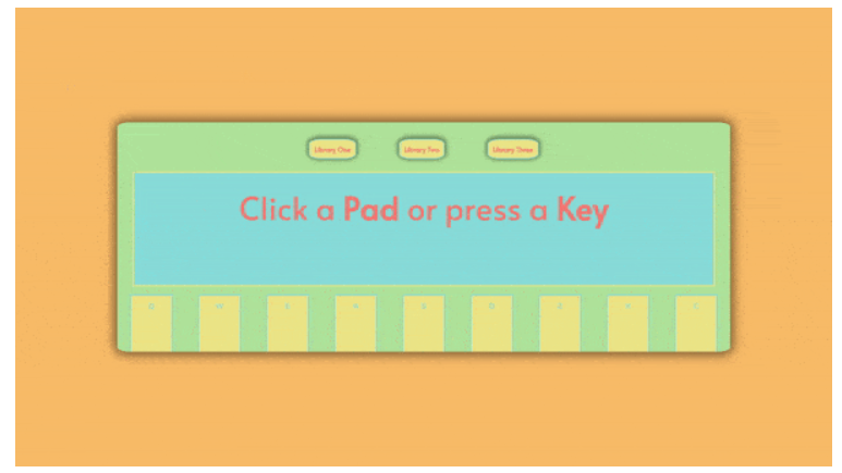
第二种是flex布局,做对称结构的页面很方便。
项目地址:https://github.com/ibanld/rhythmdrums 预览地址:https://ibanld.github.io/rhythmdrums/
最外层的大盒子container用 100vw; height: 100vh 做成全屏,内部用flex布局,居中排列
中间的方形容器, 75%;height: 50%;设置大小,内部再用flex
HTML:
    <!DOCTYPE html>
    <html lang="en">
    <head>
        <meta charset="UTF-8">
        <meta name="viewport" content="width=device-width, initial-scale=1.0">
        <link rel="favicon" href="favicon.ico" type="image/x-icon">
        <link rel="stylesheet" href="./index.css">
        <title>Rhythm and Drums</title>
    </head>
    <body>
        <div class="container">
            <div id="drum-machine">
                <div class="btn-group">
                    <div id='lib-1'>Library One</div>
                    <div id='lib-2'>Library Two</div>
                    <div id='lib-3'>Library Three</div>
                </div>
                <div id="display">
                    <p id='beat-name'>Click a <strong>Pad</strong> or press a <strong>Key</strong></p>
                </div>
                <div id="pad-container">
                </div>
            </div>
        </div>
        <script src="./index.js" type="text/javascript"></script>
    </body>
    </html>
CSS:
@import url('https://fonts.googleapis.com/css2?family=Alata&display=swap');
@import url('https://fonts.googleapis.com/css2?family=Alata&family=Nunito&display=swap');

* {
    margin: 0;
    padding: 0;
    box-sizing: border-box;
    --font-primary: 'Alata', sans-serif;
    --font-secondary: 'Nunito', sans-serif;
    --primary: #febf63;
    --secondary: #ede682;
    --light: #ade498;
    --dark: #7fdbda;
}

.container {
    background: var(--primary);
    width: 100vw;
    height: 100vh;
    display: flex;
    justify-content: center;
    align-items: center;
    user-select: none;
}

#drum-machine {
    background: var(--light);
    width: 75%;
    height: 50%;
    display: flex;
    flex-direction: column;
    justify-content: space-between;
    align-items: center;
    border-radius: 2%;
    box-shadow: 0px 0px 25px 8px rgba(0, 0, 0, 0.51);
}

.btn-group {
    width: 50%;
    margin-top: 2%;
    display: flex;
    justify-content: space-evenly;
    align-items: center;
}

.btn-group > * {
    background: var(--secondary);
    border: solid var(--dark) 2px;
    padding: 1.5%;
    font-family: var(--font-primary);
    font-weight: bold;
    color: salmon;
    text-align: center;
    margin: 10px;
    border-radius: 25%;
    cursor: pointer;
    box-shadow: 0px -2px 10px 5px rgba(0, 0, 0, 0.4);
}

.btn-group > *:hover {
    background: var(--dark);
    color: var(--light);
    border: solid var(--secondary) 2px;
    transform: translateY(-3px);
    transition: all ease 0.5s;
    box-shadow: 0px 5px 10px 5px rgba(0, 0, 0, 0.5);
}

#display {
    background: var(--dark);
    width: 95%;
    height: 50%;
    border: solid var(--secondary) 3px;
    padding: 2%;
}

#beat-name {
    font-family: var(--font-primary);
    font-size: 75px;
    color: salmon;
    text-align: center;
}

#pad-container {
    display: flex;
    width: 100%;
    height: 25%;
    display: flex;
    justify-self: flex-end;
}

.drum-pad {
    background: var(--secondary);
    width: 10%;
    height: 100%;
    border: solid var(--dark) 3px;
    border-bottom: 0;
    padding-top: 1%;
    margin-left: 2%;
    margin-right: 2%;
    font-family: var(--font-secondary);
    font-weight: bolder;
    color: var(--dark);
    text-align: center;
    cursor: pointer;
}

.drum-pad-hover {
    background: var(--primary);
    padding-top: 1%;
    color: var(--light);
    font-size: 5vh;
    box-shadow: 0px -2px 20px 5px rgba(0, 0, 0, 0.4);
    transition: all linear 0.3s;
}

.drum-pad-clicked {
    background: salmon;
    width: 10%;
    height: 100%;
    border: solid var(--dark) 3px;
    border-bottom: 0;
    padding-top: 1%;
    margin-left: 2%;
    margin-right: 2%;
    font-family: var(--font-secondary);
    font-weight: bolder;
    color: var(--light);
    font-size: 5vh;
    text-align: center;
    cursor: pointer;
}

@media (max- 690px) {
    #drum-machine {
        width: 100%;
        overflow: hidden;
    }

    #beat-name {
        font-size: 3rem;
        margin-top: 10%;
    }

    .btn-group > * {
        margin: 5px;
    }
}