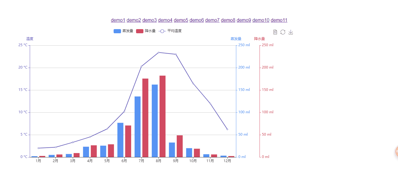
//多Y轴示例
<template>
<div id="main" :style="{'1000px',height:'500px' }"></div>
</template>
<script>
export default {
name: "demo10",
data() {
return {};
},
mounted() {
app.title = "多 Y 轴示例";
var colors = ["#5793f3", "#d14a61", "#675bba"];
//可以在这个地方设置提示表头的颜色
let myChart = this.$echarts.init(document.getElementById("main"));
myChart.setOption({
color: colors,//在这个地方引入进去
tooltip: {
trigger: "axis",
axisPointer: {
type: "cross"
}
},
//调整图表位置百分比的
grid: {
right: "20%"//让这个图表不会溢出
},
toolbox: {
feature: {
dataView: { show: true, readOnly: false },//数据视图里面的刷新
restore: { show: true },
saveAsImage: { show: true }
}
},
legend: {
data: ["蒸发量", "降水量", "平均温度"]
},
xAxis: [
{
type: "category",
axisTick: {
alignWithLabel: true
},
data: [
"1月",
"2月",
"3月",
"4月",
"5月",
"6月",
"7月",
"8月",
"9月",
"10月",
"11月",
"12月"
]
}
],
//需要多个Y轴就在这写对象
yAxis: [
{
type: "value",
name: "蒸发量",
//可以设置最大最小值
min: 0,
max: 250,
position: "right",
axisLine: {
lineStyle: {
//通过数组下标选取需要的颜色
color: colors[0]
}
},
axisLabel: {
formatter: "{value} ml"//通过type属性后面加上单位
}
},
{
type: "value",
name: "降水量",
min: 0,
max: 250,
position: "right",
offset: 80,//两个都靠右,这个设置之间的距离
axisLine: {
lineStyle: {
color: colors[1]
}
},
axisLabel: {
formatter: "{value} ml"
}
},
{
type: "value",
name: "温度",
min: 0,
max: 25,
position: "left",
axisLine: {
lineStyle: {
color: colors[2]
}
},
axisLabel: {
formatter: "{value} °C"
}
}
],
series: [
{
name: "蒸发量",
type: "bar",
data: [
2.0,
4.9,
7.0,
23.2,
25.6,
76.7,
135.6,
162.2,
32.6,
20.0,
6.4,
3.3
]
},
{
name: "降水量",
type: "bar",
yAxisIndex: 1,
data: [
2.6,
5.9,
9.0,
26.4,
28.7,
70.7,
175.6,
182.2,
48.7,
18.8,
6.0,
2.3
]
},
{
name: "平均温度",
type: "line",
yAxisIndex: 2,
data: [
2.0,
2.2,
3.3,
4.5,
6.3,
10.2,
20.3,
23.4,
23.0,
16.5,
12.0,
6.2
]
}
]
});
}
};
</script>