3D转换之移动
3D移动在2D移动的基础上多加了一个可以移动的方向,就是Z轴方向
语法:
transform: translateX(100px);
transform: translateY(100px);
/* 注意这个我们一般使用px单位 */
transform: translateZ(100px);
/* 其中x y z 分别指要移动的轴的方向的距离 */
transform: translate3d(x,y,z);
代码示例:
<head>
    <meta charset="UTF-8">
    <meta name="viewport" content="width=device-width, initial-scale=1.0">
    <meta http-equiv="X-UA-Compatible" content="ie=edge">
    <title>3D转换之移动</title>
    <style>
        * {
            transform: translateX(100px);
            transform: translateY(100px);
            /* 注意这个我们一般使用px单位 */
            transform: translateZ(100px);
            /* 其中x y z 分别指要移动的轴的方向的距离 */
            transform: translate3d(x, y, z);
        }

        div {
            width: 200px;
            height: 200px;
            background-color: pink;
            transition: all 1s linear;

        }

        div:hover {
            transform: translate3d(100px, 100px, 20px);
        }
    </style>
</head>

<body>
    <div></div>
</body>

</html>
透视perspective
如果想要在网页上产生3d效果需要透视
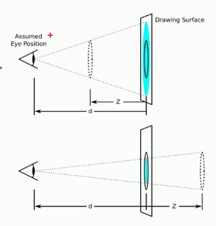
透视我们也称之为视距:就是人的眼睛到屏幕的距离
距离视觉点越近的在电脑平面上的成像越大,越远成像越小(近大远小)
透视(视距)的单位是像素
透视写在被观察盒子的父盒子上面
d:就是视距 视距就是一个距离人的眼睛到屏幕的距离
z:就是z轴 物体距离屏幕的距离 z轴越大 我们看到的物体就越大
上面的代码 如果想让20px有效果 就要写成下面这样的
<head>
    <meta charset="UTF-8">
    <meta name="viewport" content="width=device-width, initial-scale=1.0">
    <meta http-equiv="X-UA-Compatible" content="ie=edge">
    <title>3D转换之移动</title>
    <style>
        body {
            /* 透视写到被观察元素的父盒子上 */
            /* 远小近大 */
            perspective: 200px;
        }

        div {
            width: 200px;
            height: 200px;
            background-color: pink;
            transition: all 1s linear;

        }

        div:hover {
            transform: translate3d(100px, 100px, 20px);
        }
    </style>
</head>

<body>
    <div></div>
</body>

</html>
3D旋转之旋转(rotate3d)
语法:
 transform: rotate3d(x,y,z);
 transform: rotateX(X轴角度);
 transform: rotateY(Y轴角度);
 transform: rotateZ(Z轴角度);
小小案例:
<head>
    <meta charset="UTF-8">
    <meta name="viewport" content="width=device-width, initial-scale=1.0">
    <meta http-equiv="X-UA-Compatible" content="ie=edge">
    <title>Document</title>
    <style>
        .box {
            perspective: 500px;
            position: relative;
            width: 200px;
            height: 200px;
            margin: 100px auto;
            /* 控制子元素是否保持3d属性 */
            transform-style: preserve-3d;
            transform: rotateY(60deg);
        }

        .box div {
            position: absolute;
            top: 0;
            left: 0;
            height: 100%;
            width: 100%;
            background-color: pink;

        }

        .box div:last-child {
            background-color: purple;
            transform: rotateX(60deg);
        }
    </style>
</head>

<body>
    <div class="box">
        <div></div>
        <div></div>
    </div>
</body>

</html>
<head>
    <meta charset="UTF-8">
    <meta name="viewport" content="width=device-width, initial-scale=1.0">
    <meta http-equiv="X-UA-Compatible" content="ie=edge">
    <title>Document</title>
    <style>
        body {
            perspective: 400px;
        }

        .box {
            position: relative;
            width: 300px;
            height: 300px;
            margin: 100px auto;
            transition: all .4s;
            /* 让背面的紫色盒子保留立体空间 给父级添加的 */
            transform-style: preserve-3d;
        }

        .box:hover {
            transform: rotateY(180deg);
        }

        .front,
        .back {
            position: absolute;
            top: 0;
            left: 0;
            width: 100%;
            height: 100%;
            border-radius: 50%;
            font-size: 30px;
            color: #fff;
            text-align: center;
            line-height: 300px;
        }

        .front {
            background-color: pink;
            z-index: 1;
        }

        .back {
            background-color: purple;
            /* 像手机一样 背靠背 旋转 */
            transform: rotateY(180deg);
        }
    </style>
</head>

<body>
    <div class="box">
        <div class="front">黑马程序员</div>
        <div class="back">pink老师这里等你</div>
    </div>
</body>

</html>
3D导航栏
<head>
    <meta charset="UTF-8">
    <meta name="viewport" content="width=device-width, initial-scale=1.0">
    <meta http-equiv="X-UA-Compatible" content="ie=edge">
    <title>Document</title>
    <style>
        * {
            margin: 0;
            padding: 0;
        }

        ul {
            margin: 100px;
        }

        ul li {
            float: left;
            margin-right: 5px;
            perspective: 500px;
            width: 100px;
            height: 35px;
            list-style: none;
        }

        .box {
            position: relative;
            width: 100%;
            height: 100%;
            transform-style: preserve-3d;
            transition: all 0.4s linear 0s;
        }

        .box:hover {
            transform: rotateX(90deg);
        }

        .front,
        .bottom {
            position: absolute;
            left: 0;
            top: 0;
            width: 100%;
            height: 100%;
            text-align: center;
            line-height: 35px;
        }

        .front {
            background-color: pink;
            z-index: 1;
            transform: translateZ(17.5px);
        }

        .bottom {
            background-color: purple;
            /* 如果有移动和其他组合 先写移动 */
            transform: translateY(17.5px) rotateX(-90deg);
        }
    </style>
</head>

<body>
    <ul>
        <li>
            <div class="box">
                <div class="front">新浪</div>
                <div class="bottom">点击新浪</div>
            </div>
        </li>
        <li>
            <div class="box">
                <div class="front">新浪</div>
                <div class="bottom">点击新浪</div>
            </div>
        </li>
        <li>
            <div class="box">
                <div class="front">新浪</div>
                <div class="bottom">点击新浪</div>
            </div>
        </li>
        <li>
            <div class="box">
                <div class="front">新浪</div>
                <div class="bottom">点击新浪</div>
            </div>
        </li>
        <li>
            <div class="box">
                <div class="front">新浪</div>
                <div class="bottom">点击新浪</div>
            </div>
        </li>
    </ul>
</body>

</html>
旋转木马:
<head>
    <meta charset="UTF-8">
    <meta name="viewport" content="width=device-width, initial-scale=1.0">
    <meta http-equiv="X-UA-Compatible" content="ie=edge">
    <title>Document</title>
    <style>
        body {
            perspective: 1000px;
        }

        section {
            position: relative;
            width: 300px;
            height: 200px;
            margin: 150px auto;
            transform-style: preserve-3d;
            background: url(../img/pig.jpg);
            /* 添加动画效果 */
            animation: rotate 10s linear infinite;
        }

        @keyframes rotate {
            0% {
                transform: rotateY(0);
            }

            100% {
                transform: rotateY(260deg);
            }
        }

        /* 鼠标放上暂停 */
        section:hover {
            animation-play-state: paused;
        }

        section div {
            position: absolute;
            top: 0;
            left: 0;
            width: 100%;
            height: 100%;
            background: url(../img/dog.jpg);
        }

        section div:nth-child(1) {
            transform: rotateY(0) translateZ(300px);
        }

        section div:nth-child(2) {
            /* 先旋转好了 再移动 */
            transform: rotateY(60deg) translateZ(300px);
        }

        section div:nth-child(3) {
            transform: rotateY(120deg) translateZ(300px);
        }


        section div:nth-child(4) {
            transform: rotateY(180deg) translateZ(300px);
        }

        section div:nth-child(5) {
            transform: rotateY(240deg) translateZ(300px);
        }

        section div:nth-child(6) {
            transform: rotateY(300deg) translateZ(300px);
        }
    </style>
</head>

<body>
    <section>
        <div></div>
        <div></div>
        <div></div>
        <div></div>
        <div></div>
        <div></div>
    </section>
</body>

</html>