一 CSS布局的三种机制
1.标准流
2.浮动(盒子脱离标准流 浮起来 盒子水平排列)
3.定位(将盒子定在某一位置 自由的漂浮在其他盒子上面 css 离不开定位 特别是js特效)
二 为什么使用定位
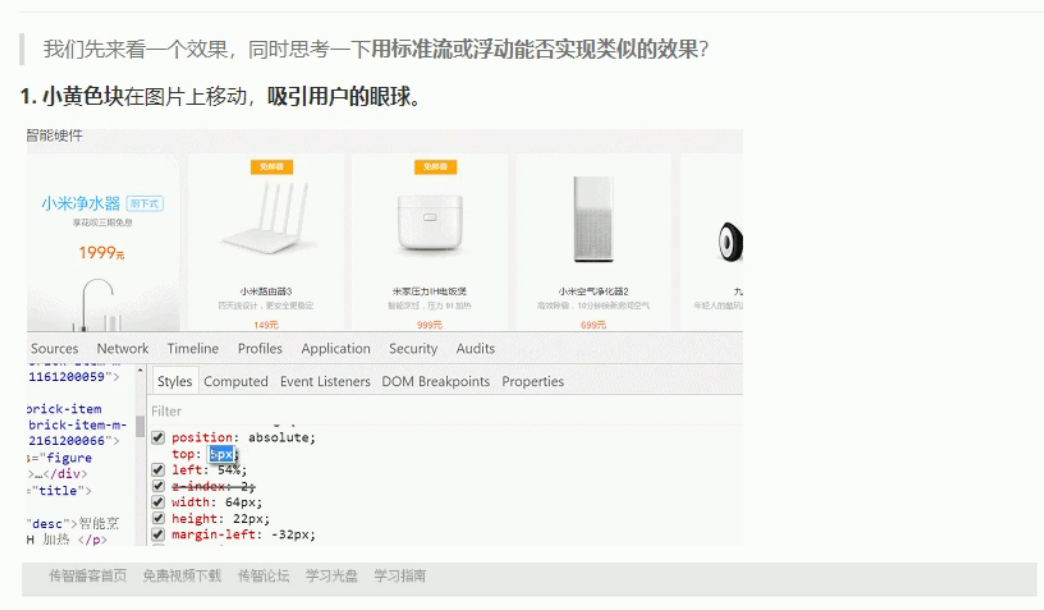
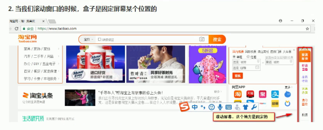
要实现以上效果,不使用定位是非常困难的
将盒子定在某一个位置,自由的漂浮在其他盒子(包括标准流和浮动之上)
所以我们脑海中应该有三种布局机制的上下顺序
标准流(最底层) ->浮动的盒子在中间层->定位的盒子在最上层
三 定位详解
定位也是用来布局的,有两部分组成
定位 = 定位模式 + 边偏移
1> 边偏移
在CSS中 通过 top bottom right left 属性定义元素的边偏移
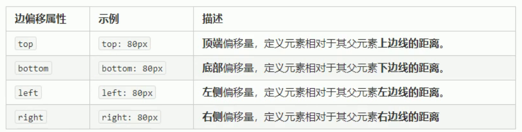
定位的盒子有了边偏移 才有价值 一般情况下 凡是有定位的地方都有边偏移
2> 定位模式(定位的分类)
在CSS中 通过position属性定义元素的定位模式 语法如下
选择器 {position:属性值}
定位模式是有不同的分类的 在不同的情况下 我们使用不同的定位模式

1:静态定位(static) 了解
静态定位 是元素默认的定位方式 无定位的意思 相当于 border 里面的none属性 就是无定位
静态定位 按照标准流特性摆放位置 没有边偏移
静态定位在布局时我们几乎是不用的
2:相对定位(relative) 重要
相对定位 是元素 相对于它 原来的位置 来说的
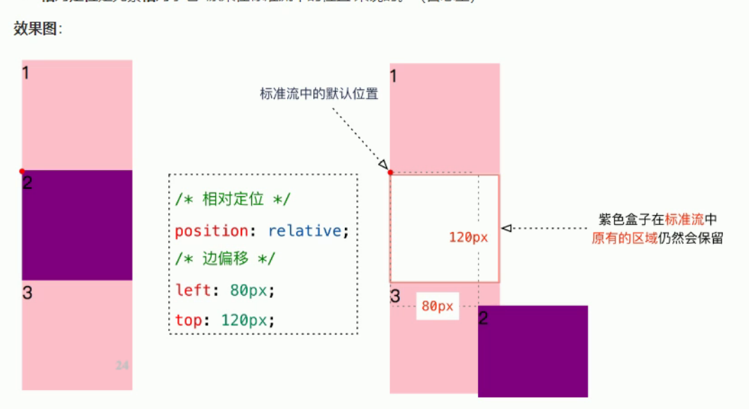
相对定位的特点:
相对于自己原来的位置移动
原来在标准流中 占有的位置 继续占有 后面的盒子仍然以标准流的方式对待它
<!DOCTYPE html>
<html lang="en">
<head>
    <meta charset="UTF-8">
    <meta name="viewport" content="width=device-width, initial-scale=1.0">
    <meta http-equiv="X-UA-Compatible" content="ie=edge">
    <title>相对定位</title>
    <style>
        div {
            width: 100px;
            height: 100px;
            background-color: pink;

        }
        .two {
            background-color: purple;
            /* 定位 = 定位模式 + 边偏移 */
            /* 虽然盒子走了 但是在标准流中仍然还有他的位置 没有脱标 */
            position: relative;
            top: 50px;
            left: 50px;
        }
    </style>
</head>
<body>
    <div></div>
    <div class="two"></div>
    <div></div>
</body>
</html>
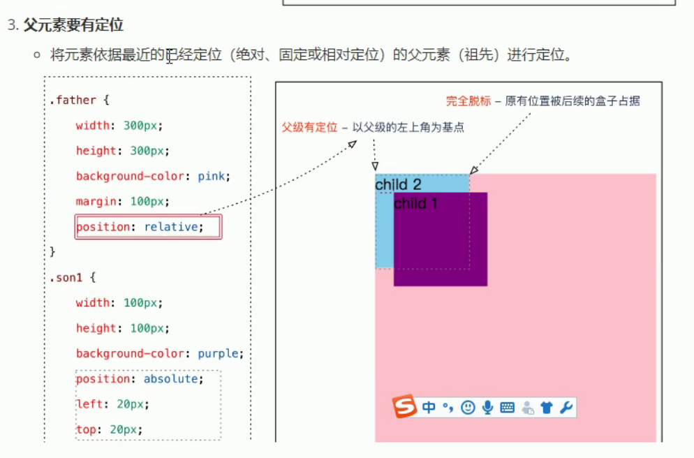
3:绝对定位(absolute)-重要
绝对定位是元素以带有定位的父级元素来移动位置
父级元素没有定位 就以浏览器为标准定位

<!DOCTYPE html>
<html lang="en">
<head>
    <meta charset="UTF-8">
    <meta name="viewport" content="width=device-width, initial-scale=1.0">
    <meta http-equiv="X-UA-Compatible" content="ie=edge">
    <title>绝对定位</title>
    <style>
        .father {
            width: 350px;
            height: 350px;
            background-color:pink;
            margin: 100px;
            /* 标准流的盒子 总是以父级为准移动位置 */
            /* 绝对定位 如果父级没有定位 那么绝对定位的盒子 会以我们文档为准
            浏览器为准移动位置 离自己最近的已经定位的为准 */
            /* 如果有一下代码 则以父亲为准移动位置 */
            /* position: relative; */
        }

        .son {
            /* 如果父级没有定位 则以浏览器为标准 */
            width: 200px;
            height: 200px;
            background-color: purple;
            position: absolute;
            top: 50px;
            left: 50px;
        }
    </style>
</head>
<body>
    <div class="father">
        <div class="son">

        </div>
    </div>
</body>
</html>
绝对定位的特点
是以带有定位的父级元素来移动位置 如果父级没有移动 则以浏览器文档为标准移动
不保留原来的位置 完全是脱标的
定位的口诀
子绝父相 :子级是绝对定位 父级要用相对定位
<!DOCTYPE html>
<html lang="en">
<head>
    <meta charset="UTF-8">
    <meta name="viewport" content="width=device-width, initial-scale=1.0">
    <meta http-equiv="X-UA-Compatible" content="ie=edge">
    <title>子绝父相</title>
    <style>
        .up {
            position: relative;
            width: 1000px;
            height: 90px;
            background-color: pink;

        }

        .down {
            width: 1000px;
            height: 150px;
            background-color: #000;
        }
        .arr-left {
            position: absolute;
            top: 25px;
            left: 0;
            width: 40px;
            height: 40px;
            background-color: purple;

        }
        .arr-right {
            position: absolute;
            top: 25px;
            right: 0;
            width: 40px;
            height: 40px;
            background-color: purple;

        }
    </style>
</head>
<body>
    <div class="up">
        <img src="../images/img.jpg" alt="">
        <div class="arr-left"></div>
        <div class="arr-right"></div>
    </div>
    <div class="down"></div>
</body>
</html>
<!DOCTYPE html>
<html lang="en">
<head>
    <meta charset="UTF-8">
    <meta name="viewport" content="width=device-width, initial-scale=1.0">
    <meta http-equiv="X-UA-Compatible" content="ie=edge">
    <title>Document</title>
    <style>
        .box {
            width: 310px;
            height: 190px;
            border: 1px solid #ccc;
            margin: 100px auto;
            padding: 10px;
            position: relative;
        }
        .top {
            position: absolute;
            top: 0;
            left: 0;
        }

        .bottom {
            position: absolute;
            bottom: 0;
            right: 0;
        }
    </style>
</head>
<body>
    <div class="box">
        <img class="top" src="../images/top_tu.gif" alt="">
        <img src="../images/adv.jpg" alt="">
        <img class="bottom" src="../images/br.gif" alt="">

    </div>
</body>
</html>
4:固定定位(fixed) 重要
固定定位时绝对定位的一种特殊形式。
1 完全脱标--完全不占位置
2 只认浏览器窗口+边偏移属性 来设置元素的位置
跟父元素没有任何关系 不随滚动条滚动
<!DOCTYPE html>
<html lang="en">
<head>
    <meta charset="UTF-8">
    <meta name="viewport" content="width=device-width, initial-scale=1.0">
    <meta http-equiv="X-UA-Compatible" content="ie=edge">
    <title>固定定位</title>
    <style>
        .box {
            position: relative;
            width: 300px;
            height: 300px;background-color: pink;
            margin: 100px auto;
        }
        /* 逃出盒子 固定定位和父亲没关系 只认浏览器的可视区域*/
        .box img {
            position: fixed;
            top: 0;
            left: 0;
        }
    </style>
</head>
<body>
    <div class="box">
        <img src="../images/sun.jpg" alt="" width="150px">
    </div>
</body>
</html>
<!DOCTYPE html>
<html lang="en">
<head>
    <meta charset="UTF-8">
    <meta name="viewport" content="width=device-width, initial-scale=1.0">
    <meta http-equiv="X-UA-Compatible" content="ie=edge">
    <title>新浪广告固定定位</title>
    <style>
        .box {
            width: 1002px;
            margin: 0 auto;
        }
        .ad-l {
            position: fixed;
            left: 0;
            top: 180px;
        }
        .ad-r {
            position: fixed;
            right: 0;
            top: 180px;
        }
    </style>
</head>
<body>
    <img class="ad-l" src="../images/ad-l.png" alt="">
    <img class="ad-r" src="../images/ad-r.png" alt="">
    <div class="box">
        <img src="../images/box.png" alt="">
    </div>
</body>
</html>
5 定位(position)的扩展
>1 绝对定位的盒子居中
注意:绝对定位 固定定位的盒子不能通过设置 margin :auto 设置水平居中
在使用绝对定位中 要实现水平居中 可以使用 left:50% 在左移 自身宽度的一半来实现居中
第一步. left:50px 第二步margin-left: 负盒子的一半宽度
垂直居中
第一步 top:50% 第二步 margin-top 负盒子的一半高度
<!DOCTYPE html>
<html lang="en">
<head>
    <meta charset="UTF-8">
    <meta name="viewport" content="width=device-width, initial-scale=1.0">
    <meta http-equiv="X-UA-Compatible" content="ie=edge">
    <title>绝对定位盒子居中</title>
    <style>
        .box {
            position: absolute;
            /* 第一步 */
            left: 50%;
            /* 第二步 */
            margin-left: -100px;
            width: 200px;
            height: 200px;
            background-color: pink;
        }
    </style>
</head>
<body>
    <div class="box"></div>
</body>
</html>
>2 堆叠顺序(z-index)
在使用定位布局时 可能会出现 盒子重叠的情况
加了定位的盒子 默认 后来者居上 后面出现的盒子 会压在 前面出现的盒子上
使用z-indexc层叠等级属性可以调整盒子的堆叠书序 如下图所示
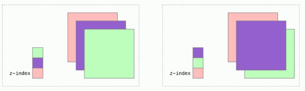
z-index 的特性如下
1.属性值:正整数 负整数 或者 0 默认是0 数值越大 盒子越靠上
2.如果属性值相同 则按照书写顺序 后来居上
z-index 只能应用于 相对定位 绝对定位 固定定位 里面 其他标准流 浮动 静态定位 无效
3>定位改变display属性
display 是限时模式 可以改变下显示模式的方式如下
1.可以使用inline-block 转换为行内块元素
2.可以用浮动float默认转换为行内块元素 (类似 并不完全一样 浮动是脱标的)
3.绝对定位 和 固定定位也和浮动类似 默认转换特性 转换为行内块
所以说 一个行内元素 如果加了浮动固定定位 绝对定位 就可以接受宽高
练习
<!DOCTYPE html> <html lang="en"> <head> <meta charset="UTF-8"> <meta name="viewport" content="width=device-width, initial-scale=1.0"> <meta http-equiv="X-UA-Compatible" content="ie=edge"> <title>定位练习</title> <style> * { margin: 0; padding: 0; } li { list-style: none; } .taobao { width: 520px; height: 280px; background-color: #fff; margin: 100px auto; position: relative; } .arrow-r,.arrow-l { position: absolute; width: 20px; height: 30px; text-decoration: none; line-height: 30px; color: #fff; background-color: rgba(0, 0, 0, .3); } .arrow-l { left: 0; top: 50%; margin-top: -15px; border-top-right-radius: 15px; border-bottom-right-radius: 15px; } .arrow-r { right: 0; top: 50%; margin-top: -15px; /* border-top-left-radius: 15px; border-bottom-left-radius: 15px; */ border-radius: 15px 0 0 15px; text-align: right; } .arrow-l:hover, .arrow-r:hover { background-color: rgba(0, 0, 0, .5); } .taobao .circle { position: absolute; bottom: 15px; left: 50%; margin-left: -35px; width: 70px; height: 13px; background-color:rgba(255, 255, 255, .3); border-radius: 7px; } .circle li { float: left; width: 8px; height: 8px; background-color: #fff; border-radius: 4px; margin: 3px; } /* 有优先级的问题 */ .circle .current { background-color: #f50000; } </style> </head> <body> <div class="taobao"> <a class="arrow-l" href="#"><</a> <a class="arrow-r" href="#">></a> <img src="../images/taobao.jpg" alt="" width="100%"> <div class="xiaoyuandian"> <ul class="circle"> <li></li> <li class="current"></li> <li></li> <li></li> <li></li> </ul> </div> </div> </body> </html>
定位小结

注意:
边偏移需要和定位模式联合使用 单独使用无效
top 和 bottom 不能同时使用
left 和 right 不能同时使用